NOTE ON FEB-03-2023: The second and third concept are now official. Time to sit back and relax.
On an AUG-05 newspost, I wrote that I had some DrunkDuck logo concepts that I've shelved. Well… I truly ever drew them today (SEP-02). These here are my new DrunkDuck logo concepts, or rather, what I think the DrunkDuck/The Duck logo{s} could look like.
Now, even though I don't claim to be a pro at this and my two concepts aren't perfect (pretty sure Emma's logo will blow them outta the water), I think coming up with these concepts will be a good way to get feedback from the community and could see if they'll match with the new redesign.
In addition, I'm going to type in that I do NOT + will not claim that the logos will be official either.
If you have some criticism, drop it down below (if it's destructive, at least type in and post about what you don't like about these concepts). If you'd like to build up/improve on them, also drop it down below; I'm all eyes. Who knows? Maybe the third logo (which is just the first concept with the Ks all turquoise and the drawn duck and/or quail mascots added in) could be added in!
And now, my new logo concepts.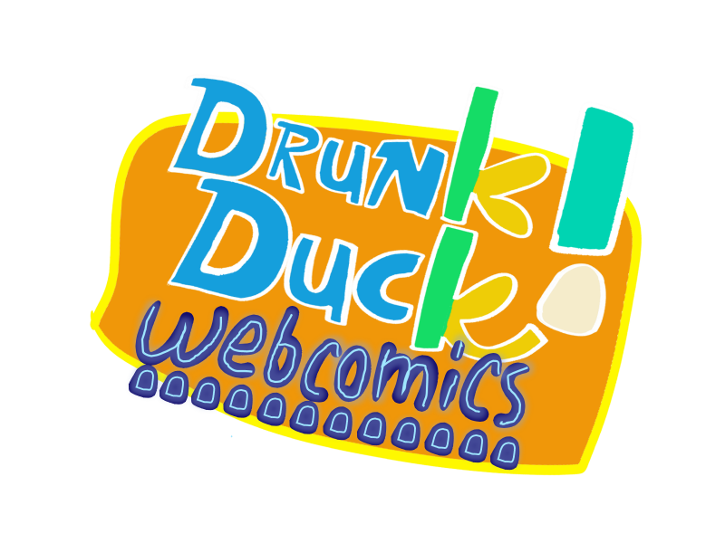
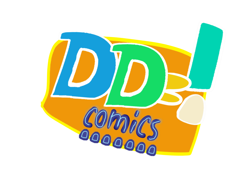

Start publishing on
DD Comics!
Advertise with us

Meet, Greet, Show and Sell*
FlydiscDude's DrunkDuck logo concepts
Yep, that's my intention! I really wanted the things to be reminiscent of the current logo in the top banner and the previous two logos with the orange rectangles - all seen here.
UPDATE: Oops, too quick to post. Yeah, the shades of blue and green do kinda resemble the Mallard color scheme. :D
ThrisbyDude wrote:
Yep, that's my intention! I really wanted the things to be reminiscent of the current logo in the top banner and the previous two logos with the orange rectangles - all seen here.
UPDATE: Oops, too quick to post. Yeah, the shades of blue and green do kinda resemble the Mallard color scheme. :D
That WayBackMachine had the original inebriated water fowl and his friend the Quail—any way the Quail will be be making a cameo in the redesign? (!!)
Third concept and its variants are in!
I've decided to make some changes to the third logo after the thought of having a more retro feel and bringing back the mascots. It should be the last one I'm going to do, unless someone decides to add something to it or request some changes. Again, everyone including yours truly shouldn't count these as official.
By the way, no "DD Comics" variant this time for this concept.
Variant #1: "The main one"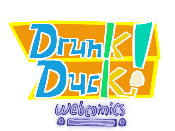
Variant #2: "A Webcomics community"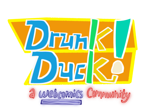
Variant #3: "The Duck and Quail returns"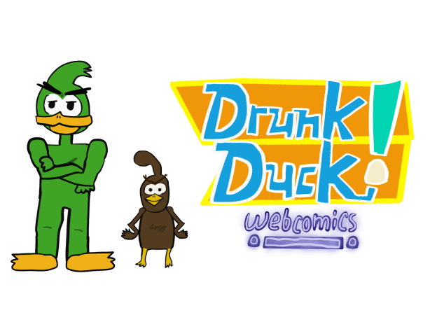
Hey, Ozoneocean!
Thanks for your interest in these concepts!
First, I gotta vectorize the concepts (presumably the third logo, the third logo's variants, and the "DD Comics" logo concept), so they can be seen much more clearly as I used Medibang and part of MS Office PowerPoint/Publisher to draw them. I'm thinking about using Inkscape to vectorize these concepts.
Second, I'll start making a few rotations or 'variants' of these concepts.
After that, finally, I'm planning to make the concepts 'open-source' to every Duck member including you and me who wants to use them for creating their own rotations, for marketing purposes and to put on their comics.
The logo{s} will then be… official!
I'm not quite sure when I'll be finished doing this, but I will be sending out updates in this thread on my progress.
Hope this will work! Let me know if you need anything!
EDIT: As for everyone else, I'm still open to make tweaks about the you-know-whats.
Folks, a little update…
Because this is my second time using Inkscape (I'm right where I left off from my first time) and work got in my way, I will admit it's a bit hard for me to vectorize the concepts refered in my previous update.
I'll aim to get them done between either on the afternoon of DEC-21 - Wednesday or the near evening of DEC-23 - Friday, all according to my time zone, but that's my 'unconfirmed' deadline.
If I can't convert the concepts to vectors from rasters, I'm either going to do something else {to pass the time} or offer someone to vectorize them.
But hey, beginner user on Inkscape, what more can I type in? Heh heh!
Another update follows after this one in the near future.
My day job is graphic design so I do that sort of thing all the time.
The two main ways I'd vectorize that is doing each shape by hand which is difficult but rewarding and really accurate; and doing an auto-trace which is quick and easy but inaccurate and you have to play with the settings to get a good result.
I use old Illustrator CS3 and CS4, new ones might be better at that.
You have a lot of time to play and fiddle so don't feel any pressure ok?
PQ me with any questions and I will try and help.
Heck yeah! A cool update!
This comparison picture speaks for itself.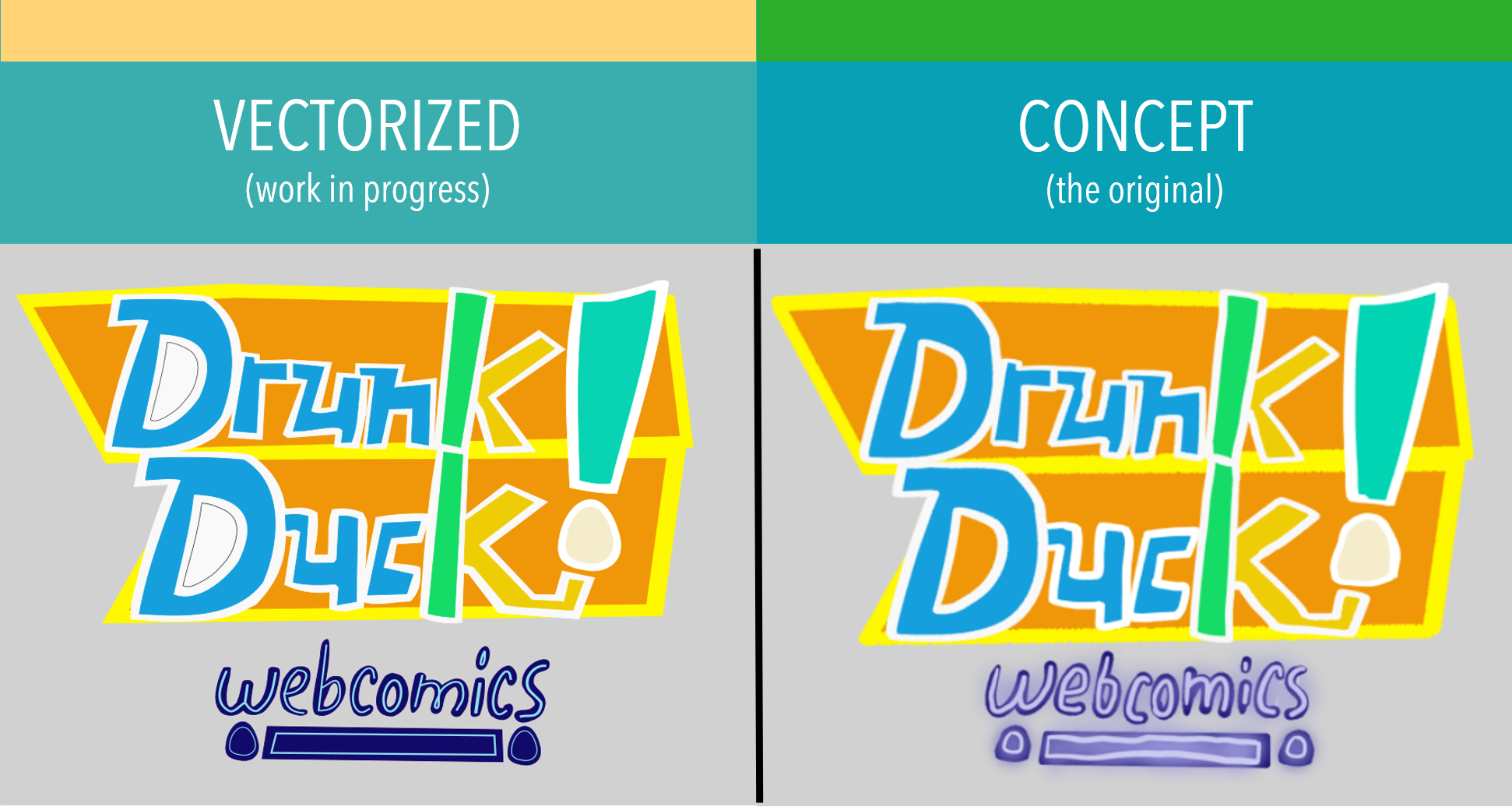
Gotta say, I'm getting the hang of {exploring the tools of} Inkscape! All I need to do is figure out how to make holes in shapes (such as the holes in the letter Ds for the vectorized concept) and how to make objects glow correctly.
You know how there are 'layers' in any art editor program? Well, I started to give some layers names for the SVG Document (It's gonna take a good while before that's complete. It's all worth it!).
Some swishes and swooshes there in the document and I should have it organized for you members to use!
Oh, and Ozone… I'll have questions/a question for you when I wake up from a well deserved rest.
For now, ThrisbyDude/Karumtoo-Rexo out!
ThrisbyDude wrote:
Heck yeah! A cool update!
This comparison picture speaks for itself.
Gotta say, I'm getting the hang of {exploring the tools of} Inkscape! All I need to do is figure out how to make holes in shapes (such as the holes in the letter Ds for the vectorized concept) and how to objects glow correctly.
You know how there are 'layers' in any art editor program? Well, I started to give some layers names for the SVG Document (It's gonna take a good while before that's complete. It's all worth it!).
Some swishes and swooshes there in the document and I should have it organized for you members to use!
Oh, and Ozone… I'll have questions/a question for you when I wake up from a well deserved rest.
For now, ThrisbyDude/Karumtoo-Rexo out!
Oh ThrisbyDude, those side-by-side comparisons are so cool. I like how clear the vectorized one is turning out.
Thank you, so much, for putting in the time to work on these concept designs. ^_^!
…
Update.
I think at this point, I might as well show you Duck users a 'sneak peek' on what the {Inkscape} SVG document will look like.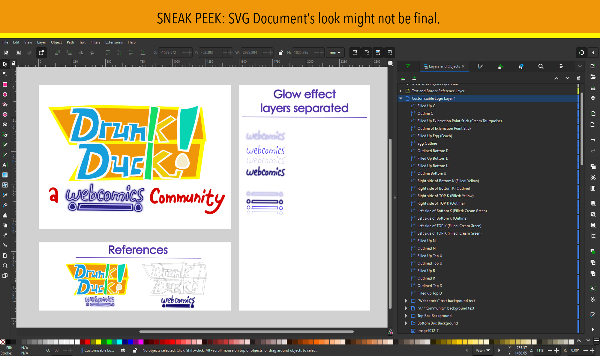
The first page (Artboard if you're using Adobe Illustrator) is where you'll customize your DrunkDuck logo.
The second page/artboard (below the first page/artboard) is where you'll find the references if you want your custom logo to look exactly everything like the original concept.
The third page/artboard (on the very right of the first and second one) is where you can customize your glow effects - y'know, for the text that says "A Webcomics Community" or simply "Webcomics" with the egg lights and bar accompanying the text. You can change the glow effects to different colors and everything! This page/artboard will be the final one made at this time.
Layer and layer names I'm still working on, because boy, are they a puzzle.
And to end this update off… an updated comparison image!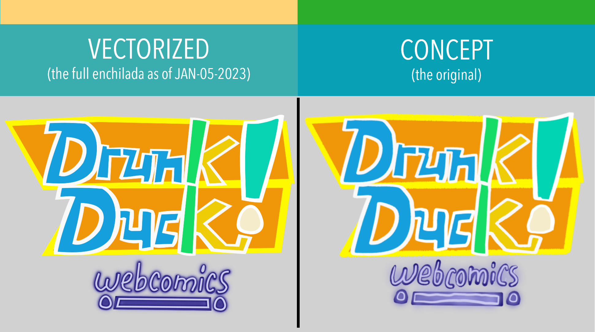
All I can type in now is… still working on it!
Oh, really? I added the tagline "A Webcomics Community" for nostalgia factor (DrunkDuck did used to have this tagline back then), and added the word "webcomics" below the logo because I was taking elements from the current egg logo (the faux cursive on "The" and the word "webcomics" of course is on there in a serif font).
But, if you think the logo can stand on it's own without those words, I could simply speed up the process, make variations of the logo, and make it open-source from the get-go, making everyone here get access to the SVG document.
Also, I'm glad you like how sharp everything about the vectorized logo is!
Okay, social media and posters: I can deal with that.
__________
EDIT with more information: Alright, a site redesign update (JAN-06) has been posted. I'll type the same thing I posted there about how your exported custom logo should be.
"So, to explain further what Ozone means, Duck users - the 4:3 proportion means your picture should be 1440 x 1080 pixels (that's the dimensions). Second proportion is 2:1; it means that your picture could be 1920 x 960 pixels."
In addition… no matter what logo will be official (Mine or DylanTale's), the SVG file for my third concept will {continue to} always be available for marketing purposes, customizing just for fun or whatever could be of use (err… as long as it's legal).
Just letting everyone know.
January 5th or 6th?… It's been so long.
Anyway, I'm going to make this short. The SVG files are 80% complete. It's just that I've haven't been working on them since I was mapping out what to do between work and school, and just needed to rest up. I haven't forgotten about them.
When the SVG files are finished, I want it to be a BIG reveal - I'm all that. That's all for now; update's coming up next time.
ThrisbyDude wrote:
January 5th or 6th?… It's been so long.
Anyway, I'm going to make this short. The SVG files are 80% complete. It's just that I've haven't been working on them since I was mapping out what to do between work and school, and just needed to rest up. I haven't forgotten about them.
When the SVG files are finished, I want it to be a BIG reveal - I'm all that. That's all for now; update's coming up next time.
Releasing your original document as an SVG is a really good idea! I could always do the same for my Illustrator document where I'd release it either as the original .ai or as an SVG. Ozone, if you're seeing this, let me know which format you'd prefer if you'd want the raw file itself.
And… bring out the fanfare, cupcakes, confetti and noisemakers!!!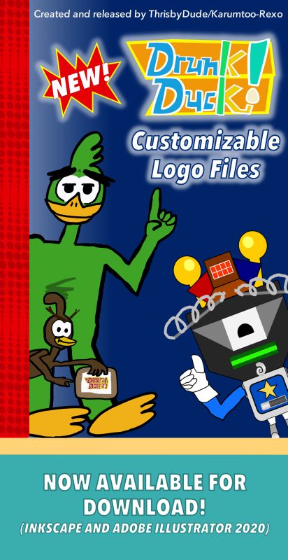
Yeah, I know I'm late to the FEB-03 party, but as of 9:45pm E{S}T (6:45pm for this website and the west coast), I've finally done them! They're finally finished! I have a lot to reveal in this post, so let's get started.
Downloads are below - Standard and Advanced Files!
Inkscape:
DD Logo Concept - Standard File.
DD Logo Concepts - Advanced File.
Adobe Illustrator (2020 and up):
DD Logo Concept - Standard File.
DD Logo Concepts - Advanced File.
My variants of the {third} logo have been made as well. ((strong toothy grin))
Variant/rotation #1: Easter.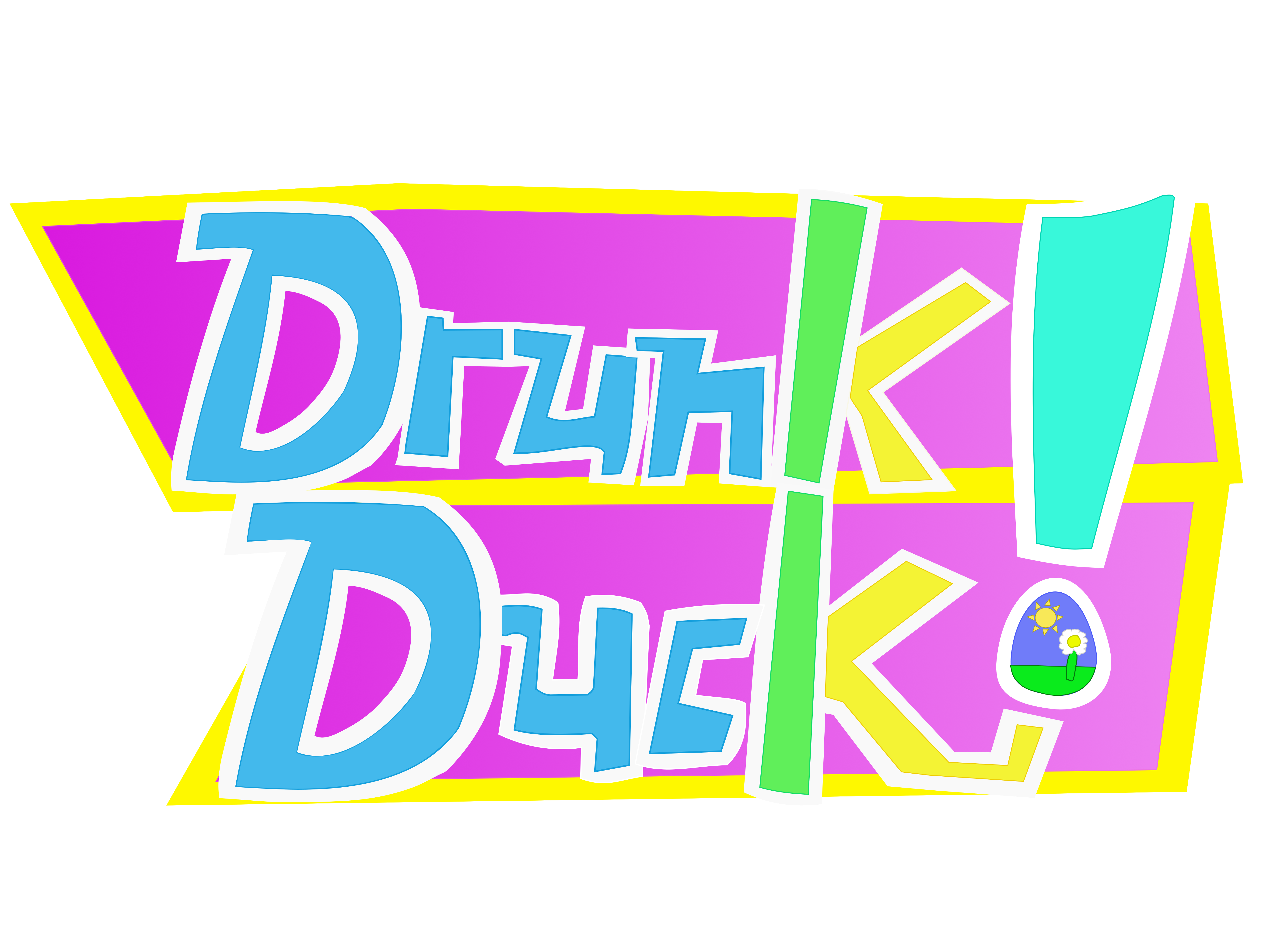
Variant/rotation #2: The Quail's own variant. Can be used whenever or for Fall events.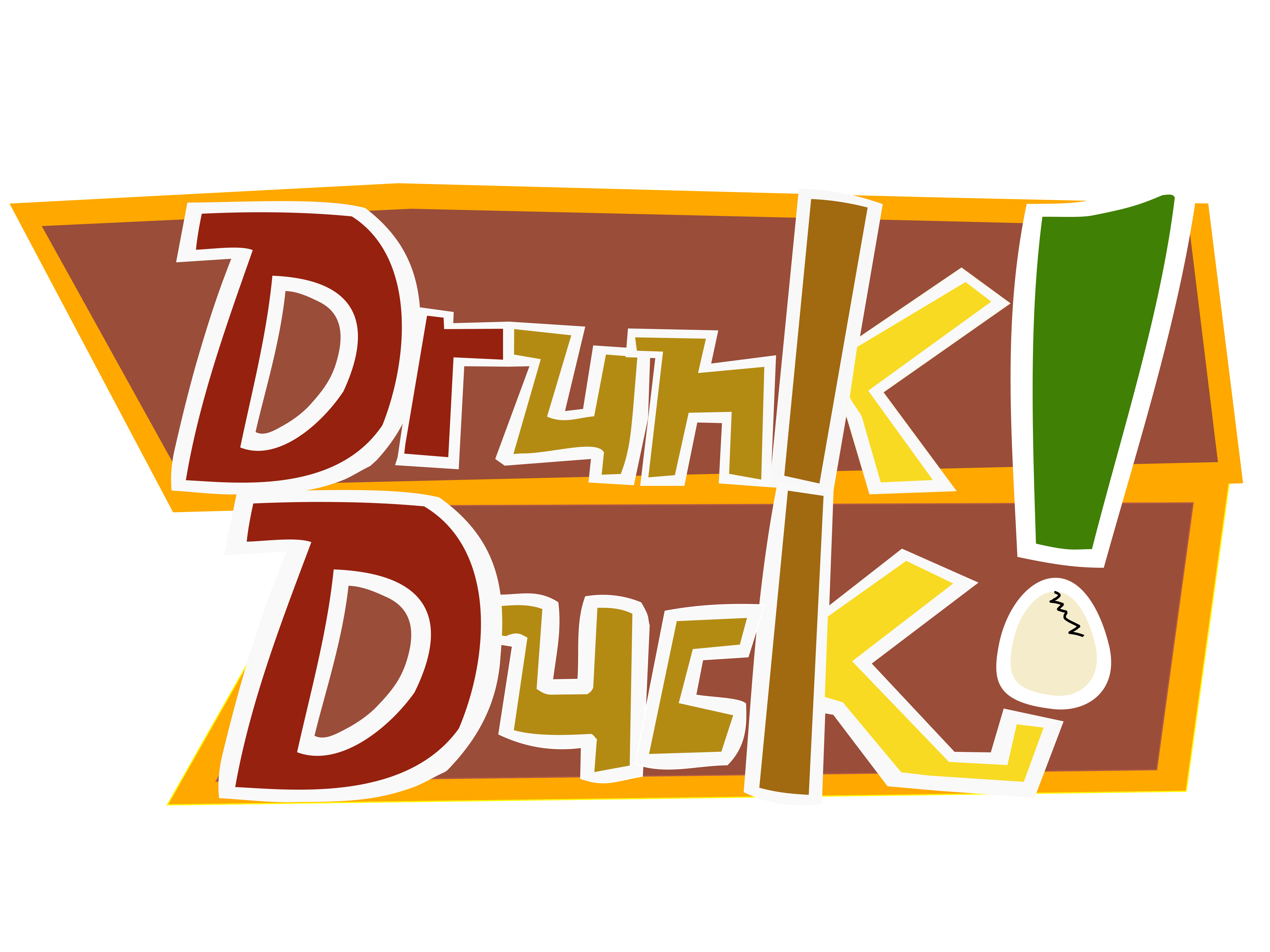
Variant/rotation #3: The Fourth of July. A version of this might be used for my upcoming project.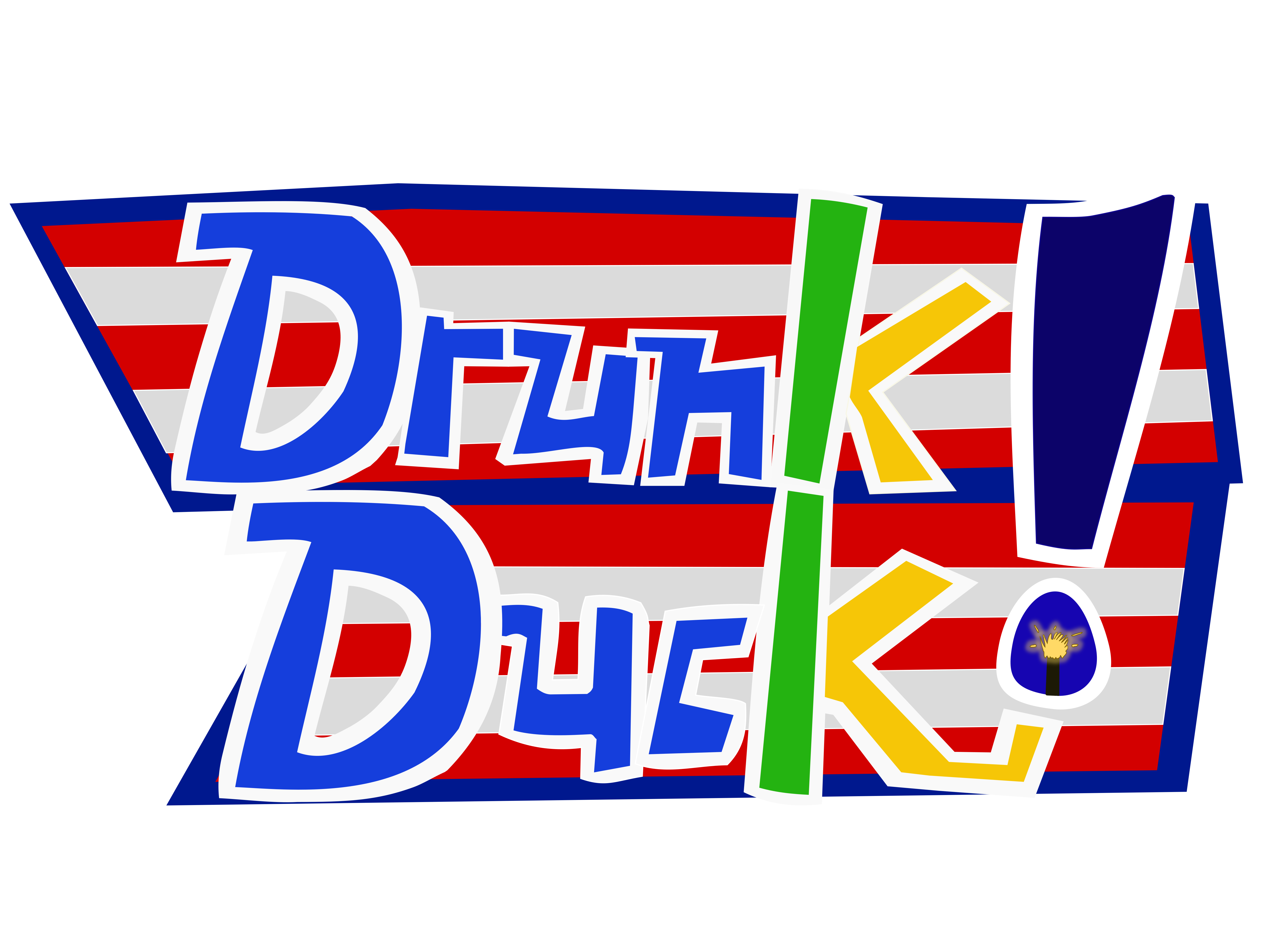
Hopefully the admins can use these three variants around the site redesign!
You know, admittedly, I wasn't expecting this to happen at all… our community making their own logos and having it presented on our website like this.
At first, I thought Emma was going to make her new Drunk Duck logo official (props to her for trying to make one), so I could use mine {quietly} for marketing my {ambitious} projects - it would be like a win-win situation.
But no… ((closed smile)) we, Duck members, did our job for the staff plus Ozoneocean, let our creativity out and crafted our own landmarks for the site - … I'm proud that happened from all of you! Now linking to others' threads and newsposts.
1. DylanTale Comics
2. J. Scarbrough
3. Casscade.
For you three/others listed, grand cheers!
You know with the new website redesign coming soon, I wondered what it'd be like if the redesign carried some elements from the {late} 2006 site over.
Okay, in hindsight, I should just leave that to Emma/Ozone/Alexey because I'm a beginner at website design. A young man like me can dream, right? Heh heh! Besides, the site's redesign is perfect where it's at.
Anyway, that's all fr-
Oh, wait, I forgot! For Adobe Illustrator users out there who want the glow effect set by default like in Inkscape on the 'Advanced' file, follow these blur level numbers below to get said effect.
Okay, this big announcement is over and everything's been covered. This thread will still be open for comments, questions, + posting variants.
Thank you all for reading.
Now… go quackers with ya'lls canvas.
EDIT: I changed some images, so they can be 'bandwidth and image size friendly'.
Advertise with us
DDComics is community owned.
The following patrons help keep the lights on. You can support DDComics on Patreon.
- Banes
- JustNoPoint
- RMccool
- Abt_Nihil
- Gunwallace
- cresc
- PaulEberhardt
- Emma_Clare
- FunctionCreep
- SinJinsoku
- Smkinoshita
- jerrie
- Chickfighter
- Andreas_Helixfinger
- Tantz_Aerine
- Genejoke
- Davey Do
- Gullas
- Roma
- NanoCritters
- Teh Andeh
- Peipei
- Digital_Genesis
- Hushicho
- Palouka
- Cheeko
- Paneltastic
- L.C.Stein
- Zombienomicon
- Dpat57
- Bravo1102
- TheJagged
- LoliGen
- OrcGirl
- Fallopiancrusader
- Arborcides
- ChipperChartreuse
- Mogtrost
- InkyMoondrop
- jgib99
- Call me tom
- OrGiveMeDeath_Ind
- Mks_monsters
- GregJ
- HawkandFloAdventures
- Soushiyo