With text as dominant as this, the central layout question for me always boils down to: Should I simply illustrate the text? Should I complement it with visual information that's not in the text? Or should I draw something which doesn't have anything to do with the text at all (city scapes for example)? I took the illustrative approach here, since I feel it adds both clarity and empathy for our protagonists.
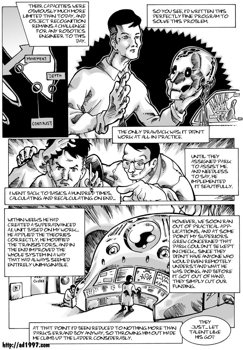
We get to see a younger Alex Selkirk here, and we'll probably see that version of his again in the future, when the time is right to reveal more about A.D's past. I imagine he was pretty handsome in his prime (or still is, depending on your preferences)… on this page he reminds me a bit of Keir Dullea, which is quite welcome, since his role in 2001, Dr Dave Bowman, was one of the two reasons why I gave Naomi her last name.
By the way, last week A.D 1997 received reviews on comicfencing.com.
REPLIES:
DAJB: You're right of course :-) Thanks!
Midge: That's the big question, ain't it?
Nepath: Yup, that was my concern… glad you feel that way.


Comments
Please login to comment.
Login or Register${ comment.author }} at
${ comment.author }} at