A Bit Cheesy

Author notes
Modern Moonlight (page 2)
Fitz onI'm late with the update - AGAIN! My bad. Most of the past week I was busy slacking and being sick for a couple of days, so I only started working on the page on Saturday. Still, I though I'd make it by Wednesday. At 2 am on Tuesday night, I was still up and groaning like a zombie "Muuust… updaaate…" - but at the time I could barely see anything, not to mention thinking straight! So I gave up and went to sleep.
But here it is, finally :) Did anyone miss it so much you cried at night? ;)
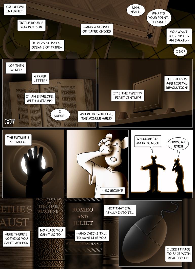
This page was a bit difficult to do. Had some trouble correlating the text and the imagery, and I finally gave up trying to do that with the first panel, feeding you some eye candy instead ;) The NYPL has really nice furniture, especially the table. And the chairs were a pain to do. I actually used CAD software from work - but had to color them myself, anyway. The book, on the other hand was so much fun. It's supposed to be a Gutenberg's Bible. I even got the Gutenberg font. Not that you can see, because it's too small - but it's there ;) And another thing you can't see is that it's not an actual Biblical text :) It's the lyrics from the songs Modern Moonlight and Necessary Evil that I talked about last time. And I actually used two-point perspective on the monitor! Yay! Go me! I felt kinda dumb always avoiding perspective - but I found it so much easier to do on photoshop than on paper. Btw, I wonder if you got what that panel refers to :)
Also, you might have noticed I soft-shaded Mick instead of cel-shading. I'm not sure yet if I'll switch to that method from now on, but I had to try :) It looks ok, I guess. The intense light makes it a little weird, but oh well :)
That's all for today! See you in less than two weeks, hopefully!


Comments
Please login to comment.
Login or Register${ comment.author }} at
${ comment.author }} at