First
Prev
- Chapter 2 part 2
- Chaper 2 part 1: my house!...again!!
- Previously on...
- A.G.T.H Poster
- Character colour concept
- A.G.T.H: Rebirth page 1
- A.G.T.H: Rebirth
- Still working on it
- A.G.T.H Reinvention break
- Chapter 1 Part 10- Dramatic group shot
- Chapter 1 Part 9: Flamin Intervention
- Chapter 1 Part 8: KADOOM?!
- Chapter 1 Part 7: The Ticking Tocking
- Chapter 1 part 6: Seriously wooden joke
- Chapter 1 part 5: I'll Krill U
- chapter 1 Part 4: Pay attention
- Chapter 1 part 3: RAAAWW!!!!!!
- Chapter 1 part 2: I didnt do it? did you??
- Chapter 1 part 1: Life sucks,then it ends?
Abram goes to hell part 1.
Next
Last
Author notes
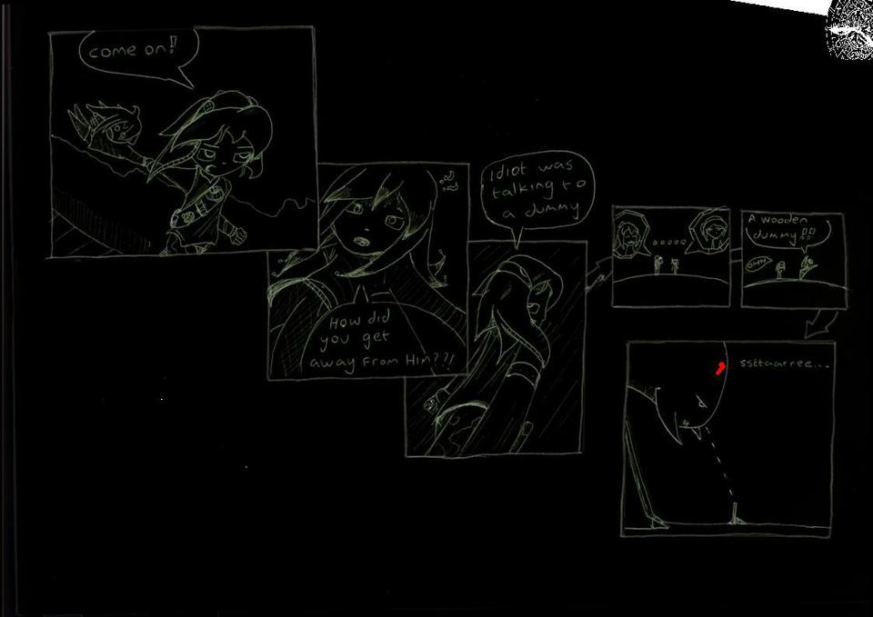
OK I really need some opinions, I think my drawings are kind of hard to see against the white background so my question is does anyone prefer the normal way or this style?


Comments
Please login to comment.
Login or Register${ comment.author }} at
${ comment.author }} at