Bleeding Moon

Morn

Author notes

Morn

OmegaWarrior32
on

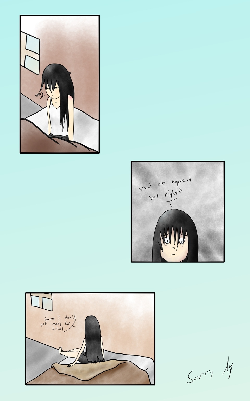
I'm gonna try to upload more consistently in the near future here, as I most likely won't have as many other things to do. It appears that I need some more practice with faces, but I hope you can enjoy the story, and I plan to try some longer pages as well. As always, feel free to leave any thoughts or suggestions in the comments and I'll try to reply!
Comments

Please login to comment.

Login or Register
  • Twikki_The_Elf at

    [con't from third] they had a really charming experimental pacing that I actually think would translate well to digital.

    Anyways, keep at it. It's not every day you find someone whose willing to experiment in this medium, too many artists just churn out the same. Consistency is the Hobgoblin of small minds.

    The story is impeccable. It reminds me of my favorite Lovecraft tale; The Outsider.

    • OmegaWarrior32 at

      Thank you for the advice! Too few people actually give suggestions when you ask for them :D I'll try to take your coloring advice into consideration. As for the pages, I am intending to lengthen the pages. I also am planning to do a less saturated coloring scheme where the world around her is colored in a way depicting how she sees it. The current 5 new pages take place about a year before the old two pages, but the story really picks up about the time of the first ones, so I will redraw the original two pages at some point. Glad you like it so far!

  • Twikki_The_Elf at

    [con't from second] As it stands they seem to be uniformly isometric.

    The light source should be emanating from the window, not the ceiling, it being morning and all.

    The shading on the fabric is promising but needs more depth, similar to the face. The lineart should indicate more folds.

    Remember, this is just what I would do as a stylistic choice in my present development as an artist. All art is inherently perfect as a cultural document because it signifies the relation of the human to reality as a sign of the shaping process of the unfolding of history. We are told that we are shaped by the world instead of making it. So therefore I think in comics as they are today it's important to find a style that's more "you" than anything else.

    While it's said that each page should ideally have 7 to 5 panels, but I'm looking at some of your older stuff, and I think you should ink the first two as faithfully as possibly, or hell, just increase the contrast. [con't]

  • Twikki_The_Elf at

    [con't from first] If you'd like to draw attention to the eyes, draw some veins in there. The nose here appears convex, or snoutlike, if that's your intention, draw a line above it to increase this effect, otherwise shade it to show that it is the bottom of the nose. Increase the contrast on the face to signify volume. As for the hair, I think with the above suggestions it would work as stylized rendering if you broke up some of the spaces between the "zig zags" with more of them. Hair, even clumps, grow in a certain direction, so it should generally follow that with a parting point between them somewhere on the forehead (in the case of straight hair, which you've rendered here). Add some blue or purple shading beneath this to show it shrouding the face. The lines going towards the head in the background should be sharper (use a different brush).

    I'd do away with the blue background and the signature. Also vary the perspective composition of the first and third panels. [con't]

  • Twikki_The_Elf at

    It looks like you are going for a watercolour effect. If you want to achieve more unevenness in the texture, what you do is select the area you want to colour, use one of those fake water colour brushes (You can download them for photoshop but the latest version of krita come with some), but make it really really big and lightly touch over the part you wish to appear shaded. Put it in multiply mod and repeat the process on a new layer for a layered effect which mimics the properties of physical watercolours. It this way the brush does most of the work for you.

    As for faces the thing to remember is that the edges of the eyebrows are even with the tips of the ears which is halfway down the face. This proportion can be lowered to show the age of the character. As for the hair, starting with the eyelashes, draw a thicker line for the top of the eye and at the end of this line pointing away from the center of the face draw some lines to show the lashes [con't].

Advertise with us

Moonlight meanderer

DDComics is community owned.

The following patrons help keep the lights on. You can support DDComics on Patreon.