Blue Circus

Author notes
19 - Hooba-what now?
Allan onI consider these kinds of updates to be metaphors for how I actually write the strip, but I'll get more into that later.
I'm going to talk about fonts now. Hope you guys like fonts, cuz I'm gunna talk about 'em.
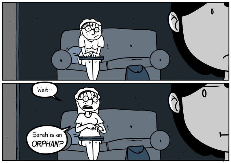
Ever notice how Marvel or DC uses all UPPERCASE FONTS THAT LOOK LIKE THIS? Here on the internet it's obvious and often strenuous to read all uppercase text (after a while some people tend to get headaches) because we know most of the time our fonts are supposed to be lowercase.
In the olden days, back when comics printed on paper and they used dots of "ink" to color them, comic artists wrote in all uppercase because the bolder letters were easier to see when they were off the presses. That's also why they used so many exclamation marks—because "!" is easier to see than "."
Anyhow, when your whole comic is written in all uppercase it's almost unnoticeable; your characters won't look like they're shouting unless you embolden, increase the size, or if they emote that way. But at the same time, in my opinion, that limits your freedom of expression and exaggeration.
When you use a font that isn't all caps you get the option of people talking calmly, precisely, and then people FLIPPING THEIR SHIT AND YELLING EVERYTHING. Plus you can embolden that, too, making it even more extreme.
Pay attention to the little details when you're planning your comics. Your readers may not know, but you'll know, and you can always be like "hee hee you readers ain't never gonna catch all dese subtleties in dis bitch."
And I do apologize for my tardiness. Jobs and jobs and jobs, amirite? Let's hope I can get sommore done soon!


Comments
Please login to comment.
Login or Register${ comment.author }} at
${ comment.author }} at