
Author notes
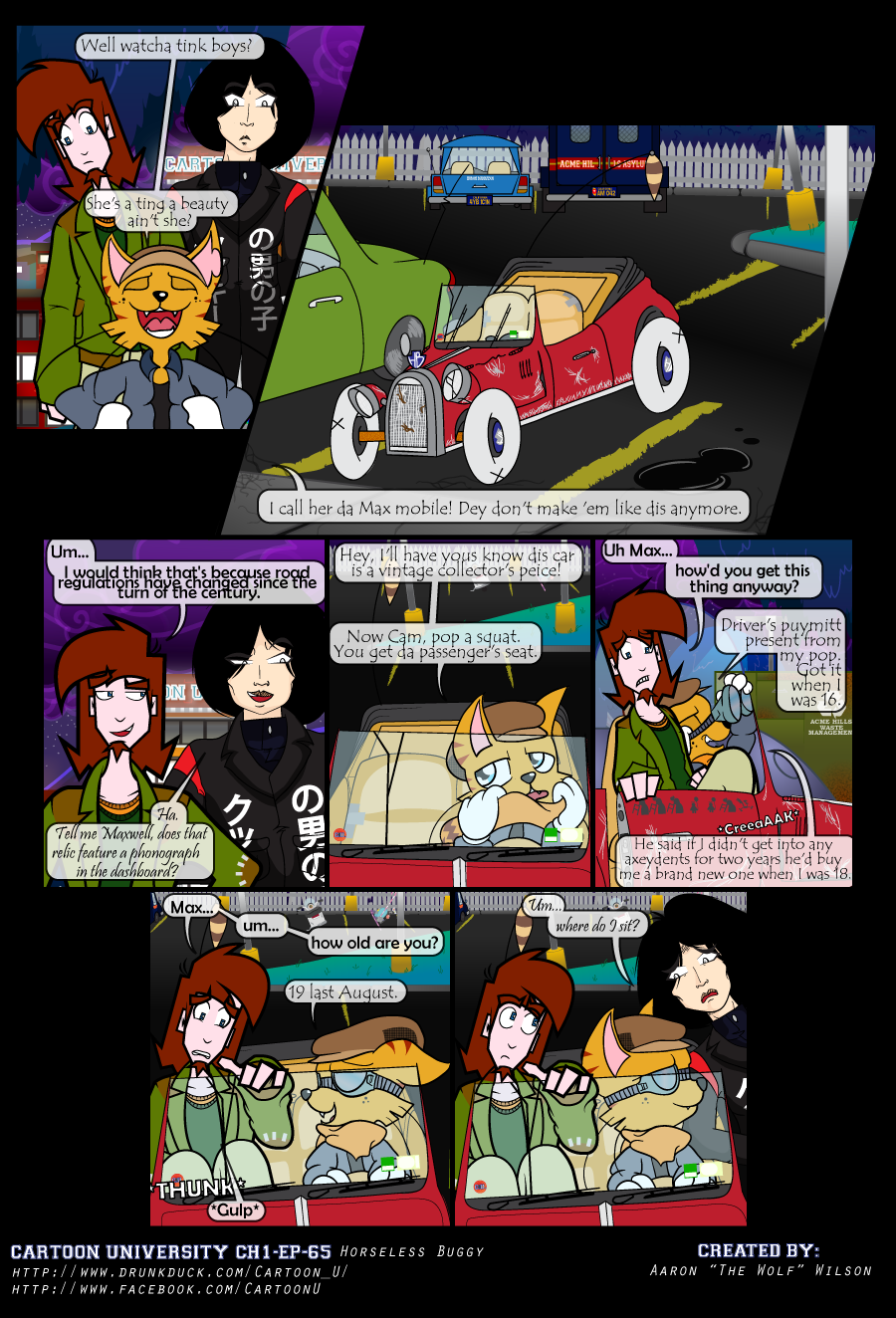
Horseless Buggy
Aaronthewolf onMax shows off his sweet ride to his room mates. they are, less than enthusiastic about riding in it.
I'm trying to get in the habit of posting on the facebook page status updates so if these sort of speel crop up people know whats going on. Sufficed to say this was supposed to go up last Friday, but work got in the way first. Then by Friday I took ill, and yesterday I spent the day in the hospital, otherwise this would have been posted yesterday. I'll spare you the gritty details…sufficed to say it's been a rough couple of weeks. I'm supposed to be taking it easy today, but I pushed myself to finish this today because I wanted it up. Keep tuned to the facebook page, listed on the comic pages themselves as well as the links embedded in the page for updates on when there will be delays and ecetera.
Now on to my discussion stuff which I haven't done in a while. A great deal of work went into this strip. Designing Max's car, the schools parking area, ect. The car was the hardest bit, but I had a vision for how I wanted it to be. It had to be an old type of buggy, the type you'd see in classic cartoons. Now i had in my head vague recolections of cars I had seen in Merry Melodies and Looney toons and the like, but I wanted to double check for some examples for referencing work in the sketching pages. That was startlingly harder than I thought it would be. Thanks to Disney's Cars, and car clip art it was hard to bring up any noteable examples via image search. Much of a Winnie the Pooh issue in that department. (If you don't know, basically it's difficult to find the pre-disney pooh stuff, because of the huge amount of Disney Pooh stuff.) So basically I had to end up taking screen shots of DVD's and Youtube videos to work from. In the end I got the design I was looking for, a jalopy style roadster from the 30's era which just screams "Max's Car."
I also have a habit of adding unecessary details…I realize now after finishing this issue that I really should scale back on that. There are so many little things that look so large when I'm working on these strips that are barely see-able in the finished copy. Perhaps I'll post some screencaps of particular elements I'd want to talk about in higher res either on here or the facebook page. I will say that 2 small art assets of note in this strip is "Acme HillS Asylum" Truck in the back of the parking in a few of the panels, and the Hit and run stickers on Max's door. I thought it would be funny and make sense that there might always be an insane asylum van near campus, as a precaution. as for the stickers there are several entries for pedestriens that max has hit with his car, which includes old womene, children, and a familiar coyote persued bird. It's a real issue with me with these small visual gags. Because this is a comic I want to cram as much in as possible because it doesn't move. But if you can barely see them i guess it's pointless.
Anyway, I should be posting the new strip by next Friday, if not sooner. I also want to post my Max production sketches for this strip at some point. See you next time.


Comments
Please login to comment.
Login or Register${ comment.author }} at
${ comment.author }} at