Celtic Minstrel Gallery

Author notes
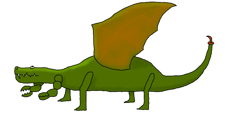
Claximander Take 2
Celtic_Minstrel onA complete redraw of the previous picture. Some things are better, some worse, others about the same.
Head: I feel this is much better, as I put more detail into the mouth (and teeth). The eye is about the same.
Pincers: About the same.
Legs: Much worse. They need to be fatter. However, there's one improvement � they now have knees.
Feet: A little better, but not significantly.
Wings: Neither this wing nor the wing of the other one looks right. Also, it would probably better if the other wing were also visible.
Stinger: A little improved. More improved than the feet, anyway.
Edit: And I'm beginning to see the disadvantages of this layout… hmmm, how to fix that…


Comments
Please login to comment.
Login or Register${ comment.author }} at
${ comment.author }} at