Dark the Hedgehog

#4#

Author notes

#4#

Lodukas
on

Sorry for the late update.
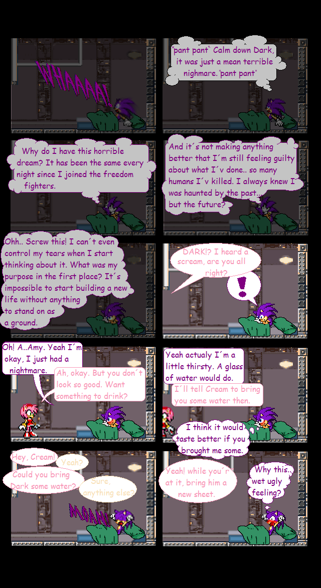
Dark is actualy a little soft when he's not angry, softer than Sonic. Almost as Cream maybe, it makes him a character I think.

So tell me.. Dosen't Dark look sad in panel five? I really had a hard time making that arm!

Comments

Please login to comment.

Login or Register
  • Flame the Hybrid at

    @ Soonmme:

    I'm just telling you to give him some time, I mean when you started DS you spelled millions of things wrong >.> So just give him some time, dude.

  • soonmme at

    @Flame: Actualy, you won't see any more spelling in DS, ever.
    (And I mess up two, but you know what I mean, in most cases, some times, I can barly tell what this guy means ;.;)

  • Doklor567 at

    lol

  • Flame the Hybrid at

    @ soonmme:

    Soonmme, I don't think you should be say anything about grammar in this considering that in most of your comics, you spelt at least two things wrong >.>

    Also color-coding the text isn't bad, you just need to find the right colors so that it's readably :P

    @ Lodukas:

    The only errors I see in this issue is that the bed sheet is off in the last two panels as Dark's legs/feet could not possibly be in that position and Amy's mouth just looks really bad >.>

    However I love this comic as it's dark, funny and has a good story just like mine's going to :P

    And I'm not going to comment on the Dark sprites as you said, there's going to be a reason for him just being purple.

    So in all, I hope you continue this great work and hope to see more of this great comic :D

  • riku valentine at

    pretty cool

  • dark link at

    good comic but as soonme said, text touching bubbles=bad.

  • soonmme at

    Your text bubbles= bleh
    Maybe you should do those in the gimp, too…
    Your grammar is also bleh.
    the shading on the blanket and pillow totally clash.
    text is touching text bubbles, which is very bad…
    Stop color coding text, it's hard to read.
    Repeating a character's pose looks weird, in most cases, such as this.
    The clouds(except in panel 1) is really bad.
    The characters should actually walk, instead of just standing there all of a sudden…
    And, the blanket is in an impossible position, his legs are definitely not big enough to bump where there's that out dent.
    The recolor is a bad thing, you should try to make an excuse to give him a sort of edit soon(cause, there'll be a continuity error) trust me, I got stuck with a recolor, and I can't change it, which is really screwing me over =(
    You still have lots of room for improvement…
    I'm going easy with this 3…

Advertise with us

Moonlight meanderer

DDComics is community owned.

The following patrons help keep the lights on. You can support DDComics on Patreon.