First
Prev
- Credits
- Blooper: Double Presentation
- After Party: Everyone to the Bar!
- Acceptance Speech: Most Improved Art, Best Supporting Character
- Acceptance Speech: Best Completed Comic
- Blooper: Red Carpet Interview
- Acceptance Speech: Best Philosophical/Political Comic
- Acceptance Speech: Readers' Choice Award
- Acceptance Speech: Best Fantasy Comic, Best Overall Comic Strip
- Acceptance Speech: Best Adult-Oriented Comic, Best Parody Tribute
- Readers’ Choice Award presented by Genejoke
- Best Completed Comic presented by Banes
- Best Overall Comic Strip presented by Niccea
- Best Overall Story Comic presented by fallopiancrusader
- Acceptance Speech: Best Plot Development, Most Supportive Reader
- User Awards presented by fallopiancrusader
- Best Supporting Character presented by PBandJ (Part 2)
- Best Supporting Character presented by PBandJ (Part 1)
- Best Antagonist presented by PBandJ (Part 2)
- Best Antagonist presented by PBandJ (Part 1)
- Best Protagonist presented by PBandJ (Part 2)
- Best Protagonist presented by PBandJ (Part 1)
- Acceptance Speech: Best 3D/Poser Comic
- Best Adult-Oriented Comic presented by PBandJ (Page 2)
- Best Adult-Oriented Comic presented by PBandJ (Page 1)
- Most Deliciously Offensive Comic presented by Banes
- Best Horror Comic presented by Banes
- Acceptance Speech: Best Mystery/Crime/Noir
- Acceptance Speech: Best Action in a Comic
- Best Mystery/Crime/Noir Comic presented by Banes
- Best Plot Development presented by gene hole
- Best 3D/Poser Comic presented by AnisykesComics
- Best Parody/Tribute Comic presented by KimLuster
- Best Dialogue presented by Niccea
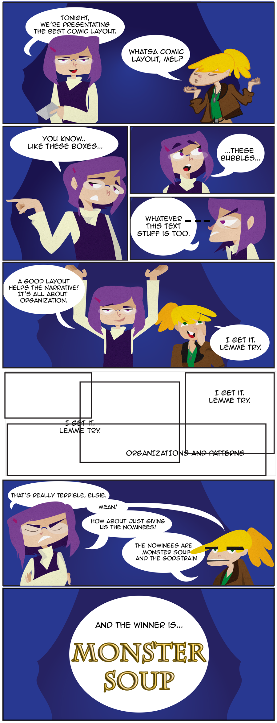
- Best Comic Layouts presented by Zac
- Best Romance in a Comic presented by VinoMas
- Best All Ages Comic presented by Genejoke
- Most Improved Art presented by Dragonaur
- Best Superhero Comic presented by shastab24
- Best Action Within A Comic presented by jgib99
- Best Philosophical/Political Comic presented by Genejoke
- Acceptance Speech: Best Community Project
- Best Fantasy Comic presented by Asbin
- Best Anthropomorphic Comic presented by shastab24
- Best Character Design presented by shastab24
- Best Adventure Comic presented by Call Me Tom
- Best Sci-fi Comic presented by Banes
- Best Use of Medium presented by KimLuster
- Best Humor Comic presented by lopriest
- Best Background Art presented by lopriest
Best Community Project presented by Strixvanallen
- Finalists - Characters, Users, and the Big Ones
- Finalists - Technical Awards
- Finalists - Style Awards
The Finalists - Genre Awards
- Tie Breakers! Vote Now
- For Your Consideration: Conclusion (Knocking Some Back)
- FYC: What the Duck?! (Part 3)
- FYC: Space Station (Part 2)
- FYC: Nice To See 'Ya Niccea (Part 1)
- FYC: I Don't Understand a Symbol You're Saying
- FYC: Its A Hoax
- FYC: Big Fish
- FYC: Times Like This
- FYC: Body Double
- FYC: Imagine Some Epic Music
- FYC: A Questing We Will Go
- The 2014 Drunk Duck Awards (You're Invited)
- Vote for the Design the Awards Contest
- FYC: We found Niccea?
- FYC: Nobody is Beating Me!
- FYC: Aren't We Supposed to be Looking for Someone?
FYC: Where is Niccea?
You're Invited
Next
Last
Author notes
Congratulations to Monster Soup .Zac .Critics Acclaim Monster Soup seems to go a step above readability and even pacing/flow by matching the panel shape with the content for mood. Monster Soup uses expansive panels stretching past borders to "set scenes" or to show meaningful moments between characters.


Comments
Please login to comment.
Login or Register${ comment.author }} at
${ comment.author }} at