First
Prev
- Website Design 2004
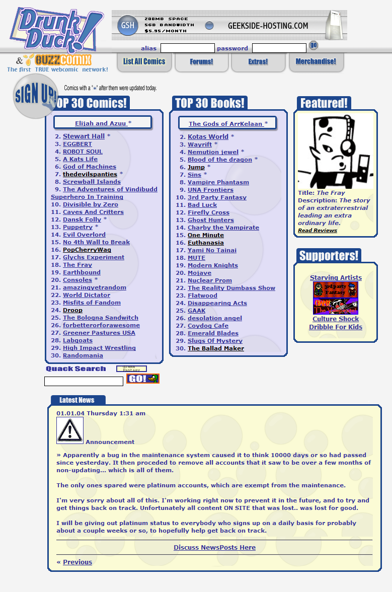
- Website Design 2003
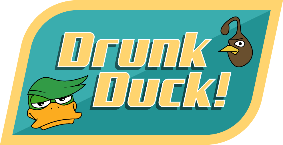
- Duck Logo #4
- Duck Logo #3
- Duck Logo #2
- Duck Logo #1
- Cameo Duck #3
- Cameo Duck #2
- Cameo Duck #1
- A different kind of duck
- A drunk duck sunset
- Quest for The Quail #80
- Quest for The Quail #79
- Quest for The Quail #78
- Quest for The Quail #77
- Quest for The Quail #76
- Quest for The Quail #75
- Quest for The Quail #74
- Quest for The Quail #73
- Quest for The Quail #72
- Quest for The Quail #71
- Quest for The Quail #70
- Quest for The Quail #69
- Quest for The Quail #68
- Quest for The Quail #67
- Quest for The Quail #66
- Quest for The Quail #65
- Quest for The Quail #64
- Quest for The Quail #63
- Quest for The Quail #62
- Quest for The Quail #61
- Quest for The Quail #60 (oops)
- Quest for The Quail #60
- Quest for The Quail #59
- Quest for The Quail #58
- Quest for The Quail #57
- Quest for The Quail #56
- Quest for The Quail #55
- Quest for The Quail #54
- Quest for The Quail #53
- Quest for The Quail #52
- Quest for The Quail #51
- Quest for The Quail #50
- Quest for The Quail #49
- Quest for The Quail #48
- Quest for The Quail #47
- Quest for The Quail #46
- Quest for The Quail #45
- Quest for The Quail #44
- Quest for The Quail #43
- Quest for The Quail #42
- Quest for The Quail #41
- Quest for The Quail #40
- Quest for The Quail #39
- Quest for The Quail #38
- Quest for The Quail #37
- Quest for The Quail #36 (alternative version)
- Quest for The Quail #36
- Quest for The Quail #35
- Quest for The Quail #34
- Quest for The Quail #33
- Quest for The Quail #32
- Quest for The Quail #31
- Quest for The Quail #30
- Quest for The Quail #29
- Quest for The Quail #28
- Quest for The Quail #27
- Quest for The Quail #26
- Quest for The Quail #25
- Quest for The Quail #24
- Quest for The Quail #23
- Quest for The Quail #22
- Quest for The Quail #21
- Quest for The Quail #20
- Quest for The Quail #19
- Quest for The Quail #18
- Quest for The Quail #17
- Quest for The Quail #16
- Quest for The Quail #15
- Quest for The Quail #14
- Quest for The Quail #13
- Quest for The Quail #12
- Quest for The Quail #11
- Quest for The Quail #10
- Quest for The Quail #9
- Quest for The Quail #8
- Quest for The Quail #7
- Quest for The Quail #6
- Quest for The Quail #5
- Quest for The Quail #4
- Quest for The Quail #3
- Quest for The Quail #2
Quest for The Quail #1
- 21 - By devlinsaints
- 20 - By Skoolmunkee
- 19 - By Josh Holley
- 18 - By VegaX
- 17 - By Reashi
- 16 - By Bloody Nora & Skreem
- 15 - By Vig Starmax
- 14 - By Reashi
- Book #3 - Drunk on laughter
- Book #2 - Drunk and Disorderly
- Book #1 - Drunk in public
- 13 - Spider Quail
- 12 - Topical Duck
- 11 - Drink up Duck
- 10 - Diaper Duck
- 09 - Bonsai
- 08 - On the menu
- 07 - Recycled Duck
- 06 - Duck reloaded
- Dawn of the Duck
- 05 - Vegax
- 04 - VegaX
- 03 - Subcultured
- 02 - VegaX
- 01 - Ronson
- Dead Duck
Next
Last
Author notes


Comments
Please login to comment.
Login or Register${ comment.author }} at
${ comment.author }} at