First
Prev
- The Crucifixion: The Price of Redemption
- The Crucifixion: The Sentence
- #1340 Holy Matrimony: One Love
- #1339 Holy Matrimony: What to Say When You Hate Your Best Friend
- #1338 Holy Matrimony: Rastafarianism
- #1337 Holy Matrimony: Parenthood
- #1336 Holy Matrimony: On the Nature of Perfection
- #1335 Holy Matrimony: Now That THAT'S Over With...
- #1334 Holy Matrimony: And Furthermore...
- #1333 Holy Matrimony: How to Treat Guests
- #1332 Holy Matrimony: Naked Sundays?
- #1331 Holy Matrimony: Clothing Options
- #1330 Holy matrimony: Side-effects May Vary
- #1329 Holy Matrimony: That Didn't Last Long
- #1328 Holy Matrimony: The Guests Arrive
- #1327 Holy Matrimony: Fathers and Daughters
- #1326 Holy Matrimony: Why Not?
- #1325 Holy Matrimony: The Site
- #1324 Holy Matrimony: Where to Wed...
- #1323 Full Recovery: New Old Friends
- #1322 Full Recovery: He?
- #1321 Full Recovery: The Mystery of Function
- #1320 Pre-Marital: Functional Jewelry
- #1319 Pre-Marital: The Truth Behind Bridesmaid's Dresses
- #1318 After: Wise Men Say
- #1317 After: Business Proposition
- #1316 After: To Seek Forgiveness
- #1315 Armageddon: From a Scientific Perspective
- #1314 Armageddon: Igor, Midget M.E.
- #1313 Armageddon: CSI
- #1312 Armageddon: Family Matters
- #1311 Armageddon: Time Keeps on Slipping
- #1310 Armageddon: He Rides a Pale Horse
- #1309 Armageddon: You Do the Crime...
- #1308 Armageddon: What's Love
- #1307 Armageddon: A Life of Regret
- #1306 Armageddon: To Care
- #1305 Armageddon: The Beast
- #1304 Armageddon: Catching Up With Old Friends
- #1303 Armageddon: The Futility of Caring
- #1302 Armageddon: Being an Insight Into the Desires and Priorities of a Modern Man
- #1301 Armageddon: Finding a Miracle
- #1300 Armageddon: Running on Empty
- #1299 Armageddon: Old Switcheroo
- #1298 Armageddon: Tricky Moves
- #1297 Armageddon: Stomp
- #1296 Armageddon: Ass Whuppin'
- #1295 Armageddon: Gloating Gets You Nowhere
- #1294 Armageddon: Repair Work
- #1293 Armageddon: Stay in the Game
- #1292 Armageddon: The Effects of Drained Power
- #1291 Armageddon: Posing for Fun and Profit
- #1290 Armageddon: Buffer Zone
- #1289 Armageddon: No News Is...
- #1288 Armageddon: What do You See When You Turn Out the Light
- #1287 Armageddon: The Man Behind it All
- #1286 Armageddon: The Gang's All Here
- #1285 Armageddon: My Friends Call Me...
- #1284 Armageddon: Not so Clever
- #1283 Armageddon: Family Matters
- #1282 Armageddon: Dramatic Entrance
- #1281 Armageddon: 20/20
- #1280 Armageddon: Caught
- #1279 Armageddon: Nowhere to Hide
- #1278 Armageddon: A Challenger Approaches
- #1277 Armageddon: Pretty Sneaky, Sis
- #1276 Armageddon: Numerology
- #1275 Armageddon: No Business Like It
- #1274 Armageddon: 36
- #1273 Armageddon: Jackets are Dumb
- #1272 Armageddon: That Damn Chain
- #1271 Armageddon: Dance Pants
- #1270 Armageddon: Why the Priest?
- #1269 Armageddon: The Priest
- #1268 Dress Shopping: No Wings
- #1267 Dress Shopping: Wings?
- #1266 Many Problems: Side-Effects
- #1265 Many Problems: Subservience
- #1264 Many Problems: Inner Desires
- #1263 Many Problems: Possession
- #1262 Many Problems: Punching a Zombie
- #1261 Many Problems: Scene of the Crime
- #1260 Many Problems: What Next
- #1259 Many Problems: Power of the Lord
- #1258 Many Problems: The Enemy
- #1256 Many Problems: Help
- #1255 Many Problems: The Man for the Job
- #1254 Many Problems: A Message
- #1253 Many Problems: Gets Away
- #1252 Many Problems: Torture
- #1251 Many Problems: The Scent of Bad Things
- #1250 Fanart Jamboree!
- #1249 Many Problems: Where's Dag
- #1248 Many Problems: Like Mike
- #1247 A Boxer's Tale: Cliffhanger
- #1246 A Boxer's Tale: Painful Memories
- #1245 A Boxer's Tale: In a Bar
- #1244 A Boxer's Tale: Pride Vs. Responsibility
- #1243 A Boxer's Tale: Home Sweet Home
- #1242 A Boxer's Tale: Durden's Gym
- #1241 Another Game Night: Rules of the Game
- #1240 Another Game Night: Marriage Jokes
- #1239 Another Poker Night: Character Profiles
- #1238 Another Game Night: Rules of Poker
- #1237 Another Game Night: More Players
- #1236 Another Game Night: Cancellations
- #1235 Ceremonial Options
- #1234 The Value of Marriage
- #1233 Gay Love: Pastry?
- #1232 Gay Love: Makin' Babies
- #1231 Spreading: Change of Clothes
- #1230 Spreading: Joint Wedding
- #1229 E&AFest
- #1228 Spreading: The Problem With Catfights
- #1227 Spreading: What a Bitch
- #1226 Spreading: Selfishness
- #1225 Spreading: The Announcement
- #1224 Spreading: Opposing Views
- #1223 Spreading: What's His Name
- #1222 Spreading: Stupid Ideas
- #1221 Spreading: All in Fun
- #1220 Earth Angel: Outwitted
- #1219 Earth Angel: The M Word
- #1218 Earth Angel: Don't Not Love
- #1217 Earth Angel: Hard Questions
- #1216 Earth Angel: Hair
- #1215 Love/Hate: Pain
- #1214 Love/Hate: Ownership
- #1213 Love/Hate: Broken Up
- #1212 Cheating
- #1211 Devilish: Good Reason
- #1210 Devilish: Guess Who's Back
- #1209 Devilish: Those Teeth
- #1208 Stranglation
- #1207 Insanity
- #1206 Costuming Department
- #1205 Prices Paid
- #1204 She's a Concubine, People!
- #1203 Brother & Sister: Feelings
- #1202 Brother & Sister: Coming Home
- #1201 Creepy: Ze Omen
- #1200 Creepy: Little Monster
- #1199 Late Night With the Boss: Nature of Sin
- #1198 Late Night With the Boss: Sin
- #1197 Late Night With the Boss: Fencing
- #1196 Late Night With the Boss: Fake?
- #1195 13th Soul: Fencing
- #1194 13th Soul: Nothing Really Matters
- #1193 13th Soul: Doubts
- #1192 13th Soul: Flight Control
- #1191 The New Guy: The Devourer Returns
- #1190 The New Guy: Horny
- #1189 Dagiel and the Fish: Last Journal Entry
- #1188 Dagiel and the Fish: Another Journal Entry
- #1187 Dagiel adn the Fish: And He's Gone
- #1186 Dagiel and the Fish: Tricks
- #1185 Dagiel and the Fish: Ineffectual
- #1184 Dagiel and the Fish: Standing Up
- #1183 Dagiel and the Fish: Kill Them
- #1182 Dagiel and the Fish: Up a Creek
- #1181 Dagiel and the Fish: New Threat
- #1180 Dagiel and the Fish: Captain Planet
- #1179 Dagiel and the Fish: Spring Break Summer Beach Party Action Go Pack
- #1178 Dagiel and the Fish: Threats
- #1177 Dagiel and the Fish: The Demons
- #1176 Dagiel and the Fish: Dagiel's Dear Diary
- #1175 Dagiel and the Fish: Word Gets Out
- #1174 Dagiel and the Fish: The Explanation
- #1173 Dagiel and the Fish: Planning Ahead
- #1172 Dagiel and the Fish: Killer
- #1171 Dagiel and the Fish: YEEEEK!!
- #1170 Dagiel and the Fish: Head Expert
- #1169 Dagiel and the Fish: The Rules
- #1168 Dagiel and the Fish: Ghostly Nature
- #1167 Dagiel and the Fish: La Agua
- #1166 Dagiel and the Fish: Everything
- #1165 Dagiel and the Fish: Got No Soul
- #1164 Dagiel and the Fish: Dead Fish
- #1163 Adventure: And it's Over
- #1162 Adventure: Actual Adventure
- #1161 Adventure: More Gay
- #1160 Adventure: Whoo
- #1159 Adventure: Predictable
- #1158 Adventure: Demon Ninja
- #1157 Adventure: Very Gay
- #1156 Feeding: Masochism
- #1155 Feeding: Sunday School 2
- #1154 Feeding: Sunday School
- #1153 Feeding: Right and Wrong
- #1152 Feeding: Mothers and Daughters
- #1151 Feeding: Goofus & Gallant
- #1150 Feeding: Psychoanalysis
- #1149 Feeding: Threats
- #1148 Feeding: Sticky Parts
- #1147 Feeding: I Love Lucy
- #1146 Feeding: More Monologue
- #1145 Feeding: Unfurled
- #1144 Feeding: Choosing Sides
- #1143 Feeding: A Simple Request
- #1142 Feeding: Pride
- #1141 Feeding: Bought the T-Shirt
- #1140 Feeding: Responsibility
- #1139 Feeding: In His Eyes
- #1138 Feeding: Unarmed
- #1137 Feeding: Get Out
- #1136 Feeding: Ultimatum
- #1135 Feeding: Just Business
- #1134 Feeding: Professional
- #1133 Feeding: Failed Logic
- #1132 Feeding: Weebles
- #1131 Feeding: Problem Solving
- #1130 Feeding: Reasons Not To
- #1129 Feeding: Crack
- #1128 Feeding: So Inconsiderate
- #1127 Feeding: New Friends!
- #1126 12th Soul: Comics
- #1125 Desire: Relaxed Attitude
- #1124 Desire: It all Comes Together
- #1123 Desire: Control
- #1122 Desire: Who We Are
- #1121 Desire: He Gets It
- #1120 Desire: Oh so Clever
- #1119 Desires: I Quit
- #1118 Desires: Work Load
- #1117 Desires: Bad Thoughts
- #1116 Crash: Continental
- #1115 Crash: Demonic Culture
- #1114 Crash: It's Also an Animal
- #1113 Crash: Greed
- #1112 Halloween '06: You're Standing on my Neck
- #1111 Crash: Shattering
- #1110 Crash: It Dawns
- #1109 Crash: Odd Numbers
- #1108 Crash: Interesting Conversation
- #1107 Crash: Starstruck
- #1106 Crash: Celebrity Sighting
- #1105 Crash: Infamy
- #1104 Crash: Watered Down
- #1103 Crash: One's Inclination
- #1102 Crash: Goals
- #1101 Crash: Super Herpes
- #1100 Crash: Since When
- #1099 Crash: Desires
- #1098 Crash: Missing Baby
- #1097 Crash: A Mother's Love
- #1096 Crash: Flight School
- #1095 Siblings
- #1094 Game Time: Pay it Back
- #1093 Game Time: No Respect
- #1092 Game Time: Phobias
- #1091 Game Time: Tasks at Hand
- #1090 Game Time: Complete Domicile
- #1089 Game Time: Monopolizing
- #1088 Game Time: Savanting
- #1087 Game Time: What the Hell
- #1086 Game Time: Taxi Rides
- #1085 Dear Diary: Addiction
- #1084 Fan Art: VelvetWood
- #1083 Fan Art: Jimeth
- #1082 Fan Art: Tea Green
- #1081 Dear Diary: A Few Examples
- #1080 Dear Diary: Occupational Hazards
- #1079 Piety: Resolve
- #1078 Piety: The Offer
- #1077 Piety: Sense of Moral
- #1076 Piety: Music History
- #1075 Piety: Sympathetic
- #1074 Guest Art: Throgmorten
- #1073 Piety: Victory Sex
- #1072 Piety: Complaint Department
- #1071 Piety: Responsibility
- #1070 Piety: Names
- #1069 Piety: Rightful Ownership
- #1068 Piety: The Quick Way
- #1067 Piety: History Lesson
- #1066 Piety: Victory
- #1065 Piety: Reclamation
- #1064 Piety: Taking Sides
- #1063 Piety: Divine Intervention
- #1062 Piety: Down But Not Out
- #1061 Piety: Regrowth
- #1060 Piety: Caught
- #1059 Piety: Other Senses
- #1058 Piety: What Sucks
- #1057 Piety: Tackle'd
- #1056 Piety: Down but Not Out
- #1055 Piety: Furthery Trickery
- #1054 Piety: Bamboozled
- #1053 Piety: Sacred Ground
- #1052 Piety: Ready
- #1051 Piety: Some Kind of Love
- #1050 Piety: That Shut Him Up
- #1049 Piety: Old Laws
- #1048 Piety: Movement
- #1047 Piety: Ceremony
- #1046 Piety: Unnecessary Violence
- #1045 Piety: Humorous
- #1044 Piety: Resolve
- #1043 Piety: Pow Wow
- #1042 Rematch: Getting Home
- #1041 Rematch: Deceit
- #1040 Rematch: Too Funny
- Guest Comic: Cheshyrecat
- #1039 Rematch: Foreplay
- #1038 Religious Man: Monetary Issues
- #1037 Religious Man: Preaching
- #1036 Private Life: Stiltskin
- #1035 Private Life: Whatever Happened to That Guy?
- #1034 A Unique Skill
- #1033 11th Soul: No Touching
- #1032 11th Soul: In Poor Condition
- #1031 Boring: New Wardrobe
- #1030 Boring: Angelic Life
- #1029 Getting Familiar
- #1028 Exorcism: Quick Solution
- #1027 Father: Exorcism
- #1026 Cracked: Babysitting
- #1025 Cracked: Tastes Familiar
- #1024 Cracked: Feeding Habits
- #1023 Cracked: The Name Game
- #1022 Cracked: The Fate
- #1021 Cracked: Drop
- #1020 Cracked: Hat
- #1019 Cracked: Slip
- #1018 Headache: Circular Logic
- #1017 Headache: Whaaa?
- #1016 Headache: Rinaldo the Terrible
- #1015 Headache: The Guilty Party
- #1014 Headache: Might as Well
- #1013 Headache: First Target
- #1012 Headache: No Longer a Suspect
- #1011 Headache: De-browed
- #1010 Headache: Waking Up
- #1009 Headache: Head Kicker
- #1008 Headache: Blood!
- #1007 Headache: Godawful at Being God Awful
- #1006 Foreshadow-y
- #1005 Youth: God's Ways
- #1004 Youth: All a Game
- #1003 Youth: Reasoning
- #1002 Youth: The Way Things Are
- #1001 Youth: The Right Choice
- #1000 Too Many Goddamn Comics
- #999 Youth: Faith
- #998 Youth: Less Than Dramatic
- #997 Youth: Missing Out
- #996 Youth: High Expectations
- #995 Youth: Morning After
- #994 Youth: Motivations
- #993 Youth: I'll Tell My Dad
- #992 Youth: Up to No Good
- #991 Youth: Imp'd!
- #990 Youth: Short Attention Span
- #989 Youth: Butt Chin
- #988 Youth: Not That Stupid
- #987 Youth: Stupid Questions
- #986 Girl's Night Out: Papal Humor
- #985 Girl's Night Out: Pitiful
- #984 Girl's Night Out: The Boss
- #983 Girls' Night Out: Good Distance
- #982 Girl's Night Out: Big Guns
- #981 Girl's Night Out: Sacred Blade
- #980 Girl's Night Out: Conventional Weaponry
- #979 Girl's Night Out: Fashion Critique
- #978 Girl's Night Out: The Lord's Name
- #977 Girl's Night Out: Facial Pains
- #976 Girl's Night Out: Special Kiss
- #975 Girl's Night Out: Careful Wording
- #974 Girl's Night Out: Nut Cases
- #973 Girl's Night Out: What a Show
- #972 Girl's Night Out: Boss Lady
- #971 Girl's Night Out: That's Entertainment!
- #970 Girl's Night Out: Bloody Good Fun
- #969 Girl's Night Out: Evil!
- #968 Girl's Night Out: It's All Good
- #967 Girl's Night Out: Torture
- #966 Girl's Night Out: Free Meals
- #965 Girl's Night Out: New Wardrobe
- #964 Girl's Night Out: Dating Tips
- #963 Girl's Night Out: Double Grope
- #962 Girl's Night Out: All Dressed Up
- #961 Egg-selent: Maternal Instincts
- #960 Egg-selent: Argument Sketch
- #959 Egg-selent: Where the Butt Is
- #958 Spawn: The Name Game
- #957 Spawn: Painful Realization
- #956 Spawn: The More Things Change...
- #955 Spawn: Birthing Procedure
- #954 Spawn: Reactions
- #953 Spawn: Bat
- #952 Spawn: Approval
- #951 Spawn: Tracking System
- #950 Spawn: Azuu's Things
- #949 Spawn: Naked Wednesdays
- #948 Spawn: Swelling
- #947 Spawn: Panic and Mayhem
- #946 Spawn: It Broke
- #945 Halloween '05
- #944 Spawn: Calm, Collected, and Rational
- #943 Spawn: Perfect Relationship
- #942 Spawn: A Towel
- #941 Gay: A Shave
- #940 Gay: Stubble
- #939 Gay: Wanna Fight About It?
- #938 Winding Down: That Marriage Thing
- #937 Winding Down: Victory for Azuu
- #936 Winding Down: Where the Videos Go
- #935 Winding Down: Killed the Radio Star
- #934 Winding Down: Smart am Hard
- #933 Winding Down: Losing the Point
- #932 Winding Down: No Torture
- #931 Winding Down: Making Out
- #930 Winding Down: Camera Tricks
- #929 Winding Down: Frisky
- #928 Winding Down: Defending Her Honor
- #927 Another Life: Justice
- #926 Another Life: The Lord's Prayer
- #925 Another Life: Clipping Wings
- #924 Another Life: The Right Thing
- #923 Another Life: Lord of Storms
- #922 Another Life: Dishonesty
- #921 Another Life: Healing Powers
- #920 Another Life: Pissed Off
- #919 Another Life: Straying from the Light
- #918 Another Life: Priorities
- #917 Another Life: Unfurled
- #916 Another Life: Holy Blade
- #915 Another Life: Assisted Living
- #914 Another Life: A Bit Busy
- #913 Another Life: Good at This
- #912 Another Life: Deceptive Maneuvers
- #911 Another Life: Sacrifices
- #910 Another Life: History Lesson
- #909 Another Life: Weak Points
- #908 Another Life: No One's Fool
- #907 Another Life: Simplicity
- #906 Another Life: Trickery
- #905 Another Life: Booby-Trapped
- #904 Another Life: Blood Hound
- #903 Another Life: Peaches & Popcorn
- #902 Another Life: Distinct Smell
- #901 Another Life: Yummy Pillow
- #900 Another Life: Cruel
- #899 Another Life: Insane
- #898 Another Life: Selfserving
- #897 Another Life: Unnerving
- #896 Another Life: Delusional
- #895 Another Life: Mad
- #893 Another Life: Influential
- #892 Another Life: Carefully Worded
- #891 Another Life: Devious
- #890 Another Life: Id-Vice
- #889 Another Life: Unperceptive Precognisance
- #888 Another Life: Books Off Topic
- #887 Another Life: Exodus 22:24
- #886 Facial Hair: Gay Beyond Gay
- #885 Facial Hair: Gayer Still
- #884 Facial Hair: Shock & Awe
- #883 Facial Hair: Inefficient Supplies
- #882 Facial Hair: Morning of Terror
- #881 Facial Hair: Still Gay
- #880 Orzo
- #879 Haircuts and Moodswings
- #878 The Date: Congratulations!
- #877 The Date: Totally Worth It
- #876 The Date: Dirty Dancing
- #875 The Date: Commanding Force
- #874 The Date: Dancing
- #873 The Date: Devil Went Down
- #872 The Date: Fond Memories
- #871 The Date: Cow
- #870 The Date: Long Arm of the Law
- #869 The Date: Getting Laid
- #868 The Date: Hooker
- #867 The Date: Reason to Stay
- #866 The Date: BDSMs
- #865 The Date: The Winner
- #864 The Date: Other Possibilities
- #863 The Date: The Oscars
- #862 The Date: All Grown Up
- #861 Stupid Argument
- #860 Lactation Fetish
- #859 No Diesel
- #858 Hair Cut
- #857 Dating Site
- #856 Pregnancy: Head Pokin'
- #855 Pregnancy: Points of Interest
- #854 Divorce: Blind Date
- #853 Divorce: Short Skirts
- #852 Divorce: Observational Humor
- #851 Divorce: Standup Routine
- #850 Divorce: Rudy's Back
- #849 Divorce: She Forgot
- #848 Broken Up: Not Fooling Anyone
- #847 Broken Up: True Love
- #846 Broken Up: Potential Threeway
- #845 Broken Up: Evils
- #844 Broken Up: What Demons Do
- #843 Broken Up: Clear and Concise
- #842 Broken Up: Mommy's Home
- #841 Broken Up: Idiot Brothers
- #840 Broken Up: Potatoes
- #839 Broken Up: Azuu's Ideas
- #838 Broken Up: Testicle Removal
- #837 Broken Up: Euphimisms
- #836 Broken Up: Gross Memories
- #835 Broken Up: Soup
- #834 Broken Up: Brotherly Advice
- #833 Broken Up: Sisterly Advice
- #832 Maternal Instincts: A Better Place
- #831 Maternal Instincts: Bathing
- #830 Maternal Instincts: Scary Dream
- #829 Maternal Instincts: Pink...
- #828 Maternal Instincts: Hairbrushing
- #827 Infidelity: "I Love You"
- #826 Infidelity: Showing
- #825 Infidelity: Accusations
- #824 Infidelity: Double-Confession
- #823 Infidelity: Guilty
- #822 Infidelity: Ugly Word
- #821 Infidelity: Gah!
- #820 April Fool's
- #819 Infidelity: Azuu's a Crappy Boyfriend
- #818 Infidelity: He Cheated Too
- #817 Infidelity: Doughnut Troubles
- #816 Infidelity: Weakness
- #815 Infidelity: Rejection
- #814 Infidelity: The Right Body Part
- #813 Infidelity: Professional Relationship
- #812 Infidelity: Izza's Memory
- #811 Infidelity: Slutty Mom
- #810 Mom: Cute Sounds
- #809 Mom: Too Cute
- #808 Mom: He's a Demon
- #807 Mom: Escalating Violence
- #806 Mom: The Shoe Toss
- #805 Mom: Losing Intereest
- #804 Mom: Popcorn Time!
- #803 Mom: Stupid Bitch
- #802 Mom: Mischief
- #801 Mom: A Trick?
- #800 Mom: Demonic Standards
- #799 Mom: Ringing
- #798 Mom: Splatters
- #797 Mom: Murder Count
- #796 Mom: Trading
- #795 Mom: Wedding Supplies
- #794 Mom: Misinterpretation
- #793 Mom: Stupid Magnet
- #792 Mom: No Sex
- #791 Mom: Wet Hat
- #790 Mom: Bitchy
- #789 Mom: Good Mom-care
- #788 Mom: Hit the Showers
- #787 Mom: Too Much Wrestling
- #786 Mom: Punch
- #785 Mom: Security Blanket
- #784 Mom: Popeophobia
- #783 Mom: To the Couch
- #782 Mom: Stupid Moral Obligations
- #781 Mom: Pissed
- #780 Mom: Who's Pregnant?
- #779 Mom: Hemliching
- #778 Mom: Tie Eater
- #776 Mom: Butterscotch
- #775 Mom: It's Broken
- #774 Mom: Going Too Far
- #773 Mom: Just Cold
- #772 Mom: Hot Robe
- #771 Mom: Directional Difficulties
- #770 Mom: Mom-Proofing
- #769 Swelling: Stupidity Runs Rampant
- #768 Swelling: Best Girlfriend
- #767 Classic Filmography: Neato Torpedo
- #766 Classic Filmography: For Kids
- #765 Classic Filmography: Idealized
- #764 Classic Filmography: Diesel Power
- #763 Not That Gay
- #762 The Vet: Creeepy...
- #761 The Vet: Mutual Advantage
- #760 The Vet: Ultimate Beings
- #759 The Vet: Impish Assistant
- #758 The Vet: Mind Control
- #757 The Vet: Married Couple
- #756 The Vet: Transformations
- #754 The Vet: Menagerie
- #753 The Vet: OJ Simpson
- #752 The Vet: Ordinary Cat
- #751 Father Knows Best: No Biting
- #750 Father Knows Best: Sacrifice
- #749 Father Knows Best: Duel to the Death
- #748 Father Knows Best: Blinded by the Light
- #747 Father Knows Best: Butt Chin!
- #746 Father Knows Best: He has a Name Now??
- #745 Father Knows Best: Painfully Inefficient
- #744 Father Knows Best: Cutting it Short
- #743 Father Knows Best: A Witty Retort
- #742 Father Knows Best: The Trump Card
- #741 Father Knows Best: Lie Lie Lie
- #740 Father Knows Best: Gullible
- #739 Father Knows Best: Azuu's in Trouble
- #738 Father Knows Best: Wear Under
- #737 Father Knows Best: No Pants Again
- #736 Father Knows Best: The Landlord
- #735 Father Knows Best: It's Azuu
- #734 Father Knows Best: The Reveal
- #734 Training Regiment: Idiot Son
- #733 Training Regiment: Fire Pit
- #732 Christmas '04
- #731 Deathsnake Love
- #730 Therapy: A Caring Satan
- #729 Therapy: Evil amongst Evils
- #728 Therapy: Azuu's Pissed
- #726 Therapy: Lesbians!
- #725 Therapy: Deedly-Doo
- #724 Therapy: Punch-Out
- #723 Therapy: Lack of Pants
- #722 Therapy: Gay Couch
- #721 Therapy: Nunchuck Gun
- #720 10th Soul: Romantic Advice
- #719 10th Soul: Quarters
- #718 A Woman: The Ultimatum
- #717 A Woman: Still Pissed
- #716 A Woman: Glazed Ham
- #715 A Woman: Fireblast
- #714 A Woman: Young Love
- #713 A Woman: Tricked
- #712 A Woman: Kinda Creepy
- #711 A Woman: Surprisingly Evil
- #710 A Woman: Wisdom
- #709 A Woman: Drinking
- #708 A Woman: Like a Ton of Bricks
- #707 A Woman: Mysteries of the Universe!
- #706 A Real Date: Consequences Later
- #705 A Real Date: Painful Imagery
- #704 A Real Date: Desperate Times
- #703 A Real Date: Running Off
- #702 A Real Date: It's a Boy!
- #701 A Real Date: Intelligent Conversation
- #700 A Real Date: Amy's Job
- #699 A Real Date: Social Commentary
- #698 A Real Date: Amy's Dress
- #697 A Real Date: The Code
- #696 A Real Date: THAT Hole
- #695 Kill Frantz: Blackmail
- #694 Kill Frantz: Awkwaaard...
- #693 Kill Frantz: Theorizing
- #692 Kill Frantz: Steps for Success
- #691 Kill Frantz: Raiminized
- #690 Kill Frantz: The Decision
- #689 Sibling Rivalry: Phoney Phun
- #688 Sibling Rivalry: Quote-tastic
- #687 Sibling Rivalry: Orzo Love
- #686 Sibling Rivalry: Cutting Things Short
- #685 Sibling Rivalry: Confrontation
- #684 Sibling Rivalry: Bloody Kisses
- #683 Sibling Rivalry: Goodnight Kiss
- #682 Sibling Rivalry: Kitty Kitty Kitty
- #681 Sibling Rivalry: More Important Matters
- #680 Sibling Rivalry: Sharing is Caring
- #679 Sibling Rivalry: Not Undrunk
- #678 Halloween '04
- #677 Sibling Rivalry: Pointy Hair
- #676 Sibling Rivalry: Horny Drunk
- #675 Sibling Rivalry: Uberslut
- #674 Sibling Rivalry: Drinking Troubles Away
- #673 Sibling Rivalry: The Slamming Door
- #672 Sibling Rivalry: They're idiots
- #671 Sibling Rivalry: Take it Outside
- #670 9th Soul: All said and done
- #669 9th Soul: The Frenchy Wins
- #668 9th Soul: The Skeleton Trick
- #667 9th Soul: Joka Cards
- #666 Fun With Numbers
- 9th Soul: Screwing Around
- 9th Soul: She's Gone Again
- 9th Soul: Broken Glasses
- 9th Soul: Angry Americans
- 9th Soul: Frenchy Talk
- 9th Soul: French Her Out
- 9th Soul: Suckerpunch
- 9th Soul: Swordfight
- 9th Soul: Skeletonized
- To Dangerfield
- 9th Soul: Fishing for Souls
- 9th Soul: Azuu's pissed
- 9th Soul: Disappearing Frenchwoman
Next
Last
Author notes
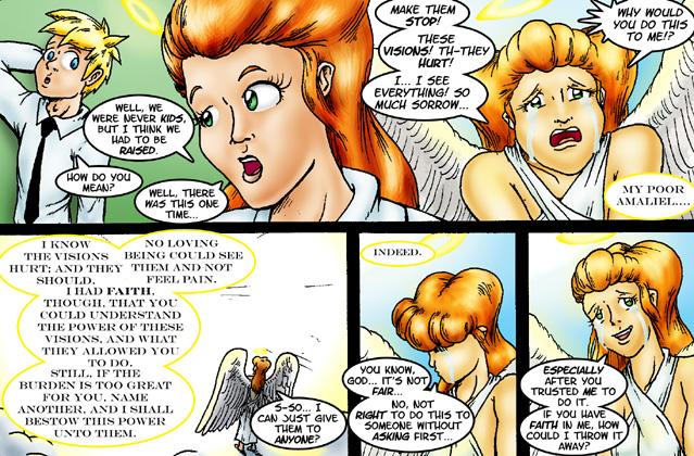
Not entirely happy with how the dialogue came out on this one, but I think it gets the idea across.


Comments
Please login to comment.
Login or Register${ comment.author }} at
${ comment.author }} at