Full Steam Ahead

Author notes
Page 02
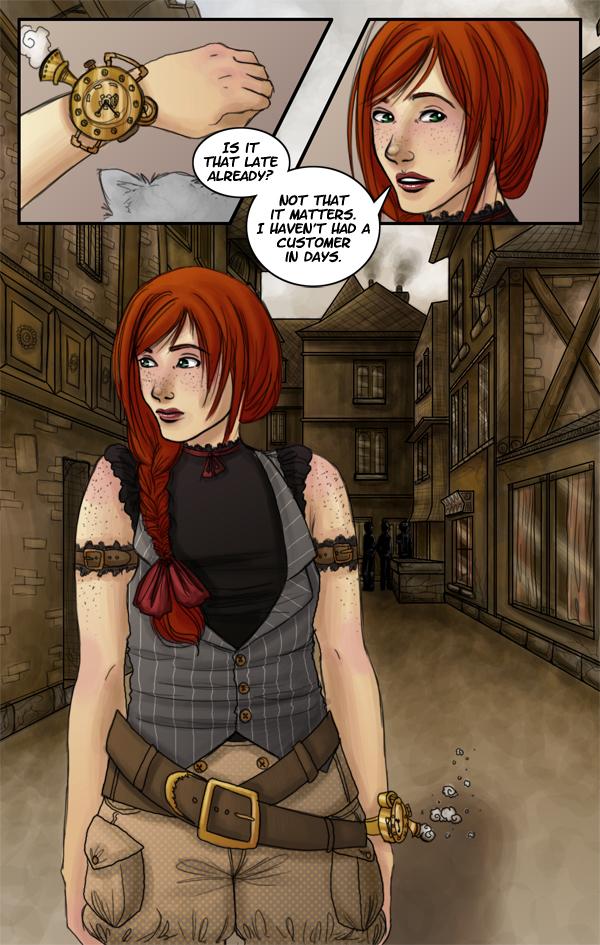
MMMelody onSo, I actually had this page done and colored a month ago, but when I went to look at it, I realized how lazy and crappy looking the background was. Here, see for yourself, haha…
http://img338.imageshack.us/img338/7651/fsa02linessmdh6.jpg
Needless to say, the new background took all day, but it was sooo worth it. I like the painting style I used, it's gritty. So I think I'm going to go back and add for detail to Page 01 and paint it in a similar manner.
I notice that a lot of western comics generally put a lot more panels on a page than I feel comfortable with. Thus, my story seems to be developing much slower than it probably should. Do my pages seem too sparse to you guys? Any advice?


Comments
Please login to comment.
Login or Register${ comment.author }} at
${ comment.author }} at