Kragsyde

Author notes
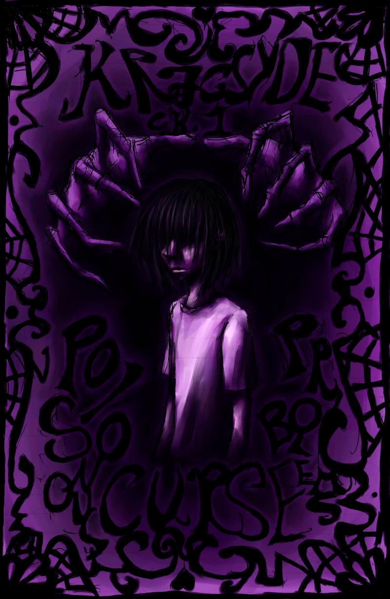
Ch.1 P.3 - Title Page (Ooh so spooky.)
Seira_chan onRek: Page for you.
Seir: Why thank you so much. *bows*
This page was drawn under the direct influence of the Bleach manga, which I love, and so therefore, every new chapter will have a nice illustration announcing its name, a couple pages in… Just like Bleach. XD
The idea behind this illustration was to have a sort of 60's psychadelic/Victorian filigree look with a heaping helping of spooky. After eating at a Mexican restaurant tonight, I see it looks a little Spanish/Mexican as well. Cool. This is a direct scan of the rough in my notebook, which was originally just going to be a plan…
Colored in Corel Painter with a wacom tablet, courtesy of my lovely assitant Rekul. I LOVE that program/peripheral. I think I'll marry it. Anyhoo… Thanks. ^_^ It was a lot of fun to make.
[drafted 11/06/07, colored 1/25 and 2/01/08]
UPDATE!
Have a new version of this page! [done.. a whole year later, 12/19/08. Lol. Lame.] I vowed not to re-edit my comic, but… I couldn't STAND how it looked… The hands were supposed to be coming out of darkness, but I screwed up in the original, because I didn't know a whole lot about digital coloring…. Now that I've gotten better at it, and have a tablet of my own to practice on, I'd been meaning to fix it, and I finally did.
Added more shadows, reduced some of Sean's odd face-pudge, and added light tones to his hair, and shaded it all over again- the hardest part. For reals.
AND IT LOOKS EVEN MORE PSYCHEDELIC NOW! AWESOME!


Comments
Please login to comment.
Login or Register${ comment.author }} at
${ comment.author }} at