Misfire Reactional

Author notes
02-07
aquapermanence onChapter 2, page 7.
Newton's Laws return!
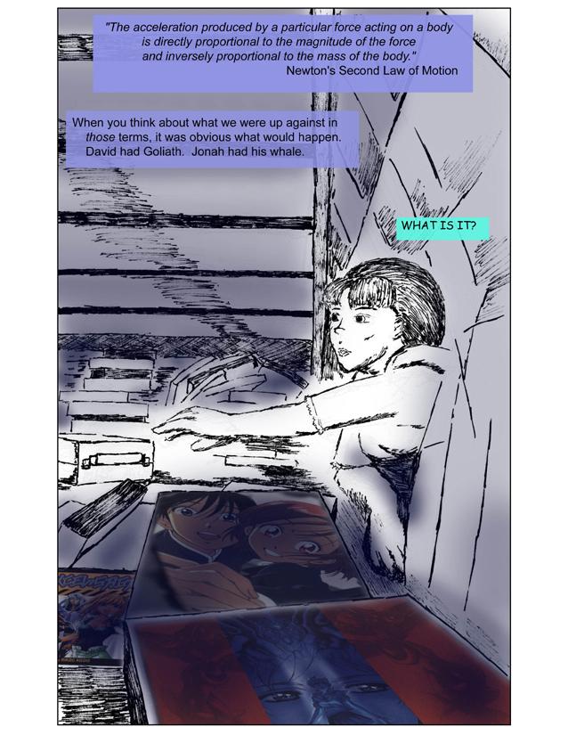
David & Goliath and Jonah & the Whale are both stories from the Bible about a chosen person who faces a seemingly insurmountable task. While these stories share the common theme of faith in God leading to rescue from peril, they are typically used to illustrate different things.
From left to right, the comic book covers in this image are as follows:
Excel Saga volume 1 by Rikdo Koshi. This is the English-language edition published by VIZ. The 1999-2000 Excel Saga anime earned a lot of notoriety for what it was and what it did. In a lot of ways it was making a point, and while I don't necessarily like what it says, I love how it went about it. It was very much a show geared toward anime fans, making frequent references to other shows and famous sci-fi movies, and poking fun at its own creative staff and anime production in general. For those familiar with the anime, the manga is more immersive and less frantic, and its humor more sly and less in-your-face. For those not familiar with the anime, go watch it now.
His and Her Circumstances, or Kareshi Kanojo no Jijyou (a.k.a. Kare Kano) by Masami Tsuda. Actually, this is the cover art for the US DVD volume 1 release by Right Stuf of the anime series. I chose this image both because I felt it was more immediately recognizable and evocative, and because I wanted to make a more direct reference to the anime version. The 1998-1999 KKnJ anime was made by GAINAX and directed by Hideaki Anno (and later his protege Kazuya Tsurumaki), and made numerous references to the phenomenally successful Neon Genesis Evangelion and an occasional nod to Nadia: The Secret of Blue Water (which was based loosely on Jules Verne's "Twenty Thousand Leagues Under the Sea" and its follow-up, "The Mysterious Island"). KKnJ was notable for its visual style, which included photographs and live-action sequences strongly reminiscent of Anno's 1998 live-action film, Love & Pop. I mention all this because I feel it's important to keep in mind the connectedness of works. All culture exists within a context. Allusion and stylization are just two elements in the language of popular culture, but they're two that tickle me when done right.
Escaflowne. This image is from the cover of the CD soundtrack that came with the deluxe edition of the Bandai Entertainment US release of the 2000 movie. I very much wanted to make a reference to the 1996 TV series, but this was the image I liked the most since it showcases Hitomi's eyes and the column of light. The show is unusual in that it was conceived as a TV series first, with two different manga adaptations targeting shonen and shoujo audiences. Since I haven't read either of them I can't give a recommendation, but the show is a standout piece in its genre. The movie, as many anime movie retellings do, took some of the elements and grand themes and made them big and pretty and largely missed out on what made the show click. Characterization through interaction with environment is a big plus for me.


Comments
Please login to comment.
Login or Register${ comment.author }} at
${ comment.author }} at