First
Prev
- Modest Medusa Fan Art
- DrLuck's "Drannik and Lizzep"...Inked
- DrLuck's "Drannik and Lizzep"
- First Royalty Check! wOOt!
- Genejoke's Drannik
- Mischa
- Ojmiz and Drannik
- It's Ojmiz
- Lizzep for Prez
Negligence: The First Fifty-Three
- Lizzep story Cover Page
- Lizzep story Page 14
- Lizzep story Page 13
- Lizzep story Page 12
- Lizzep story Page 11
- Lizzep story Page 10
- Lizzep story Page 9
- Lizzep story Page 8
- Lizzep story Page 7
- Lizzep story Page 6
- Lizzep story Page 5
- Lizzep story Page 4
- Lizzep story Page 3
- Lizzep story Page 2
Lizzep story Page 1
- Chapter 7 Preface
- Chapter 6 Preface
- Chapter 5 Preface
- Chapter 4 Preface
- Chapter 3 Preface
- Chapter 2 Preface
- Chapter 1 Preface
- Negligence Origins Cover
- Who Started The Fire?
PIT_FACE's Jameel
- Nitpick #11
- Nitpick #10
- Nitpick #9
- Nitpick #8
- Nitpick #7
Nitpick #6
- Nitpick #5
- Nitpick #4
- Nitpick #3
- Nitpick #2
Nitpick #1
Negligence Christmas Vacation
- Remake Comparison #5
- Remake Comparison #4
- Remake Comparison #3
- Remake Comparison #2
Remake Comparison #1
- Fan Art Entry #2
Fan Art Entry #1
- A preview of the new format
- Drannik, you'll never escape
- Sexy Drannik
The second T-shirt Ad
- Bones meets Lizzep
- Drannik and me
- Drannik goes digital
Lizzep says "Splendid!"
- Self-portrait with Negligence
- Save the Dillotanks
- Ranger Read Promotion featuring Negligence
T-shirt Advertisement
- Mike's Lizzep #2
- Mike's Lizzep #1
- Mike's Drannik #2
Mike's Drannik #1
- Negligence Animated Ad
- Chaos Rules! design
- Color panel of the "Bitch Seat" punchline
First Negligence T-shirt
- Original Negligent Guardian model
- Original McKinley model
- Original Lizzep model
Original Drannik model
- The very first ever drawings of Drannik and Lizzep
Negligence Pin-up by Roy Duncan
Next
Last
Author notes
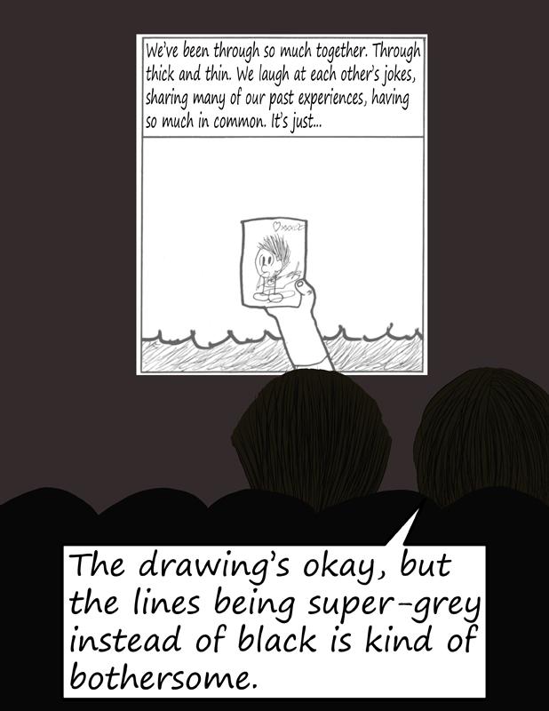
During this story arc, any comic that had grey in some way, shape, or form (even if it was just a little tear) came out looking like this. Like Lizzep says, the art itself is okay by my standards, but the black lines looking grey looks jarring especially compared to the strips with just black and white. It's stuff like this that made me eventually switch to digital (but that isn't until much later).


Comments
Please login to comment.
Login or Register${ comment.author }} at
${ comment.author }} at