Point Me At The Sky

Author notes
Beautiful: page 11
Blitzkrieg1701 on…oh. Well okay then.
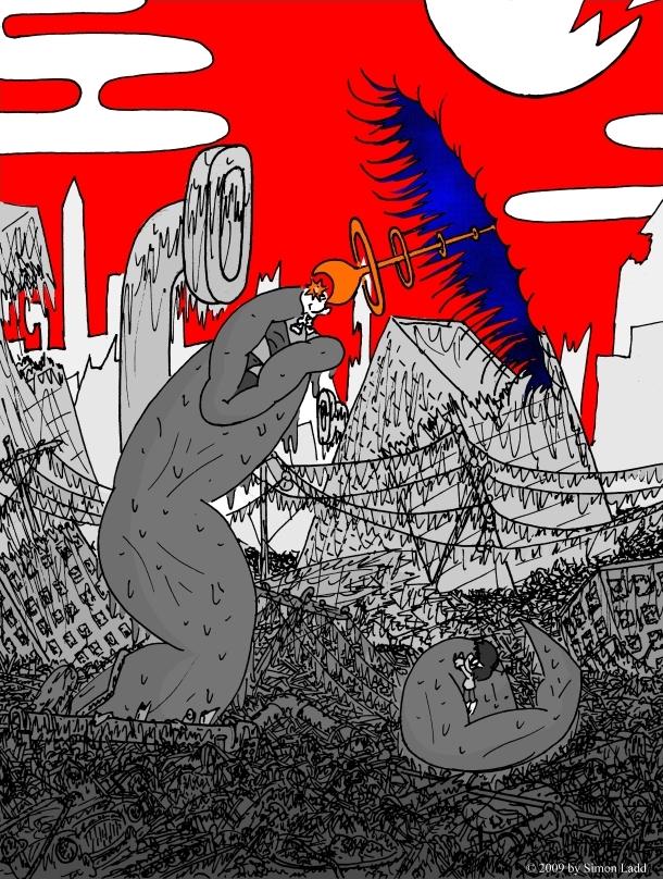
I'm not sure how I feel about this page. On the one hand, I really didn't draw the big hole in space thing the way it looked in my head. It was supposed to be an M. C. Escher style optical illusion, but that didn't really work out. The perspective here should have been lower, then those buildings in the back would have been more obscured and the impossibility of the "hole's" angle versus the rest of the image would have been clearer. Plus, all the shading on this page to WAY too long for WAY too little results. I really wanted a major illusion of depth that just isn't coming through here (again, a different perspective would have helped).
On the other hand, the blue on red contrast here works REALLY well, much better than I'd anticipated. Also, that sky pattern than I slapped over the blue as an afterthought really does more to create an illusion of depth than all that shading ever could have. So, I guess this page breaks even


Comments
Please login to comment.
Login or Register${ comment.author }} at
${ comment.author }} at