Pokemon Glory
Author notes
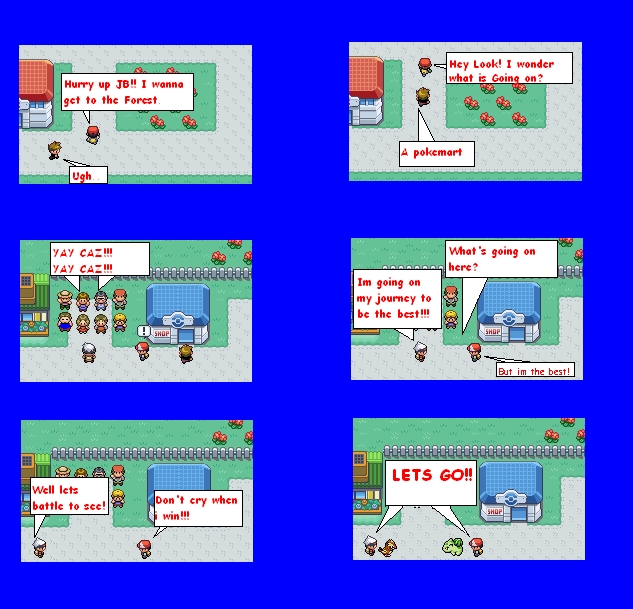
02: Going Away
JC3 onI like this page alot better than the last one!!
Caz is the more of the proud and bold type.

02: Going Away
JC3 onI like this page alot better than the last one!!
Caz is the more of the proud and bold type.
Advertise with us

DDComics is community owned.
The following patrons help keep the lights on. You can support DDComics on Patreon.
Comments
Please login to comment.
Login or Register${ comment.author }} at
${ comment.author }} at