First
Prev
- Ch5: Pg15: The End
- Ch 5: Pg 14: Incognito Mode
- Ch 5: Pg 13: Friend of the Family
- Ch 5: Ph 12:The Blade of Thorn and Stone
- Ch 5: Pg 11: Healing Wounds
- Ch 5: Pg 10: Scar Story
- Ch 5: Pg 9: Time Bubble
- Ch 5: Pg 8: Transfusion
- Ch 5: Pg 7: Lauren's Assistant
- Ch 5: Pg 6: Onlookers
- Ch 5: Pg 05: A Girl Worth Fighting For
- Ch 5: Pg 4: Autra's Plan
- Ch 5: Pg 03: Waiting for Ga-Stone
- Ch 5: Pg 2: Prometheus
- Ch 5: Pg 1: Emaciated
Chapter Five: Stone the Professor
- Ch 4: Pg 54: The Next 15 Years (or so)
- Ch 4: Pg 53: Questions Answered
- Ch 4: Pg 52: Reassuring Alice
- Ch 4: Pg 51: Twin Track
- Ch 4: Pg 50: Escape Plan
- Ch 4: Pg 49: Two Girls, One Elf
- Ch 4: Pg 48: Grubered
- Ch 4: Pg 47: Crumble
- Ch4: Pg46: Sunken
- Ch 4: Pg 45: More Fighting With Magic
- Ch 4: Pg 44:Broken Mask
- Ch 4: Pg 43: Autra vs Felicity
- Ch 4: Pg 42: The Plans of Elves and Men
- Ch 4: Page 41: Distraction
- Ch 4: Pg 40: Ultimate Weapon
- Ch 4: Pg 39: Tower Control
- Ch 4: Pg 38: Going Up
- Ch4: Pg37: Open Sesame
- Ch 4: Pg 36: To the Tower
- Ch 4: Pg 35: Call For Help
- Ch 4: Pg 34: Power of Suggestion
- Ch 4: Page 33: Latent Abilities
- Ch 4: Page 32: After High School
- Ch 4: Page 31: C-
- Ch 4: Pg 30: By Proxy
- Ch 4: Page 29: Backstory
- Ch 4: Pg 28: Information on Autra
- Ch 4: Pg 27: Back to the Guild
- Ch 4: Page 26: Merchant of [Apples]
- Ch 4: Page 25: Return to the Elf City
- Ch 4: Page 24: Lost Books
- Ch 5: Pg 23: Consolation and Coffee
- Ch 4: Page 22: Flashbacks
- Ch 4: Page 21: First Assignment
- Ch 4: Page 20: Meet Your Master
- Ch 4: Pg 19: Twin Swap
- Ch 4: Pg 18: Change Back?
- Ch 4: Pg 17: CHANGE PLACES!
- Ch 4: Page 16: Wonder Twins
- Ch 4: Pg 15: Pteropodidae
- Ch 5: Pg 14: First Day
- Ch4: Pg13: Felicity's Nightmare
- Ch4: Pg12: Ian the Librarian
- Ch 4: Page 11: Finding a Master
- Ch 4: Page 10: Those Who Can't Teach...?
- Ch 4: Page 9: Language of Magic
- Ch 4: Page 8: Wand Safety
- Ch 4: Page 7: Momma Bear
- Ch 4: Page 6: Price Check
- Ch 4: Page 5: Felicity's Choice
- Ch 4: Page 4: Right Hand of Restoration
- Ch 4: Page 3: Second Opinion
- Ch 4: Page 2: Spot Remover
- Ch 4: Page 1: Magical Friends
Chapter 4: Stone the Chosen
- Intermission 3: Page 11: Several Months Later
- Intermission 3: Page 10: Family Matters
- Intermission 3: Page 9: The Last Hurdles
- Intermission 3: Page 8: Pillow Talk
- Intermission 3: Page 7: Family Dinner
- Intermission 3: Page 6: Medium Rare
- Intermission 3: Page 5: Gone Home
- Intermission 3: Page 4: Absolution
- Intermission 3: Page 3: Closure
- Intermission 3: Page 2: Maximum Security
- Intermission 3: Page 1: Alexis's Compromise
Intermission 3: The Prisoner of The Guild
- Ch 3: Page 70: Disabilities
- Ch 3: Page 69: Magic Test
- Ch 3: Page 68: Aftermath
- Ch 3: Pg 67: Monster Allies and Parasites
- Ch 3: Pg 66: Oggy Goes Down
- Ch3: Pg 65: Elf in Distress
- Ch 3: Page 64: A Comic of Ice and Magic
- Ch 3: Page 63: Wizard Fight
- Ch 3: Page 62: Magic Battle
- Chapter 3: Page 61: Landing Zone
- Ch 3: Page 60: Cloudy with a Chance of Dragon
- Ch 3: Page 59: Rise of the Orange Wyvern
- Chapter 3: Page 58: The Blue Dragon Rises
- Ch 3: Page 57: Pass the Dragon
- Ch 3: Page 56: Ultimatum
- Ch 3: Page 55: The Shape of Mana
- Ch 3: Page 54: Confessions of an Elf
- Ch 3: Page 53: Final Form
- Ch3: Page 52: Elf World
- Ch 3: Page 51: Control Spell
- Ch 3: Page 50: Confronting the Dragon
- Ch 3: Page 49: Magic Jam
- Ch 3: Page 48: Sacrificial Book
- Ch 3: Page 47: Confessions of a Teenage Wizard
- Ch 3: Page 46: Laundry Dragon
- Ch 3: Pg 45: Setting the Table
- Ch 3: Page 44: Defensive Spell
- Ch 3: Page 43: Third Form
- Ch 3: Page 42: Outside Help
- Ch 3: Page 41: Proxy Portal
- Ch 3: Page 40: She Can Talk!
- Ch 3: Page 39: Charm Transfer
- Ch 3: Page 38: Parasite
- Ch 3: Page 37: The Chosen Three
- Ch 3: Pg 36: Into the Unknown
- Ch 3: Page 35: Return of the Elf
- Ch 3: Pg 34: Robbie vs The Librarian
- Ch 3: Page 33: Safe Place
- Ch 3: Page 32: Cheap Shot
- Ch 3: Page 31: A Case of the Mondays
- Ch3: Page 30: Weekend at Oggy's
- Ch 3: Page 29: Milk and Cereal
- Ch 3: Page 28: Interloper
- Ch 3: Page 27: As You Wish
- Ch 3: Page 26: Stone the Summoner
- Ch 3: Page 25: Opening the Tome
- Ch 3: Page 24: Proxy
- Ch 3: Page 23: Bag of Tricks
- Ch 3: Page 22: Escape Plan
- Ch 3: Page 21: Ctrl + Z
- Ch 3: Page 20: Swish
- Ch 3: Page 19: Fighting Mana a Mana
- Ch 3: Page 18: Retaliation
- Ch 3: Page 17: Tome Retrieval
- Ch 3: Page 16: Stone the Thief
- Ch 3: Page 15: Pre-Show Jitters
- Ch 3: Page 14: Catch a Ride!
- Ch 3: Page 13: Sunday Dress
- Ch 3: Page 12: The Truth Comes Out
- Ch 3: Page 11: Twinsplaining
- Ch 3: Page 10: Bonding Over Breakfast
- Ch 3: Page 9: Saturday Morning Breakfast
- Ch 3: Page 8: The Mediator
- Ch 3: Page 7: Alice's Lament
- Ch 3: Page 6: Into the Box
- Ch 3: Page 5: The Great Robino
- Ch 3: Page 4: I Dream of Better Routines
- Ch 3: Page 3: Dress Rehersal
- Ch 3: Page 2: Robbie's Plan
- Ch 3: Page 1: Robbie's Dilemma
Chapter Three Cover
- Intermission 2: Page 11: Tanisha and Richard
- Intermission 2: Page 10: Bruce
- Intermission 2: Page 9: Alex
- Intermission 2: Page 8: Class Start
- Intermission 2: Page 7: Expansion
- Intermission 2: Page 6: Mental Defenses
- Intermission 2: Page 5: Not-so-Guilty Conscience
- Intermission 2: Page 4: Worksheets
- Intermission 2: Page 3: End of Class
- Intermission 2: Page 2: Return of the Phantom
- Intermission 2: Page 1: Q&A
Intermission 2: The Four Problem Students
- Ch 2: Page 38: Memories of a Wizard
- Ch 2: Page 37: The Calvary Arrives
- Ch 2: Page 36: Exit Elf
- Ch 2: Page 35: Nix Down
- Ch 2: Page 34: Phantom Remover
- Ch 2: Page 33: The Great Escape
- Ch 2: Page 32: It's a Trap!
- Ch 2: Page 31: Gorgon in the Hall
- Ch 2: Pg 30: Chimera
- Ch 2: Page 29: Friendship Rift
- Ch 2: Page 28: End of the Date
- Ch 2: Page 27: Museum of Mom
- Ch 2: Page 26: Book Wyrm
- Ch 2: Page 25: Curse Detection
- Ch 2: Page 24: Mimicry
- Ch 2: Page 23: Wait Staff
- Ch 2: Page 22: Main Attraction
- Ch 2: Page 21: First Date
- Ch 2: Page 20: Date Ready
- Ch 2: Page 19: Magic Interrupted
- Ch 2: Page 18: Wax On
- Ch 2: Page 17: Try, Try Again
- Ch 2: Page 16: Potion Making 101
- Ch 2: Page 15: What about Rob?
- Ch 2: Page 14: Lunchtime Lies
- Ch 2: Pg 13: On the Other Hand...
- Ch 2: Page 12: Robbie's Diagnosis
- Ch: 2: Page 11:Curse Talk
- Ch 2: Pg 10: Cursed!
- Ch 2: Pg 9 Felicity's Statement
- Ch 2: Pg 8: Not Your Fault
- Ch 2: Pg 7: Recovery
- Ch 2: Pg 6: My Hero
- Ch 2: Pg 5: Total Destruction
- Ch 2: Pg 4: Red Mana Mambo
- Ch 2: Pg 3: Soul Transfer
- Ch 2: Pg 2: Monologue
- Ch 2: Pg 1: Back to the Story
Chapter Two Cover
- Intermission 1: Page 4: The Darker Side
- Intermission 1: Page 3: That Woman Needs Therapy.
- Intermission 1: Page 2: An Angel On Your Shoulder
- Intermission 1: Page 1: A Pause in the Story
Intermission 1: Lunchtime
- Ch 1: Page 36: Walter Nix
- Ch 1: Page 35: Magic Detection
- Ch 1: Page 34: The Receptionist
- Ch 1: Page 33: Scry Me a River
- Ch 1: Page 32: Felicity vs. Brick
- Ch 1: Page 31: Basic Spells for Basic Witches
- Ch 1: Page 30: Back to Lessons
- Ch 1: Page 29: Alice's Assets
- Ch 1: Page 28: Control Your Mana
- Ch 1: Page 27: Bully for You
- Ch 1: Page 26: It's Not a Trick, It's an ILLUSION!
- Ch 1: Page 25: Breakfast and a Braid
- Ch 1: Page 24: Take Time with a Wounded Hand
- Ch 1: Page 23: Overload
- Ch 1: Page 22: Push
- Ch 1: Pg 21: The Color of Mana
- Ch 1: Pg 20: Workout Clothes
- Ch 1: Page 19: Italian Dinner
- Ch 1: Pg 18: Celebration Time!
- Ch 1: Pg 17: Reunion
- Ch 1: Pg 16: Unmasked
- Ch 1: Pg 15: Eddie's Test
- Ch 1: Pg 14: Masked Woman
- Ch 1: Pg 13: Portal Sphere
- Ch 1: Pg 12: Family Dinner
- Ch 1: Pg 11: The Kids Are Home
- Ch 1: Pg 10: Mana Tapping
- Ch 1: Pg 9: Up and At 'Em
- Ch 1: Pg 8: Waking Up Again
- Ch 1: Pg 7: You Wouldn't Like me When I'm Angry
- Ch1: Pg6: Friend and Enemy
- Ch1: Pg5: Meeting the Girlfriend
- Ch 1: Pg4: First Day
- Ch 1: Pg3: Get Ready!
- Ch 1: Pg2: Magic Block
- Ch1: Pg1: Some Background
Chapter One Cover
- Prologue #05: Story Time!
- Prologue #04: Scar
- Prologue #03: Remedial Class
- Prologue #02: Assembly
- Prologue #01: It's a Sign
Prologue Cover
Next
Last
Author notes
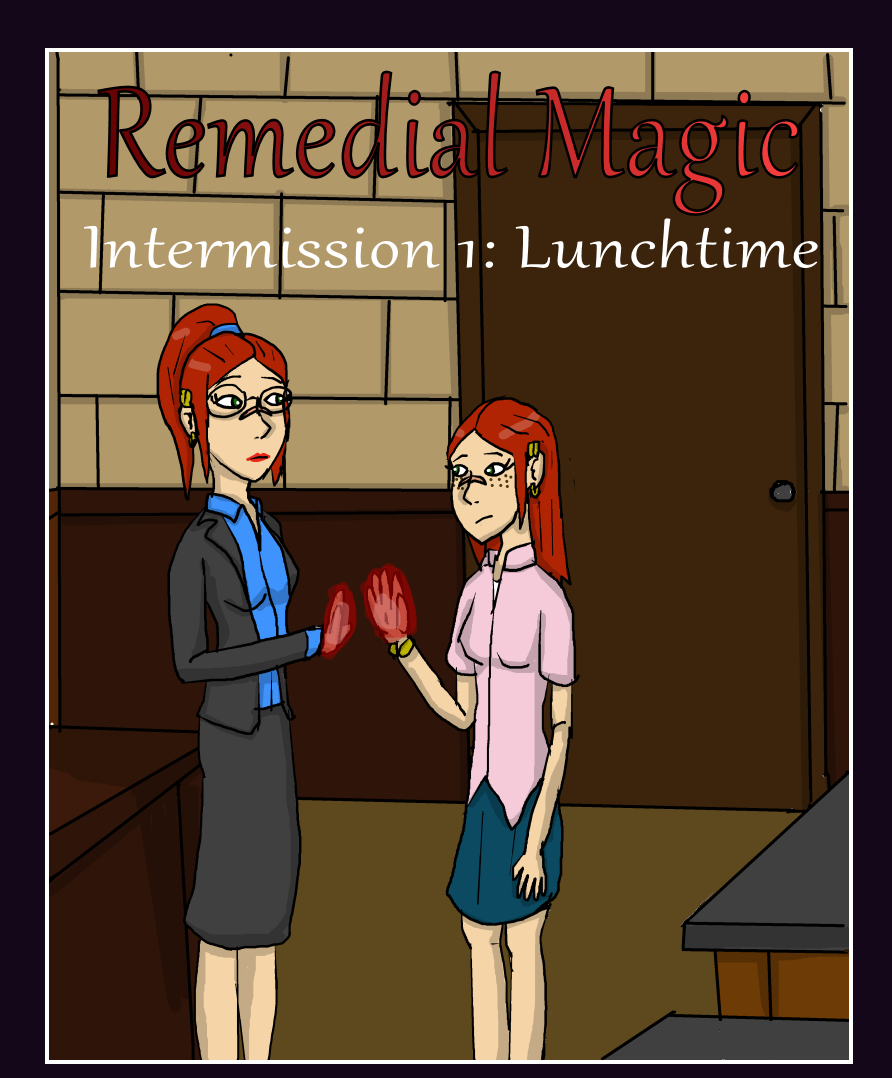
Still trying to get a feel for how I want to do cover art. I'm not the best designer. I always try to go for an image that fits the chapter, prologue, or intermission, though. There is a reason why Felicity is seeing her teenage self. This isn't just one of those covers that comic books do where the story has nothing to do with the cover and the cover is basically a precursor to click baiting like "You won't believe why Superman is denying Lois air!" followed with Superman saying, "You can't breathe now, Lois! You must be taught a lesson," and Lois screaming, "I–need–air, Superman!" and then the comic has absolutely nothing to do with that or it does, but never fully explains the context of the cover art.


Comments
Please login to comment.
Login or Register${ comment.author }} at
${ comment.author }} at