This will be the last page for a while. If I get time and inspiration to draw the next page before March I'll be lucky.
You see, I'm moving out from home, I'm graduating on Friday and a lot of stuff must be taken care of in my life. So please bear with me.
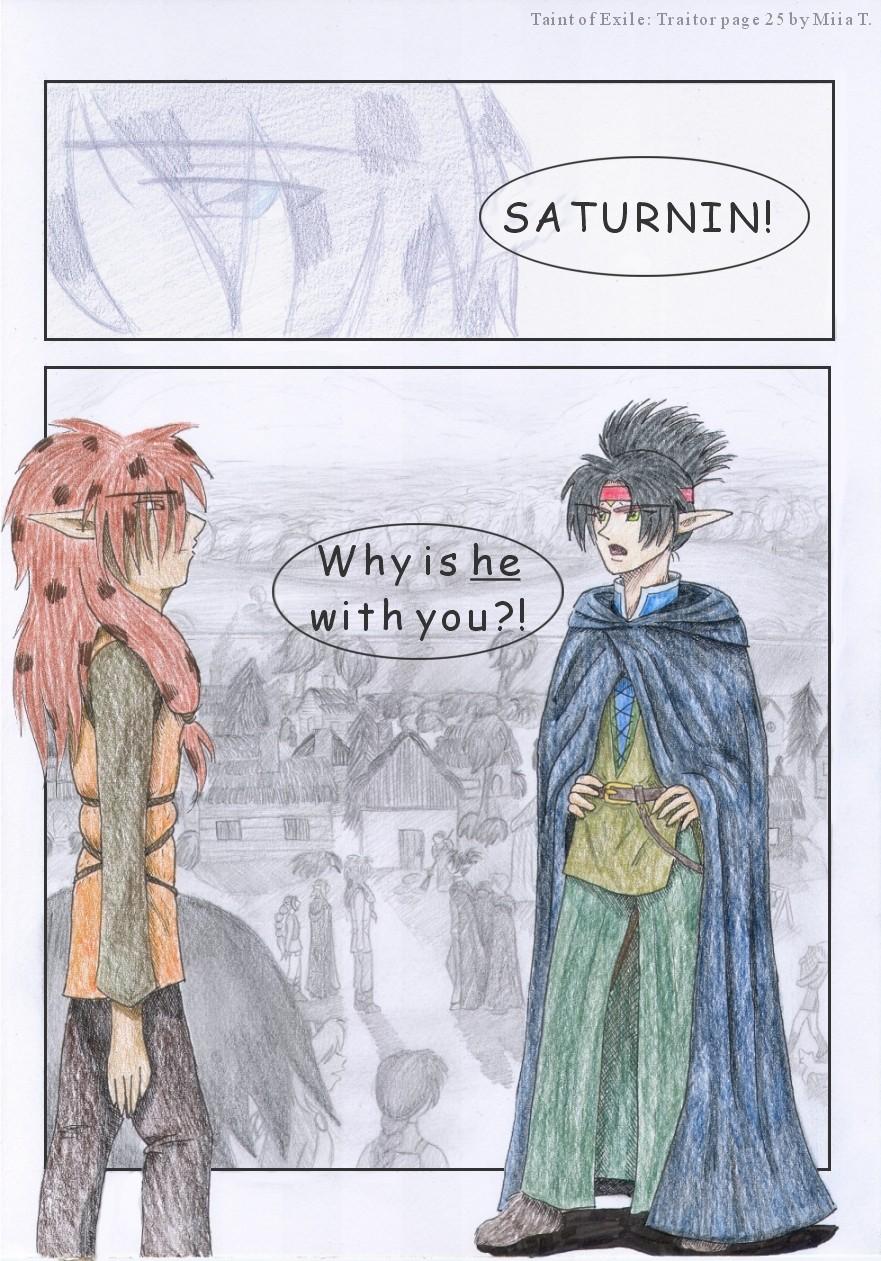
But enjoy this experimental page. I really could spend more time with the background than before. There could be more people there, thought, but… I'm still happy with the outcome.
The first panel should be darker, but that's my bad. My scanner does not function so I should call to the maintanance, but I'm lazy. The colors of the two characters are pretty close to the ones I wanted. But I really need to practise on coloring with coloring pencils.
Anyway… Enjoy the page and I'll come back with a new page asap!
EDIT: Now the page is charper and better than before. Also I did a slight darkening to the first panel. I usually don't want to but I felt like trying out.
Have I mentioned how I want that hair? I mean… how could to have spots in your hair, yo? As for colored pencil- I suggest Prismacolor and pressing freakin' hard. And once you get it on the computer you acn always blendy-smoosh things to fill in those pesky white dots that always appear from NOWHERE! Believe me… I know the pain of the white dots. Overall, Markers and paints will always win in the smoothness/professional category.
It was my bad that bear and bare thing. I was not sure which one was the right spelling, but bare came first ^^'
Saturnin is very stiff. He could still show his elbows, but he usually stands very straight. I intentionally made her look like that. The other colored-guy is more laidback in his movements.
The huge background had many mistakes in it. And Saturning does look bigger than the other and the main reason for that is his hair. But both of the colored ones are taller than most of the other characters so that also makes Saturning look bigger. The other one just looks too thin in the background. Saturnin should be the one who's thin ^^' The height differences in the background for the six characters are pretty much the right ones thought.
To "bear" with you is quite a bit different from to "bare" with you. One involves nudity.
Colored pencils are HARD to scan, so good luck ever getting them to look quite as you intended!
Hmmm, Saturnin looks very stiff, especially as opposed to the new boy. Standing on rank, or just missing his elbows? The effect of having one large panel, and then magnifying just those two characters, is one I think looks cool. But in the large panel the heights/sizes look a bit off - Saturnin is just so much larger than everyone else.
Advertise with us
DDComics is community owned.
The following patrons help keep the lights on. You can support DDComics on Patreon.
Comments
Please login to comment.
Login or Registeriagojester at
der… "how cool to…" how could? I guess I coudl ask that too, but it wasn't the charm I was goin' for.
iagojester at
Have I mentioned how I want that hair? I mean… how could to have spots in your hair, yo?
As for colored pencil- I suggest Prismacolor and pressing freakin' hard. And once you get it on the computer you acn always blendy-smoosh things to fill in those pesky white dots that always appear from NOWHERE! Believe me… I know the pain of the white dots. Overall, Markers and paints will always win in the smoothness/professional category.
winzrella at
It was my bad that bear and bare thing. I was not sure which one was the right spelling, but bare came first ^^'
Saturnin is very stiff. He could still show his elbows, but he usually stands very straight. I intentionally made her look like that. The other colored-guy is more laidback in his movements.
The huge background had many mistakes in it. And Saturning does look bigger than the other and the main reason for that is his hair. But both of the colored ones are taller than most of the other characters so that also makes Saturning look bigger. The other one just looks too thin in the background. Saturnin should be the one who's thin ^^' The height differences in the background for the six characters are pretty much the right ones thought.
Mina_Lunga at
To "bear" with you is quite a bit different from to "bare" with you. One involves nudity.
Colored pencils are HARD to scan, so good luck ever getting them to look quite as you intended!
Hmmm, Saturnin looks very stiff, especially as opposed to the new boy. Standing on rank, or just missing his elbows? The effect of having one large panel, and then magnifying just those two characters, is one I think looks cool. But in the large panel the heights/sizes look a bit off - Saturnin is just so much larger than everyone else.