First
Prev
- Latest Work in Progress
- The Second Era - Page 12
- The Second Era - Page 11
- The Second Era - Page 10
- The Second Era - Page 9
- The Second Era - Page 8
- The Second Era - Page 7
- The Second Era - Page 6
- The Second Era - Page 5
- The Second Era - Page 4
- The Second Era - Page 3
- The Second Era - Page 2
- The Second Era - Page 1
- A New Chapter - Page 5
- A New Chapter - Page 4
- A New Chapter - Page 3
- A New Chapter - Page 2
- A New Chapter - Page 1
- The End
- Volume 2 Finale - Page 24
- Volume 2 Finale - Page 23
- Volume 2 Finale - Page 22
- Volume 2 Finale - Page 21
- Volume 2 Finale - Page 20
- Volume 2 FInale - Page 19
- Volume 2 Finale - Page 18
- Volume 2 Finale - Page 17
- Volume 2 Finale - Page 16
- Volume 2 Finale - Page 15
- Volume 2 Finale - Page 14
- Volume 2 Finale - Page 13
- Volume 2 Finale - Page 12
- Volume 2 Finale - Page 11
- Volume 2 Finale - Page 10
- Volume 2 Finale - Page 9
- Volume 2 Finale - Page 8
- Volume 2 Finale - Page 7
- Volume 2 Finale - Page 6
- Volume 2 FInale - Page 5
- Finale - Work in Progress part 4
- Finale - Work In Progress part 3
- Volume 2 Finale - Page 4
- Volume 2 Finale - Page 3
- Volume 2 Finale - Page 2
- Volume 2 Finale - Page 1
- Hiatus ending
- Behind the Scenes Part... I don't know
- Even More Filler
- More filler
- Finale - Work In Progress part 2
- Finale - Work In Progress part 1
- Volume 2 - Part 7 - Page 8
- Volume 2 - Part 7 - Page 7
- Volume 2 - Part 7 - Page 6
- Volume 2 - Part 7 - Page 5
- Volume 2 - Part 7 - Page 4
- Volume 2 - Part 7 - Page 3
- Volume 2 - Part 7 - Page 2
- Volume 2 - Part 7 - Page 1
- Volume 2 - Part 6 - Page 4
- Volume 2 - Part 6 - Page 3
- Volume 2 Part 6 - Page 2
- Volume 2 - Part 6 - Page 1
- Volume 2 - Part 5 - Page 4
- Volume 2 - Part 5 - Page 3
- Volume 2 - Part 5 - Page 2
- More Sketches
- Happy Holidays 2013!
- Ottawa Pop Expo sketch
- Volume 2 - Part 5 - Page 1
- Volume 2 - Part 4 - Page 7
- Volume 2 - Part 4 - Page 6
- Volume 2 - Part 4 - Page 5
- 2013 Drunk Duck Awards
- Volume 2 - Part 4 - Page 4
- Volume 2 - Part 4 - Page 3
- Volume 2 - Part 4 - Page 2
- Volume 2 - Part 4 - Page 1
- Volume 2 - Part 4
- Happy Canada Day!
- A Little Teaser
- Bluenoser Cartoon 2
- Bluenoser Cartoon 1
- Cartoon Characters
- Volume 2 - Part 3 - Page 5
- Volume 2 - Part 3 - Page 4
- Volume 2 - Part 3 - Page 3
- Volume 2 - Part 3 - Page 2
- Volume 2 - Part 3 - Page 1
- Volume 2 - Part 3 - Cover
- Volume 2 - Part 2 - Page 6
- Volume 2 - Part 2 - Page 5
- Volume 2 - Part 2 - Page 4
- Volume 2 - Part 2 - Page 3
- Volume 2 - Part 2 - Page 2
- Volume 2 - Part 2 - Page 1
- Chapter 2 -- Part 2
- Chapter 2 -- Page 10
- Chapter 2 -- Page 9
- Chapter 2 -- Page 8
- Chapter 2 -- Page 7
- Chapter 2 -- Page 6
- Chapter 2 -- Page 5
- Chapter 2 -- Page 4
- Chapter 2 -- Page 3
- Chapter 2 -- Page 2
- Chapter 2 -- Page 1
- Chapter 2 -- Cover Page
- More sketching
- Headshots 1
- Happy Holidays 2012!
- Volume 1 Epilogue -- Page 2
- Volume 1 Epilogue -- Page 1
- Volume 1 Finale -- Page 13
- Volume 1 Finale -- Page 12
- Volume 1 Finale -- Page 11
- Volume 1 Finale -- Page 10
- Volume 1 Finale -- Page 9
- Volume 1 Finale -- Page 8
- Volume 1 Finale -- Page 7
- Volume 1 Finale -- Page 6
- Volume 1 Finale -- Page 5
- Volume 1 Finale -- Page 4
- Volume 1 Finale -- Page 3
- Volume 1 Finale -- Page 2
- Volume 1 Finale -- Page 1
- Another sketch
- Head shots
- Randomness -- Page 19
- Randomness -- Page 18
- Randomness -- Page 17
- Randomness -- Page 16
- Randomness -- Page 15
- Randomness -- Page 14
- Randomness -- Page 13
- Randomness -- Page 12
- Randomness -- Page 11
- Randomness -- Page 10
- Randomness -- Page 9
- Randomness -- Page 8
- Randomness -- Page 7
- Randomness -- Page 6
- Randomness -- Page 5
- Randomness -- Page 4
- Randomness -- Page 3
- Randomness -- Page 2
- Randomness -- Page 1
- Randomness -- Cover Page
- goblins! -- Page 5
- goblins! -- Page 4
- goblins! -- Page 3
- goblins! -- Page 2
- goblins! -- Page 1
- goblins! -- Cover
- Best Man -- Page 14
- Best Man -- Page 13
- Best Man -- Page 12
- Best Man -- Page 11
- Best Man -- Page 10
- Best Man -- Page 9
- Best Man -- Page 8
- Best Man -- Page 7
- Best Man -- Page 6
- Best Man -- Page 5
- Best Man -- Page 4
- Best Man -- Page 3
- Best Man -- Page 2
- Best Man -- Page 1
- Best Man -- Cover
- The Trolls of Orleans -- Page 5
- The Trolls of Orleans -- Page 4
- The Trolls of Orleans -- Page 3
- The Trolls of Orleans -- Page 2
- The Trolls of Orleans -- Page 1
- The Trolls of Orleans -- Cover
- MOVE BACK!
- Dan and Heather - Page 5
- Dan and Heather - Page 4
- Dan and Heather - Page 3
- Dan and Heather - Page 2
- Dan and Heather - Page 1
- Dan and Heather - Cover
- Marvelous Maestro - Page 9
- Marvelous Maestro - Page 8
- Marvelous Maestro - Page 7
- Marvelous Maestro - Page 6
- Marvelous Maestro - Page 5
- Marvelous Maestro - Page 4
- Marvelous Maestro - Page 3
- Marvelous Maestro - Page 2
- Marvelous Maestro - Page 1
- Marvelous Maestro - Cover
- Good ol' Chuck part 2
- Good ol' Chuck
- The Wait
- Master Mummy - Page 11
- Master Mummy - Page 10
- Master Mummy - Page 9
- Master Mummy - Page 8
- Master Mummy - Page 7
- Master Mummy - Page 6
- Master Mummy - Page 5
- Master Mummy - Page 4
- Master Mummy - Page 3
- Master Mummy - Page 2
- Master Mummy - Page 1
- Master Mummy - Cover
- Dialog Free Comic Day
- Story 1 - Page 6
- Story 1 - Page 5
- Story 1 - Page 4
- Story 1 - Page 3
- Story 1 - Page 2
- Story 1 - Page 1
- Story 1 - Cover
- Preview -- page 8
- Preview -- page 7
- Preview -- page 6
- Preview -- page 5
- Preview -- page 4
- Preview -- page 3
- Preview -- page 2
- Preview -- page 1
- A cover page
Next
Last
Author notes
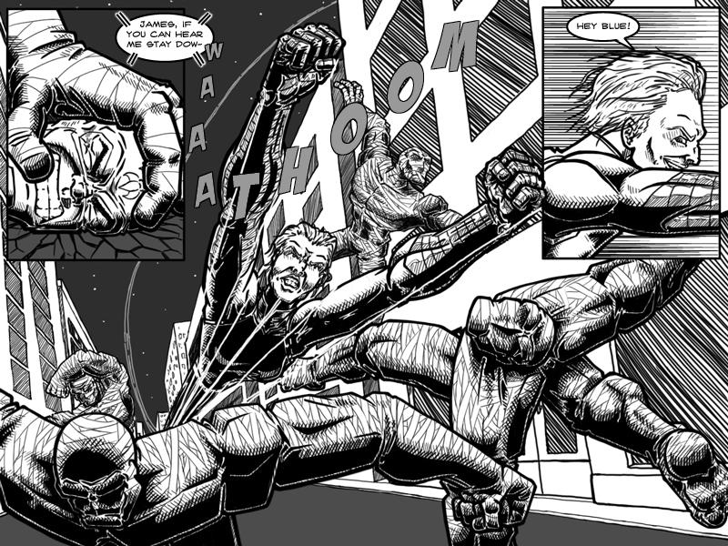
And we have the first appearance of Victoria. I normally don't like taking up a full page/update for one panel (or in this case, one dominant panel and two smaller ones) but I think they have their place if used infrequently. In this case I wanted Victoria's first appearance to stand out visually and give the reader the sense of a powerful character. And as for the drawing, I decided to go with stretching her body out to try to give the look of speed. It's not something I do often because I never really feel like I get it right (and I have some issues with this page of course). Perhaps I could have gone with some speedlines in there as well (or instead of stretching out her body) but in the end I do sort of like how it came out and it was definitely a learning experience of what worked and what doesn't (though the final lesson will be reading the responses to this page of course). When I was drawing it I sort of thought that mummy on the right reminded me of a typical Erik Larsen-esque pose.Locoma - Happy to hear the action/dialog works because there's definitely more to come.I am Candyman and shastab24 - I think I may have been overreacting to the lack of backgrounds there. I do think with the action going on backgrounds would make it too much and take away from the action (details and sound effects may get lost in the background and such).ghostrunner , jerrie - Thanks!


Comments
Please login to comment.
Login or Register${ comment.author }} at
${ comment.author }} at