The Optimist

Author notes
Page 3
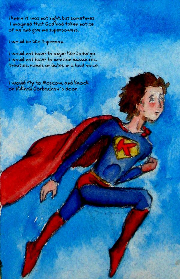
Kristen Gudsnuk onHi guys! Here's page 3, aka panel 3 from page 1. Making 3 "splash pages" (isn't that what you call a big one-framer?) was a good idea, I think– it spaces out the story, and now I've got 3 pages instead of 1!
Page 4 is almost done– I could scan it and letter it and post it tonight if I were in a rush. But I'm not, and so I think I'm gonna do some detail-work and make it as good as I can before posting it.
SO, how do you like my new font? : ) as you'll find out, our wonderful narrator is relatively young, so I chose a childish font. I'm happy with it. And I am incredibly happy with the font I found for the title on page 1– WOW! It's exactly what I want!! It looks exactly how I imagined it would when I was writing this! (You'll find out what The Optimist is… and then you can take a gander at who the optimist is, too!)
Well thanks for commenting, and expect the next page sometime tomorrow!


Comments
Please login to comment.
Login or Register${ comment.author }} at
${ comment.author }} at