Hi guys, i'm here to show you how I go about creating the artwork for my webcomic Hocusha.
I'm gonna use the cover for Chapter 8 as an example.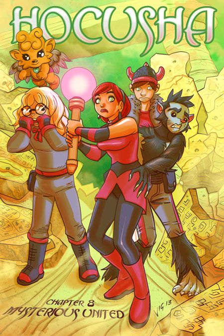

Start publishing on
DD Comics!
Advertise with us

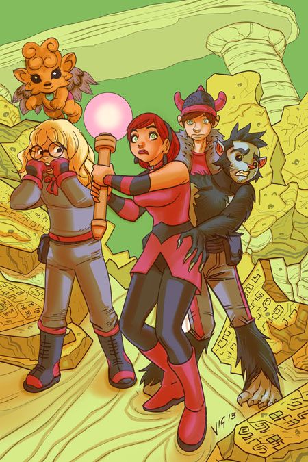
Step-by-Step: Hocusha Chapter 8 cover process
Step-by-Step: Hocusha Chapter 8 cover process
Step 1: Workspace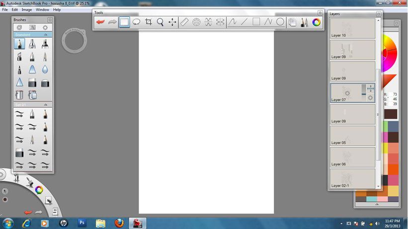
Hocusha is drawn digitally with Autodesk Sketchbook Pro. I switched to digital artwork back in 2008 due to work related issues. I had a trial version of Sketchbook back then, usually used to create concept sketches. It was a very tablet friendly program, simple and feels like you are drawing on paper.
I was a heavy user of Manga Studio EX back then. The first 4 chapters of Hocusha were made with MS. The thing with MS is, it can feel like you are Auto Tuning your work. It corrects your lineart and you can waste precious time just to get that perfect line. Once I started using Sketchbook Pro, I threw MS out. No more MS.
Sketchbook Pro is a very simple & straight forward program. Your artwork feels more natural and you are not tempted to use various effects and whiz bangery. I do all my digital drawing with Sketchbook Pro now.
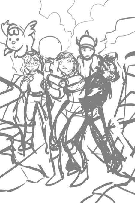
Step 2: Rough sketch
Did I say i draw Hocusha digitally? Well, just about 90% of it is done digitally. The other 10%? Good old freehand drawing.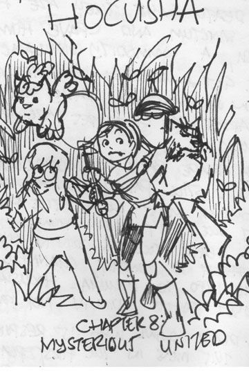
As I was writing down the script for Chapter 8 in my notebook (I write on paper first before typing the script but most of the time, I don't even do that), I had an idea for the cover and quickly sketched it out. Then I scanned it & opened it in Sketchbook Pro. The thing with doing sketches or thumbnails in freehand is that it captures your initial idea way better than any software could. It's kinda like alchemy or sorcery, pure magic.
I tend to flip flop between freehand and digital while drawing. When I have issues with a drawing or a page, i will print it out, figure it out in freehand and scan it back in.
Step 5: Working with layers
The thing with drawing digitally, you can build your artwork, layer by layer. Kinda like drawing over tracing paper. You just change the opacity of the bottom layer (or layers) and just draw on a new layer. In this stage, i'm doing what I would call, my penciling stage.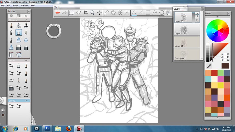
Step 7: SketchUp elements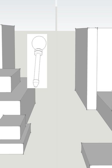
I love working with Google SketchUp. It saved me countless hours back in the day, when I was stuck drawing cars or buildings. Then I became infatuated by it. I would build or download models and use it for even the simplest of things. I would even spend hours or days creating something that might turn out to be insignificant or for a throw away shot. I remember getting frustrated because my PC could not process an elaborate cityscape that took me days to build which I ended up using only once and it was rejected anyway. Or that time (I think it was the shower scene from Hocusha Chapter 3), where I became frustrated in finding the right model for a syampoo bottle and realising later that I could have just drawn the damn thing. After that, I only use SketchUp when I really need it, like for stories that require various shots of the same set.
For the cover, I used simple blocks as the background element guides. The model of Hocusha's staff was made years ago because I know I will use it often and I positioned it the way i wanted it and placed it above the background element in Sketchbook Pro. Stupid old me would have spent hours creating the background element and spent another hour to positon Hocusha's staff into the same scene.
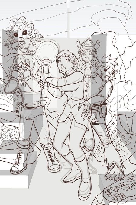
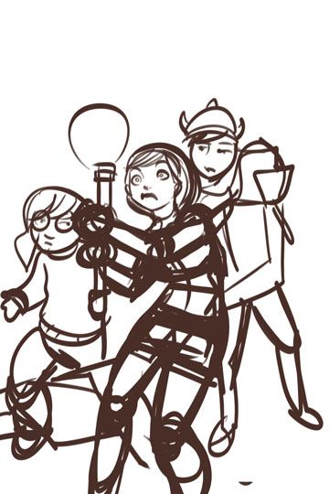
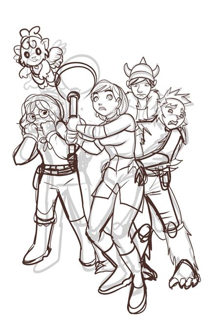
Step 9: Final lineart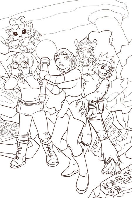
Here's the final lineart. But in my opinion, not finished art.
For Hocusha, i do not fill any solid blacks or spot blacks or even do crosshatching to create weight or shadows. It's one of my unwritten rules when drawing Hocusha. Another rule, no solid black lines (the current line is actually dark maroon) and when inking, all open ended lines must be joined. It saves time when you fill in the colours. It's all part of my esthetic for a Hocusha webcomic.
Step 10: Flat Colours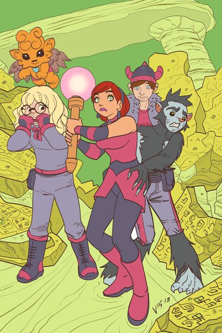
When I'm inking Hocusha, I make sure all open ended lines are joined. So when I use the Paint Bucket to fill in colours, it's done quickly. If & when there are open ended lines or hard to fill spaces, I colour it in with the Marker tool or Brush tool.
I had a friend who once saw my flat coloured art and said I should just publish it as finished art. In my eyes, the flat colours, expecially in Hocusha, make the art appear naked. But I would love to just publish just flat colours, maybe use it for another project.
Step 11: Adding Shadows 1
Once the flat coloures are done, I create another layer, set it to multiply and play with adding shadows. In the world of Hocusha, everything has a violet/purple/pink hue to it. IMHO, it gives the comic a touch of magic & wimsy. Additionally, there are no solid blacks or white. I use maroon, navy blue or green as a substitute for black. White is mainly off-white except for high lights. I am inspired by the techniques used in japanese anime because they usually (i don't know the proper term for it) 'play with light'. And I like how they add atmosphere, ambience and mood to a scene. They don't over render it or make everything look plastic. When colouring, I try to make the art look a smidge painterly or pastel-ish.
Step 13: High Lights
Once shadows are done, I create another layer, set it to Add and um… add high lights.
I use it generally for the eyes, stuffs that are supposed to be shiny, hair and as gradient to separate the foreground & background elements. It gives the artwork some contrast & pop.
Once this is done, I save the file as a Photoshop format (PSD) file and load it up on Photoshop.
Sketchbook Pro's native format is TIFF which enables using layers but when you open it in Photoshop, for some reason, it appears as a flat file. Worse, if you accidentally saved this file in Photoshop, opened it again in Sketchbook Pro for editing, you will end up with a flat file, even if the file is in TIFF.
Step 14: The Photoshop Phase.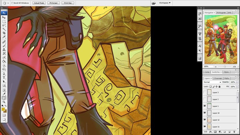
i have friends who ask me this general question: "Why don't you just draw your pages with Photoshop? It has various functions, brushes, colour mixers, gradients, filters, colour correctors and countless wonderful magical things." My answer; "That's why I don't use it."
With Photoshop, I have a terrible habit of overdoing my pages, correcting & perfecting just about everything in my art and can spend days thinking over my choices. It gives unlimited options which drives me nuts.
So I had to discipline myself when using Photoshop.When I open the file, I firstly think my work is crap. Then I control the urge to redo it. Now, I continue with the page.
With Photoshop, I generally use it to add texture to things using the Brush tools (as seen on the ruins in the background). The Brush tools lets you load & use a number of brushes you have created or downloaded. i also use the Paint Daub or some other filters to give parts of the page a painterly feel. After all this, I play ever so slightly with the page (like making the markings on the ruins look raised).
All this while suppressing the urge to go bananas on the art.
Step 15: Almost There.
Now, I use the Gradient tool to create high lights, creating depth to the page & to some of the elements and using it for some other stuff here and there.
I do some slight touch up and finishing in some areas, again, while suppressing my urge to go bananas on the art.
Step 16: Other elements.
Sometimes, I like to add atmospheric and fractal effects. For this cover, I created another layer and used my collection of mist,smoke and cloud Brush presets to create the mysterious feel of the enviroment. It is relevant to the story.
Some additional touch up and finishing here and there and we are about done with the art part of the cover,
Step 17: Done!
I created the Title and Chapter Heading in Photoshop rather than use a vector program.
I save this page and create a Duplicate (i tick the merge all layers box and create a flat file), pump up the Saturation to 12% and save this file as a copy.
This file IS my finished art. Not my line art, not the flat file or my original TIFF file. Those are just all part of the process to create this file, the 'copy' file. I make any final corrections using this file. Mostly some touch up using the Liquify filter.
Once I'm happy with everything, I create a web friendly JPEG file of this page and post it online. Usually, for the interior pages, I will import the page to Corel Draw, add dialogue and word balloons, export the file as JPEG to Photoshop and create a web friendly file for posting online.
Well, that's it guys!
Advertise with us
DDComics is community owned.
The following patrons help keep the lights on. You can support DDComics on Patreon.
- Banes
- JustNoPoint
- RMccool
- Abt_Nihil
- Gunwallace
- cresc
- PaulEberhardt
- Emma_Clare
- FunctionCreep
- SinJinsoku
- Smkinoshita
- jerrie
- Chickfighter
- Andreas_Helixfinger
- Tantz_Aerine
- Genejoke
- Davey Do
- Gullas
- Roma
- NanoCritters
- Teh Andeh
- Peipei
- Digital_Genesis
- Hushicho
- Palouka
- Cheeko
- Paneltastic
- L.C.Stein
- Zombienomicon
- Dpat57
- Bravo1102
- TheJagged
- LoliGen
- OrcGirl
- Fallopiancrusader
- Arborcides
- ChipperChartreuse
- Mogtrost
- InkyMoondrop
- jgib99
- Call me tom
- OrGiveMeDeath_Ind
- Mks_monsters
- GregJ
- HawkandFloAdventures
- Soushiyo