Prenna

Author notes
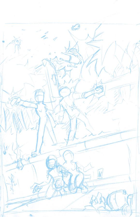
Prenna #1 - Shining Through: Cover blue lines
rainingbells onAs you probably noticed, there was no cover at the start of the story. I had one, but I didn't like it, so I worked on sketching out a couple of others and this is the one I'm going to use.
Originally just a pencil sketch, I coverted in Photoshop the grayscale image to CMYK and then individually selected the channels M, Y, and K and did a 100 percent white fill to kill any of the lines in those channels, leaving only Cyan. Then I did a 75% white fill on the Cyan to make it very light, resized the image from the original sketchbook thumbnail (which was about 6" x 9") to fill an 11" x 17" image area.
I blew it up to full size and made it non-repro blue.
Now, at work I have access to a machine that I can use that is basically a giant color copier. Kodak makes one, Xerox makes one, HP makes one…you can probably find something at an average copy/print shop if you want to try something similar. Once upon a time I co-inked a book called "The Exec" with this guy, and the penciller had worked on some paper that was difficult to ink on (it was thin and the fibers pulled very easily), so my co-inker had some Strathmore cut down and took the original pencils to a copy shop and had them run the pencils off in non-repro on the Strathmore. In the end, the penciller got to keep his pencils and we had something on which we could do the inks.
Now I use this similar approach from time to time to do small thumbnails, only a couple of inches in size, for layouts. At around 6x9 this is actually much larger than I would normally do such a piece…it's almost a full 1:1 printed size, though still smaller than I usually work. Anyway, scan them in, enlarge them, covert to blue, and then print them out for the finishing art. Cover less space in the little thumbnails, while I'm figuring out where things should be, so I spend less time working out the math of the piece, and then I can just enlarge and go in knowing exactly what I'm doing.
When I scan the finished, inked piece, I do that in the line art/bitmap setting so it doesn't pick up little gray edges that tend to make the piece look fuzzed out. It's either black or white, nothing in-between, so the light blue doesn't come through.
For instance, that's how I did pretty much the last half of Sune issue 5.
Anyway, enough jawing.


Comments
Please login to comment.
Login or Register${ comment.author }} at
${ comment.author }} at