Starsign

Author notes
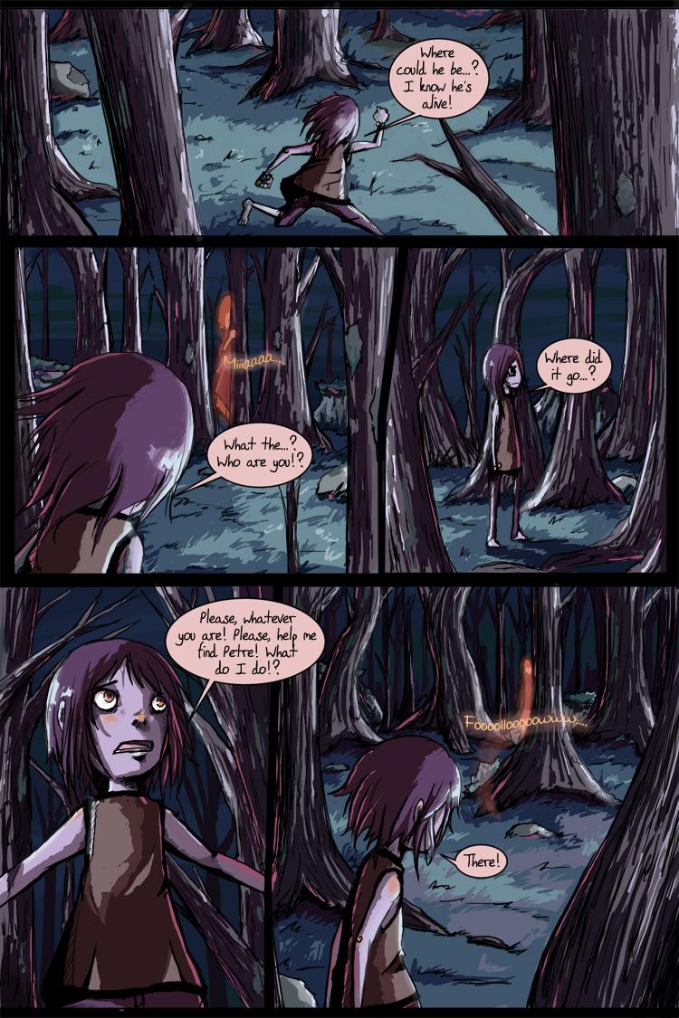
Chapter 2 - Page 27
Kiah onI'm doing some new things with this page, different panelling, different colouring, etc and I think I'll go back and work on Page 26 to get a similar look. I also still need to go back and do a new chapter 1 title page…
I vastly prefer the animated/comicy look of hard colours and clean speech bubbles and panels with the gritty inks and dark look I put together here. It took me a while to get the colour scheme down, but once I had it, it took a lot less time and I feel like it looks a great deal more textured and interesting. This is what I'd initially wanted to do, but I got lost in the painty look toward the end of chapter 1. Things change, I guess. :)
Let me know what you think! I'm also thinking I'd like to get more panels per page without cluttering it up too bad. I tend to think and dream in animation (believe it or not) so it can be tough to break it down into comic format.
Ah, the things I learn and experience by doing this comic! haha
EDIT: Touched the colours up a tiny bit and removed some of the soft lighting that spilled into the panelling. I also redid page 26 a bit. Check that out :) You may have to shift + refresh to see the changes on the pages!


Comments
Please login to comment.
Login or Register${ comment.author }} at
${ comment.author }} at