Text and thought bubbles.
I know many fans of this aren't bothered by it and as such Lopriest will wonder if it's an issue. We can only call it as we see it. There were four people reviewing this and I think we all agreed on. That said it's all about what flaws you can put up wiyth and what stops you reading. Those would stop me reading but they did make me hesitate.
Expressions
This is one of the criticisms made that I think may bear more discussion.
The expressions in Dark sisters are mixed, sometimes they work very well, but most of the time they look like a (fashion) model posing. El cid is the master of expressions with 3d software, striking a balance between realism and hyper realism is hard at least it is for me. I've been accused of both over doing it and having expressionless characters… it's tricky.
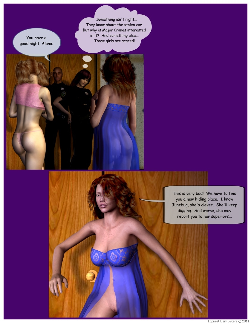
The last panel for example, she really doesn't look worried does she.
3D art in general.
For the most part the core 3D work is good, I know lopriest is more experienced with the software than I am. But it isn't just about building sets and putting nice outfits on (or taking them off rather) As mentioned it's all zoomed out, which is fine for establishing shots… do I need to explain that term? I have mentioned it to other people and they didn't understand what I meant, so here goes.
An establishing shot, or panel(s) will show the reader where the scene is happening and who is there.
http://en.wikipedia.org/wiki/Establishing_shot
Anyway they are important and Lopriest does that aspect well, but for conveying drama or emotion you don't always need or even want the background or to see people whole bodies. close ups help with intimacy, so if you have a girls in mid orgasm thinking about how magical it feels use a close up on her face. this is assuming that before it (or maybe after) is another panrl showing just why she is having an orgasm, you need to give it some context.
Well that will do for now.

Start publishing on
DD Comics!
Dark sisters review
Two big things for me:
COMPOSITION
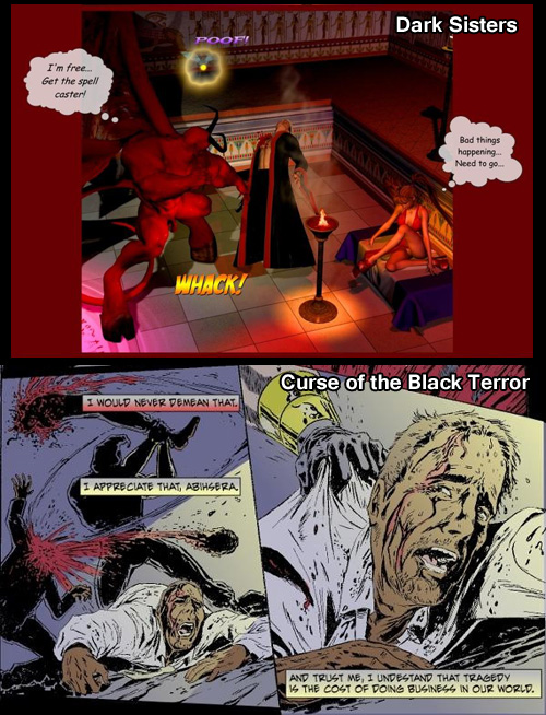
Overall, my biggest issue with the comic has to do with the layouts and composition, or more accurately the general lack thereof. I get it that the comic started out not as a comic but illustrated text, but that does not explain the new pages having no layout and really it was never an excuse for the earlier ones either. This tendency in the comic to show every panel as a wide shot without ever bothering to find more interesting compositions, is a very "Poser" thing to do. It's also a very lazy thing to do, and it does detract from the impact of the artwork in many ways. For example, compare this death scene from Dark Sisters to this one from fellow Drunk Duck comic Curse of the Black Terror:

See what I mean? Composition is everything. It's not enough to just show that things are happening; a good artist can actually put the reader there and let them experience it. There has not been a single moment in Dark Sisters that I have felt like I'm experiencing the events rather than voyeuristically watching things happen. It's always felt more like a diagram of a comic than an actual comic, and that's entirely because of the overuse of wide shots and the lack of page layouts.
And I know from that, um, previous incident (*cough*) that sometimes people take it the wrong way when they receive criticism. We;re not "attacking" the comic; we're pointing out things that can be made better. We're trying to help.
CHARACTERS
The characters are not very engaging. I understand Caitlin and Roxy as character types, but they never feel fleshed out as actual people. It's like I know who they are and what events happen to them, but I never feel like I know them the way I know for example Juno MacGuff or Bruce Wayne. I'll never find myself saying "that is such a Caitlin thing to say," or anything like that. There are a few moments when the characters do seem to briefly come to life, but for the most part they don't seem to think, talk, or act like real people. They're character types, there to serve a purpose in the story, and that seems to be pretty much it. That may well be adequate for this type of story, and your readers don't seem to mind, but overall I think that both this and the layout issues contribute a certain amount of narrative noise that creates a barrier between the reader and the story, preventing them from being as immersed in it as they could be.
When you have a comic where the artwork is basically a diagram, and the characters don't have any real presence about them, it's sort of like the difference between reading the summary of a novel and reading the actual novel. Sure it's adequate to get the point across, but there's a lot missing that could enrich the experience.
SUGGESTIONS
Dark Sisters has a lot going for it. It's a girl-heavy cheesecake comic, which is always popular. It's a fairly straightforward mystical adventure, not too offensive or challenging to the reader insofar as subject matter goes. Anyone should be able to pick this comic up and be able to get into it; it has universally enjoyable qualities… well, for anyone who isn't a prude, at least! By and large, the audiences here at DD and elsewhere on the net aren't all that demanding, especially when they're getting your comic for free and it has lots of nekkid women in it. But as much as they may be happy with the comic as it is, they'd be a lot happier if it were done with a bit more finesse. Two quick recommendations:
#1: You need to step outside your comfort zone and try experimenting with image compositon, and maybe even try putting some pages together as actual comic layouts. It's hard, I know, but it will pay off. Look at some other comics here on DD that do a good job of visual storytelling and try to learn from the things they do well (Curse of the Black Terror is an excellent example).
#2: I know this sounds counterintuitive at first, but when it comes to characterization, sometimes less can be more. Stop relying on thought balloons to get across what your characters are thinking. This is a classic example of telling when you should be showing. There is never a good excuse for using thought balloons in a comic, and if you find yourself feeling the need to rely on them, then that means you're failing somewhere. What your characters are thinking should be clear from their expressions, posture, actions, and the things they say.
Stop relying on blocks of narrative text. If you're doing a good job illustrating the story, your readers should be able to figure out what's going on without you verbally explaining it to them. And as much as possible, avoid using too much expositional dialogue. Again, you should be showing and ot telling wherever you can. It may seem counterintuitive, but the way you present your comic, showing every last detail in each panel and bombarding the reader with narrative text, thought balloons, and explanatory dialogue, actually ends up keeping the reader more distant than if you'd simply allow the story to tell itself naturally unencumbered by all the narrative noise. Also, I believe that relying too much on these narrative devices is a crutch that can actually prevent you from developing both as a storyteller and as an artist.
These are, of course, only suggestions, and your comic appears to be doing well enough as is, so don't feel any need to rush out and start changing things just because a few webcomic review people said you should. Ultimately, you should make the comic that feels right for you.
~Squalllion, We hope so too, but you never know how someone will take a critique. I don't think it will be an issue with Lopriest though. Dark sisters has fans which are perfectly happy with how it is and they have said as much in various comments. Those views are valid, but I think it is worth artists taking all criticisms on board and thinking them over even if they don't initially agree. There is almost always room for improvementm in the case of Dark sisters I think working on the layouts and composition could make a vast improvement.
jerrie wrote:The backgrounds are really good, I think it was mentioned in the review. As for the speech bubbles, yes they can help but all too often they don't really advance they plot in anyway.
I really love this comic, so i guess I'm biased. To me the thought balloons add to the story. I like reading what's on the characters minds. The backgrounds are outstanding.
Being a fan of the comic you have already overlooked or accepted the flaws, which is absolutely fine and worth lopriest considering, however I don't think it makes the points given any less valid. The decision for Lopriest is to how much to take onboard try improving and where to stay true to what has already been done. i certainly don't expect the next hundred pages of Dark Sisters to be speech bubble free with constant extreme close ups.
Genejoke wrote:I wouldn't complain to seeing a few close ups of those hotties though!(DROOOL…)
jerrie wrote:
I really love this comic, so i guess I'm biased. To me the thought balloons add to the story. I like reading what's on the characters minds. The backgrounds are outstanding.
The backgrounds are really good, I think it was mentioned in the review. As for the speech bubbles, yes they can help but all too often they don't really advance they plot in anyway.
Being a fan of the comic you have already overlooked or accepted the flaws, which is absolutely fine and worth lopriest considering, however I don't think it makes the points given any less valid. The decision for Lopriest is to how much to take onboard try improving and where to stay true to what has already been done. i certainly don't expect the next hundred pages of Dark Sisters to be speech bubble free with constant extreme close ups.
jerrie wrote:
I really love this comic, so i guess I'm biased. To me the thought balloons add to the story. I like reading what's on the characters minds. The backgrounds are outstanding.
The thought balloons do add to the story, but they're only adding things that shouldn't have been missing to begin with. They're a way of coping with deficiencies, which is not a bad thing in and of itself, but when it gets to a point that it's enabling the artist to go on without addressing those deficiencies, then it becomes a crutch.
Have another look at that example image I posted. Notice how he uses a thought balloon to indicate that Roxy is frightened? That's because there is no other indication, for example from her posture or facial expression, to indicate that she's scared (she's not even looking at the wizard dude getting killed, for Chrissakes!). Also, even if he did do any expression work, the camera angle would have made it impossible to notice. So in other words, he didn't bother creating an expression or getting his characters to interact properly with each other, and didn't bother coming up with a believable dramatic pose (in fact, it looks like an out-of-the-box pinup pose), and he's able to get away with that because he falls back on the thought balloon. The end result is a less compelling comic, and that the artist gets no opportunity to work on fundamental 3D skills, and for that matter has no incentive to when no one ever points it out to him.
The backgrounds are mostly great, but don't give him too much credit for them. Like the poses, they mostly look out-of-the-box to me, which is fine, but that also becomes a crutch. When Lopriest uses high quality Poser props from a decent merchant source, the backgrounds are excellent. When he uses lower quality props, I'm guessing from free sites like ShareCG, the results are way sub par. For example, look at the ground texture on this page. It wouldn't have taken much to create a better quality ground texture, even using Poser procedural materials, but Lopriest didn't bother with that. Why? My guess is that he's gotten too used to relying on already-provided textures as a crutch, and so long as he continues doing that, his artwork will remain inconsistent because prop textures and quality are inconsistent depending on where you get them from. There's nothing wrong with using pre-fab props and backgrounds, but you need to also develop the skills to customize them or create your own when necessary.
Well, I was going to go over all the points raised but El Cid's earlier post kind of covers most of what needs to be said. I did want to clarify some things on the narrative though. The "archaic Victorian" narrations came about rather accidentally, kind of an afterthought really. The initial response I got from some was that they were really funny as the tone so contrasted with what is being depicted. They've since become part of the flavor of the story so that will not change, though their frequency will. I had already begun foregoing them on the pages I'm currently working on when, as you said, they really aren't necessary. As for the tense, they are always present tense, with the exception of the flashback arc in chapter two, which was done in the past tense because it was a flashback.
I did want to add something to El Cid's later post above. I do mix and match backgrounds sets to where they often differ from the pre-sets, also using different textures and shaders. The example he gave though is one that was previously pointed out to me as horrible, and I did indeed originally miss how bad the textures were. I do use pre-sets because I have zero skills in modeling and if I need to concentrate on learning new things I'd rather concentrate on improving composition, lighting and image creation.
I do like the example he gave in his post of the summoner death scene. Reading that made me immediately think of how I could have done that so much better, especially by using multiple images and close ups.
Will you see changes in the next 100 pages or so? Some, but keep in mind I've already done a lot of them in advance. I will take some of the suggestions (in fact in some cases had already started doing so,) for some of the work I am now on. So hopefully, that will bear some results when the story catches up.
I wanted to thank you for doing the review, as you took the time to do it well, even as I didn't like all that was said. And thanks to all my readers who piped in as well, you guys are great.
@El Cid. I went back to look at the page you linked to. I see your point about the background there. I really don't know a lot about doing 3d art to know about background quality. You know a lot about this, so I have to yield to your opinion, honestly though, when he posted that picture…that beautiful girl was all i was looking at.(not to mention that she's my favorite character in Dark Sisters, so all my attention was on her.)
DDComics is community owned.
The following patrons help keep the lights on. You can support DDComics on Patreon.
- Banes
- JustNoPoint
- RMccool
- Abt_Nihil
- Gunwallace
- cresc
- PaulEberhardt
- Emma_Clare
- FunctionCreep
- SinJinsoku
- Smkinoshita
- jerrie
- Chickfighter
- Andreas_Helixfinger
- Tantz_Aerine
- Genejoke
- Davey Do
- Gullas
- Roma
- NanoCritters
- Teh Andeh
- Peipei
- Digital_Genesis
- Hushicho
- Palouka
- Cheeko
- Paneltastic
- L.C.Stein
- Zombienomicon
- Dpat57
- Bravo1102
- TheJagged
- LoliGen
- OrcGirl
- Fallopiancrusader
- Arborcides
- ChipperChartreuse
- Mogtrost
- InkyMoondrop
- jgib99
- Call me tom
- OrGiveMeDeath_Ind
- Mks_monsters
- GregJ
- HawkandFloAdventures
- Soushiyo

