Here, I just wanna do the same thing that ThrisbyDude did and I'd like to post my concept logos, meaning that they aren't official, at least not yet. When I had sent these to Ozoneocean, he gave a really positive response, but I also would like to know what you guys think? Which ones do you like? Which ones could you see as the new logo for this historical website? For the first two, I took a modern approach and I played around with the egg icon a bit. For the last three, I decided to take a more retro, classic approach and I slightly redid the box background from the older DD logo. Let me know what you guys think, I'm open to any constructive criticism.
The concepts: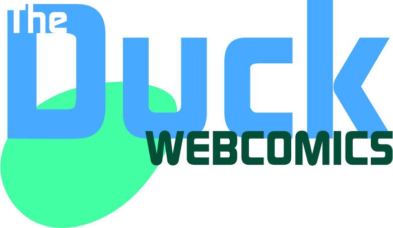
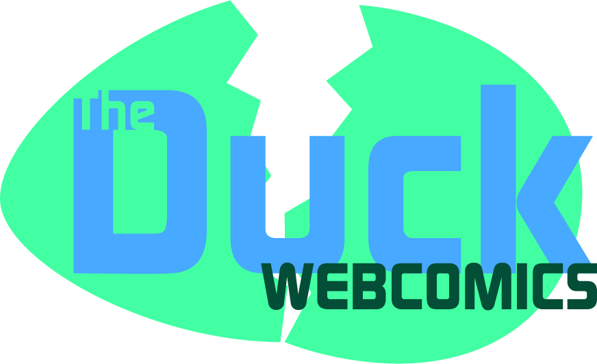
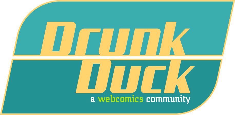
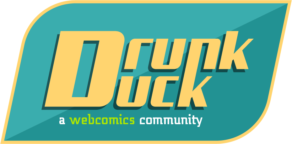
These were designed in Adobe Illustrator, the same medium I use for my comic.

Start publishing on
DD Comics!
Advertise with us

Meet, Greet, Show and Sell*
New DrunkDuck/The Duck Logo Ideas
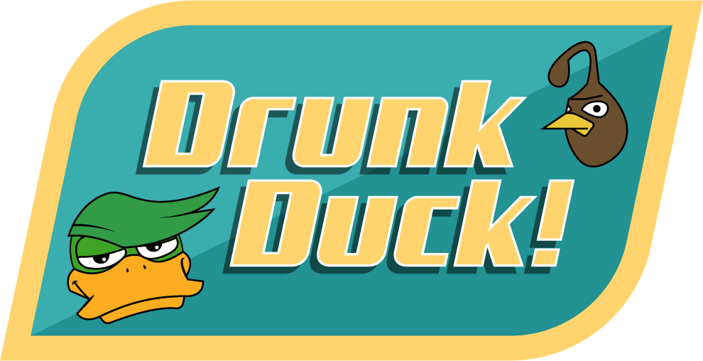
Ain’t looking bad at all! If my concepts don’t go through {the open-source SVG file stage or aren’t chosen}, I can definitely see one of the latter three be the official logo, though I might reconsider the first two if they have the same font{s} as the last three with a few changes.
It’s my opinion, but if I could change some things about the last three I would…
1. Have the “Drunk Duck” text stick out of the slick box backgrounds {a bit}, like the original DD Logo or my concepts.
2. Maybe add a unique outline to the letters themselves? The letters could pop out more.
3. Add an exclamation point! ((wink wink)) It would make the logo{s} far more familiar.
4. Make the line width of the slick box backgrounds bolder.
5. Place a symbol or representation of the Duck mascot somewhere. If you can’t do that, that’s fine - the logo{s} still look cool even without a symbol.
Other than that, your last three fit the site redesign quite well! I mean, one of yours has a drop shadow in it – mine doesn’t! The 5-color minimalist (in a good way) color design fits in with the turquoise and dandelion/tinted cream yellow sections of the site.
Keep up the good work!
These are really cool and clean, DylanTale Comics!
I would like to add that the third logo design is the easiest to read because it has a faint line separating the words "Drunk" and "Duck"–the original site's name, assuming the Duck fell off the wagon. The title was changed to "The Duck" during the previous site design to create an inviting, all-ages community.
The last two logos might look confusing to someone unfamiliar with the site. It could be read as: "Drunk uck" or "D Runk uck". From a distance, it reminded me of when I accidentally type-in the site's name and replace the "D" with an "F".
The turquoise-dandelion yellow background of the site may be replaced by a different color scheme.
I have always been a fan of waterfowl mascots to give the site some flair.
Thank you for the time spent making all five of these logo designs!!
ThrisbyDude wrote:
Ain’t looking bad at all! If my concepts don’t go through {the open-source SVG file stage or aren’t chosen}, I can definitely see one of the latter three be the official logo, though I might reconsider the first two if they have the same font{s} as the last three with a few changes.
It’s my opinion, but if I could some things about the last three I would…
1. Have the “Drunk Duck” text stick out of the slick box backgrounds {a bit}, like the original DD Logo or my concepts.
2. Maybe add a unique outline to the letters themselves? The letters could pop out more.
3. Add an exclamation point! ((wink wink)) It would make the logo{s} far more familiar.
4. Make the line width of the slick box backgrounds bolder.
5. Place a symbol or representation of the Duck mascot somewhere. If you can’t do that, that’s fine - the logo{s} still look cool even without a symbol.
Other than that, your last three fit the site redesign quite well! I mean, one of yours has a drop shadow in it – mine doesn’t! The 5-color minimalist (in a good way) color design fits in with the turquoise and dandelion/tinted cream yellow sections of the site.
Keep up the good work!
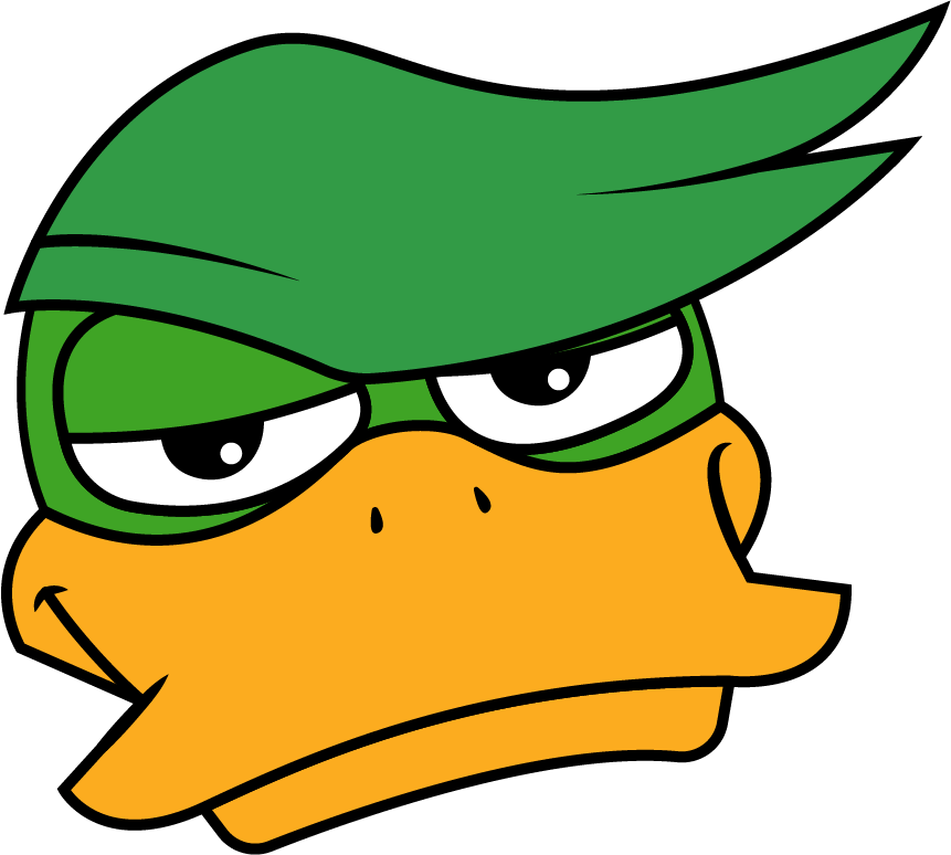
I completely forgot about adding an exclamation point! I might go back and do that along with the other things you mentioned if I feel like making more concepts. That's also a good idea to include The Duck himself, and maybe even Quail. That's the beauty of Illustrator, you can do a lot of different effects to make something that stands out! Thank you for your input, I'll keep those things in mind.
kawaiidaigakusei wrote:
These are really cool and clean, DylanTale Comics!
I would like to add that the third logo design is the easiest to read because it has a faint line separating the words "Drunk" and "Duck"–the original site's name, assuming the Duck fell off the wagon. The title was changed to "The Duck" during the previous site design to create an inviting, all-ages community.
The last two logos might look confusing to someone unfamiliar with the site. It could be read as: "Drunk uck" or "D Runk uck". From a distance, it reminded me of when I accidentally type-in the site's name and replace the "D" with an "F".
The turquoise-dandelion yellow background of the site may be replaced by a different color scheme.
I have always been a fan of waterfowl mascots to give the site some flair.
Thank you for the time spent making all five of these logo designs!!
I kind of figured the name change was for that reason, as it does set the tone for a more broad audience. With what you said about the last two logos, I do see how that can be misinterpreted. I could combine the third and fifth ones where I'd have the text layout of the third with the drop shadow effect from the fifth. Definitely something to think about… If the color scheme isn't final and does change, I'd be more than able to adapt the colors if needed. Thrisby did also bring up the lack of The Duck himself, that gives me some ideas of how I can reincorporate him and maybe even Quail! I'm thinking either distinguishable silhouettes or even a full color modern take on them. Thank you for the input! I'll definitely keep those things in mind.
ThrisbyDude wrote:
↑ Looking good, DylanTale, my man! They all look good - nothing else from me to add.
Thank you, I especially had a lot of fun redesigning the DrunkDuck himself with a modern twist!
kawaiidaigakusei wrote:
Wow, these logo evolutions are looking really stellar!
HawkandFloAdventures wrote:
I agree these logos are tight :D
Thank you both, hopefully they'll get used at some point. That would be so cool!!
Advertise with us
DDComics is community owned.
The following patrons help keep the lights on. You can support DDComics on Patreon.
- Banes
- JustNoPoint
- RMccool
- Abt_Nihil
- Gunwallace
- cresc
- PaulEberhardt
- Emma_Clare
- FunctionCreep
- SinJinsoku
- Smkinoshita
- jerrie
- Chickfighter
- Andreas_Helixfinger
- Tantz_Aerine
- Genejoke
- Davey Do
- Gullas
- Roma
- NanoCritters
- Teh Andeh
- Peipei
- Digital_Genesis
- Hushicho
- Palouka
- Cheeko
- Paneltastic
- L.C.Stein
- Zombienomicon
- Dpat57
- Bravo1102
- TheJagged
- LoliGen
- OrcGirl
- Fallopiancrusader
- Arborcides
- ChipperChartreuse
- Mogtrost
- InkyMoondrop
- jgib99
- Call me tom
- OrGiveMeDeath_Ind
- Mks_monsters
- GregJ
- HawkandFloAdventures
- Soushiyo