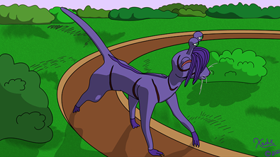
Xade's Guide to Pacing!
Ozoneocean at Feb. 28, 2021, midnight

So, you have a comic or comic idea and want to put pen to paper or tablet. Great! Check off what you need. Tools, check. Basic story idea, check. Art skill, also a check, even if your art is terrible you’re bound to improve. Knowing how to pace the comic …. uhhhh…
I thought so or you wouldn’t be reading this.
First off, what is pacing? Pacing is the flow of the story. Without good pacing, the story will be too fast or worse drag, which both bores the reader.
Almost everyone read a book that captivates you and takes you by the hand, drawing you in like a fish on a hook. Didn't have some fast and slow parts that made the story great?
Preparing for a quest can be slow and, in the hands of a master, very engaging. A battle, of course, is fast-paced, sparse on surrounding details but does not ignore them completely. A great battle will also add a smattering of extra detail that gives the reader a thrill before their roller coaster thunders down a hill. In short, the pacing should be like our roller coaster, up and down, slow and fast.
How can I apply pacing to my comic, Xade? Panel amounts, shape, and size are great ways to do it. But that’s not all! Let’s take a look at the details.
A nice slow scene that doesn’t bore the reader can be a languid stroll in the park as the character(s) discuss something. Vary the camera angles, show their surroundings. Have a bird fly around behind them. When people walk through busy parks, owners walk their dogs and children play. Empty parks are boring so make it at least a little busy. Yes, it’s extra work for you, but your story will benefit from these extra details.
Also, don’t forget to allow panel space for this extra stuff while keeping the main character(s) in the panel. More updates will lengthen the scene but don’t go crazy. Don’t forget establishing shots and the occasional distance shots, say from a tree branch with a squirrel in it, for example. Watch a good animated movie, Nut Job and Woody Wood Pecker comes to mind, and pay attention to how the camera acts. Sometimes it is up close and other times it is way back before an action then zooms in dramatically. When the characters look around, so does the camera, as though you are seeing what the hero sees. It’s the little things here that make the story.
On the other side of the hill is the action, like a battle. Skimp on the backgrounds here but don’t ignore them completely. Just put something there to say that the battle takes place here. Is it in the woods? Draw a few tree trunks that fade out to dark with a basic canopy and maybe a few basic bushes but only a dash of details unless it’s important for a panel or two.
Your players are having a sword fight so focus on them.
Is the hero being pressed back into a tree? Bring that tree into focus by adding more and more details until he slams into it. The enemy raises the sword to strike. Hero gasps. He lunges away. The sword embeds itself into the tree and the battle continues.
See what I did there? Short sentences enhance the fast pace. I even took the time to say the hero gasps before moving on. A quick breath, pun intended, enhances the battle. Use decent sized, dramatically shaped panels when you want to highlight a part of the battle, a panel slashed diagonally into two will slam the point home during the gasp and duck, while using smallish and a few more panels than normal during the fight. It will tighten the pacing, creating the illusion of a blazing battle/chase scene even if you have weekly updates like my Growlution.
Has your heroine has just broken free from the villain and is trying to escape? This one is tricky to do right but not impossible. You must vary the pacing here.
She eases the cell door open and slides out into the hall. We see the bricks of the stone behind her. She swiftly moves down the hall, now there is less detail, simply suggesting the bricks because she is moving. She spots the patrolling guard and ducks behind a pillar with a blur of background to suggest speed. Peering out behind her hiding spot, she watches as the guard moves around with a light coating of backgrounds. He passes a vase, a painting that suggests it’s a picture of the villain’s father. Then the guard turns and walks the other way, allowing her to flee more.
A few minutes later the villain himself crosses her path and she hides behind a floor-length curtain. Every detail matters here. He paces the lavish room as he talks on the phone. She freezes in place, praying he won’t discover her. Her heart beats wildly. Her breath gasps out. Then it’s back to show the villain shouting into his phone, the detail vanishing “Find her now!” He storms out, muttering about his incompetent guards, allowing her to flee the room, which only suggests the details and the castle where the hero discovers her and they have a joyous reunion.
In short, it’s all about the details and panels. Fast or slow, less or more, shape and size enhance the story at the right time. Environmental cues also enhance the story. Interaction with the environment does wonders to pacing as well. Add more to prolong the event, skimp to show action while tossing in a little bit more background when it’s important to the story. You’ll thank me when you do.
What is your favorite way to change pacing?
Guest post by Xade.


Comments
Please login to comment.
Login or Register${ comment.author }} at
${ comment.author }} at