DD update post 5th of August 2022
Ozoneocean at Aug. 5, 2022, midnight
Latest update news
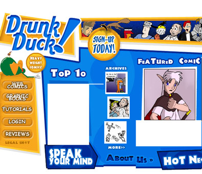
The title pic shows DD as it was 20 years ago. It's really not a bad design at all. The fashion then was to have a front page as an image all sliced up with a bunch of active areas working as buttons/links. The top ten list is vacant, as is the feature review- the Wayback machine only remembers so much. It was a good way to organise the content at the time and fit nicely into the most common screen sizes.
But these days there's a lot more functionality to think about, we also have more comics to promote, and screen sizes vary from super wide to thin and tiny.
Alexey is working on adapting Emm's designs which won our member design competition a few years ago. The design has had to change a bit and you can see here what it looks like currently.
- https://next.theduckwebcomics.com/
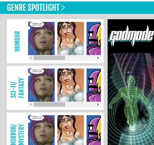
The drop-down menu has more content and the genre lists are supposed to more obviously side scroll on mobile screens, but we haven't finalised how to do that yet. I want to put triangles in the lists to show that each scroll.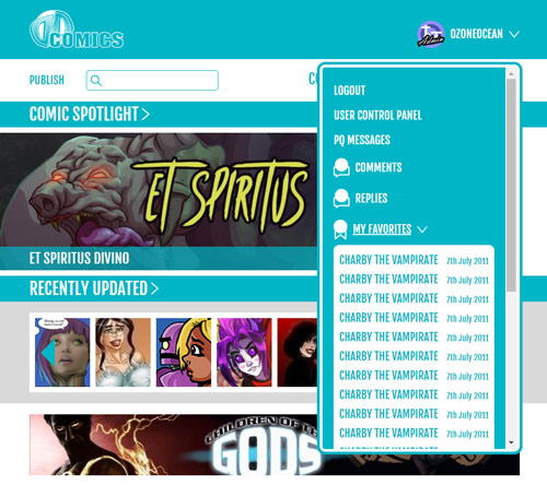
However, Emm has been reading everyone's comments and come up with a new design which you can see below. She introduced the colours people suggested, the logo space is empty (waiting on a pic), the thumbnails were all enlarged, ad types changed into banners only, and things moved around a bit. She worked very hard to make it usable and to incorporate feedback!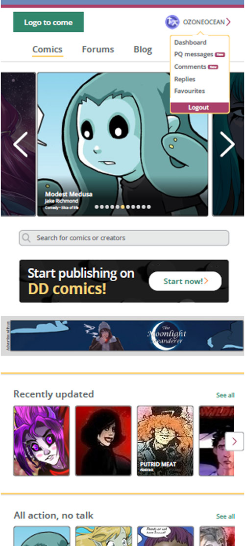
PDFs showing the designs - https://drive.google.com/drive/folders/1PoNlT-TH79JwmREcbxmov4yHTaHpfw9E
But there are some problems with it
- First up, large thumbnails and different styles of ads will involve a lot more front end and back end coding to implement than we've budgeted for right now.
- Secondly, we've already spend a lot of money getting the current design converted, we'd be losing out. That's the all the money that Elsa, Mal, and Pit raised through the DD Anthology plus a whole lot more that came from my bank account.
- Thirdly, I really love Em's original blue design.
Given all this hopefully we can adapt and merge the more usable elements of Emm's new design with the current one. That would be the best case scenario I think. Remember, we're mainly doing aesthetic changes to the site because we don't have the resources to do major coding and features in this round of upgrades.
____________
Don’t forget you can now advertise on DrunkDuck for just $2 in whichever ad spot you like! The money goes straight into running the site. Want to know more? Click this link here! Or, if you want to help us keep the lights on you can sponsor us on Patreon. Every bit helps us!
Special thanks to our patrons!!


Justnopoint - Banes - RMccool - Abt_Nihil - PhoenixIgnis - Gunwallace - Cdmalcolm1 - PaulEberhardt - dragonaur - Emma_Clare - FunctionCreep - Eustacheus - SinJinsoku - Smkinoshita - jerrie - Chickfighter - Andreas_Helixfinger - Tantz_Aerine - Epic Saveroom - Genejoke - Davey Do - Spark of Interest - Gullas - Damehelsing - Roma - NanoCritters - Scott D - Bluecuts34 - j1ceasar - Tinchel - PhillipDP - Teh Andeh - Peipei - Digital_Genesis - Hushicho - Sad Demon Comics - JediAnn Solo - Kiddermat - BitterBadger - Palouka - cheeko - Paneltastic - [https://www.theduckwebcomics.com/user/L.C.Stein/]L.C.Stein - Zombienomicon - dpat57 - Bravo1102 - The Jagged - LoliGen - OrcGirl - Miss Judged - Fallopiancrusader - arborcides - ChipperChartreuse - Jaybiejay - Chris_tar - Mogtrost

Comments
Please login to comment.
Login or Register${ comment.author }} at
${ comment.author }} at