Panel By Panel: ‘Small Gods’ and A Classic Establishing Shot
hpkomic at Dec. 30, 2022, 1:35 p.m.

Hello everyone, and welcome to Panel by Panel, a periodic exploration of comic panels around The Duck. This week we're talking about the comic Small Gods, created by Duck user Bof Phaff. Specifically, we are looking at a panel on "page 55 of chapter 6."
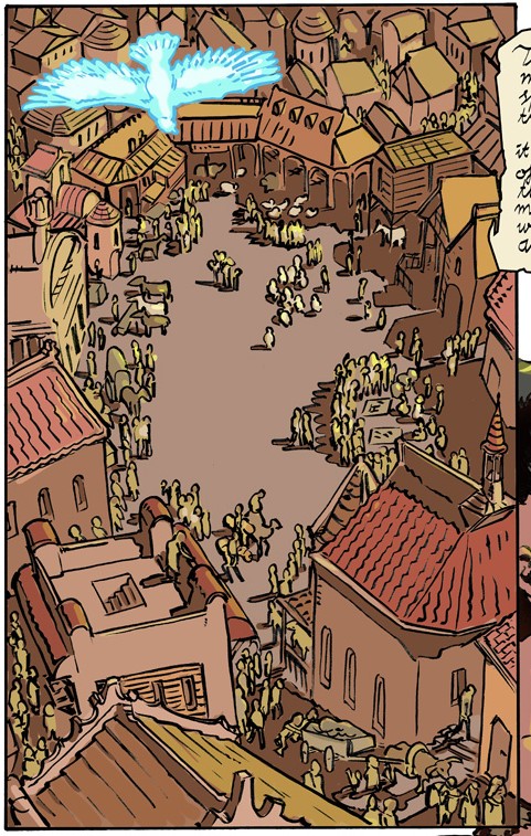
First off, the panel in question:
I want to talk about three elements that make this an effective establishing shot - three things any of us can borrow from. Before that, I want to mention that this is the page's first panel as well, which is pretty important. if you are conveying a switch in setting or where characters are positioned, I suggest making your first panel an establishing shot. That is more a subject for another time.
Anyway… I want to point out three elements of this shot: detailing, angle, and color.
Detailing is something that I still struggle with myself as an artist, or more specifically - using less detail when necessary. I still tend to overly detail distant elements in my panels, including backgrounds. Notice on this panel that the further an object is, such as a building, the less detail there is, while objects closer to our POV are more detailed. The closest object, the bird, is the most detailed thing in the panel. The usage of detailing and simplifying distant objects creates an easily interpreted distance.
The angle chosen for this panel, a literal bird's eye view, is important in the context of the narrative on the page, but also in a general sense. the higher angle establishes more space. Should all establishing shots be pulled-out, bird's eye views? Of course not. An establishing shot's angle depends on what part of the setting needs to be established. In the context of this panel, we need to see that this is a bustling town. We also need to showcase what the bird can do. You'll see this is a merchant town if you read the dialogue on the page. The angle helps sell that because it emphasizes the pockets of people and small crowds in a market square. Showing these clusters is best achieved through the angle the illustrator chose.
Lastly, we have color. The panel's palette is limited to 4 to 5 colors with shading that introduces some values of those limited colors. The panel doesn't appear muddy, though, as the areas of interest sprinkle in the assembly of color to create a little more depth and life. The color also works well with the detailing. We get more pops of color when there is more detail in the panel, but the further removed from detailing we are, the more the color comes together. This is how we often see colors in real life - trying to look at objects in the far distance, and you'll notice that it takes on a hue associated with other colors around them. This is more or less a result of how light plays on distant objects in our atmosphere. Using the limited palette for background elements that are farther away simulates this natural effect as we're already conditioned by life to see distant coloration as more uniform.
I hope this establishing shot proves inspirational to most of us. This is a great example of how to use them in a panel, and I hope my points provide a little reasoning as to why. Please pop on over to Small Gods and add it to your favorites list.
See you next time.
____________
Don’t forget you can now advertise on DrunkDuck for just $2 in whichever ad spot you like! The money goes straight into running the site. Want to know more? Click this link here! Or, if you want to help us keep the lights on you can sponsor us on Patreon. Every bit helps us!
Special thanks to our patrons!!


Justnopoint - Banes - RMccool - Abt_Nihil - PhoenixIgnis - Gunwallace - Cdmalcolm1 - PaulEberhardt - dragonaur - Emma_Clare - FunctionCreep - Eustacheus - SinJinsoku - Smkinoshita - jerrie - Chickfighter - Andreas_Helixfinger - Tantz_Aerine - Epic Saveroom - Genejoke - Davey Do - Spark of Interest - Gullas - Damehelsing - Roma - NanoCritters - Scott D - Bluecuts34 - j1ceasar - Tinchel - PhillipDP - Teh Andeh - Peipei - Digital_Genesis - Hushicho - Sad Demon Comics - JediAnn Solo - Kiddermat - BitterBadger - Palouka - cheeko - Paneltastic - [https://www.theduckwebcomics.com/user/L.C.Stein/]L.C.Stein - Zombienomicon - dpat57 - Bravo1102 - The Jagged - LoliGen - OrcGirl - Miss Judged - Fallopiancrusader - arborcides - ChipperChartreuse - Mogtrost - InkyMoondrop - jgib99 - Hirokari


Comments
Please login to comment.
Login or Register${ comment.author }} at
${ comment.author }} at