Panel by Panel: 'Ghastley Heights' and Framing
hpkomic at May 20, 2022, midnight

Hello and welcome to Panel by Panel, an analysis of panels from comics right here on The Duck and exploring what they do, how they work, and what we can learn from them.
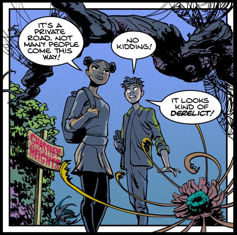
This week's panel comes from the Ghastley Heights strip "Pamphlets." This comic is by IronScarf. Let's take a look at it real quick.
The topic today is using framing and why I feel this panel is a great example. Framing can have a few different meanings, but for our comic-specific context, let's just think about it as the arrangement of objects in a panel to lead the eye around. In this case, we should also take into account the idea of a "picture frame" where an image is placed within an object to draw attention to the image.
We can see this prospect present in this panel, as our two characters are in the center of the panel. Notice the arrangement of objects within the panel around them as well. The branch hanging overhead, and the bushes to the left side of the panel, are effectively boxing in the characters within the panel. Given the panel's aim of depicting the idea of the path ahead as foreboding, the crowding here makes a ton of sense. It's very effective.
But let's take it further. What about the overlapping flower? The flower, even though it intersects the characters a bit, still creates a feeling of crowing not only on the right-hand side of the panel but also creates a z-axis effect. This foreground object not only helps establish the oppressive crowding around the characters but cleverly establishes the path ahead of them is dense and dangerous.
Also, let's take into account the usage of contrast as well. The image lacks a "background" in the sense that the space behind the characters and depicted environment is entirely negative space. The usage of contrast between the objects in the frame and the openness created by the negative space creates impressive depth, which, I feel would be lessened had there been anything other than negative space in the background.
I would be curious to know if there was a conscious acknowledgment within the framing of the page by Ironscarf that the dialogue balloons also drive the eye inward and box in the characters. The positioning of the balloons makes sense where they are, to begin with, but was it after the panel was drawn, or were the balloons accounted for in the thumbnailing process?
And that is it for now. Please share your thoughts on framing within panels. How conscious are you of this sort of thing in your own comics? Please feel free to share examples of framing in your comics as well. I would love to see them.
Also, be sure to check out Ghastley Heights.
____________
Don’t forget you can now advertise on DrunkDuck for just $2 in whichever ad spot you like! The money goes straight into running the site. Want to know more? Click this link here! Or, if you want to help us keep the lights on you can sponsor us on Patreon. Every bit helps us!
Special thanks to our patrons!!


Justnopoint - Banes - RMccool - Abt_Nihil - PhoenixIgnis - Gunwallace - Cdmalcolm1 - PaulEberhardt - dragonaur - Emma_Clare - FunctionCreep - Eustacheus - SinJinsoku - Smkinoshita - jerrie - Chickfighter - Andreas_Helixfinger - Tantz_Aerine - Epic Saveroom - Genejoke - Davey Do - Spark of Interest - Gullas - Damehelsing - Roma - NanoCritters - Scott D - Bluecuts34 - j1ceasar - Tinchel - PhillipDP - Teh Andeh - Peipei - Digital_Genesis - Hushicho - Sad Demon Comics - JediAnn Solo - Kiddermat - BitterBadger - Palouka - cheeko - Paneltastic - [https://www.theduckwebcomics.com/user/L.C.Stein/]L.C.Stein - Zombienomicon - dpat57 - Bravo1102 - The Jagged - LoliGen - OrcGirl - Miss Judged - Fallopiancrusader - arborcides - ChipperChartreuse - Jaybiejay


Comments
Please login to comment.
Login or Register${ comment.author }} at
${ comment.author }} at