

Panel By Panel: 'Phineus: Magician for Hire' and Visual Pacing
hpkomic at Nov. 18, 2022, 4:31 p.m.

Hello everyone, and welcome to Panel by Panel, a periodic exploration of comic panels around The Duck. I am working on another comic submission from a couple of posts ago. This week our volunteer is the creator of Phineus: Magician for Hire, Phinmagic. Specifically, he sent in page four of 'Dragon Attack.'
The specific panel I want to look at today can be seen below.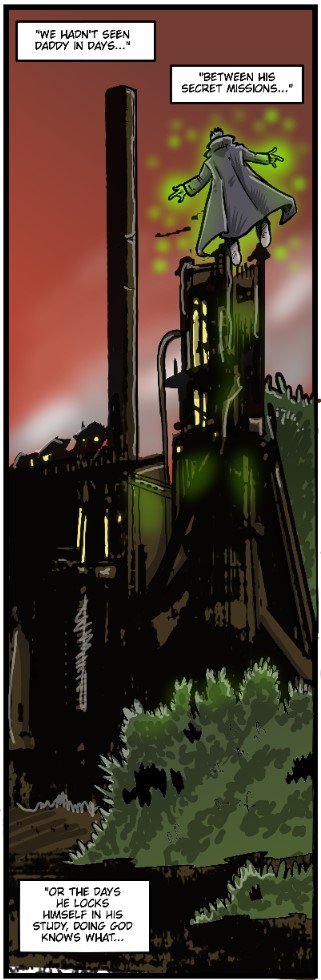
We have a very dynamic, vertically-oriented panel here. We've seen these before in this article, but it is always fun to see how they are utilized in different ways by different artists.
Now, Phinmagic is a professional in many regards, and I think a panel such as this one is a great example of experienced storytelling. I think the panel has a natural throughline that leads the eye down, starting with Phineus in the air, and then we follow through to see how high he is, set against the building. The bushes in the foreground also create depth; they're larger as they are closer, and based on the sizes of our three focal points, we get a sense of spacing between them.
My concern, however, is the position of the captions. Specifically, the captions should match the visual trajectory of the pattern a little closer. I think the first box at the top of the panel is fine. The second box, so close to Phineus and still so high up, feels like a missed opportunity.
Our eye is heading down the panel; why not move that second caption downward a bit, perhaps between Phineus and the bush? Then we naturally follow down to the third and final caption box. I feel the panel would feel more balanced that way, especially as it emphasizes the columned nature of this panel, ensuring our eyeliner doesn't cross panels to read another group of text to the right.
But, that's just what I feel would work. I think the panel is fine as is. I think the contrasts of imagery are strong, with the looming building nice and dark, whereas Phineus, the bush, and the sky stand out from the 2/3s of the page that are darker. With that said, if my eye is already sinking to the bottom of the panel, I would follow that through with my dialogue boxes as well.
What do you think, readers? Please let me know!
____________
Don’t forget you can now advertise on DrunkDuck for just $2 in whichever ad spot you like! The money goes straight into running the site. Want to know more? Click this link here! Or, if you want to help us keep the lights on you can sponsor us on Patreon. Every bit helps us!
Special thanks to our patrons!!


Justnopoint - Banes - RMccool - Abt_Nihil - PhoenixIgnis - Gunwallace - Cdmalcolm1 - PaulEberhardt - dragonaur - Emma_Clare - FunctionCreep - Eustacheus - SinJinsoku - Smkinoshita - jerrie - Chickfighter - Andreas_Helixfinger - Tantz_Aerine - Epic Saveroom - Genejoke - Davey Do - Spark of Interest - Gullas - Damehelsing - Roma - NanoCritters - Scott D - Bluecuts34 - j1ceasar - Tinchel - PhillipDP - Teh Andeh - Peipei - Digital_Genesis - Hushicho - Sad Demon Comics - JediAnn Solo - Kiddermat - BitterBadger - Palouka - cheeko - Paneltastic - [https://www.theduckwebcomics.com/user/L.C.Stein/]L.C.Stein - Zombienomicon - dpat57 - Bravo1102 - The Jagged - LoliGen - OrcGirl - Miss Judged - Fallopiancrusader - arborcides - ChipperChartreuse - Jaybiejay - Chris_tar
Comments
Please login to comment.
Login or Register${ comment.author }} at
${ comment.author }} at