Panel By Panel: Reader Request - "Vampire Girl" and Perception of Scale
hpkomic at July 14, 2023, 7:49 p.m.

Hello everyone, and welcome to Panel by Panel, a periodic exploration of comic panels around The Duck. This week I am tackling a reader request! I was pleased to find a message in my inbox here on the Duck from J_Scarbrough asking me to look at and share some thoughts on a panel from his comic, Vampire Girl. So that's what we're doing!
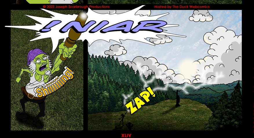
Specifically, he wanted me to weigh in on the last panel of "Strip XLIV - ecnaD niaR." Let's look at the panel in question.
Several cool things are going on with the panel, but I want to start by saying that I appreciate the use of overlapping elements between the last panel and the prior. Combined with the dramatic pose from a raised angle and the fact that the figure is cutting into his dialogue balloon works out quite well. A lot is going on across these two panels. It also spills into that final panel, giving a sense of time as the cry of "Rain" -backward - fills the scenery.
As for that final panel, I think there is a lot to like, but I also have a little criticism. First of all, the sense of scale and depth is solid. I get a sense of the vastness of the environment, ranging from the more detailed trees in what we might call the "foreground" compared to the jagged outline that makes up the distant forest. Also, I like the use of clouds as framing on the horizon - they bring the incoming rain cloud, but they are also quite literally peeking over. Overall, the combined elements sell the idea of what is happening, and it's a strong panel to end a page on.
With that said it could be stronger. The most significant issue I have with the panel, and more to the point, the visual style of the comic, is a lack of contract. Because of the heavy use of photographic texture rather than color fills, elements get lost. For example, the figures that occupy the lower portion of the panel blend in with the dark green of the grass. I'd either lighten the figures up or use some lighting trickery to spotlight around them, especially given the lightning arc.
That leads to my other issue: the lighting looks weak in comparison to the environment, such as the clouds. The clouds pop the most in the panel because they are so stark and bright and give contrast. One way to make the lightning more impactful might be to actually draw it in, much like the clouds, rather than use a brush setting that gives it a halo. Imagine hand-drawn lightning thicker with black outlines that cut across the page, and you might see what I mean.
The panel is largely great regardless of my quibbles, mostly regarding an established visual style. Good work, and thanks for being kind enough to send me something to sink my teeth into.
If you want to find earlier editions of Panel By Panel, click here.
On that note, please let me know if you would like to see me expand into a more general art critique panel periodically. And if you want me to write about your panels, my DMs are open. Thanks for reading.
____________
Don’t forget you can now advertise on DrunkDuck for just $2 in whichever ad spot you like! The money goes straight into running the site. Want to know more? Click this link here! Or, if you want to help us keep the lights on you can sponsor us on Patreon. Every bit helps us!
Special thanks to our patrons!!


Justnopoint - Banes - RMccool - Abt_Nihil - Gunwallace - PaulEberhardt - Emma_Clare - FunctionCreep - SinJinsoku - Smkinoshita - jerrie - Chickfighter - Andreas_Helixfinger - Tantz_Aerine - Genejoke - Davey Do - Gullas - Roma - NanoCritters - Teh Andeh - Peipei - Digital_Genesis - Hushicho - Palouka - cheeko - Paneltastic - [https://www.theduckwebcomics.com/user/L.C.Stein/]L.C.Stein - dpat57 - Bravo1102 - The Jagged - LoliGen - OrcGirl - Miss Judged - Fallopiancrusader - arborcides - ChipperChartreuse - Mogtrost - InkyMoondrop - Jgib99 - Hirokari - Orgivemedeath Ind - Mks Monsters - GregJ


Comments
Please login to comment.
Login or Register${ comment.author }} at
${ comment.author }} at