Panel By Panel: Kingdom of Cats and the Boundary Break
hpkomic at June 2, 2023, 1:23 p.m.

Hello everyone, and welcome to Panel by Panel, a periodic exploration of comic panels around The Duck. We return to our regularly scheduled program this week, where I find interesting panels and wax philosophical about them. Previously we did a scavenger hunt which was a lot of fun, but we're going to knuckle down and focus on panel analysis for the next couple of articles.
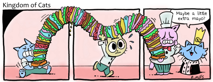
So… who likes cats? That's how I will segue into today's selection, Kingdom of Cats, by Rachel87. We're looking at a specific strip, the first one, actually, which shows the comic is off to a good start. Here is the strip in question:
So obviously, we're going to talk about the boundary break in the comic as that big-ass sandwich spans three panels but occupies the space outside the panels. If you subscribe to the theory that panels are moments in time, this sandwich is technically outside the time boundary.
The theory about panels spanning time is something I am cribbing loosely from Scott McCloud, who articulated it best in his book [url-https://scottmccloud.com/2-print/1-uc/index.html]Understanding Comics. Still, the gist is that you could look at each panel as a unique moment in a sequence and that, depending on the visuals between panels, more or less time can pass between those panels. So, on the one hand, the central panel showing the cat carrying the mid-section of the sandwich is doing extra work because you can get the sense the sandwich is being carried for some time.
Of course, the most obvious gag here is that this is a big-ass sandwich, and the joke is that it breaks the panel boundary by sheer size is the main takeaway. But when you think about the construction of comics and how sequencing plays out, there is quite a lot to it.
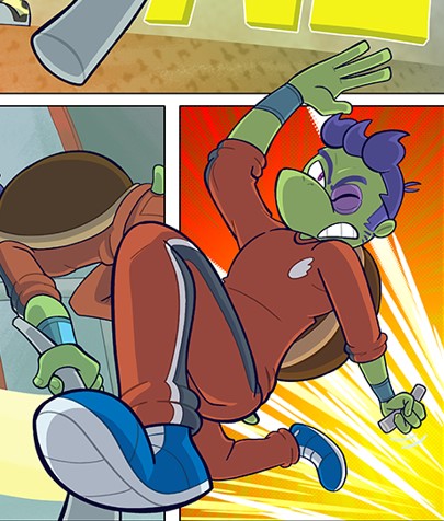
It's also interesting to see a boundary break like this. Usually, overlapping elements, such as boundary breaks, can be used to give a comic the appearance of more three-dimensional depth. Comics are a largely flat medium, originating on printed pages, so visual depth is entirely simulation. Aside from perspectives and foreshortening, layering is the biggest tool for making a page feel more three-dimensional than it is. Allow me to indulge in an example from my webcomic, Cosmic Dash, for a second:
In that example, I have the character popping off the page through extreme foreshortening and a boundary break across two panels.
But in the case of Kingdom of Cats, the emphasis on the boundary break is less on three-dimensional appearance as the comic is entirely designed on a single plane, and more about serving a simple gag, but it works quite well. The comic doesn't appear to be angling to me more three-dimensional, but rather using the nature of panels to make the sandwich appear larger because of the temporality created by the panels.
Wow, I wrote a lot about a sandwich in a comic strip, huh?
Please feel free to share examples of boundary breaks in your comics in the comments. I'd love to see them! Thanks for reading.
____________
Don’t forget you can now advertise on DrunkDuck for just $2 in whichever ad spot you like! The money goes straight into running the site. Want to know more? Click this link here! Or, if you want to help us keep the lights on you can sponsor us on Patreon. Every bit helps us!
Special thanks to our patrons!!


Justnopoint - Banes - RMccool - Abt_Nihil - Gunwallace - PaulEberhardt - Emma_Clare - FunctionCreep - SinJinsoku - Smkinoshita - jerrie - Chickfighter - Andreas_Helixfinger - Tantz_Aerine - Genejoke - Davey Do - Gullas - Roma - NanoCritters - Teh Andeh - Peipei - Digital_Genesis - Hushicho - Palouka - cheeko - Paneltastic - [https://www.theduckwebcomics.com/user/L.C.Stein/]L.C.Stein - dpat57 - Bravo1102 - The Jagged - LoliGen - OrcGirl - Miss Judged - Fallopiancrusader - arborcides - ChipperChartreuse - Mogtrost - InkyMoondrop - Jgib99 - Hirokari - Orgivemedeath Ind - Mks Monsters - GregJ


Comments
Please login to comment.
Login or Register${ comment.author }} at
${ comment.author }} at