Quackcast 628 - Cover me!
Ozoneocean at March 28, 2023, midnight
 LISTEN on our new player!
Listen on Stitcher - https://www.stitcher.com/podcast/drunkduck-quackcast
Or TuneinRadio - https://tunein.com/podcasts/Books--Literature/Drunkduck-Quackcast-p1150194/
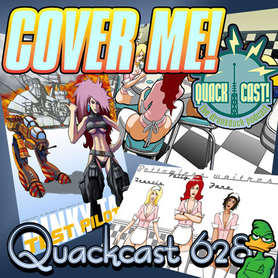
We're talking about the importance of a good cover in this cast. Another technical comicscast! I love making coves, they're one of my fave things because I get to stretch my artistic muscles and get a little more flashy and creative with my art and graphic design. They can also be pretty dread things to work on when you've used up all your creative powers on your actual comic and have nothing left over…
The art of creating covers is extremely important! It's the initial thing that attracts people to your work along with the title. I'm huge fan of all covers, it's one of the things that got me into art in the first place: books, albums, movies, games, posters etc, cover-art can be so cool! There are many different kinds of cover art, but number one fave is art that illustrates an exciting, evocative scene from the story it's promoting, something that makes you want to find out more about what's happening behind the scene you're looking at. Good covers not only attract your attention and get you to look at or buy something but they can be a part of the ACTUAL thing, just as much as the story itself, especially for book covers and album covers- covers ADD to the work, they're part of the experience.
Another great cover type is a sort of medley of story content as well as having a bit of story narrative on there. Josh Kirby was known for doing that with his Terry Pratchett covers, he'd have everything on there, all sorts of Easter-eggs for the reader to spot. The art was weird and bubbly but fun and it captured the flavour of Pratchett's writing so well. Indiana Jones and Star Wars movie posters are typical of this in a way too- their primary focus is the "pin-up" image of the main characters, but they also have little bits and pieces form the story there to reward you if you look for them.
Pin-up covers are when the main focus is a person or persons, usually the main protagonist in a story but not necessarily, especially with album covers. These can be hit or miss. They're very popular because they're so easy to make but can be really bland and chicle if done badly, or people just get carried away with the "sex sells" adage and don't go beyond that (I make all these mistakes!). A good pin-up doesn't just have a figure but it also expresses something unique and interesting about the story itself, this could be as simple as showcasing a really unique and interesting looking character that makes people want to find out more about them.
What I like to call the "graphic design focused" covers can be a mixed bag too. These can have really cool design elements that make you want to know more- with clever use of symbol or text. Or they can be just massively bland and tedious like those that use a generic symbol in a boring way or simply have a giant title and author name and nothing else. These are lazy and stupid. Lazier and stupider though are the designers who make covers using cropped copyright free art- typically they crop a portion from a classical painting that has nothing to do with the work they're promoting, and stick generic title and author credits on it. or they do the same thing with a licensed stock photo.
Photographic covers in general can be problematic, not because photography is bad but because it seems easy so people often create bad cover images with photos (especially author photos). They don't realise that you have to be just as artistic and creative with photographic images as you do with other kinds of artwork.
The bottom line with cover art is that regardless of the approach you take, the more unique it is to your work the better! The more generic and meaningless the cover the more crap it will be (though there are always exceptions… Penguin classics anyone?). Given that criteria, it's advisable not to use AI art!
What are your fave types of cover?
This week Gunwallace has given us the theme to Kingdom of Cats - An early morning start, sun streaming golden at a low angle, on the road, moving away, moving towards, making a start.
Topics and shownotes
Links
Featured comic:
Danse Macabre Danse Amour - https://www.theduckwebcomics.com/news/2023/mar/21/featured-comic-danse-macabre-danse-amour/
Featured music:
Kingdom of Cats - https://www.theduckwebcomics.com/Kingdom_of_Cats/ - by Rachel87, rated E.
* Theme music taken from Gunwallace's theme to Thrud Goddess of Thunder - https://www.theduckwebcomics.com/THRUD_Goddess_Of_Thunder/
Special thanks to:
Gunwallace - http://www.virtuallycomics.com
Ozoneocean - https://www.theduckwebcomics.com/user/ozoneocean
Kawaiidaigakusei - https://www.theduckwebcomics.com/user/kawaiidaigakusei
Banes - https://www.theduckwebcomics.com/user/banes
Tantz Aerine - https://www.theduckwebcomics.com/user/Tantz_Aerine/
VIDEO exclusive!
Become a subscriber on the $5 level and up to see our weekly Patreon video and get our advertising perks!
- https://www.patreon.com/DrunkDuck
Even at $1 you get your name with a link on the front page and a mention in the weekend newsposts!
Join us on Discord - https://discordapp.com/invite/7NpJ8GS


Comments
Please login to comment.
Login or Register${ comment.author }} at
${ comment.author }} at