

Avart wrote:
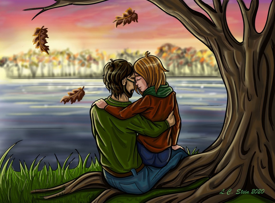
@Demas_Olich, I post my comments in your comic. While it's just a few pages your characters are well drawn and you aren't affraid of using diferent angles, which I like the most.
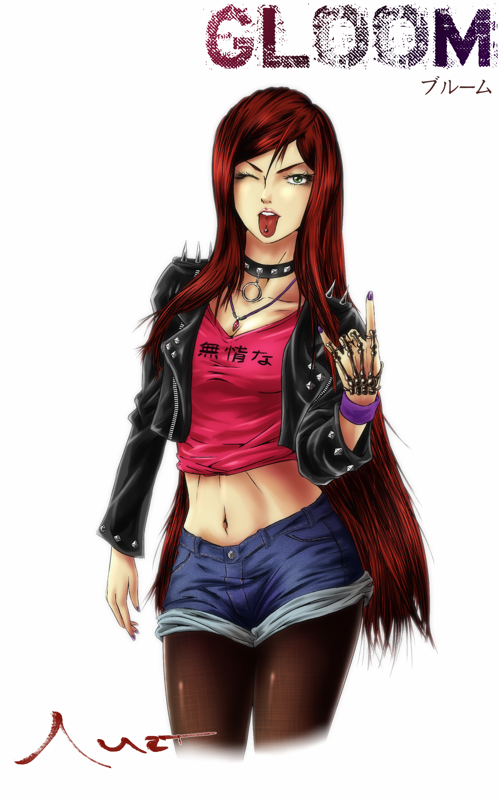
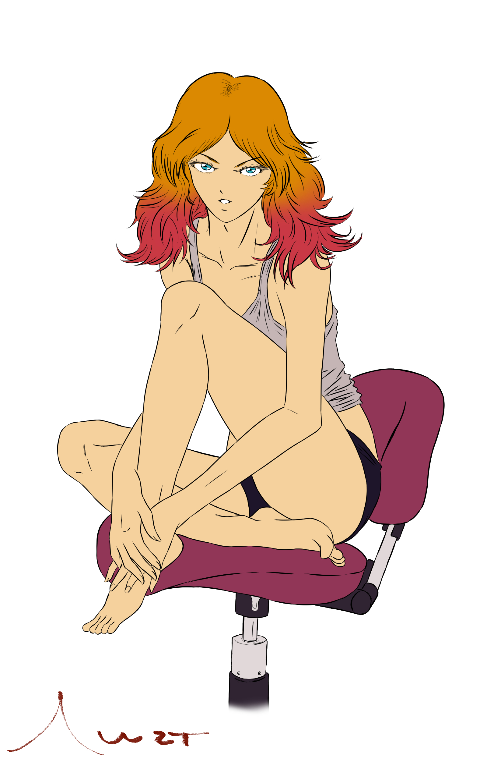
Now, I'm including this fairly recent art of my protagonist Usui Hitomi, which I like to give a punky-look that it's a perfect opportunity to show us her pierced tongue.
Hope you like it ;)
P.S. In this page of my comic I show the process of this art.
P.S.2 The kanji on her shirt reads 'heartless'
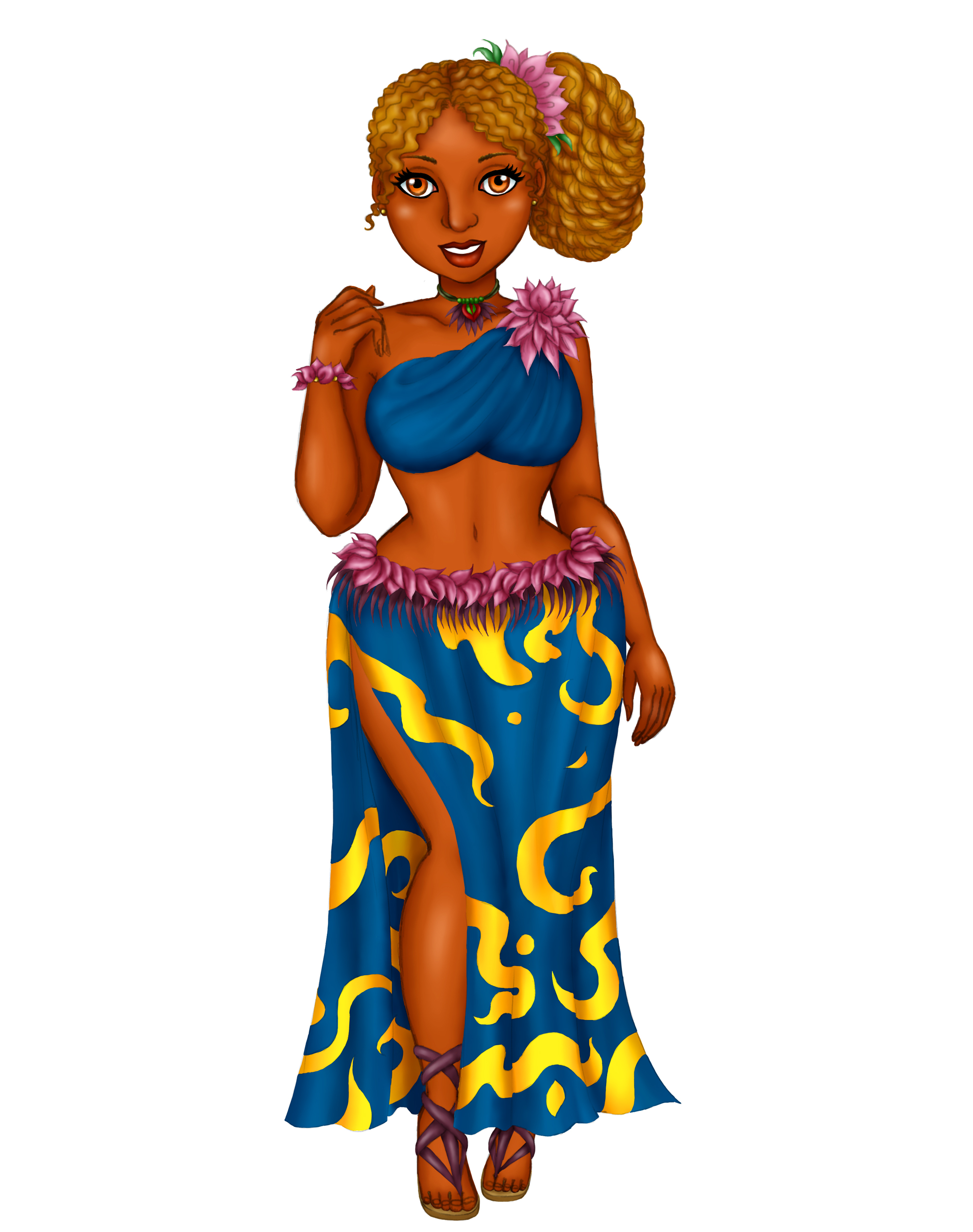
I really like your characters looks, she seems punkish, the type that I really adore and actually gave me some inspiration for me to design one of my charaters, Indyah Summers, for the upcoming volume I'm working on. Really loving the design! :)
For anyone wanting to critique or give feedback on character I made, here ya go! The art was made by Emmanuel for my character Stringy for Stringy and Mopy: The Adventure Begins #3. Tell me what you think. :D


