so the rules are to comment about the art piece of the previous poster. and then post your own art work (kind of like the other topic on the comic subforum)
so here goes, ill start: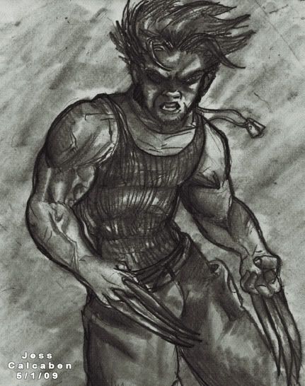

Start publishing on
DD Comics!
Advertise with us

Meet, Greet, Show and Sell
Comment on the Art Belonging to the Person Above You!!
so the rules are to comment about the art piece of the previous poster. and then post your own art work (kind of like the other topic on the comic subforum)
so here goes, ill start:
Nice wolverine! A lot of emotion on the face, and the muscles have a good sense of volume.
however, when I glance at it quickly, it looks like he has a barbie-doll waist; it's because of the light line here:

—————————-
here's a watercolor I did not long ago. (11x17)

ive never seen art from eityher of you two, good stuff so far!
kristen i really like that piece, especially the rendering of the dogs fur and face…great depth! however, I feel that the two different objects in your pic contrast and clash rather than working together as a cohesive unit…the colors on the persons face do not go with the dog at all. maybe some highlight of color on the dog would make it seem more "together" cuz right now it looks seperate. hope that helps! :)
and heres something from me =\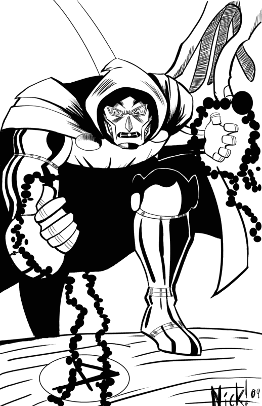
This is all great stuff we have going here. I love wolvy and the amount of shading put into it, and that water color is pretty well done. I just love the style you have too kristen, your art reminds me of the art from the steam boy and akira animes. The Dr.Doom piece is awesomely drawn as well. Nice proportions and I just like the overall style. Now here's a work of mine that I did based off marvel chars. too…it's not much of my best work though…
YAY!
Wow all of these are good so far.
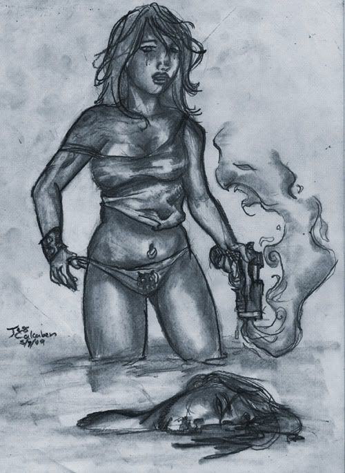
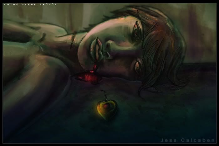
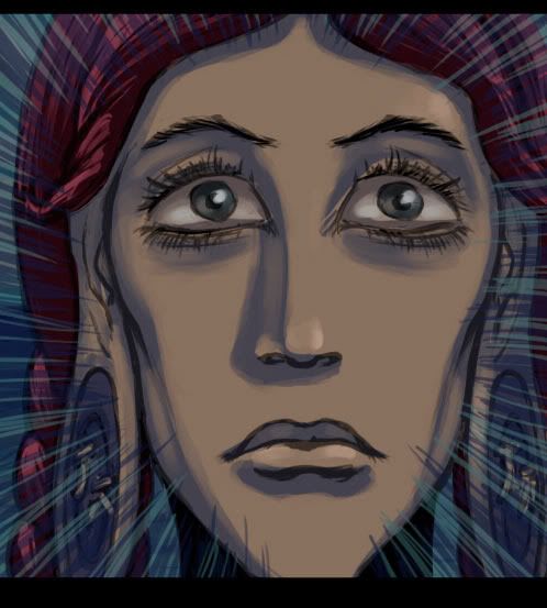
Hmmm… I wonder what caused that sexy chic to put a bullet in his brain. I like it.
Nice Wolverine pic as well Sub. I take it that was before Wolverine joined Broadway. :D
@Nickguy cool pic of Dr. Doom, I really like the thickness of your linework. It really makes the picture pop. Kind of has a Kirbyesque look to it.
@Kristen I admire anyone who can do watercolors. I can't produce anything with that stuff.
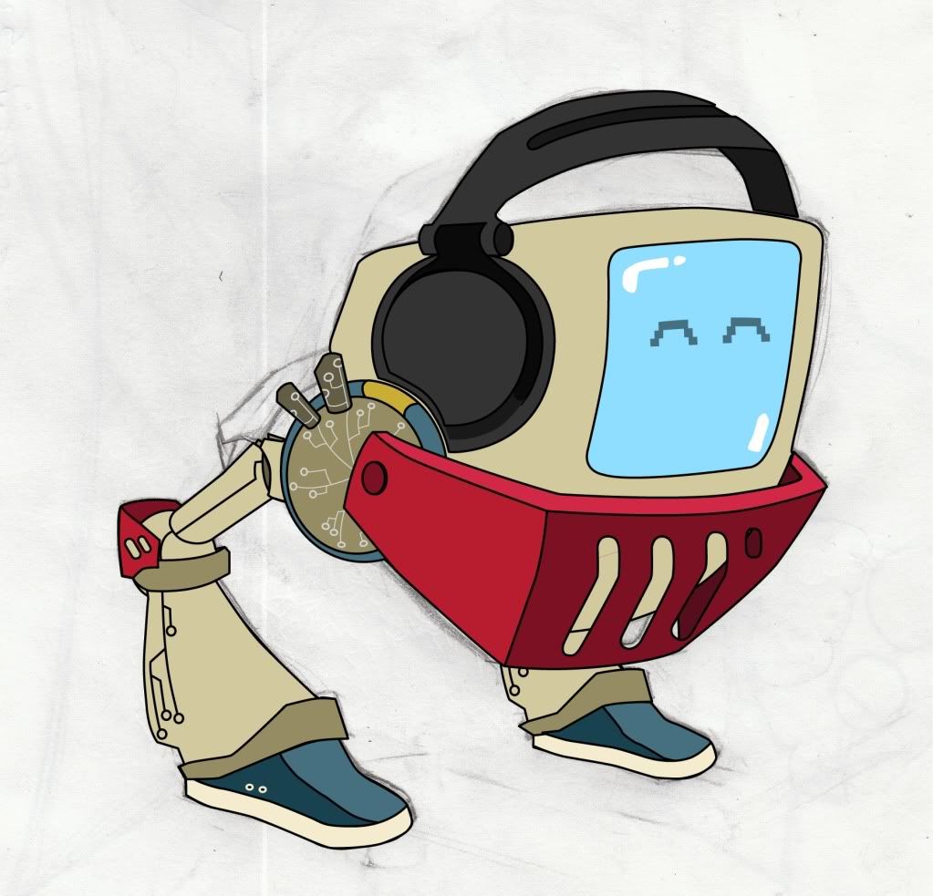
@alex It looks like the Teen Avengers! :)
I'm pretty sure Dave Thomas is rolling over in his grave because of this one.
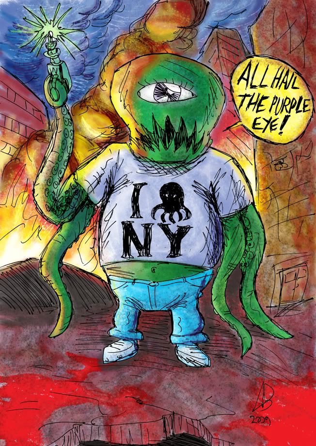

Here's mine:Cool, reminds me of a royal card, as well as being freaky and mutated. Nice radial symmetry and the colourong has a nice contrast and watercolourish effect. :)
—-
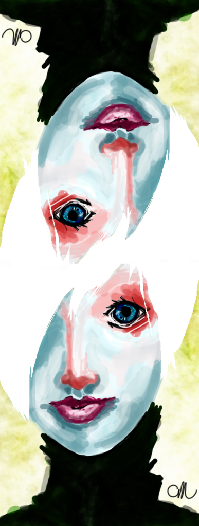
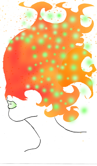
I find that when I take a break from drawing sometimes, my style takes interesting new turns… I'm always interested in how Pinky will look the net time I draw her:
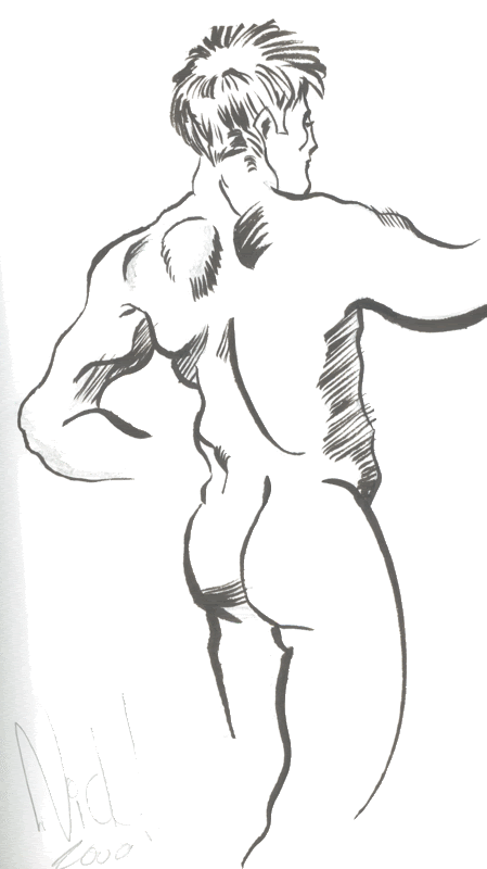
Right, so… I like the changing line weight a lot I think the right shoulder/upper back could use some more details (the lone shoulderblade on left looks slightly weird) but over all it looks good.
- - - - -
This one was made yesterday, too me somewhere between 90-120 minutes.
I'll have to do a short comic in this art style someday (got a couple of 48-52 page long concepts).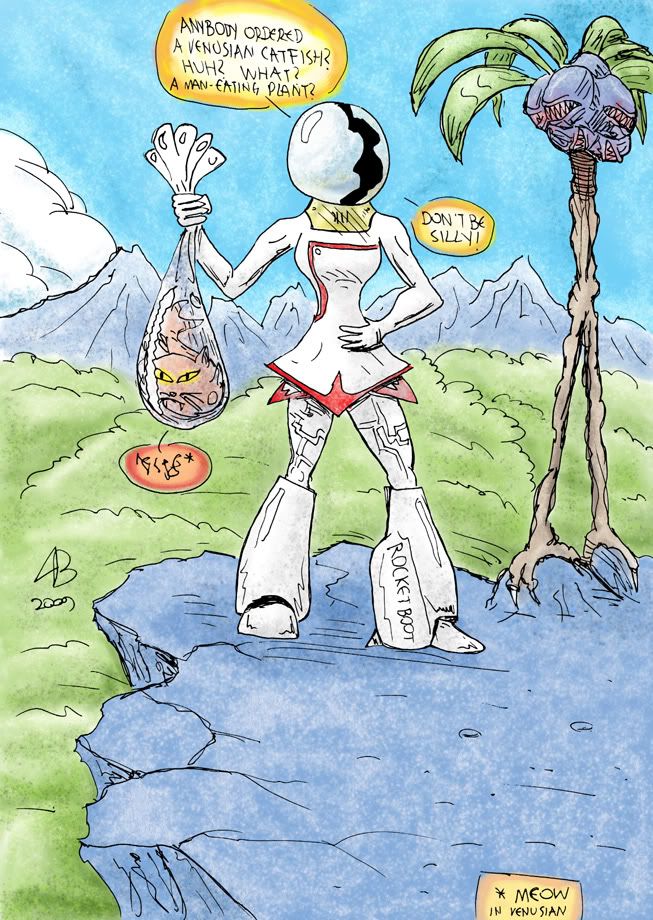
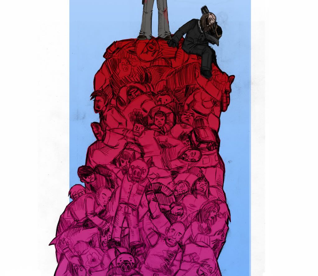
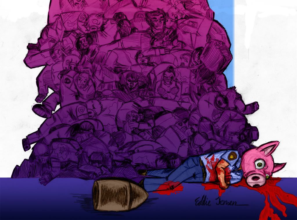
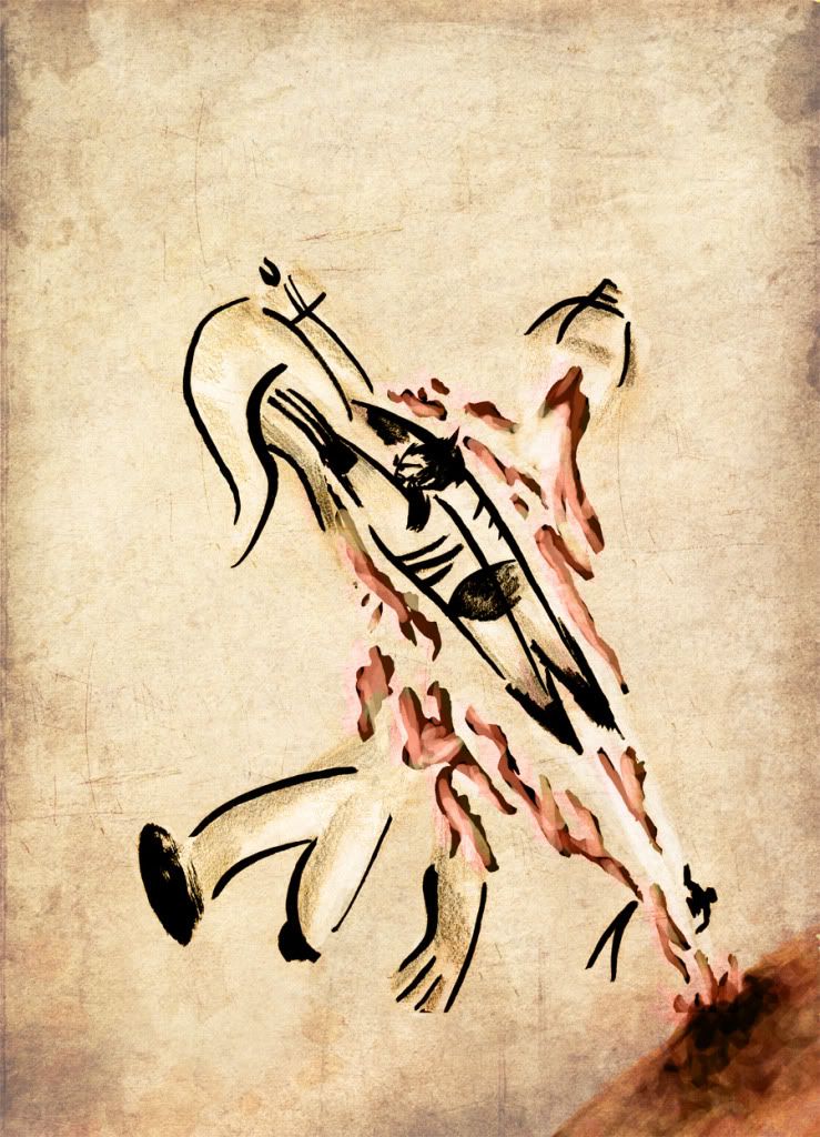
That's very…different, and very cool! I like how the 'pigs' are literally pigs… I'd like to have seen that fight. XD
Very nice coloring there.
___
I don't have much new stuff to show, but a lot of people liked this simple pic at Deviantart…sorry about Topaz's (the light-haired guy) weird arms though. -
I really like the positioning of the two characters and the all around softness of the picture. ;) Topazs' shirt reminds me of an 80's style motorcycle gangster. And that makes him automatically made of win.
~~
Heheheh, this picture was a project for my brother's geography packet thing. The theme was Africa and what had to be done was draw something that pertained to the continent (that also included it). The teacher liked it quite a bit, hur hurr.
I like the front two giraffe's heads, I think it is the dark in the middle of their heads that really make them look good. And I like how you blurred the background giraffe although at first glance I didn't think it looked great.
—
This I did at school and I think I will do a series of this scene with the spacemen springing the ambush on the aliens. Being a landscape shot it got smaller in the thread, here is the direct link
http://i659.photobucket.com/albums/uu320/ParkerFarker/coollandscape.jpg
ParkerFarker: There are some cool ideas in here, but there is a point where sketchy pencil lines and lined notebook paper really aren't going to help you get your ideas across. Get some unlined paper, and put something up here that really looks "finished"
Here are two quick little things i did WAY back. WAAAAAY BACK:
I put the blue one on a tshirt, it came out rather nice :)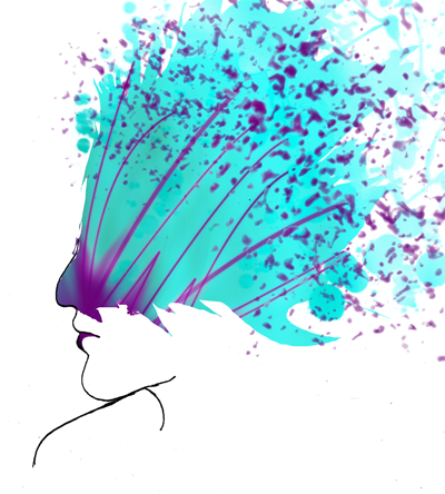
I like the paper texture, not sure if that's digital or not, but still. It's also very simplistic, but nice. Correct me if I'm wrong, but is that Wolverine? Nevertheless, great work, as always.
Just finished, took maybe like…an hour and a half total?
Only used a Pilot Precise V5.
Advertise with us
DDComics is community owned.
The following patrons help keep the lights on. You can support DDComics on Patreon.
- Banes
- JustNoPoint
- RMccool
- Abt_Nihil
- Gunwallace
- cresc
- PaulEberhardt
- Emma_Clare
- FunctionCreep
- SinJinsoku
- Smkinoshita
- jerrie
- Chickfighter
- Andreas_Helixfinger
- Tantz_Aerine
- Genejoke
- Davey Do
- Gullas
- Roma
- NanoCritters
- Teh Andeh
- Peipei
- Digital_Genesis
- Hushicho
- Palouka
- Cheeko
- Paneltastic
- L.C.Stein
- Zombienomicon
- Dpat57
- Bravo1102
- TheJagged
- LoliGen
- OrcGirl
- Fallopiancrusader
- Arborcides
- ChipperChartreuse
- Mogtrost
- InkyMoondrop
- jgib99
- Call me tom
- OrGiveMeDeath_Ind
- Mks_monsters
- GregJ
- HawkandFloAdventures
- Soushiyo