I'm yelling at the morons who seem to think that I should have to change my browser settings to be able to read.
You're calling me a moron? I was just trying to help–help you with the problem you said you have. Plus, if there is ever any other site that has text which you consider too small, or if someone in the forum changed their font size to something like 2 just so they can pretend they're whispering, it'll show up as your minimum font size.
But whatever. I guess you're too mad at the world to recognize when someone's trying to help someone with a problem.
We are asking that you all be patient and hopefully we can come to some sort of compromise about everything. Really, this scenario is exactly like the launch in 2006.
And we all got used to it. Like we should be attempting to do right now.
If the color of the ink on $100.00 Bills was changed to blue and you gave every person you met 2 of them some people would gripe because they weren't the old green ones. Hey, with the exception of the inability to drop, dead favorites, darn near everything I commented on has been fixed, or shows improvement.. no gripes here.
no one answered to my questions : 1. how do i view more of the updated comics? 2. how do i view more of the top comics? 3. how do i know the top comics updated?
Wouldn't using "Browse" answer all those questions for you?
no, i don't want to see every little comic there is on drunk duck in wathever order possible. i want to know wich one updated in the current day, and not knowing the date it last updated, its useless
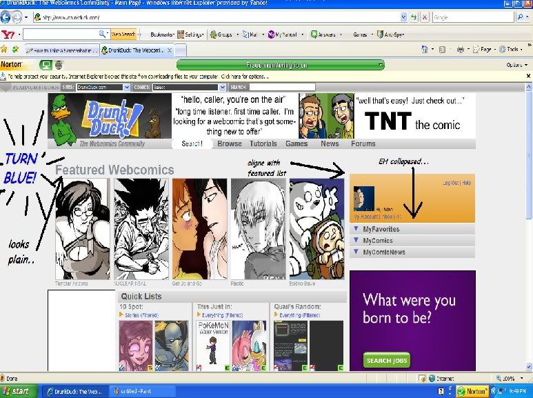
I really, really abhore the new layout. I think it's 100 steps backwards progress wise than the last one. The only thing I kind of like is the thumbnails, however, I have many objections.
1) The white background is killing my eyes! It's very uninviting. I can understand wanting to brighten up the page, but it just makes it look like the layout isn't done.
2) The layout is poorly designed. I liked the news on the front page, the thumbnails are assualting you on the front page, there is way too much empty space, and overall it looks like whomever designed the front page didn't know a thing about html.
3) Now DD is even more unfriendly towards msn users. With the old layout, while I couldn't fav. comics while looking at DD on msn, I could at least see the comics I favorited through Firefox. Now when I look at DD via MSN, I can't even get my favorites to show up. It's just a little bit annoying having to use another internet viewer just because DD is MSN unfriendly.
It's pretty much what everyone already said, but I'd just like to make a plea to please, please, PLEASE go back to the old layout! I thought when I first saw the new layout, that you were in the process of redoing it and that you weren't finished yet, but now that I see that it's staying, it's really a big turn off. :(
Another small gripe. Can we get the ability to filter by Rating as well?
Some of the Adult comics have very uninviting images on the thumbnail that I would rather not be looking at =p
I see one of the mods mentioned that this new layout should make bug fixing easier as well. I hope so. That makes me feel a bit more comfortable.
I have to say, a very big issue about the bugs in this change was the fact that so many bugs had gone unattended to for so long. However if the face lift is ALSO to remedy new bugs and old then that's great to know!
Personally, the color choice of the current layout is very bland. Also, I'm prone to getting migraines from bright layouts and… Well.
There's lots of other issues already mentioned so I wont bother bringing them up.
I do however suggest that in the future DD do versions of beta tests or have polls so the users are more involved in sharing their opinion. Probaly will help with weeding out the bugs early on and have more sastified users. Just a suggestion for the future.
If DD did have something similar that was done before it was lauched, I never heard of it.
I really don't get the "white background" gripe. You guys don't use Google? Or YouTube? Or Wikipedia? Or Ebay? Or Facebook? Etc? Black on white is the easiest to see for the most people. It makes sense to make a white BG when you want to draw in the most audience.
I do, however, hope that they'll be customizable to user settings.
I really don't get the "white Background" gripe. You guys don't use Google? Or YouTube? Or Wikipedia? Or Facebook? Etc? Black on white is the easiest to see for the most people. It makes sense to make a white BG when you want to draw in the most audience.
I do, however, hope that they'll be customizable to user settings.
The thing is that all those websites you listed where with a white background from the beginning. I think the whole blue with the dots it just drunkducks "thing" you know? Youtube and wikipedia etc have white as their thing so yeah.
I did notice Volte fixed the un-eveness of the page though. :)
We are asking that you all be patient and hopefully we can come to some sort of compromise about everything. Really, this scenario is exactly like the launch in 2006.
And we all got used to it. Like we should be attempting to do right now.
I'm still attempting to get used to it.
But… no matter how I try to look at it positively, the main page looks like something done by an amateur webmaster who does his pages on Geo-cities. It doesn't scream: "Awesome web-comic hosting site with an excellent community" to me. It's the ads on both sides of the page that's giving it that Geo-cities feeling.
I just keep on waiting for the changes that was promised to be made. Of course I'm hoping it's coming sooner than later…-_-
I liked the old one a LOT more- it looked more proffessional, and was easier to navigate visually- this page confuses me. Also, I liked all the different features we had on the homepage- I miss the news. Also, I really really don't like the new minimized lists at the side- there's no reason for it, it's just hassle to have to maximize my favorites and comics. phew, done.
Is it just me or does this all reek of AJAX for the sake of AJAX though. Pretty much everything happening on the main page I did with javascript and PHP yeeeaaars ago and still managed to get a more stable result. Hell, DD ITSELF did the same thing years ago and it worked, save for having collapsable lists. But even those are easy to accomplish in javascript.
I don't know if it's because of the new layout or not, but DD was having problems loading earlier. I tried all the stuff with clearing cache's etc, and I even tried restarting my computer.
It fixed itself after a few hours of sitting though. It'd be nice if it hadn't happened at all.
Oh, and I have a suggestion. If you guys still have the old template on file somewhere, why not switch back to THAT while you work out the kinks in the new one? That way, people won't bitch so much, and when you DO put the new one back up it will work properly.
I really don't get the "white background" gripe. You guys don't use Google? Or YouTube? Or Wikipedia? Or Ebay? Or Facebook? Etc? Black on white is the easiest to see for the most people. It makes sense to make a white BG when you want to draw in the most audience.
I do, however, hope that they'll be customizable to user settings.
My thought here is that a white background requires much more careful layout. It's much harder to make a white background look GOOD, I guess.
Google does it the best because of its simplicity. A logo, a search bar and a few text links on a white background is beautiful, elegant simplicity. It looks finished. It looks DONE. It's less easy to handle when it's a lot of pictures and thumbnails on a white background with little to delineate between sections.
Wikipedia works because it looks like a book or a newspaper- the things it's BASED on are white, and it's mostly text, and that makes it much easier to read, what with it being mainly about reading.
As for Ebay and Youtube, I don't think they DO look attractive. I find the usability of Ebay suffers sometimes because of the overcrowding of its pages. But I don't think they NEED to be attractive in the same way that an art-based site which needs a careful design to pull in readers does.
White works sometimes, and not others. It depends on the look, content and purpose of your website. I think the reaction here shows the difficulty people have with it working here. If you're not lucky, it seems to cause a site to appear unfinished, or unplanned. I think that's the case here- I totally appreciate the intent of the white background, but in practice I do feel that looks like a stripped down model that still needs to be built on.
My take on this whole debate is that some (most) of the ideas here are GREAT, and will be of huge benefit to the community. Coming up with new ideas is wonderful. But the other side of improving things is listening to feedback- I'm not just talking about with the new design, but the bugs forum, the ideas forum, etc. And I think a lot of people here feel like they're not being listened to- that their ideas and hopes for the site are falling on deaf ears.
Whether that's true or not, I think more communication could only be a good thing. I know you're all busy people, but if someone reports a pretty serious bug, and it gets passed on to Volte, and he's working on it, but we never hear about that, it seems like it's just being ignored. If we were left a little note to say "Hey, Volte's aware of this and it's on his to-do list", then everyone feels a little happier. And I'm sure you'd get much less whining and tantrums. ;)
Old: 1) The Lists instead of Racks. I found good comics based on the title, not the thimbnail image(others may disagree) 2) that little comic list to the right was better then the Dropdown of the new 3) Featured comic rotation 4) the Tabs that took you to different genre's(Like the Horror and Manga sections. was looking forward to all types of genres to have that one…)
New: 1) The Text Bubble with the Comic's "Short Description" is Great. I was wondering if it had a use besides the Comic Home Page 2) New Banner looks nice
but that's what i wuld do if i had control of this site(which i don't)
Alright, if you want my civil opinion on all of this, other than the fact that I'm still fed up with the mass of ads you decided to put everywhere and a half bogging down the connection speed, all I really have to say is that I'm not liking the tabs to see favorites and definitely for news. I believe news should have stayed on the front page.
I believe news should have stayed on the front page.
This is a pretty common one, and I completely agree. Nobody's gonna read it anymore, guys! People are gonna feel jipped because their comic won't get any more popular due to their milestones.
I guess I just mean that if there was one major complaint I had about the new design, this would be it. I'm trying not to sound negative, because I really do like the new design as a whole and think the site will be better for it when all the bugs get fixed, but I think not having the news on the front page was just a bad decision.
I believe news should have stayed on the front page.
This is a pretty common one, and I completely agree. Nobody's gonna read it anymore, guys! People are gonna feel jipped because their comic won't get any more popular due to their milestones…
As an FYI, just about every Admin feels this way too. It seems to have made the front page a lot less personal now. So, this is noted, and hopefully there can be some sort of compromise soon.
My other major concern is that the reviewer's blurbs for the featured comics, but volte says that will change back soon.
Just curious. Do the people that are being venomous and RUDE think that their posts will be addressed quicker than others?
There is a thing called diplomacy. You may want to try it instead of acting like whiny jerks.
The text thing is noted. Nobody is going to fix it on Sunday. Do you have to keep yelling about it?
I think it's because most of the people here have been shrugged off when it comes to suggestions before. When your stance of fixing bugs or adding features that are of crucial use is "well that just like your opinion, man…" it doesn't help your image. Of course a large portion of the admins and mods here have very very little to do with the actual code, or much past organizing events, posting news, and policing users. However, a lot of people see "admin" next to someone's name and assume they can fix everything.
And when that doesn't happen you get users who express their views more and more in a shitty manner. Quite a few of us are keeping things civil in this thread in order to push for improvement, at least those of us who want to see the community grow.
It's a mixed bag, mate. I don't think any one person's opinion should be looked over, no matter how harsh. That doesn't mean you have to agree with it, however.
I really don't get the "white background" gripe. You guys don't use Google? Or YouTube? Or Wikipedia? Or Ebay? Or Facebook? Etc? Black on white is the easiest to see for the most people. It makes sense to make a white BG when you want to draw in the most audience.
I do, however, hope that they'll be customizable to user settings.
Again, I just don't think those people have been around long enough to know DD used to use tons of white. Also we're coming down from a page that was very color heavy, so it's a bit of a shock to the eyes. I like more shades of grey, personally, at least when you're using so many color heavy images.
I think it's because most of the people here have been shrugged off when it comes to suggestions before. When your stance of fixing bugs or adding features that are of crucial use is "well that just like your opinion, man…" it doesn't help your image.
I don't remember anyone doing that. If you can post examples, I'd appreciate it. Unless you are talking about the 2006 re-image. In that case, fair enough, I was as big an ass as anyone else acting ass-like. But I don't think anyone has shrugged anything off. As a matter of fact, lots of opinions that you guys have had are ones that we brought up in the admin forum before the launch. But, unfortunately, the launch could not be delayed, for several reasons I don't feel I should get into here.
We've suggested "work-arounds" for now. I don't think anyone has ever said "too bad that's the way it is". Not even Volte, the guy that actually does the code.
And yeah, we've said several times that none of the Admins except Volte work on or have access to the coding. He's the only guy doing it, and he's doing it between other things Platinum has him doing. This is not his only project unfortunately. Far from it. One fo these days I hope PS realizes volte needs a TEAM working for/with him.
Advertise with us
DDComics is community owned.
The following patrons help keep the lights on. You can support DDComics on Patreon.