OK, we had a Quackcast about creating your world a while ago, but that was mainly in terms of writing. Some people touched on the visual aspects, Falopian Crusader among them, and Usedbooks showed us her city map…
-For this Quackcast we're going to talk about creating the LOOK of the world your story takes place in. Whether that's just the flat scenes with a few props you get in a comic strip or the whole city you get in Tantz Aierie's Without Moonlight (https://next.theduckwebcomics.com/Without_Moonlight/)
Do you do research? Just base it all on imagination? Draw what you know? Do you do designs for buildings, floor plans, interiors, the objects within the room?
What about the colour choices of your environments- Do you go for a unified schme or just do whatever?
Do you attempt perspective? Base your stuff on a real city? Use photos? 3D design?

Start publishing on
DD Comics!
Drawing your world! - world drawing cast
All of the above.
I guess it can be a little different with CG comics as often we use a lot of premade resources.
For BASO I don't research that much, but I always had a plan that different star systems would have varying levels of technology and different design. the design asppect made my work a lot harder, the tecgnology made it easier. I did research planet and star types a lot mind, that in turn led to inspiring other ideas, which led to more work for design.
With Lore I do more visual research, I often have a rough idea of what I want but sometimes it needs refining, often a google image search will find some art to inspire me or a film might be put on, or in some cases a computer game.
I've created a world map for it, with a more detailed local area mapped out too. This has a few notes on ecology in it as well. The ecology part helps ddefine the writing more than the visuals but a few details can inspire those too.
I have research buildings for lore more than anything, as I plan to have each town they go to be visually different. This has proven to be a lot of work when it comes t modelling the buildings.
For the Godstrain, all my scenery is based on real locations (except for the secret base, but even that is set in a real area), although I may exagerate the scenery a little… I haven't actually named the main city and area my story is set in. Guesses are welcome of course ;)
My middle name is research. I have heaps of research materials and books and liberally mix and match. But for the figures I am often limited by what is commercially available and what I can afford. I mean $85 for a 1/6th scale wheel chair… well there won't be any wheel chairs. It was nearly the same for some hospital beds so I built it myself instead.
You'd be surprised what you can do with foamcore, posterboard and Styrofoam. Add a few scraps of old tee-shirt and viola! hospital/examination beds. For interior design I generally go with neutral colors because they photograph well and are easy to paint. I use lots of Barbie furniture and that is all pink so re-painting is a must. Brown, beige, rust are all easy to mix and match. I also had a lot of fun redoing white furniture in dark wood tones. I matched the colors to the stain on my dining room set.
The most comprehensive sets though were for Interstellar Blood Beasts and Attack of Robofemoids. Attack of… was simple. Institutional colors. Green, ochre, grey and white. Interstellar Blood beasts was undated futuristic institutional colors with some inspiration from my tours of preserved ships and submarines. Grey and sea foam green and unexplained do-nothing go-nowhere pipes and stuff.. The simplest sets were for Mask of the Aryans where everything was Styrofoam painted at random with grey and black and lots of old t-shirts draped over other bits of Styrofoam. Nothing specific just enough to give an impression of a system of caverns and caves.
In future I want to get away from specific backgrounds and go more impressionistic like I've done with my drawn work in the Radio Plays and Security Breach. That was just creating a variety of textures in Photoshop, printing them out and pasting them up. That is what was done for most of the ship interiors in Interstellar Bloodbeasts. It was all variations of a texture of pipes and wires created in Photoshop. It was then printed out and put over interchangeable wall panels. Stuff that i could easily use once and then throw away.
As I mentioned, I usually draw blueprints for the settings before I start a long arc.
My settings are all ficticious, but I keep photo references for inspiration from places I've been. Occasionally, I look up furishing and designs online. I call my sister my "set designer" because I can tell her a setting, and she'll send me links on google or pinterest to designs that suit my purpose. I find this especially helpful in designing fancier location and rich people's homes.
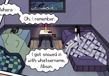
Some scenes are more researched than others, and it doesn't always show. This was set in the home of an antique collector/dealer (the guest room).
I looked up quilt designs and paintings and experimented with colors for a ridiculous amount of time. I wanted everything to clash. It's so much harder to make realistic colors instead of coordinated colors, because most people have things that clash in their personal homes (especially lovers of bric-a-brac).
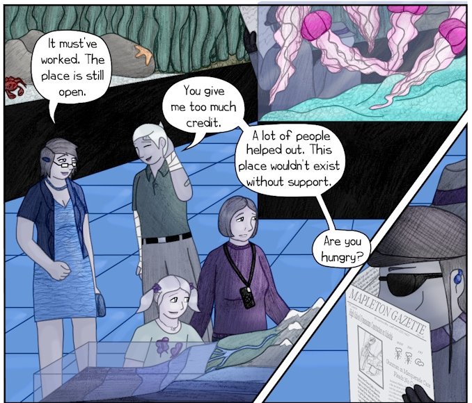
In a professional setting like an office or restaraunt, all the wood matches, the lines are neat, and there's little to no miscellany. It's "easier" to draw the simple, professional settings, but it gets really boring. I find I'm more motivated by the complex settings. This page is set in a little camp store, and it was a pain in the butt to draw. But it was very important because it set the whole layout. I had blueprints for it and practiced a few of the details before drawing it.
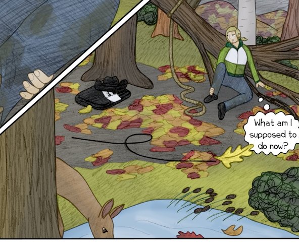
My favorite trick for keeping setting interesting (for me) is by adding animals wherever appropriate. Having an animal in the background means part of the scenery is moving during the conversation, which is especially good in the calmer scenes. I have to keep the critters from upstaging the characters, but it gives me something interesting, and it makes the world more alive. 


Full disclosure: I have degrees in zoology and biology; I grew up with pets of many species; I work in national parks, and my mom taught biology. Used Books is full of animals, mostly part of the scenery.
KimLuster wrote:Aw, thanks. I'm better at planning than execution. I also have to reference earlier pages a lot. It drives me crazy to spot an inconsistency – even if no one else sees it.
Usedbooks, you put so much thought and plannery into your scenery - Im so impressed!!
It can be very satisfying when you put in a needless bit of detail in a scene and think nothing of it. Then as the story grows inspiration hits and it takes on meaning.
Then there is something as simple as showing the character hitting the light switch as she enters a room. I like to put boxes of tissues everywhere.
A number of years (er, decades?) ago, a presenter at a writing workshop I attended said, "If you describe a rifle hanging on the wall, it should be fired before the end of the story." As a teenager, I thought that was good advice. As an adult, I realize it's a simplistic and foolish way to think about scenery.
Not every detail in a scene exists as a plot device. The little details make the world real, provide atmosphere, give characters things to interact with while talking or taking dramatic pauses. A more devious writer can use objects for misdirection or red herrings while others serve as foreshadowing either directly (the rifle on the wall that will be fired) or symbolically (a dead flower foretelling a character's death). – Anecdotal aside, I was watching a show (not going to name it because omg spoilers) in which a character is attacked and then a flower falls from a branch and lands on his motionless form. When it is revealed that he is alive but hospitalized in the end of the series, my brother said, "Then why did the flower fall?!"
You can go overboard with details in written forms, so I can sort of see why anything described should have some function. In visual storytelling, this is not the case. Establishing shots should be as detailed as possible. The detail could be to emphasize emptiness in a scene or order or chaos or activity or whimsy or darkness or whatever. Once the focus changes to the characters or action, it is necessary to dial back the detail for those panels. Including a lot of inert or potentially interactive scenery can also add flexibility to your writing. You start MacGyvering and Jackie Channing things. Oh hey, I drew a couch in the background! My characters can tumble onto that when the power goes out! Oh, I forgot I drew that table lamp there, we can use it in the fight scene! The character is bored with the conversation, what can I have her distract herself with? A deck of cards? Examining paintings on the wall? Counting ceiling tiles?
If all you include are the plot devices, the effect is that of a low-budget cartoon where part of the fence is clearly painted in simple flat colors on the animation cell while the rest blends in with the painted background. You know what's going to move in the scene. If every rifle in every story gets fired, it won't be interesting or surprising. Leave a few for decoration.
Yep - 'Chekhov's Gun' http://tvtropes.org/pmwiki/pmwiki.php/Main/ChekhovsGun - the notion that in writing you're never supposed to mention a specific 'anything' and then it have no bearing on the story in any way (even only as red herring). While I think that might have some merit in a purely written story, in a visual story it just doesn't work!! In comics, having characters doing things in a visual panel (smoking, slouching, checking their mobiles…) make a panel vibrant, whereas if you mention the same 'mundane' stuff in a written paragraph it could add undue clutter. But ya know… rules!! Break them :D
Over the years, my stories became far less description and much more dialogue. So now I just write dialogue. :P
I take sadistic pleasure in knowing which elements in the scene will play into the story, like a personal secret. Foreshadowing doesn't work well in webcomics maybe because there is so much "background noise." You have to direct people to pay attention on a reread. It becomes post-shadowing. You have to resist every urge to point out the presence of something innoculous like a rope or a fire poker or a gun on the wall and what terrible potential those things might have.
The famous Chekhov's gun, i think, is played in visual storytelling when you draw particular attention to an object… but everything in scenery has a function… sometimes they tell us a backstory, sometimes is placed there for athmosphere, and sometimes to mess with those people who think everything has to have a function…
usedbooks wrote:Actually the reference I was taught was that if the gun on the wall is fired, it better have been mentioned earlier and not just appear out of nowhere. That is good scene setting in fiction.
A number of years (er, decades?) ago, a presenter at a writing workshop I attended said, "If you describe a rifle hanging on the wall, it should be fired before the end of the story." As a teenager, I thought that was good advice. As an adult, I realize it's a simplistic and foolish way to think about scenery.
>"Oh it was always there…"
>NO, if it was it should have been mentioned.
I believe changing things afterward is retconning? Oh it was always that way I just forgot to mention it…
Now you can approach scenery one of two ways (or somewhere in between)
>The only props are the ones that will be used. The only scenary is only what matters. This is usually used in minimalist settings especially in theater. Classical tragic theater going back to ancient Greece didn't have tons of property. Only the things that are used in the drama are there. One play I did had no walls. There were a few windows hanging down because characters look out them and the only door is the one mentioned in the script as being opened and closed.
>If it is there in real life, it better be there used or not. So every drawer, even if the drawer is never opened better have all the stuff in that the drawer would if a real room. If the setting is a classroom there will be a pencil sharpener in the back whether anyone ever even looks at it. If there is a chalkboard there better be an eraser and chalk even if nothing is ever written or erased. And if at some point it is used, it better have always been there.
>Not , oh I need an eraser *POOF* there it is and it's always been there. Um no in previous episodes it was NEVER there! Retcon time.
Of course this can lead to some great gaffes too. Where the property master couldn't get the right X but still needs an X so any old thing is thrown in there. Look at the state flags in Animal House. It's the only one they could find, not the one where the film was supposedly set. The sniper rifle in Kelly's Heroes. It's not one that was really available, it was the only one they could find.
What are you looking to do in your story? Do you need everything? Do you want everything, just in case at some future point you want to use it? (The shuttle bay on the Enterprise in Star Trek. They couldn't afford the effects when they came up with the show, but they might in the future so it was stuck in there.)
Lots of amazing responses :D
For Pinky TA I found this sort of thing a nightmare. My brain is the sort of detail foccussed POS that when I try and draw a tree it doesn't work unless I try and draw every single leaf, getting the light and shadow right on all of them. I HATE drawing trees.
How that applies to scenery in Pinky TA is that When I needed a location I would spend weeks and weeks reseaching it (not just location but the location in TIME), even if it was just for one or two pages- not so I could draw the exact place, but so I could get enough of a feel of it to create my own version. But things like window frames had to be right for the time and place, the crest on the wall of the Pascha's place had to be appropriate…
Some of my locations:
The Battlehip Buccaneer.
Various places in Tunissia in the 1920s including the palace of the Pasha.
The city of Tripolli in Lybia in the 1920s.
Afghanistan*
The Crimea
Siberia…
*It was with and after Afghanistan that I started losening up. I realised that no one would know or care whether location elements were accurate to the place or time so I just started adding scencery that's right for the story. So much easier to think about that way!
That said, I try not to put in things that would be wrong for a place. Even though I was loose with Afghanistan I still wanted to make sure I get the landscape looking right for some of the locations- ie. there's forrest in places, swamps and fields, it's not all rocky treeless desert!.
That Checkov's gun thing really only applies to elements that become a foccuss- that are NOT background elements. Like say you have a guy in the background with a pistol on his hip or in his hand: you don't have to do anything with that.
But, if early in the story you have main characters mention a gun and pick it up etc- THEN you have a wrinkle that the audience will fixate on and won't be satisfied till something happens with it.
I had a go at that in chapter 7 of Pinky TA where in the very start of the chapter there are two mecha in the background that the charters chat about then move on. A few pages later they're fighting for their lives in them. By the end of the story that're the most important thing.
Baravo, tupapayon, Usedbooks, and Kimluster have adressed it well. Background elements CAN crossover to being story elements.
Bravo makes a good point with the Star Trek transporter deck thing: something used for convienience that become a major story pillar.
Sometimes you can look around at why you have in your story setting/background and come up with new plot points based on it, like an escape route for a character to get out of a situation…?
I did some comics years ago where I spent about 3 months developing many pages of costume, hairdo, vehicle, and acrhitectural designs before I ever started a page of actual artwork. In the stories, the characters spent their whole time walking around commenting on everyone's tacky outfits, and on the hideous decor of the houses they were in. None of the costumes and scenery ever played a part in the actual plot development. However, those comics were intended as parodies of fashion and architecture trends of the 1990s, so the props and scenery were really the most important part of the work.
These days, I build rough massing models of props and scenery in 3D, and then draw over line renderings of those models. Not only does that speed up the process of drawing complex geometry, but it also ensures consistency of the designs.
Well, in my world of comics, it's a mixture of everything. What I do try to do is base my world off science…..sometimes. I do used real world places but for some reason I don't use any famous person. As far as perspective, it really all depends on my mood. But if I feel lazy, I will use photos, convert them to pencil art and then ink over it in Photoshop. I really wish I could use 3D designs, it would make my work so much easier. (I would still draw, of course.) I just wish I could draw very fast and neat to tell my tale.
Now, I am doing semi animation comic panels for my comic with just a splash of color to my black and white comic. The Backgrounds I try to animate like falling leaves or rain falling or a glowing light flickering. And be cause I make my own beats, I add background music that I create to go along with my comic…..I'm just trying to finger out how to transition from page to page.
Because I love action comic art, I wanted it to give you, the reader, a different flavor.
DDComics is community owned.
The following patrons help keep the lights on. You can support DDComics on Patreon.
- Banes
- JustNoPoint
- RMccool
- Abt_Nihil
- Gunwallace
- cresc
- PaulEberhardt
- Emma_Clare
- FunctionCreep
- SinJinsoku
- Smkinoshita
- jerrie
- Chickfighter
- Andreas_Helixfinger
- Tantz_Aerine
- Genejoke
- Davey Do
- Gullas
- Roma
- NanoCritters
- Teh Andeh
- Peipei
- Digital_Genesis
- Hushicho
- Palouka
- Cheeko
- Paneltastic
- L.C.Stein
- Zombienomicon
- Dpat57
- Bravo1102
- TheJagged
- LoliGen
- OrcGirl
- Fallopiancrusader
- Arborcides
- ChipperChartreuse
- Mogtrost
- InkyMoondrop
- jgib99
- Call me tom
- OrGiveMeDeath_Ind
- Mks_monsters
- GregJ
- HawkandFloAdventures
- Soushiyo
