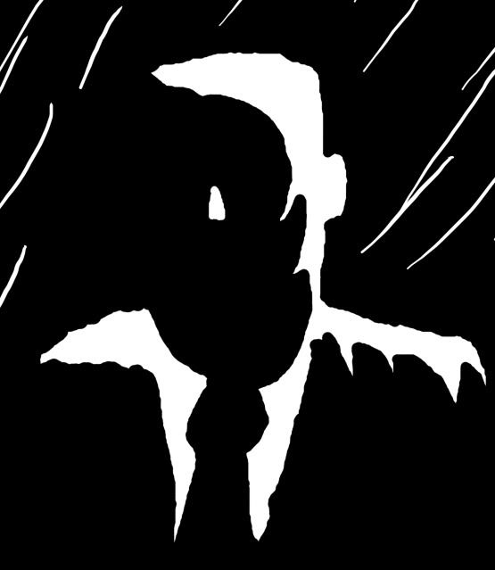
Nice! I love the small head compared to the big broad shoulders. :) You have a really neat style coming along.
His arms along the side seem a bit odd somehow, though. The way they're shaped, or the way they connect to the body or something.
Apparently there was some crap on my scanner, which is why he has a random dot on his forehead here.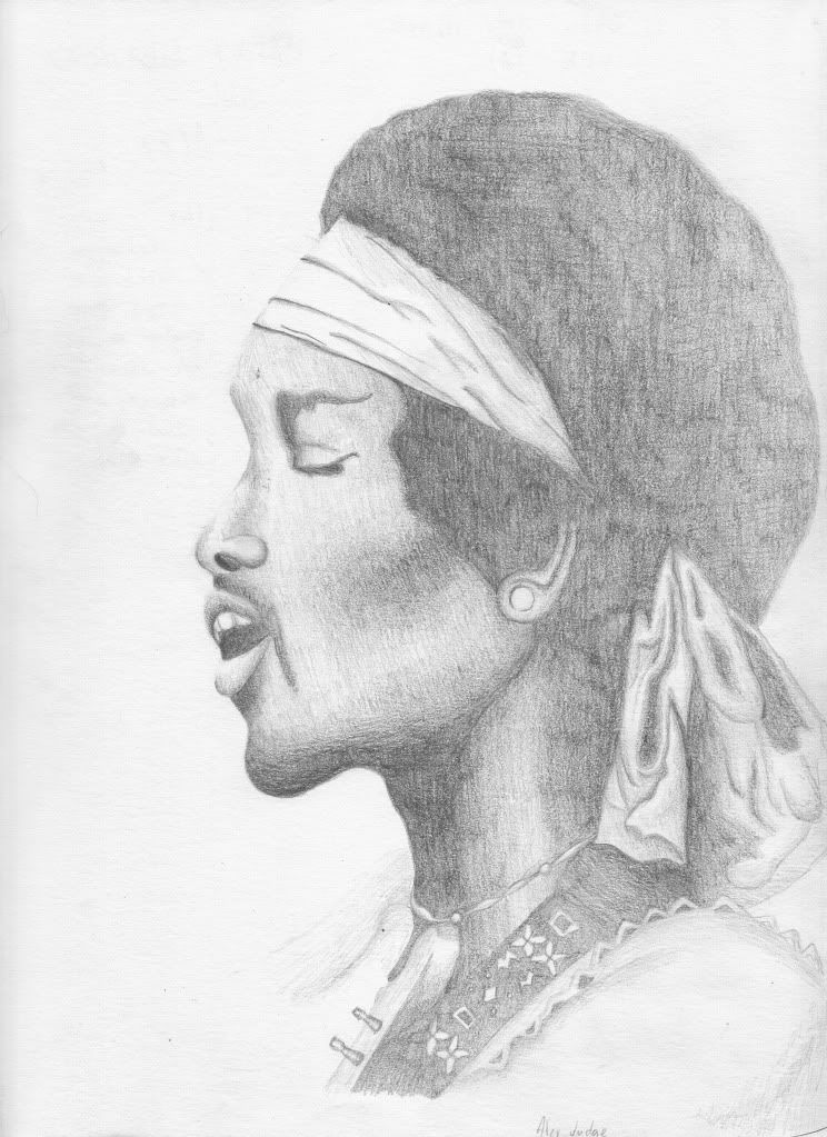
Start publishing on
DD Comics!
Comment on the Art Belonging to the Person Above You!!
A very nice portrait :) I like the softness of this, it gives a peaceful feel.
The skin and the hair is very nicely done; my only crit here would be to make the ribbon around the back of his head less "outlined". Other than that, great work :3
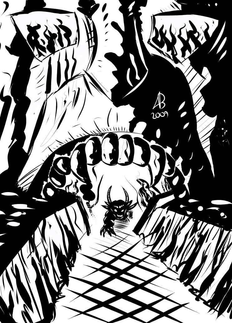
Here's mine! A terrible attempt at perspective, I realise the floor is very, very wonky, but I was focusing on the character DX
You guys are all so awesome, not fair |D
well as far as perspective goes you pulled it off pretty well the biggest problem is that the upper and the lower body are different extremes of the same perspective ( I make this error alot myslef) so the legs are about twice as extreme as the torso , and the arm just leaves perspective completely. Still pretty damn well done though.
just a something I drew for sketch of the week over at penciljack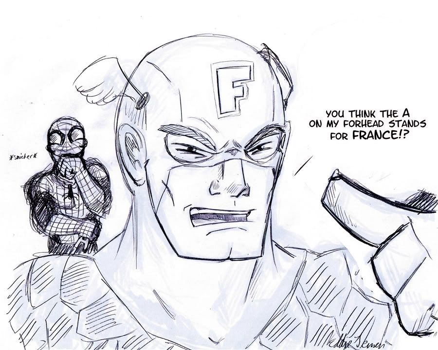
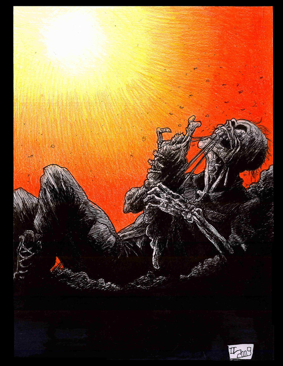
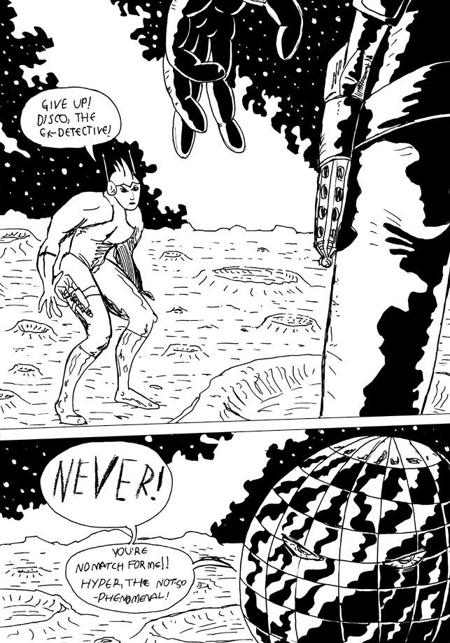
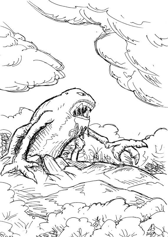
I like the sketchiness of the second one more than the first one, though the first one has a better use of black.
——-
Because I'm so generous, I'm offering up two lambs to the slaughter: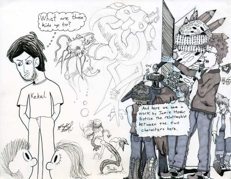
(Note: this one was done by me and two of my friends, so it may technically be cheating)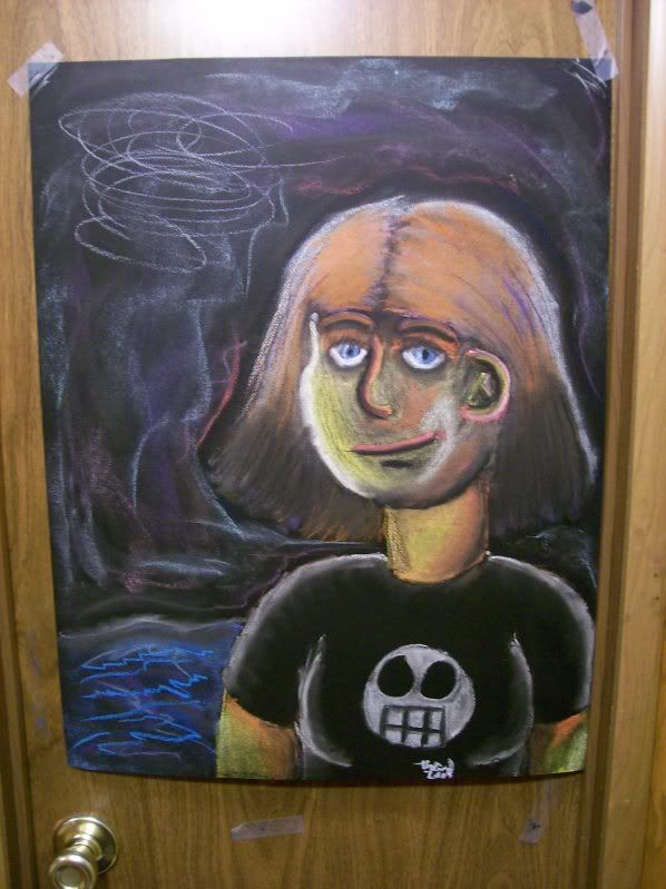
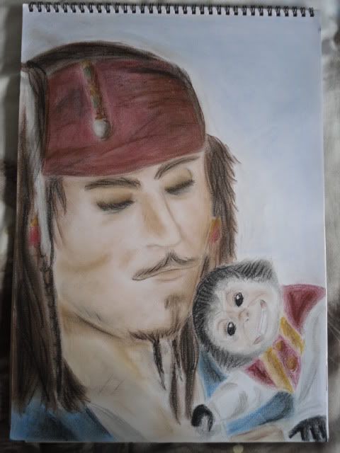
^ I love the softness of the picture, but it may be too soft at places that require hard lines, like around the face and on the cloth of the bandana… Jack's face seems a bit stretched (I believe it's a little turned toward the right), but you captured a sense of tranquility. One I've never seen in Sparrow. =D
Whelp, here's mine. GUESS THE FANART. It's from my favoritest movie ever.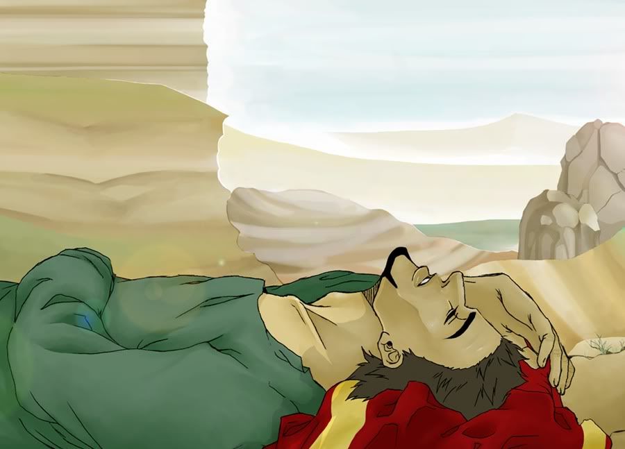
Very nice! I don't know the movie, but I do like the lineart and the background a lot. It's simple, but you can still tell what it is. I also really like the colouring, especially on his skin.
~~~
A brand spanking new character I made up about last week, I believe. I haven't quite figured out which colours I should use on him.
Very nice! I don't know the movie, but I do like the lineart and the background a lot. It's simple, but you can still tell what it is. I also really like the colouring, especially on his skin.Leg joints and the position of one of the feet looks unnatural. Also, I believe the one arm is to point backwards, but it lacks the perspective for that. Other than that, the eyes are too high I think, and one hand has two thumbs I think, the pinky is attached as an opposable digit. Also, in one of the shoes a human foot couldn't fit.
~~~
A brand spanking new character I made up about last week, I believe. I haven't quite figured out which colours I should use on him.
Folds of the clothing though are done excellent and really show the difference in texture between plastic / leather and jeans in how they fold. except that one knee perhaps. Facial expression hits it on every point.
Since all you people are posting humans or at least antropomorph things, I'm going to be daring and original:
http://nihilarchitect.net/v7/sp:popup/image/the_reckoning
It's in a link because the image is too wide.
Wow. That is really, really cool! I love the detail and the effects!
Here's a picture I just coloured. Also, I shaded it! I don't usually shade, but I'm probably going to start shading my comics, so I'm trying out different stuff, and at the moment I like this way best.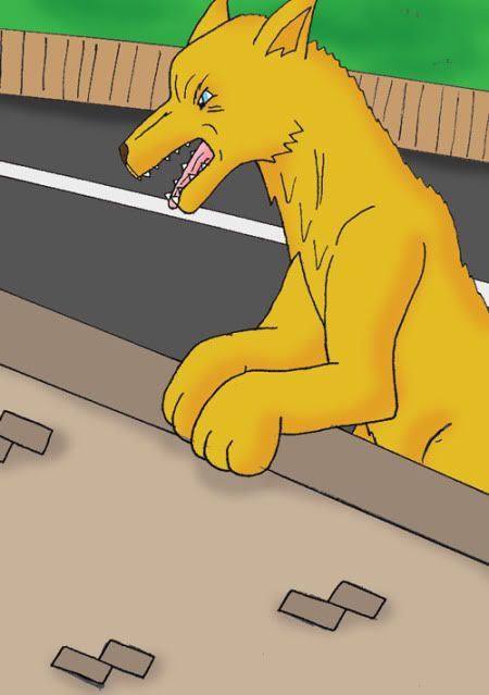
Wow. That is really, really cool! I love the detail and the effects!Very good dog anatomy there. I'm not quite sure what she's leaning on but I guess that's not that relevant
Here's a picture I just coloured. Also, I shaded it! I don't usually shade, but I'm probably going to start shading my comics, so I'm trying out different stuff, and at the moment I like this way best.
About the shading, I could recommend a steeper slope in intensity if you get what I mean, at the edges make the colouring a little darker. Especially the part under the jaws and the elbows, it can create a good sense of depth. Also, the part with the paws.
Let me try some thing more human this time:

Why yes, it's inspired by Kerrigan, Queen of Blades.
The anatomy is great! Also I love the sort of 'creepiness' of it. I like the design too, it's very interesting and I haven't really seen anything much like it before :)
Here's a picture of Blue, a werewolf character I made up. I also tried a different shading technique: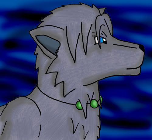
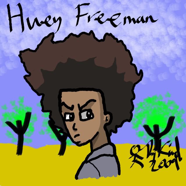
Huey Freeman in a desert is classic 'cause that's the look he'll give.I can't say I do that much to be honest. I have an aversion for any drawing style that bends the noses to the left or the right even when the face is shown right up front. The way the mouth is drawn do makes up for it more than in most of it.
I'm thinking of starting a new comic with this lining/colouring style… I like it.
Also, I tend to find most 'naturally drawn' comics like Questionable Content and indeed this one's faces to have a certain unhuman or plastic emotion that leaves me unable to enjoy the humour because it makes me read all texts as if it were robots. The same with the posts in most. About only Japanese comics, a variety of Franco-Belgian one's and of course Watterson's very lively and human emotions in his work seem to escape this. That's why I use sticks in comedic material only.
Also, I'm not really sure of what to think of the hair. I've seen a variety of cartoons that used this style on the television, together with 'wobbly lines' and I never got their appeal if am quite frank. I don't think I can give any construction, I can recognise to the best of my knowledge that it's of the same level as those cartoons, but I never got their appeal.
Another human form:
(the thing I can't get clear on it is that the legs actually start under the shirt and the shirt simply hangs over it, I know no way to make it clear from really short legs, but then I realized that probably on a picture it wouldn't be clear either so I realized it's not possible and gave up…)
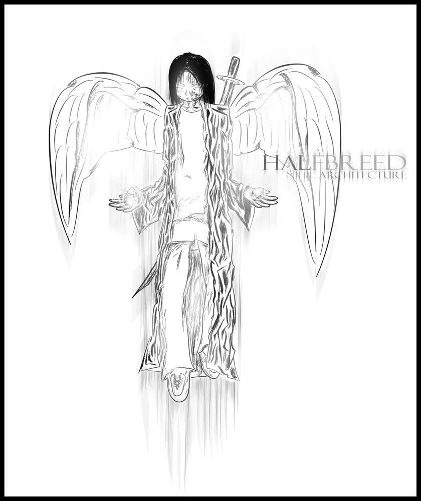
qqq, The angel design is very good, and the pose is subtle. It has a veryThe wind's done very realistically which is a trouble for most people. I have only one item on this of discontent, but that's a rather large one and that's that their facial expressions don't match it at all, especailly the right one which looks as if she's pretty twisted and lost sanity.
opposite look to the style with the bright white lighting
————————————
This is the full image for my comic title banner
Kind of a shame, because it ruins an an otherwise perfectly caught atmosphaere of three heroes / trekkers standing together in an empathic environment.
Design of a logo for a band I did this time:

Leg joints and the position of one of the feet looks unnatural. Also, I believe the one arm is to point backwards, but it lacks the perspective for that. Other than that, the eyes are too high I think, and one hand has two thumbs I think, the pinky is attached as an opposable digit. Also, in one of the shoes a human foot couldn't fit.
Folds of the clothing though are done excellent and really show the difference in texture between plastic / leather and jeans in how they fold. except that one knee perhaps. Facial expression hits it on every point.
Since all you people are posting humans or at least antropomorph things, I'm going to be daring and original:
http://nihilarchitect.net/v7/sp:popup/image/the_reckoning
It's in a link because the image is too wide.
Thank you dearly for that~! I knew there was something off about the picture, but I couldn't quite pin point it. It's not often that I get critique/criticism (even when I'm on my knees, begging for it) and I appreciate what you have given me. :> I shall go off, now to Photoshop and fix it.
As for your picture, BffSatan, I love the different brushes you used for that picture. Gives it nice texture. Also, it gave me a good laugh. :)
A'ight, here's my next picture. I drew it because I got tired of all those 'bishie' naga man/women things that seem to be so popular on the internet.

On the belly, the white part is in such a way as it would if iy were standing en face to you, which it isn't. Needs to move a little to the left, also, how it touches the ground is a little bit unnatural. Otherwise quite perfect.
Oh, edit, forgot to post some thing of my own:
http://nihilarchitect.net/v7/sp:popup/image/shrine_core
as link again, because of too wide.
Ah, that one I like a lot, no points of criticism on it whatsoever.
http://nihilarchitect.net/Junk/13%20For%20love%20and%20war%20the%20laws%20shall%20mute%20(2).mp3
Piece of music this time, game soundtrack.
Although music is a form of art, I think this thread is just for drawings.
But It was a cool tune, I could only really see it as background music for a game or a TV show, and that's what you made it for. It was a cool tune, but what type of game you're making this for would help to know whether or not in fits.
———-
This may be considered NSFW but it only shows her bum.
It is also one of my first times retouching an image (I made the shadow's darker)
http://www.drunkduck.com/Out_There/gfx/girl%20retouch.jpg
DDComics is community owned.
The following patrons help keep the lights on. You can support DDComics on Patreon.
- Banes
- JustNoPoint
- RMccool
- Abt_Nihil
- Gunwallace
- cresc
- PaulEberhardt
- Emma_Clare
- FunctionCreep
- SinJinsoku
- Smkinoshita
- jerrie
- Chickfighter
- Andreas_Helixfinger
- Tantz_Aerine
- Genejoke
- Davey Do
- Gullas
- Roma
- NanoCritters
- Teh Andeh
- Peipei
- Digital_Genesis
- Hushicho
- Palouka
- Cheeko
- Paneltastic
- L.C.Stein
- Zombienomicon
- Dpat57
- Bravo1102
- TheJagged
- LoliGen
- OrcGirl
- Fallopiancrusader
- Arborcides
- ChipperChartreuse
- Mogtrost
- InkyMoondrop
- jgib99
- Call me tom
- OrGiveMeDeath_Ind
- Mks_monsters
- GregJ
- HawkandFloAdventures
- Soushiyo

