Um, who's work am I supposed to comment on? 0.0
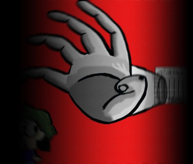
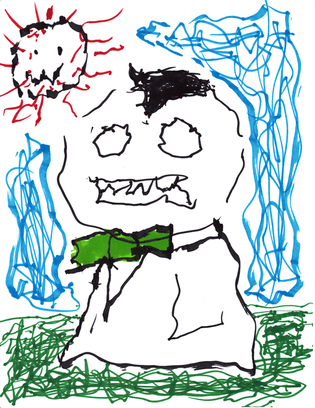
Well here's my pic: I just doodled it but I'm fairly happy with it. Apart from that hand.

Start publishing on
DD Comics!
Advertise with us

Meet, Greet, Show and Sell
Comment on the Art Belonging to the Person Above You!!
Um, who's work am I supposed to comment on? 0.0The link in the pic on top of you. it's bold: http://www.drunkduck.com/Out_There/gfx/girl%20retouch.jpg
Although music is a form of art, I think this thread is just for drawings.They just made it like that by posting only drawings, besides, I don't see what bad it can do. Originality I'd hold as a good thing.
But It was a cool tune, I could only really see it as background music for a game or a TV show, and that's what you made it for. It was a cool tune, but what type of game you're making this for would help to know whether or not in fits.It's to be under a part of a 'chase' scence if you get what I mean.
This may be considered NSFW but it only shows her bum.
It is also one of my first times retouching an image (I made the shadow's darker)
http://www.drunkduck.com/Out_There/gfx/girl%20retouch.jpg
The shadows seemed a little too dark but it's not a bad life drawing image otherwise.
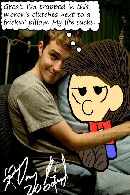
Well here's my pic: I just doodled it but I'm fairly happy with it. Apart from that hand.
Is the hand supposed to be the right or left hand? I can't really tell.
———-
Since I always post multiple works, I figured I'd do it again:
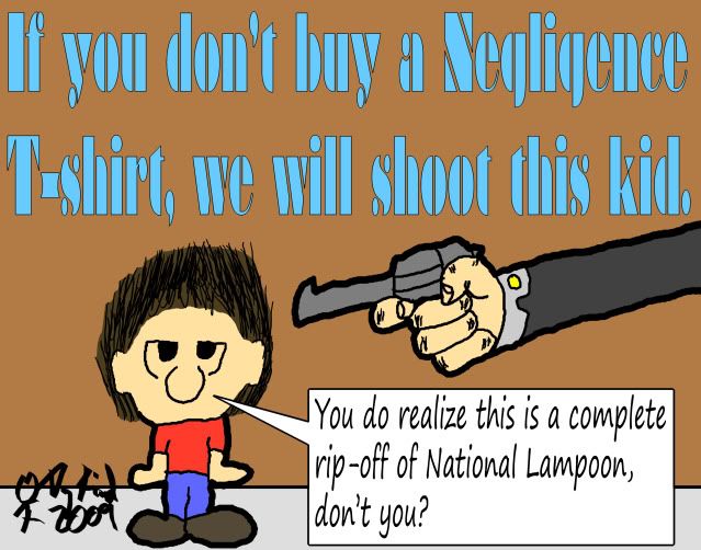
Ad I designed for the Negligence T-shirt shop.
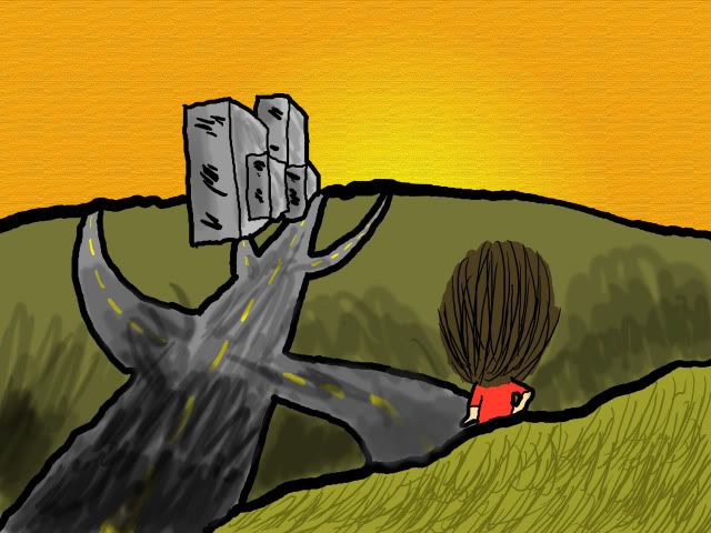
This image I made for Target Audience Magazine
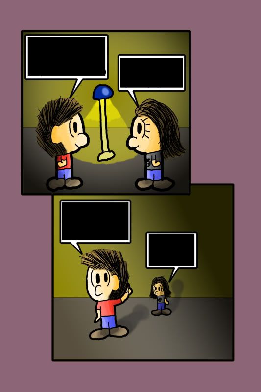
Finally, this is a two page spread for a story I made for subcultured's anthology comic. There's no text in this version. Personally, I'm not happy with the way I made the shadows for these pages, but I got better with the other ones.
@ ParkerFarker - The anatomy of the feet seems a bit off and I don’t like the way you can see the shading blotches (if you know what I mean). It seems to me you’re not taking full advantage of your “re-touching†as you could have made the image crisper and the hair all black rather than dark grey as that would make it more striking.
@ elektro - I've axed that hand now >_> it was ugly and not worth saving.
@ Elektro: I like the tshirt advert, I love the boy's expressio lol. I'm not too keen on the shading in the last picture though, I think maybe it would have looked better with just flat colour or maybe cell shading. But other than that I do like the picture :)
Here's some character art for my next comic, it's in a slightly different style, and I haven't used shading in a comic before lol also it's just a reference thing I'll be using, which is why only one of the pictures is coloured. If you want, ignore the uncoloured one lol
The walls are a bit bland and you should put something like a picture to make things more interesting to look at. Also the perspective makes it look like they're standing in a giant hall or something. Are you using black in those gradients? Because for normal shading you usually shouldn't do that.
Here's a picture I drew with copics. It took quite a long time and I think it's probably the best thing I've drawn so far so I'd really like feedback.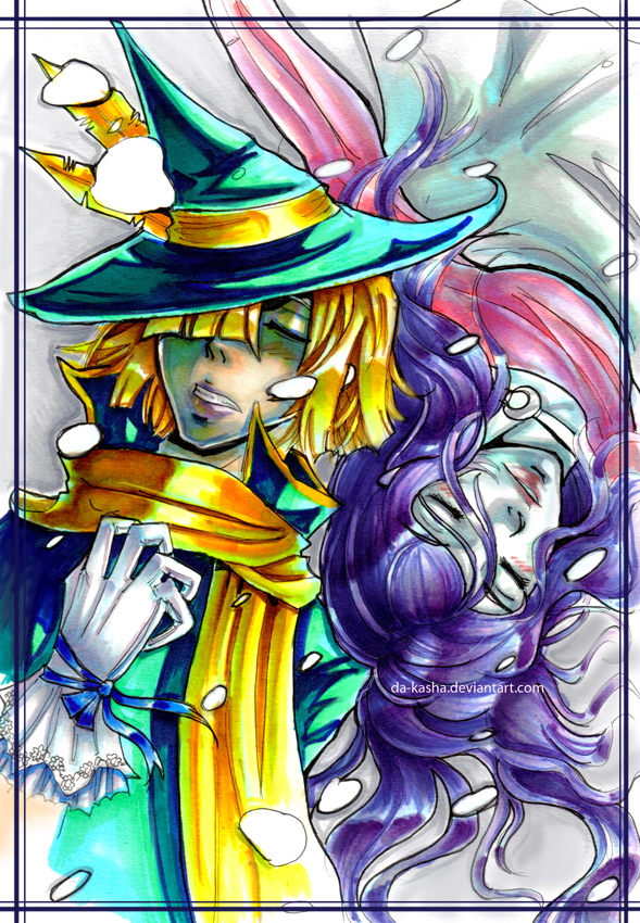

Since you know there are some mistakes, I won't point them out. Although the big eyes look weird, somehow they fit.
——-
Roy Duncan of Villain Next Door recently made a pin-up for my Negligence comic. Since he was so nice to make that, I made something to promote his comic. Enjoy.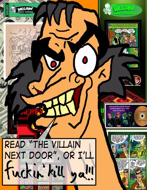
Since you know there are some mistakes, I won't point them out. Although the big eyes look weird, somehow they fit.
——-
Roy Duncan of Villain Next Door recently made a pin-up for my Negligence comic. Since he was so nice to make that, I made something to promote his comic. Enjoy.
It's very in your face but I think the word bubble tail might be too in his face. It doesn't have to be so close to his mouth that he might eat it, just point towards it. I'd say make it half as long as it'll look great!
I'd like to see a bit of line thickness variety in his face so it gives a clearer idea. Other than that, it's pretty cool.
—-
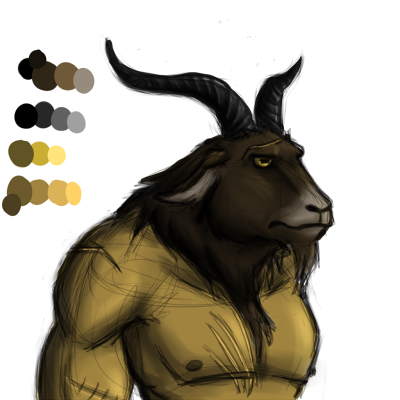
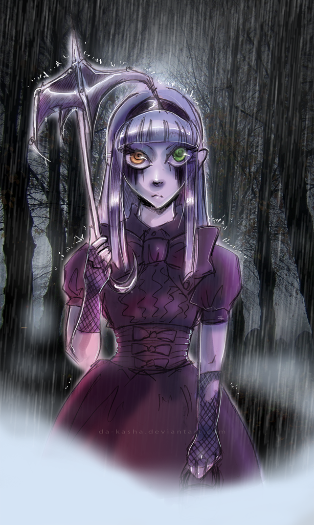
Here's two drawings I've done recently. The first drawing is a colored sketch of a satyr who is the guardian for a young girl. I'm still trying to work out how to get some nice bold looking colors in Sai.
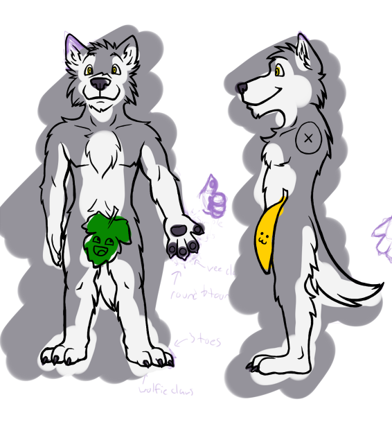
The second drawing is a work in progress of a character sheet for a friend. The colors are just blotted in for later ref and to make it easier to see the lines. I color within the lines, really!

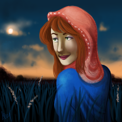
wow I really love the soft look of this! her hair and the sky look just fantastic, though her head looks a little odd postioned over her shoulder like that. Regardless this is still really good! nice work :)
anyway here's a character ref sheet for my comic
EDIT:: uh in response to da_kasha right below this pic- thanks! and well i use a line tool. The lines proabably look like that since i color and draw everything on ms paint and paint.net( i can't afford photoshop sadly)

thats rly nice, i love the colors and the concept is childish, but scary at the same time. looks like it took a lot of time.
banner for my comic Boy Lessons
I like the fact that you didn't make a rectangular banner, that its kinda a big circle. It seems more creative. I love the colors and the energy of the pic. My only real crit is that I could tell which body parts belonged to whom in the center of the pic. I had to stit for a couple of minutes and then it seemed obvious.
I did this a couple months ago. Also, what style would you consider this?
I'm ruining the whole "69" posts by doing this but here!
I don't know if it's my bugging (yeah, that's right, BUGGING) computer or not but I can't see the image you posted. :( . So I'm conna comment on your avatar. :( .
I like the coloring you did and the dark cloud in the bacground but I probably won't get what the large, cracked item is until I read one of your comics, right? Oh well.
Here's my piece-please excuse the smudging and the fact that it's on another page. :(
http://www.drunkduck.com/Pwnd_Randomness/gfx/avatar-monsterBUDDY.jpg
Its a stone crown.
And here's s link to the pic I posted.
http://stephaniechristina.deviantart.com/art/Cow-Girl-139492993
Advertise with us
DDComics is community owned.
The following patrons help keep the lights on. You can support DDComics on Patreon.
- Banes
- JustNoPoint
- RMccool
- Abt_Nihil
- Gunwallace
- cresc
- PaulEberhardt
- Emma_Clare
- FunctionCreep
- SinJinsoku
- Smkinoshita
- jerrie
- Chickfighter
- Andreas_Helixfinger
- Tantz_Aerine
- Genejoke
- Davey Do
- Gullas
- Roma
- NanoCritters
- Teh Andeh
- Peipei
- Digital_Genesis
- Hushicho
- Palouka
- Cheeko
- Paneltastic
- L.C.Stein
- Zombienomicon
- Dpat57
- Bravo1102
- TheJagged
- LoliGen
- OrcGirl
- Fallopiancrusader
- Arborcides
- ChipperChartreuse
- Mogtrost
- InkyMoondrop
- jgib99
- Call me tom
- OrGiveMeDeath_Ind
- Mks_monsters
- GregJ
- HawkandFloAdventures
- Soushiyo