It reminds me a bit of Caliber, with the art of Garrie Gastonny. The seriousness of the image is accompanied brilliantly by the cheeky moon hovering in the background. I like it. I wouldn't like to have this guy skulking about near my house…
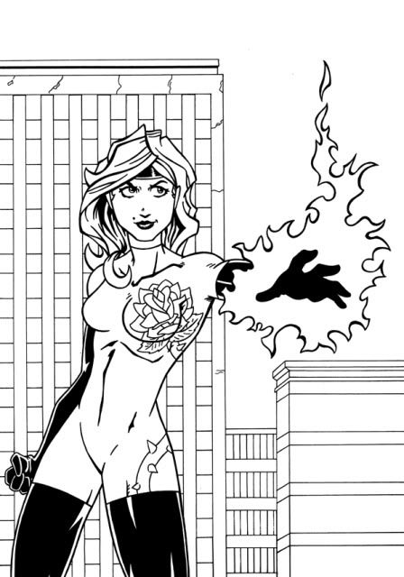
This is a piece of art I made for a superhero webcomic coming to DD in a year or two.
Click for best results.

Start publishing on
DD Comics!
Advertise with us

Meet, Greet, Show and Sell
Comment on the Art Belonging to the Person Above You!!
Very nice texture on the fabric over his mouth. Some of the colors are a little muddy, especially the skin tones. The hair has some nice detail and depth to it.
Link to the big version so you can see all of my mistakes.
Like the nose. It's a nice break from the usual pointy noses. I think the shading is consistent on her and she has cool hair. Only thing I could guess to being off is she seems slightly off balance. But her feet are below the edge and the leg she's standing on may have its foot directly below her head for all I know.
I say good job. =)
Fan art I did recently of a World of Warcraft Hippogryph:
Personally, I think a good bit of it is too scrawny and its hind legs are too long. =/
I like the detail work, good pose, with my favorite part being the head/beak. The line flow in the wings, tail and furry neck area are a bit unsteady/uneven(drawing from the shoulder would create a graceful and smooth line), otherwise very nice drawing. I see an illustrator.
I like the detail work, good pose, with my favorite part being the head/beak. The line flow in the wings, tail and furry neck area are a bit unsteady/uneven(drawing from the shoulder would create a graceful and smooth line), otherwise very nice drawing. I see an illustrator.VERY PERKY!

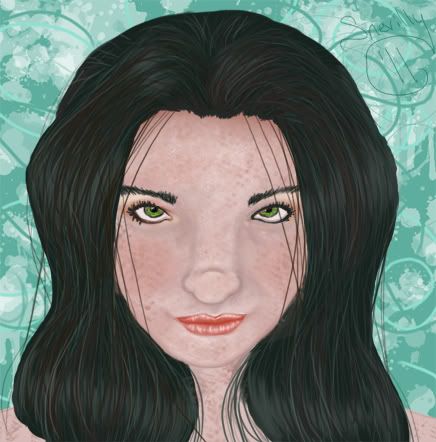
Nice, very niiiice! Good use of colour and I love the freckles! The anatomy is a little off, the eyes are a tad far apart (but are very good in shape!) and the nose a little strange, but the lips, my god, they're perfect.
wooo… my tuuuurrrnnnn… So this is a work in progress, I haven't NEARLY finished it, still got the background and the rest of the neck and shoulders to go, but yeah…


..
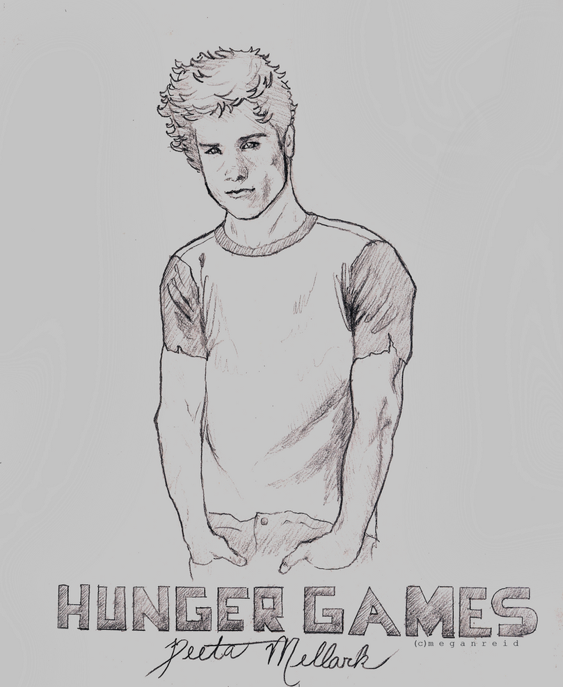
TOP: I'm lucky, Black and whites are on the top of my list of styles. Your line work is great, I can tell you been at it. The expression on the kids sell: SAD (at least to me) I might be looking too close but the females hair, did you do that afterward, it looks off somehow, but not enough to make a deference. I love it!
..
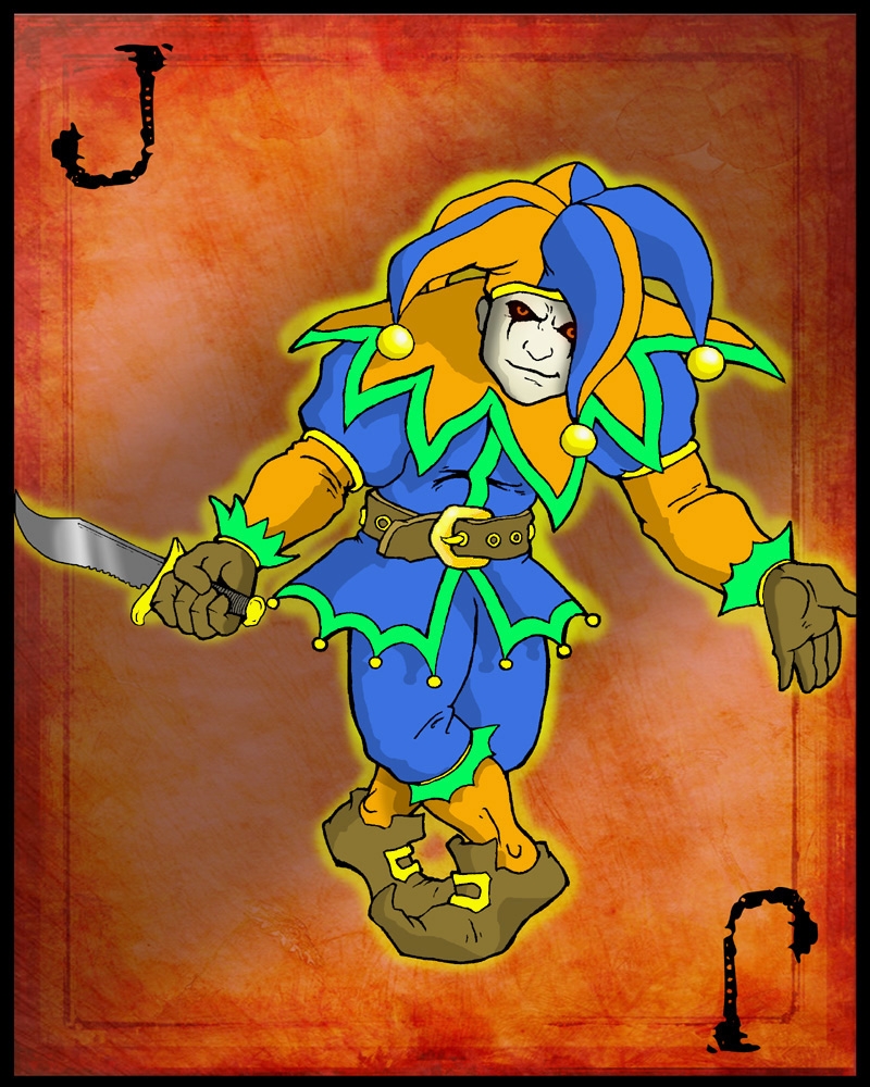
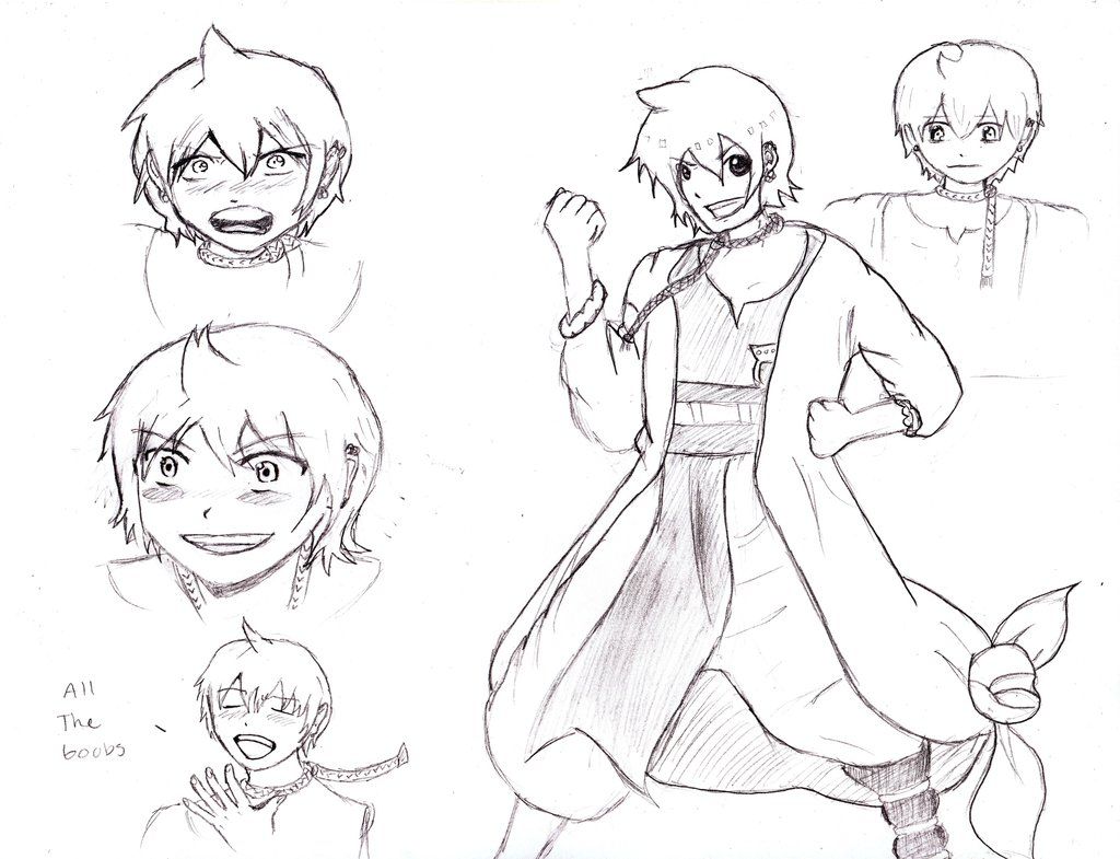
Mine: I made this guy when I was feeling violent, I think it shows.
..
nice clean work,i like it.


http://www.drunkduck.com/user/espcomix/

Hey, I remember your picture here before, and now it's not, and I did some digging and it's like your account got suspended or something, but I remember it being pretty sick looking (and interesting enough to check out your other stuff)
huzza:
this is a character from my comic in a chibi-ish drawing.
was looking at the blu-ray cover of Okami-san while drawing it, slightly
copying the style. been kind of stuck on what to draw for the
background, but I think I got my objective of cute down
^ Definitely cute! I'm assuming her eyes are *supposed* to be different colors? Anyway, I like the simplicity of it - The simple, straightforward tones and colors. She has character. It also has a more hand-drawn, hand-colored look that appeals to an old-school natural media artist like myself.
Here's my contribution:
This is the villain of the currently-running storyline in my KFP comic. He takes great delight in his work. FWIW, I don't really go for elaborate backgrounds and effects in my work - Mostly I focus on trying to create expressive linework and simple, elegant grey scales.


I really like the gesture-esque look of these dogs! They are both realistic and stylish at the same time.
Here's mine. I still need to learn about drawing hands- after all these years, I am still bad. And I don't know why she's holding her stomach. I just randomly drew her holding her stomach. : / 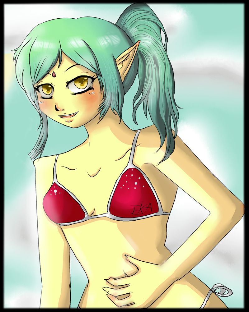

@Straberrymilk: Nice character study. Have you thought about coloring it? The head on the bust in the top right corner is a tad off center, though. This is a problem I frequenlty have, myself. I hold the page up to the light and look through the back of the paper and it helps me catch things like that.
Here's the cover to a series I illustrated like, over a year ago, but is just now being put online. It's called The Speculum of Time.
I love it. I´d like a poster of it!
Good work on the pose of the figure and the how the arm comes closer! I know that´s pretty hard to do! Overall the picture reminds me of a mirror I used to have at home. The mirror had a small plastic border, and when I would look in the mirror, I would see myself, my iris, my pupil, the white border of the mirror in the reflection of my pupil, myself again, my iris again, my pupil again and finall the white border of the mirror again. I´m sure the image continued, but it was simply too small to see. I´ll check out the link!
Today I fixed an old painting I did a year ago. Not really sure about it yet. I´ll have to see it with fresh eyes in the morning. Not sure I´m happy with the lighting. 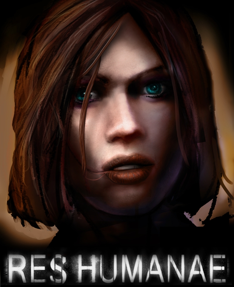

Advertise with us
DDComics is community owned.
The following patrons help keep the lights on. You can support DDComics on Patreon.
- Banes
- JustNoPoint
- RMccool
- Abt_Nihil
- Gunwallace
- cresc
- PaulEberhardt
- Emma_Clare
- FunctionCreep
- SinJinsoku
- Smkinoshita
- jerrie
- Chickfighter
- Andreas_Helixfinger
- Tantz_Aerine
- Genejoke
- Davey Do
- Gullas
- Roma
- NanoCritters
- Teh Andeh
- Peipei
- Digital_Genesis
- Hushicho
- Palouka
- Cheeko
- Paneltastic
- L.C.Stein
- Zombienomicon
- Dpat57
- Bravo1102
- TheJagged
- LoliGen
- OrcGirl
- Fallopiancrusader
- Arborcides
- ChipperChartreuse
- Mogtrost
- InkyMoondrop
- jgib99
- Call me tom
- OrGiveMeDeath_Ind
- Mks_monsters
- GregJ
- HawkandFloAdventures
- Soushiyo