Nice, very nice. His ear looks a tad off. But good all the same.
I'm not happy at all with the way the lineart turned out with this, but I figured I'd share it anyway. (I think I'm going to redo the damn thing)
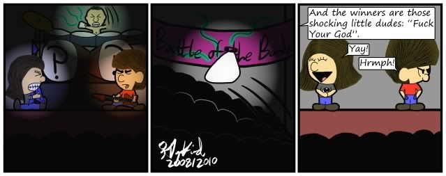
Oh right, its from another original series of mine in the works called "Shatter"

Start publishing on
DD Comics!
Advertise with us

Meet, Greet, Show and Sell
Comment on the Art Belonging to the Person Above You!!


Nice avatar. If there were something in the background other than white, it would make a cool "I'm a badass" shot for a battle scene.
————
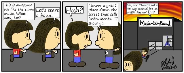
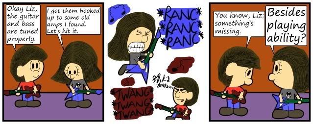
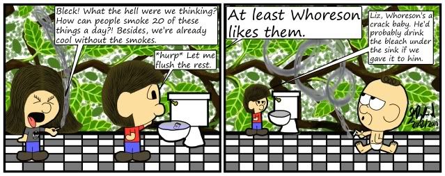
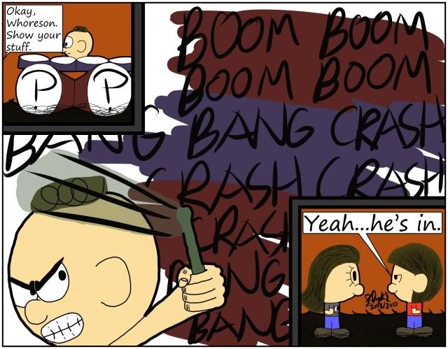
So, for the last month, I have been remaking the first fifty-three Negligence comics I've ever done, as they all looked really bad and I'm planning on putting them together for another book. I have not decided whether or not I will put them on the main comic page as either a replacement or supplement to the original comics, but I have decided to share the better remade comics here.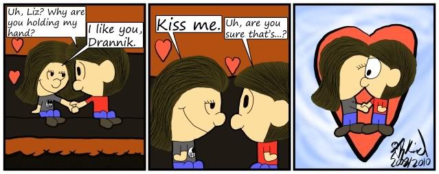
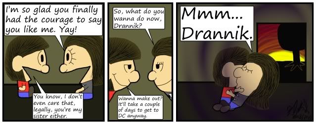
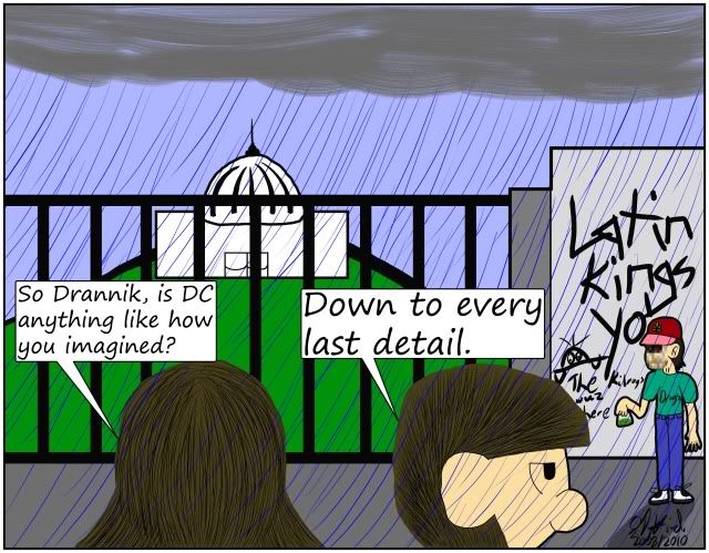
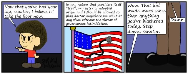
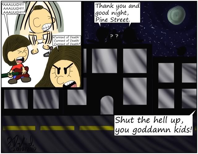
Man, remaking work takes a lot of time, and I compliment you in your effort to make your work better! That said, the style's quite adorable and reminds me of Charlie Brown for some reason (probably the big bobble heads). It has a very "innocent" vibe to it.
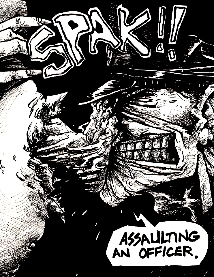
This was a comic class assignment. It's a story called Noir that I'm working on that will eventually get its own comic someday.


While I'm not a huge fan of the whole seeing-an-eye-behind-spikey-hair effect, The shadows and the green eye are done very well. I also like the gleam of the hair. However, unless the man is casting his shadow over the girl (which seems unlikely because the light source would have to be quite close to the ground for that to happen and some of the shadows on him seem not to point to that), the girl would have the same shadows on her as the man, which she does not. I like the colours you used and the background has a nice gradient. The caption also looks very professional.
This image is a collection of my representations of lyrics from MGMT's new album, Congratulations. It's a good album, you should have a listen.
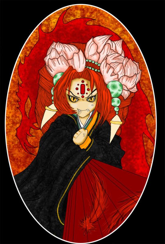
@Snevilly - I love the colors and the spots of cooler colors among the reds and oranges, and I think the rich textures in the background and robe really add to it and create interest without being overpowering.
The attention to detail in the hair is awesome, and I really like those flowers. The only critique I have, really is the hand. I know it's meant to be chibi, but it looks a little off compared to the rest of the drawing and studying it for a moment, I think it might be because the lines of the fingers don't quite flow with the lines of the fist. But that's kind of nitpicking - overall, I like it.
—-
Just finished inking this. I'll probably be coloring it, but I'd like some crit on the line art. Feel free to be harsh. :)
http://www.drunkduck.com/Bright_Snow/gfx/waterelementalnew4inked3.jpg (Click to see it a little bit bigger.)
I like the linework just fine, but it should definitely be in color. It would fit the artwork better.
———-
So, I've been trying some new things with my drawing. Namely, I've been trying to work in a bit of a looser style. Here are a few images I've been working on in that style.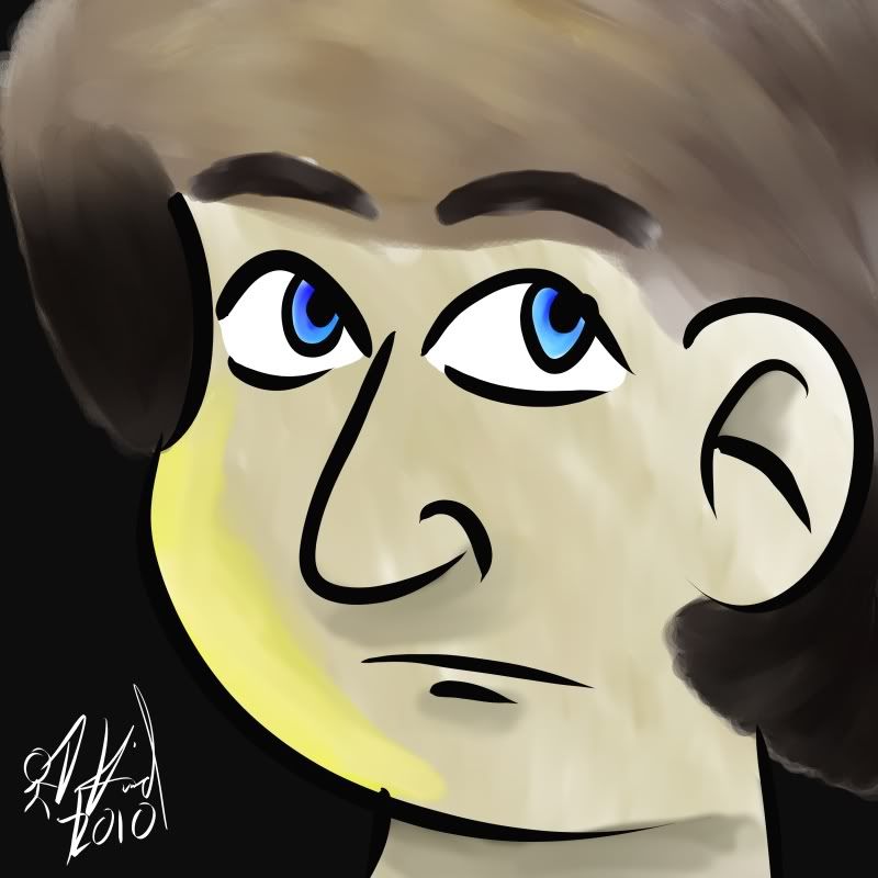
I like the use of color, it makes especially the first image look quite lively. I don't however like the lines, which are a little too loose for my tastes. They all cross each other which makes the pieces look a bit rushed.
I'd recommend you keep experimenting, just go back to a somewhat cleaner look.
Deadpool wearing a top hat.
I know its sideways.
I also made this spiderman: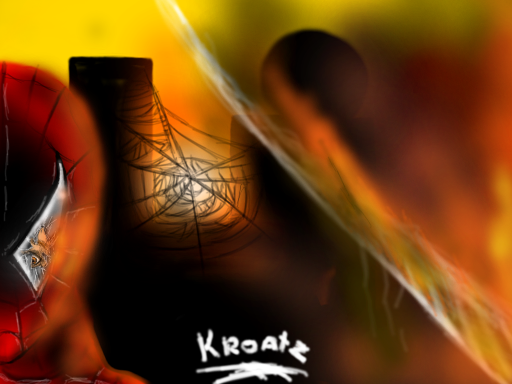
And this Jedi Squirrel: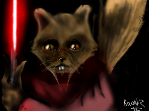
And this Smoke Demon: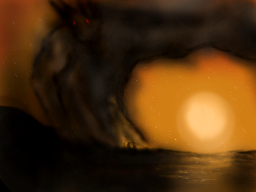
I love the colors in this pic. I like that its dark, but there's so much that still shines and the guy seems to really glow without any "glowy" effect. It just seems to fantastical, I love it. ^.^
This is Dak and LaBelle. Just finished it a day ago. I think its my best work yet, but I've still got so much to improve upon.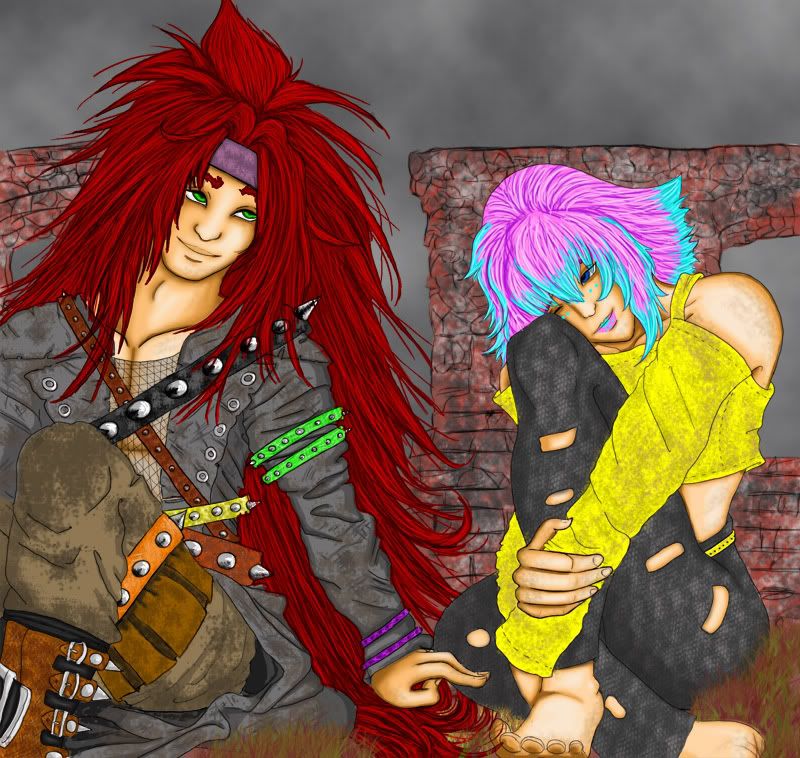


I like it! It's very clean, especially for what I'm assuming is pencilwork. His face strikes me as a bit… empty, like it's missing something. That's probably just me though, and that doesn't really detract from the picture itself. I like it.
Goblins and robots are my two favorite subjects. There aren't any robots in this picture though.
This is a fun pic! Vibrant colours, and a layout that lets you know immediately what is going on. Well done!
Here's my lineart of one of the main characters from my fantasy books, Aaron, a sorcerer. His non-sword arm is going to be casting a spell when the pic is done :)
You can truly tell by the details of the art that he's old, but still strong and kicking. The foldings, indents, and details on the clothing are very impressive! For a line art without environment, shading, or color at all, this picture still tells a lot.
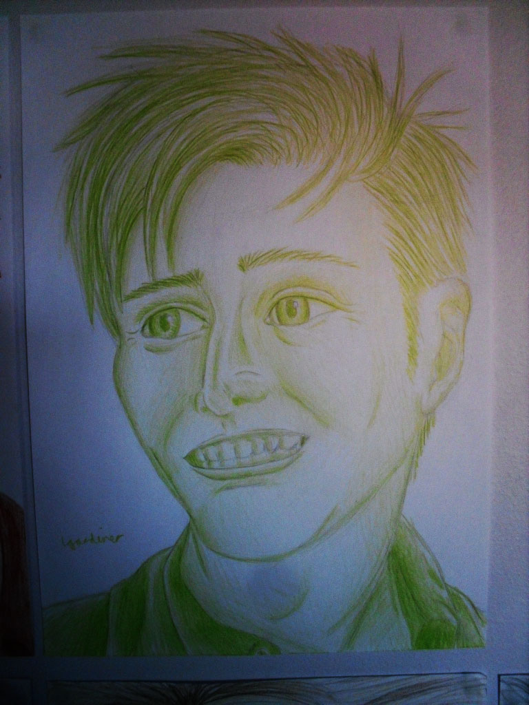
One of my earlier sketches, drawn during my third or second year in High School (I should be second year in college by now…SHOULD be), this is a character for a .hack//G.U. RP I joined YEARS ago. However, the style back then is greatly different than it is now…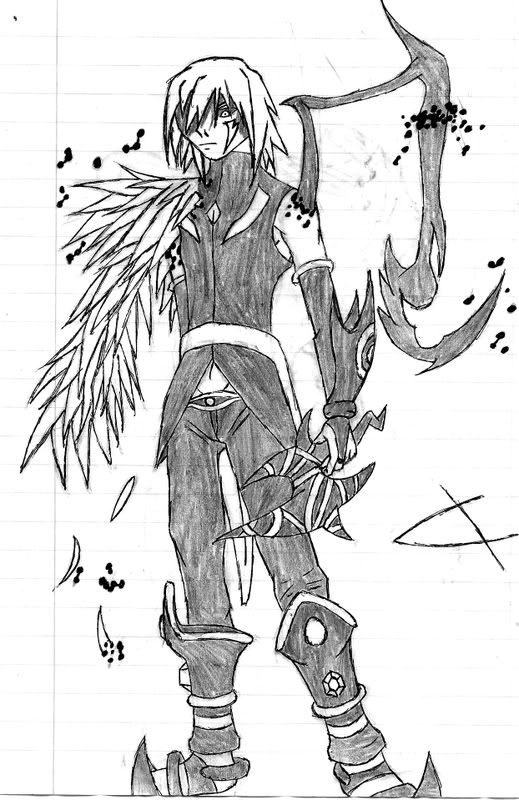

Did you just make his head bigger on purpose? I can see some pencil marks… Anyways, his right foot seems to be pointing in the wrong direction, or it just somehow looks funny to me, and the perspective has caused his left arm to look horribly distorted. Actually, both arms look a bit distorted. And the thumb should be facing in the opposite direction.
Anyways, here's something I drew for Halloween.
Turn up the monitor for best results.
Advertise with us
DDComics is community owned.
The following patrons help keep the lights on. You can support DDComics on Patreon.
- Banes
- JustNoPoint
- RMccool
- Abt_Nihil
- Gunwallace
- cresc
- PaulEberhardt
- Emma_Clare
- FunctionCreep
- SinJinsoku
- Smkinoshita
- jerrie
- Chickfighter
- Andreas_Helixfinger
- Tantz_Aerine
- Genejoke
- Davey Do
- Gullas
- Roma
- NanoCritters
- Teh Andeh
- Peipei
- Digital_Genesis
- Hushicho
- Palouka
- Cheeko
- Paneltastic
- L.C.Stein
- Zombienomicon
- Dpat57
- Bravo1102
- TheJagged
- LoliGen
- OrcGirl
- Fallopiancrusader
- Arborcides
- ChipperChartreuse
- Mogtrost
- InkyMoondrop
- jgib99
- Call me tom
- OrGiveMeDeath_Ind
- Mks_monsters
- GregJ
- HawkandFloAdventures
- Soushiyo