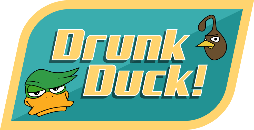
Looks fantastic, really like it! Fresh and clean.
The only issue I found is Publish link and search input - too close to each other, so it looks to me like I have to input search query and then hit Publish :-).
Also I read DD logo as DC for the first time.
Anyway, great work!

Start publishing on
DD Comics!
DRUNK DUCK graphical redesign????
These Look great!!!
Nice and sleek design like people are saying, Like the layout, and also I love the logo.
I dunno about the comparison between the logo and DC Comics, on the one hand, maybe, and with that maybe I don't know if DC would send a letter saying it looks too much like theirs, but I still feel it looks significantly different from DC.
What if you specified "DDWebcomics". And if the 'Webcomics' was a little more stylized, since currently it looks like it's using an existing typeface and that may also come into legal trouble. Maybe…
Emma_Clare
The design looks fantastic so far.
Looks good, I'm a huge fan of the blue! Looks a lot cleaner as well.
A decent mobile site would be cool too - that seems to be one advantage tapas/webtoons have in that they have apps/easy to navigate mobile sites. They also have more money to throw around because of their awful premium comic business model, I suppose, but it might be worth exploring.
One editor's pick at the top of the site could be nice, with a really big banner ad + description? I hate to suggest it because the Duck is more egalitarian but the reality is that tapas and webtoons both start you off with a polished comic with a fat backlog as soon as you open up the site. It gives you something to click on right away.
I'd kill for an ultra customisable/searchable tagging system myself - like Ao3 has. I love being able to get very very specific in searches. Discoverability is really important and a lot of the other webcomic sites shove normal creators aside in favour of the premium stuff. Stumbling across hidden gems is a great way to browse in my opinion.
For successful people (unlike me lol) a way to link your patreon could be useful. Unsure of the logistics involved in getting social medias linked up, though.
Obligatory request for a dark mode.
bluecuts34 wrote:All great points.
Looks good, I'm a huge fan of the blue! Looks a lot cleaner as well.
A decent mobile site would be cool too - that seems to be one advantage tapas/webtoons have in that they have apps/easy to navigate mobile sites. They also have more money to throw around because of their awful premium comic business model, I suppose, but it might be worth exploring.
One editor's pick at the top of the site could be nice, with a really big banner ad + description? I hate to suggest it because the Duck is more egalitarian but the reality is that tapas and webtoons both start you off with a polished comic with a fat backlog as soon as you open up the site. It gives you something to click on right away.
I'd kill for an ultra customisable/searchable tagging system myself - like Ao3 has. I love being able to get very very specific in searches. Discoverability is really important and a lot of the other webcomic sites shove normal creators aside in favour of the premium stuff. Stumbling across hidden gems is a great way to browse in my opinion.
For successful people (unlike me lol) a way to link your patreon could be useful. Unsure of the logistics involved in getting social medias linked up, though.
Obligatory request for a dark mode.
We definitely need a better search system!
Starting out with a polished comic: normally we'd rely on something from the top 10 for that. They're usually popular for a good reason. But some weird ones can sneak in there XD
Great points!
One thing that would be really helpful would be an expansion of the Recently Updated section. As far as i can figure out, there is no way to see that a comic has updated after it falls off that list. If it was 2 or 3 rows, like 20 to 30 comics in the recent updates, that would be gret.
In addition to making it easier for me to spam comments by opening 30+ tabs at a time, it would also encourage more people to post comics here if they get more front page time.
At the very least, can we get a little button or text link that says "more" for each of the sections?
That would be cool
DDComics is community owned.
The following patrons help keep the lights on. You can support DDComics on Patreon.
- Banes
- JustNoPoint
- RMccool
- Abt_Nihil
- Gunwallace
- cresc
- PaulEberhardt
- Emma_Clare
- FunctionCreep
- SinJinsoku
- Smkinoshita
- jerrie
- Chickfighter
- Andreas_Helixfinger
- Tantz_Aerine
- Genejoke
- Davey Do
- Gullas
- Roma
- NanoCritters
- Teh Andeh
- Peipei
- Digital_Genesis
- Hushicho
- Palouka
- Cheeko
- Paneltastic
- L.C.Stein
- Zombienomicon
- Dpat57
- Bravo1102
- TheJagged
- LoliGen
- OrcGirl
- Fallopiancrusader
- Arborcides
- ChipperChartreuse
- Mogtrost
- InkyMoondrop
- jgib99
- Call me tom
- OrGiveMeDeath_Ind
- Mks_monsters
- GregJ
- HawkandFloAdventures
- Soushiyo
