I vote yes to DDwebcomics. It sounds cleaner than The Duck Webcomics. TBH, I still call this place Drunk Duck when I tell people about it (then tell them to find it under The Duck Webcomics)
Start publishing on
DD Comics!
DRUNK DUCK graphical redesign????
I can work on something with my newly-hired web monkey at the studio when I get back from vacation later on this month. I need a project or two for her to work on to expand our portfolio since we're getting into design stuff other than screen printing anyway.
———————-
To be honest, so far as the name goes, ( and I've been thinking on it for a good while. ) I think it might just be time to put the whole 'duck' part down for good. Drunk Duck made sense as a name, and was definitely pretty normal for it's time, but now it feels a bit dated, and trying to do riffs on it just doesn't make sense to anyone who doesn't have a sentimental attachment to it.
I think if you keep the Drunk Duck reference, it needs to become something far enough off of Drunk Duck that it sounds like it's own new concept. Like as an example of one way to do it would be to take a line from phone apps and make up a word like Lyft, or stackd, that can still reference the old name as a small sentimental in-joke for old hands ( DeeDee? Dunno. We can work on that. ), but doesn't require an understanding of back story for new visitors. I think DD Webcomics and The Duck just sound nonsensical. It's either that or just take advantage of the fact that by changing the name you lose the old reputation and the site could completely re-invent itself as a totally new brand, sans any past experiences of broken pages, bad code, dying forum or whatever else keeps people away.
There is also the problem that is we do go with DDwebcomics the site will somehow get confused with D&D which might actually lead to a legal battle? Or that the site will be somehow thought to consist of nothing but fantasy role-playing campaign rehash comics.
And do we want to be confused with that monolith of role-playing games?
But never, ever give up the idea of a duck. That is just too wonderful a motif going back to the Marx brothers. (Vhy-a-duck? Why not a chicken? Duck soup, the You bet your life Groucho duck)
Anyone ever thought of changing the Duck and Quail into Groucho and Chico doing the Why-a-duck sketch?
https://www.youtube.com/watch?v=v3hjo7V7TPs
Personally I would be against a reinvention. We could as easily start a whole new site then I think, rather than leverage the Drunk Duck history, such as it is.
I like history and maintaining a visible, living link to roots.
So I'm for DDwebcomics more than anything… If we co-opt D&D brand recognition that's fine with me, but I don't think it's likely.
I like that "DD" can mean many things, while "webcomics" is explicit and straight forward.
This is a bad, miss-remembered retelling… here goes:
At some time in 2001 I think, Dylan Squires' friend had a duck in his apartment, but the duck sadly died…
Anyway, to commemorate the amazing ex-duck he created a website. It was to be called "deadduck.com" but that was already taken so he called it drunkduck instead, which is what the poor dead duck looked like.
It hosted webcomics! Well before the rest of these webtoons, tapastic, comicfury, whatevers… I think the only other host around at the time was Keenspace, but they weren't that easy to use and kept going down all the time.
I like the name as it is. I actually liked drunk duck over the duck. Just sounded better. And it was easy to remember. Stuck out from everyone else out there. Which made it fun to say DD comicsor drunk duck comics. Admittly keenspace was the first place I started and then drunk duck till the great crash, although I had to make a new account because I was getting stalked by someone who used to be on this site so much so I had to create a new one.
But I still stay here cause you guys maybe small and quite but community wise you guys make it wonderful place. So I stayed here longer than any other site I been on. Even if I don't say much.
In that, I will forever call the site drunk duck
KimLuster wrote:
I, for one, tend to like the way DD is laid out. It seems easier to navigate that other comic sites I've visited. Other than (maybe) a fresh coat of paint (changing colors and images maybe…), what needs changing?!!
But then, I'm old fashioned myself! ;)
THIS! I agree.
I wish I saw this thread earlier! I'm not a professional web designer but I do know a decent amount of graphic design. I'd be interested in helping the old duck get back on his feet. I'll try my hand at my own mockup and in the meantime, here's some design notes that explains some of my thought process *cough* gripes *cough*. Feedback appreciated.
–
Issue: Too many bright colors (bright yellow, neon green, teal)
Solution: Rebrand the duck color palette. Keep it colorful but easy on the eyes.
Issue: Design feels very dated.
Solution: Limit the number of boxes and borders.
Issue: Design feels very cluttered.
Solution: Add white space / breathing room. Redesign the front page.
Issue: Design reads as kid friendly / aimed at kids
Solution: Decide the target demographic. Limit the amount of colors. Appeal to a wider audience.
Issue: Eye not naturally drawn to content.
Solution: Make content more appealing by enlarging (and adding more) images.
mishi_hime wrote:
I wish I saw this thread earlier! I'm not a professional web designer but I do know a decent amount of graphic design. I'd be interested in helping the old duck get back on his feet. I'll try my hand at my own mockup and in the meantime, here's some design notes that explains some of my thought process *cough* gripes *cough*. Feedback appreciated.
–
Issue: Too many bright colors (bright yellow, neon green, teal)
Solution: Rebrand the duck color palette. Keep it colorful but easy on the eyes.
Issue: Design feels very dated.
Solution: Limit the number of boxes and borders.
Issue: Design feels very cluttered.
Solution: Add white space / breathing room. Redesign the front page.
Issue: Design reads as kid friendly / aimed at kids
Solution: Decide the target demographic. Limit the amount of colors. Appeal to a wider audience.
Issue: Eye not naturally drawn to content.
Solution: Make content more appealing by enlarging (and adding more) images.
That's pretty solid :)
The way we need to approach this is to come up with a look for the main page and then also apply elements to the rest of the pages on the site.
So what works on the front page, like with the control panel placing, the ads, and the top bar links, has to work on other parts of the site too.
Also: a design that's adaptable to different page dimensions.
O hai!
Absolutely LOVE the blog-part of this website though, i dont think it should be gone from the frontpage just maybe re-positioned with the comics in focus?- But still being a part of the page. I think its what makes this website different from other pages since I feel like its such a personal touch to the entire thing.
Also the community shows through these posts, you can see people share ideas and talk about comics, and this makes Duck comics A LOT more interesting than any of the other pages imo.
I got accounts on both tapastic and SJ but i still prefer Duck because i think people in general seem nice and there is more going on (contests, blogs, PODCASTS!).
So despite it being (apparantly) not as popular as the other pages its still a step ahead most because it proves dedication, passion and love for comics in general and isnt just a 'show' site to host things on. Its a COMMUNITY with cool comic loving people!
Focus on the strenghts of the webpage and put it into the design.
Just my thoughts about the issue though.
Wish I could help but graphic design is and has always been my weak spot lol.
Udyr wrote:That's a great vote of confidence ^_^
O hai!
Absolutely LOVE the blog-part of this website though, i dont think it should be gone from the frontpage just maybe re-positioned with the comics in focus?- But still being a part of the page. I think its what makes this website different from other pages since I feel like its such a personal touch to the entire thing.
Also the community shows through these posts, you can see people share ideas and talk about comics, and this makes Duck comics A LOT more interesting than any of the other pages imo.
I got accounts on both tapastic and SJ but i still prefer Duck because i think people in general seem nice and there is more going on (contests, blogs, PODCASTS!).
So despite it being (apparantly) not as popular as the other pages its still a step ahead most because it proves dedication, passion and love for comics in general and isnt just a 'show' site to host things on. Its a COMMUNITY with cool comic loving people!
Focus on the strenghts of the webpage and put it into the design.
Just my thoughts about the issue though.
Wish I could help but graphic design is and has always been my weak spot lol.
I agree. I really like what we do with the newsposts. Though we DO need to present them better.
Hi there Everyone!
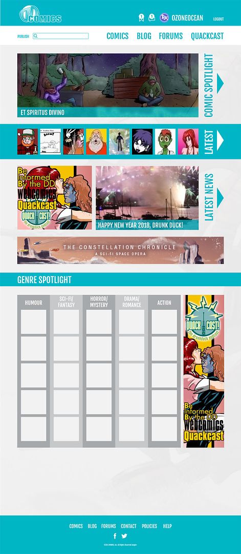
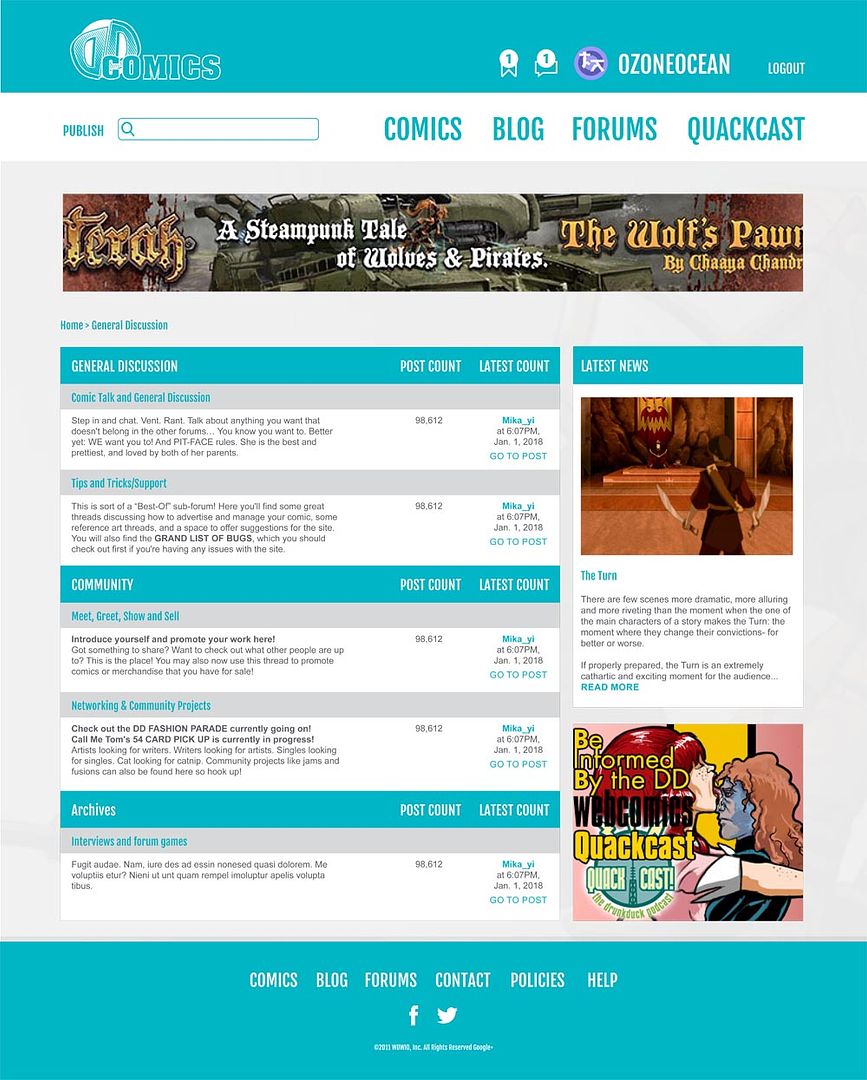
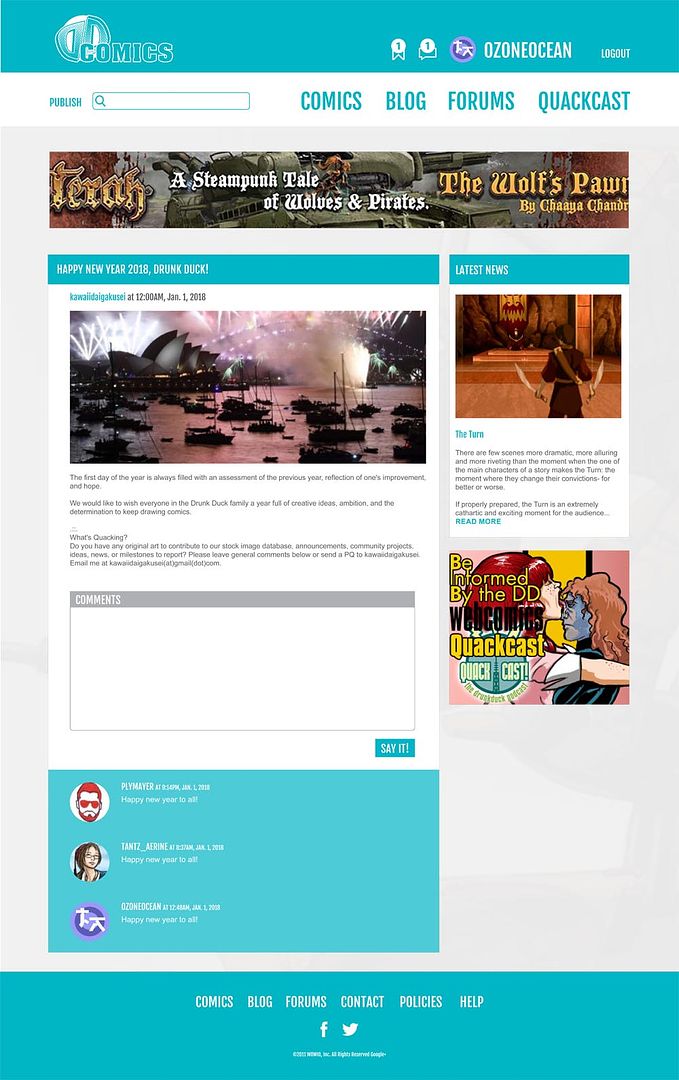
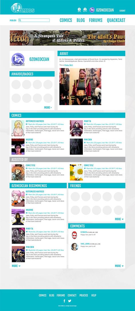
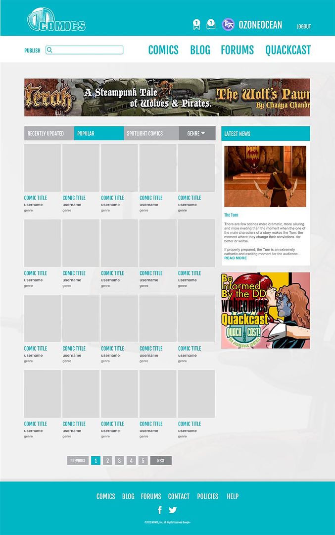
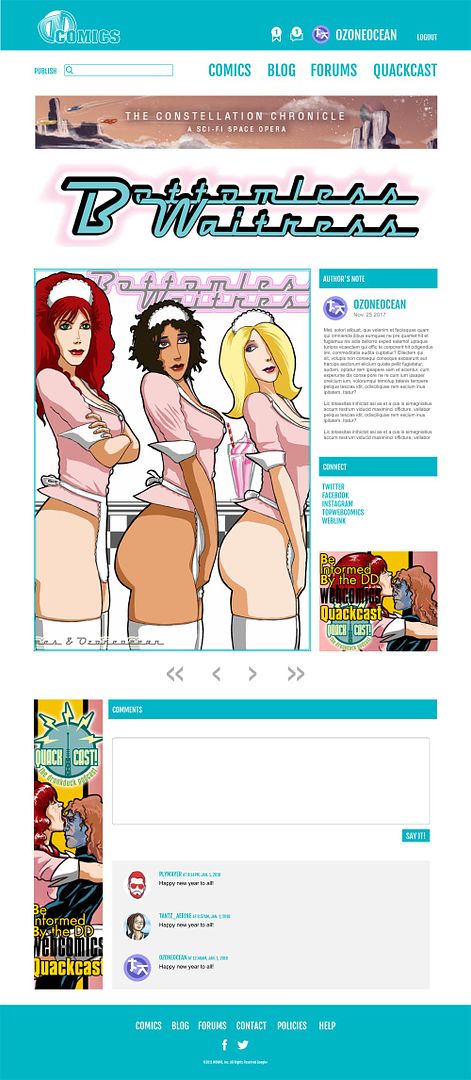
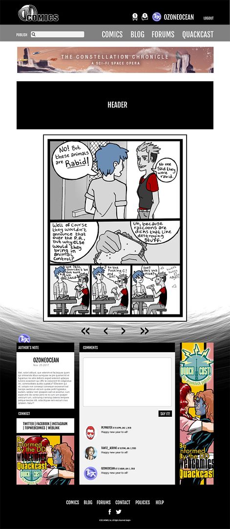
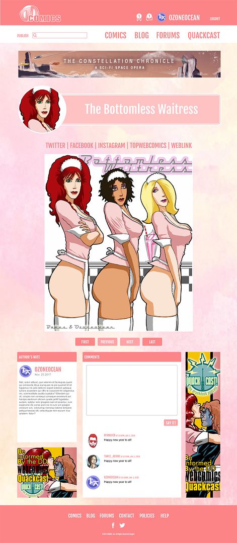
Oz and I have been working on an updated design for you all! We've overhauled quite a bit so check it out HERE. Some of the exciting features we're looking to introduce include:
- A front page that features even more comics. Featured comics now get more real estate, latest comics are right near the top and now we feature the top 5 comics in the key genres on the site. That's a total of 40 comic spots now.
- The forums are more or less the same albeit with a fresh, new skin to match the rest of the site.
- We have overhauled the profile completely adding a whole new section namely awards and badges!
- You can search for comics either in the "Recently Updated", "Popular" or "Spotlight" categories. You'll be able to narrow it down by the genre as well. This will default to "recently updated" to give new comics a chance to be seen.
- You'll also get three new templates you can use for your comic to give you a head start! There's the "Basic Blue", "Eerie Ebony," and "Sherbet Sorbet". You'll still be able to put in your own coding if you want to personalise your site.
- The logo has been updated as well. It's a slight departure from "The Duck" to "DD Webcomics". Given the community refers to the site as DD most of the time it seemed fitting to bring that back whilst highlighting what it is we do here. This is out community and we have always been DD! :D
This is your "high level" design for the moment. Once people are happy with it we'll be looking into getting quotes to try and fund the changes as well as ensuring that it is optimised for mobile viewing as well.
Let us know what you think of the redesign. Are there any features you would like to see incorporated that we might have missed?
I like it a lot. It addresses most of the issues raised and it looks clean and easy to read. If you were coming here for the first time, the logo with the reverse D might leave you guessing at the site's name, but a much better and less confusing first impression with these layouts.
DDComics is community owned.
The following patrons help keep the lights on. You can support DDComics on Patreon.
- Banes
- JustNoPoint
- RMccool
- Abt_Nihil
- Gunwallace
- cresc
- PaulEberhardt
- Emma_Clare
- FunctionCreep
- SinJinsoku
- Smkinoshita
- jerrie
- Chickfighter
- Andreas_Helixfinger
- Tantz_Aerine
- Genejoke
- Davey Do
- Gullas
- Roma
- NanoCritters
- Teh Andeh
- Peipei
- Digital_Genesis
- Hushicho
- Palouka
- Cheeko
- Paneltastic
- L.C.Stein
- Zombienomicon
- Dpat57
- Bravo1102
- TheJagged
- LoliGen
- OrcGirl
- Fallopiancrusader
- Arborcides
- ChipperChartreuse
- Mogtrost
- InkyMoondrop
- jgib99
- Call me tom
- OrGiveMeDeath_Ind
- Mks_monsters
- GregJ
- HawkandFloAdventures
- Soushiyo

