Hmm, maybe just to make it more "in your face" that this is a newer and improveder version of the site, you could change the logo to say "The NEW Duck Webcomics?"
Or would that be too cheesy?

Start publishing on
DD Comics!
Advertise with us

Comic Talk and General Discussion
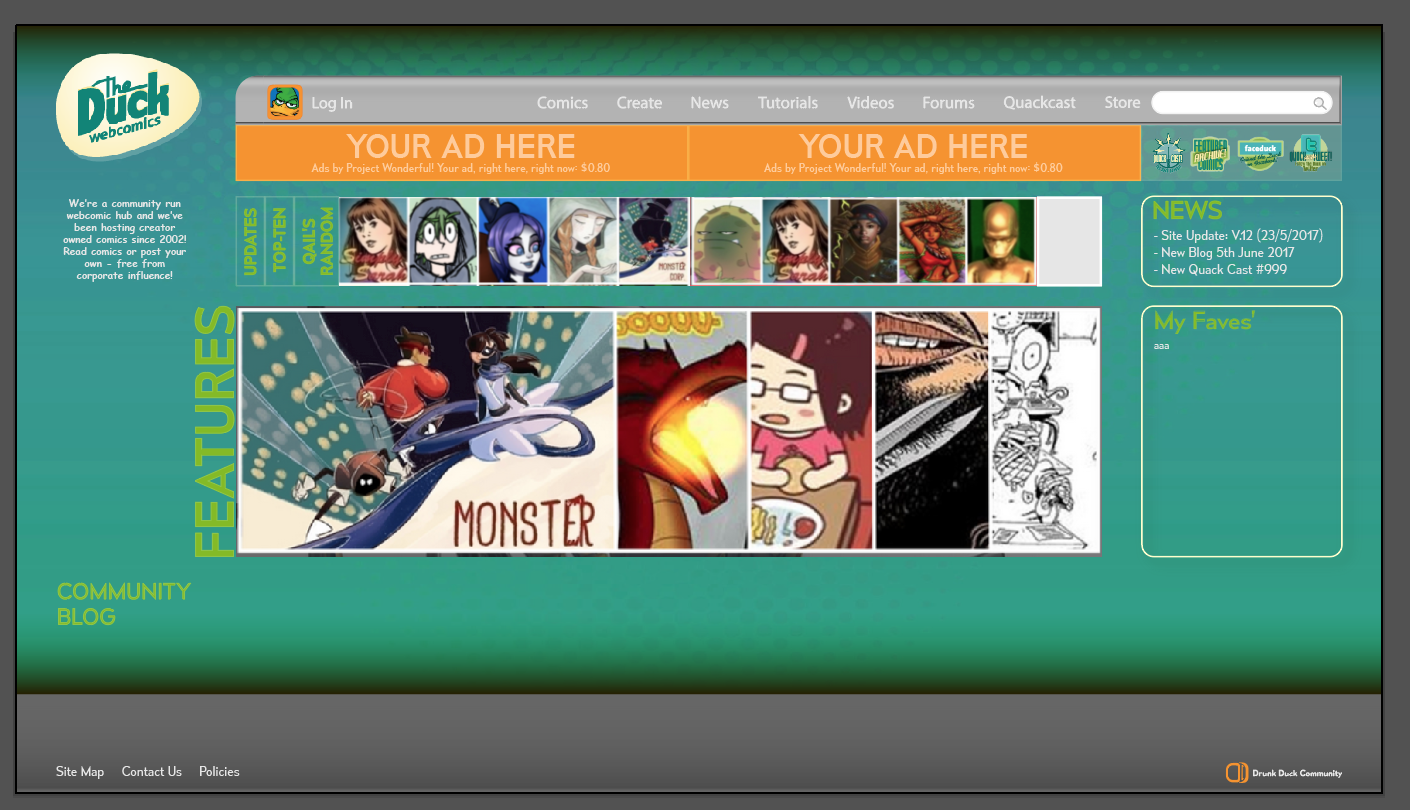
DRUNK DUCK graphical redesign????
Ironscarf wrote:
It's all true. The only reference to this site I ever see is "The Duck is dead" and that's coming from sites that can't even manage a newspost, let alone all the great content we have.
People like to stick with what they know. They come here and see the same old thing and go away safe in the knowledge that The Duck is dead, without having to actually look. Give them a reason to look, and give ourselves a look that makes them want to stick around.
That egg up there is kind of symbolic of our current state.
Hatch the egg!!

Just an idea for the Drunk Duck re-design:
https://next.theduckwebcomics.com/X_Up_test_pages/5541930/
Amelius has some really good points.
Also, had I known about this on the 22 of May I would have been right on it. That I only know about it today is, I think, an example of a communications problem too. Like, I have to visit the page for the weekly DD updates, and If I'm not thinking about DD, I'm not visiting it.
SO I think a bigger external presence needs to fit in with this redesign, to properly facilitate drawing new users into the website's sphere of influence.
Also I'm a graphic designer by heart and experience, I soooo am going to start working on a concept piece for this. I'm too excited right now, lols.
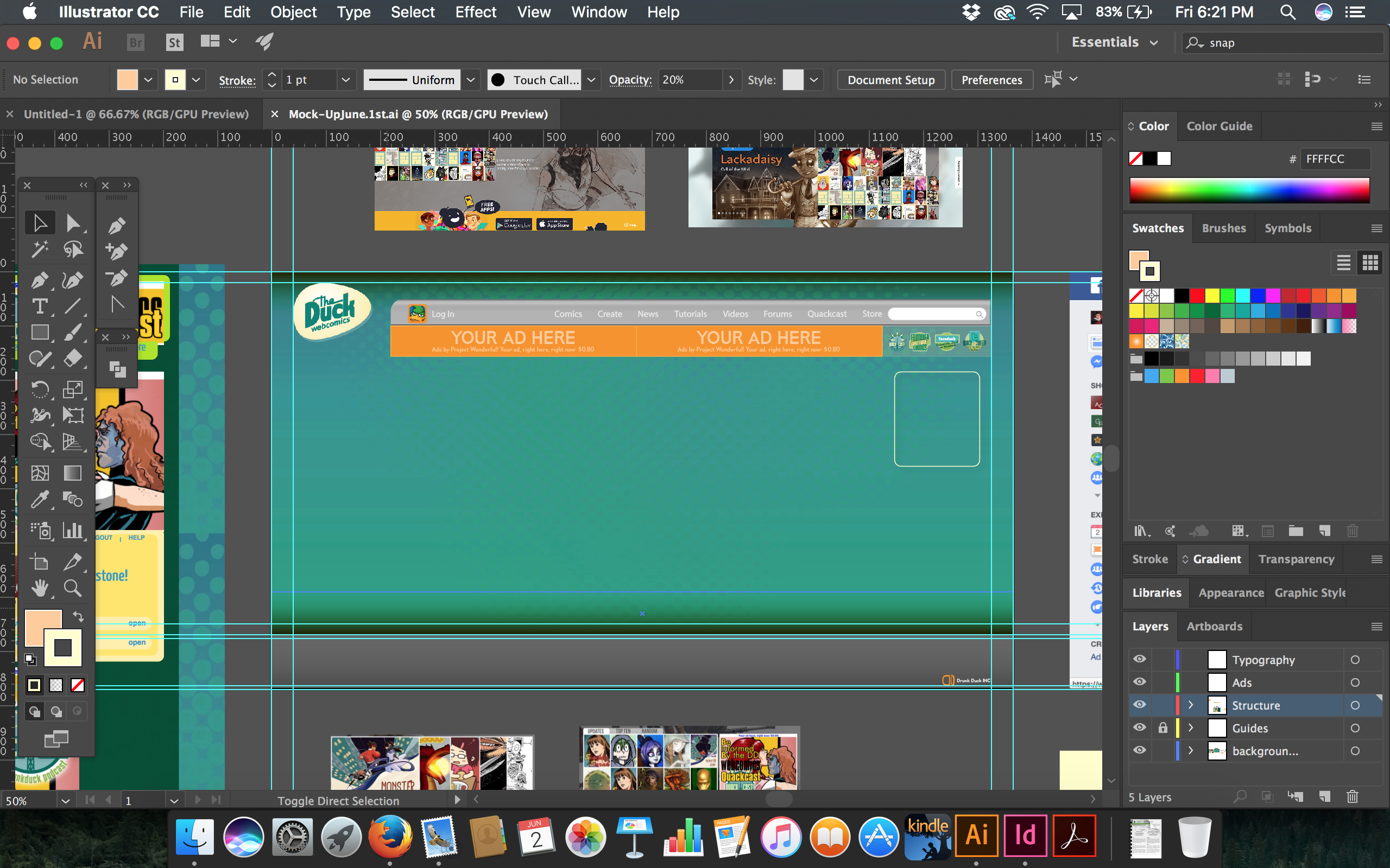
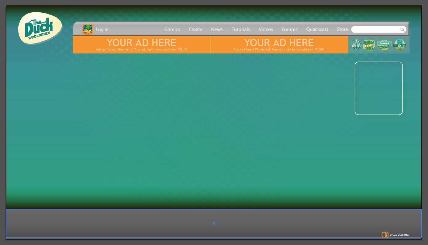
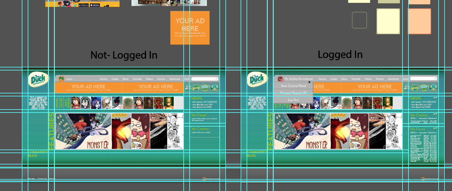
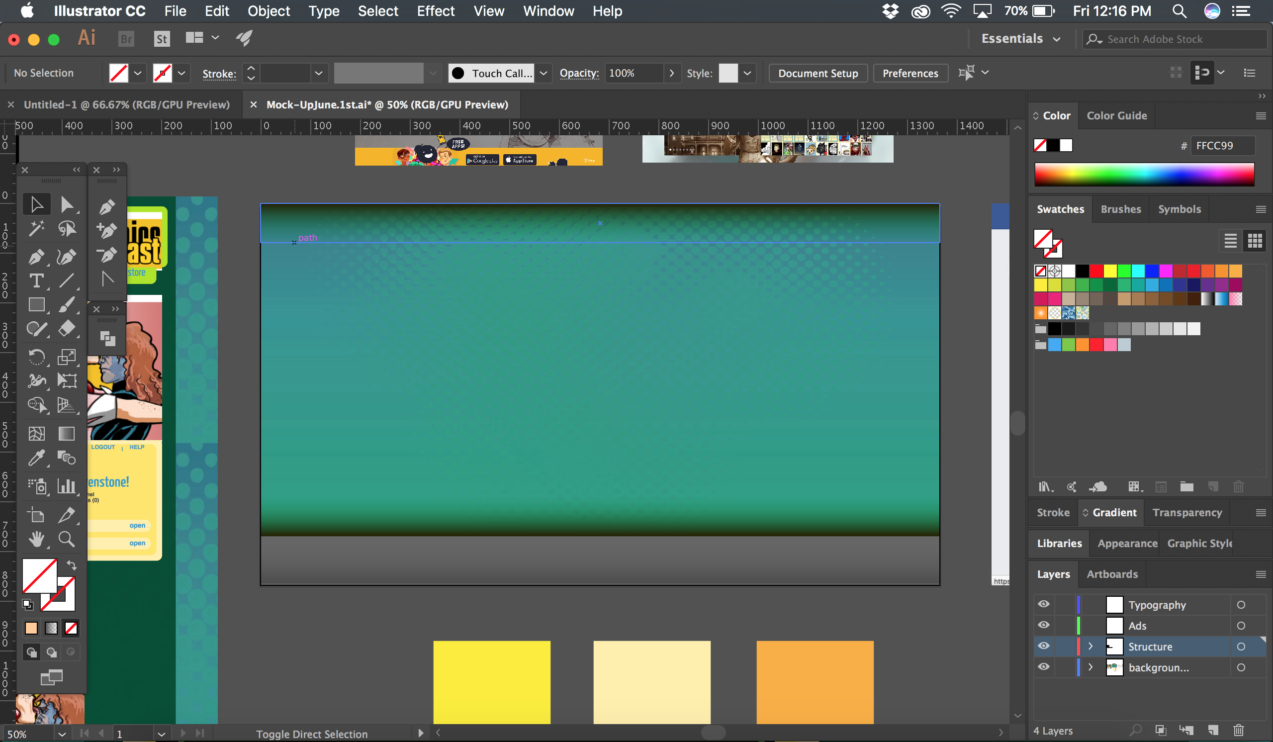
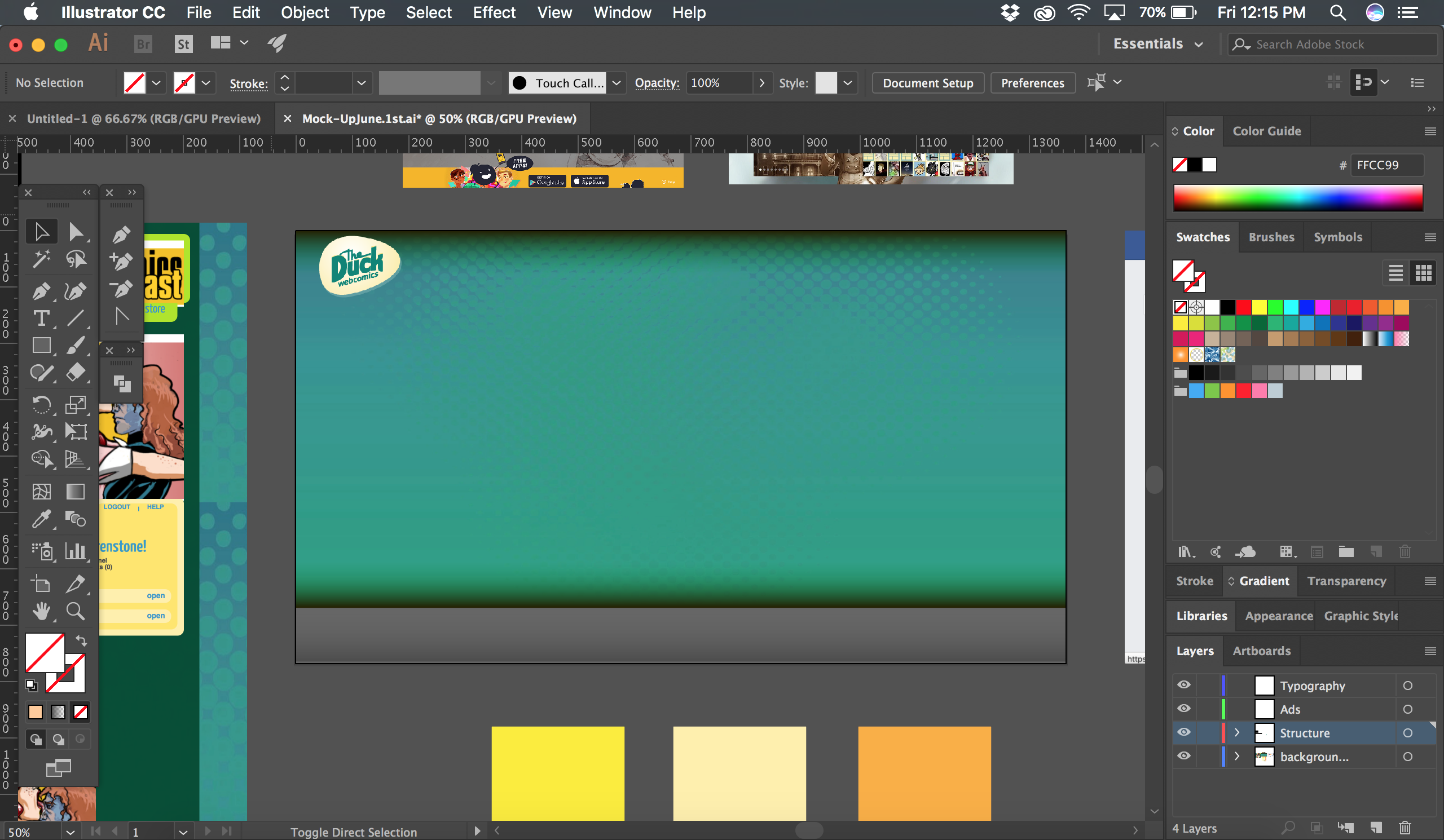
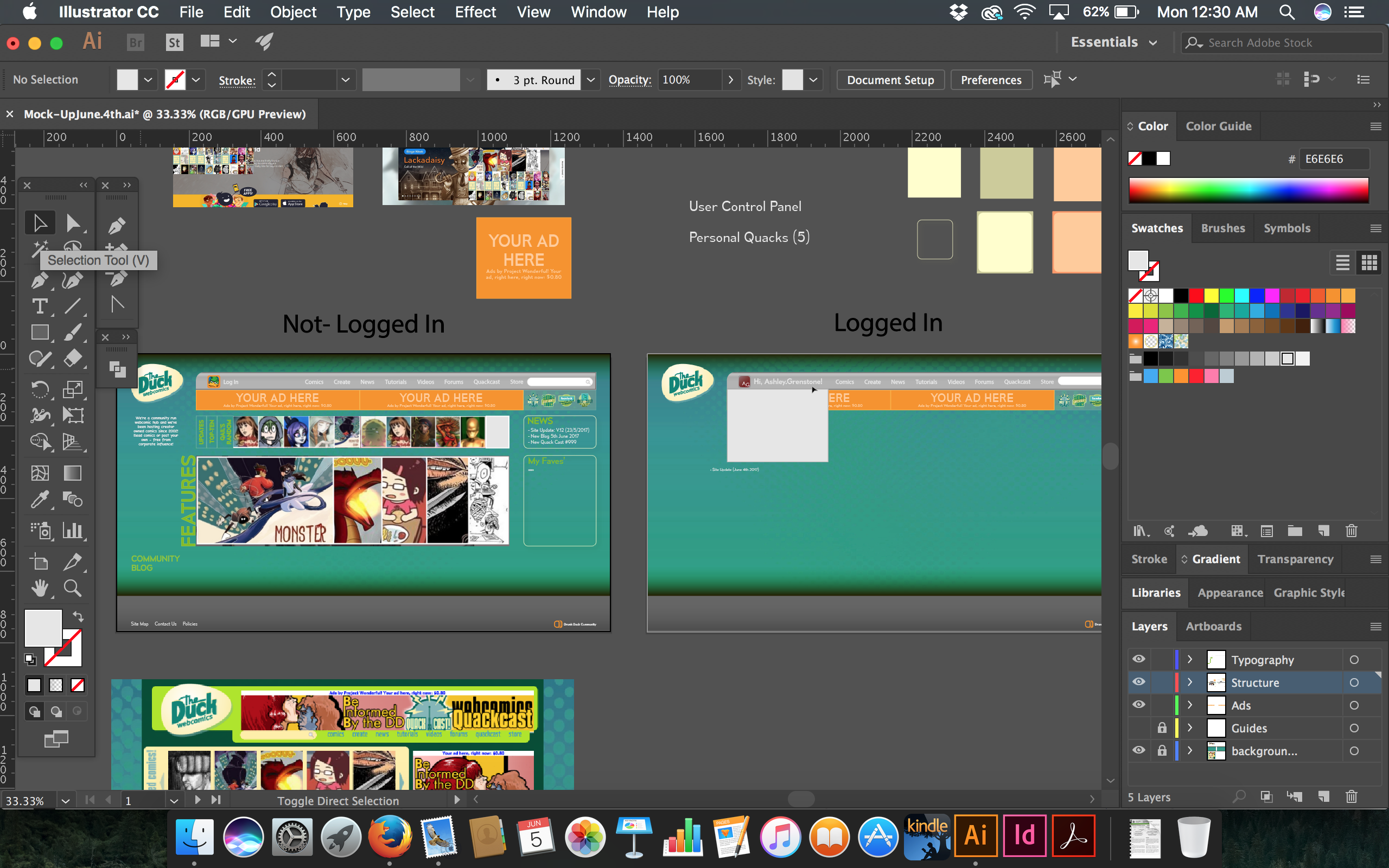
Working on my concept for the redesign. Not much to see here since it's the same image, just showing the potential for placement and structure:
/media/users/Ashley.Grenstone/assets/Screen%20Shot%202017-06-02%20at%2012.15.58%20PM.png
/media/users/Ashley.Grenstone/assets/Screen%20Shot%202017-06-02%20at%2012.15.46%20PM.png
/media/users/Ashley.Grenstone/assets/Screen%20Shot%202017-06-02%20at%2012.15.34%20PM.png
I love the way you guys run the site, it works well all the TOS and the copyright issues. also the idea that there is a big creativity run on the site; adult, sprite, photo images. It's something a lot of places don't have, or have restrictions on. I try to get people to come but they do get the drunk duck is dead, or not functional. so it's kind of hard.
I do think that bigger thumbnails would work with the site, as well as the buttons for 'just update' so it's not just the one line of updates. I do like how the feature is set up so you can go see the features.
One thing I think I do notice is the 'alert' system. I know you guys said you don't have the money for it, or you are trying to work on it. but from what I read in other places they like to have some sort of alert when their favorites update, or even when they receive a comment; I remember you guys used to have something like that in the control panel that let you see comments, and on what pages.
btw I do enjoy the blogs on the site, it shows a lot of activity and it's easy to see what's going on in forums, or what events are happen on Drunk duck. I love that you guys try to get everyone involved in the site discussions.
/media/users/Ashley.Grenstone/assets/Screen%20Shot%202017-06-05%20at%2012.30.07%20AM.png
/media/users/Ashley.Grenstone/assets/Screen%20Shot%202017-06-05%20at%2012.30.28%20AM.png
I took a lot of ideas from Ironscarf's concept and added them to what I have so far. Still a work in progress though.
OzoneOcean:
Do you mean the row of comic icons for 'Updates' 'Top Ten' and 'Qail's Random' or do you mean the logos/icons of the twitter, facebook, podcast?
The row of comic icons I really just blatantly co-opted from other concepts shown on the blog post, but ya, I like the idea of condensing the three groups into this overlay. Plus, I think subconsciously, the act of clicking on each category acts as a reward for some people. Like, I anticipate finding out what each tab has in store. I'm sure others feel the opposite - whereas before they had all three groups exposed they have to do more clicking.
I stick to the idea that it's fun to review each section - makes the user interact more with the front page; feels like they have more ownership over what they want to check out; and, that engagement translates into further engagement with the rest of the site.
As for the logo/icons, I love their look and detail, so giving them their own cute spot like that where they can be seen without scrolling down feels right. I might make them bigger so their detail isn't lost because of their current size.
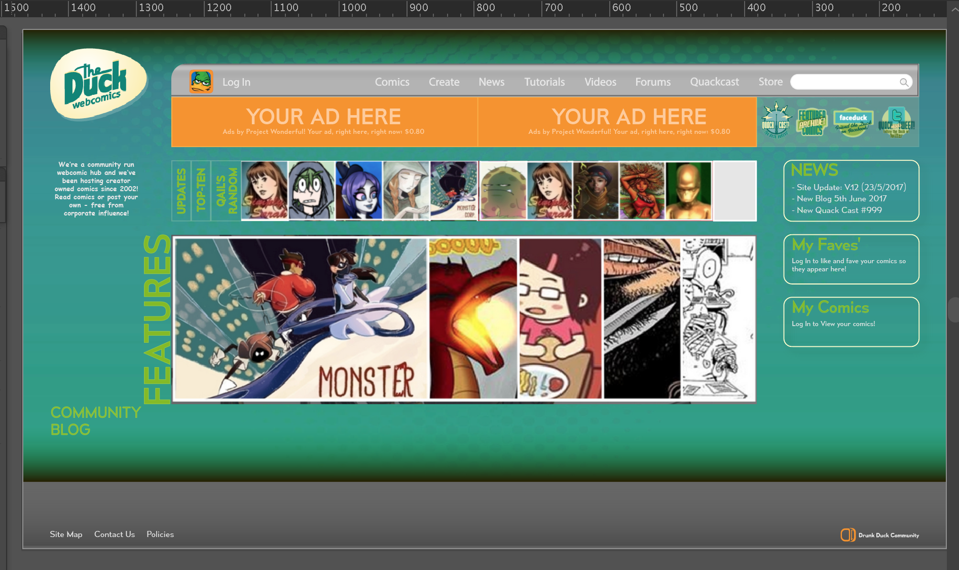
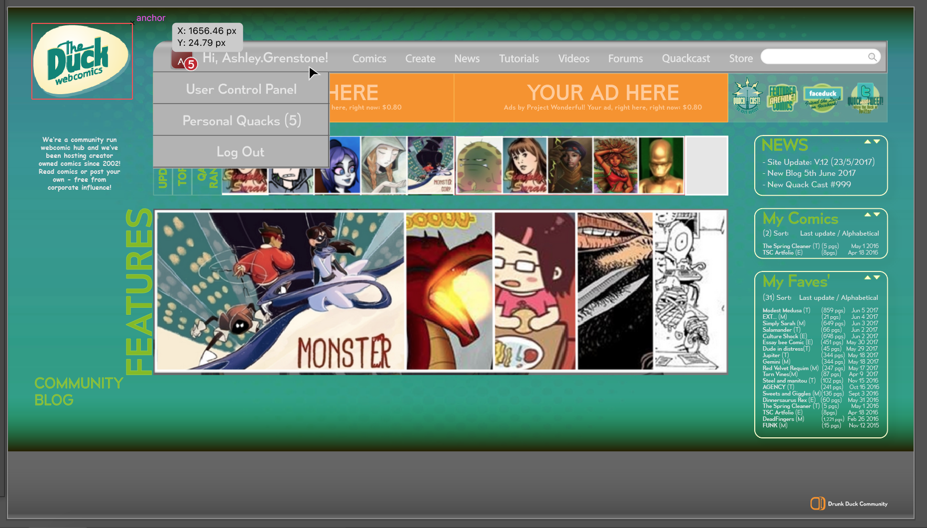
You've thought a lot of it and I love that you have logged in and not logged in options both shown, along with the collapsing menus and the favourites, as well as an indication of news on the top right that I assume is in addition to the full news bellow the features?
Things I personally don't like as much are; the old Drunk Duck background; the site being so encapsulated (as it is now), and not potentially taking advantage of larger screen real-estate that's available now or being able to adjust to a smaller window size.
It's a great design! :D
Looks good. Definitely try a different backround as this is a reminder of what we want to leave behind. I'd put the egg in that category too: I think a new logo design would be critical to shifting preconceived ideas about the site, but we probably need a whole other thread for it!
Awesome, thank you both for the feedback :)
OzoneOcean:
Thanks! And yes that's right, below features I plan on having a section for the news/blog/podcast posts - basically a similar to the features, wherein an image for each new news post (the most recent anyway) is available to click on.
I know what you mean about it being too encapsulated and I agree - I tend to totally tighten up the design more and more as I add stuff so it'll feel good to break loose of the structure a bit. I like the menu drop down system too but I feel it's a little smothering at the moment, so I want to fix that.
The background, okay, and I think like you are saying, a lot of people are wanting to move away from it, which I'm fine with - I use to hate the background because I could never see it, but when I copied it out, I kinda had a bit of a new appreciation for it, lols. Okay, so new background.
I gotta figure out how to better understand screen real-estate and changing size formats - like the do's and don'ts because I imagine as it is now, a person can't technically scale up or down the screen, is that right?
Thanks again for the feedback!
Ironscarf:
Thank you! Okay, definitely different background. Might take me a few tries because I am terrible at being not satisfied with a background design, lols.
I'm actually fond of the idea for a new logo - Like with the bckground, I got a weird new fondness working with it these past few days but outside of that bubble, ya, I totally hate the logo, lols!
Thanks for the feedback too!
—
Are people split on the name of the website or is there an overwhelming desire to return to 'DrunkDuck'?
Luccia wrote:And as a child of the 1970s, it reminds me of the avocado and harvest gold craze in house interior decor if that decade. Or my high school colors of green and gold.
Is the color scheme going to be changed, too? The one used in the picture for the Quackcast looks pretty cool. It's kinda sporty. The green and yellow has always reminded me of corn.
I personally prefer Drunk Duck :)
There is one issue with that though:
Drunkduck.com is not controlled by us. It points to our site but that could change and I can't easily fix that if it did. -say if something changed with our hosting.
theduckwebcomics.com IS controlled by us and DDwebcomics.com is owned by me personally, so that's why we flip flop on the name change.
I like "Drunk Duck" as a name, I do not like "The Duck Webcomics", I think it's a lame compromise.
"DD webcomics" is a GOOD compromise, but having a third name change would be confusing.
We could co-brand with variations of those names though because they all fit us in one way or another.
I don't know that a third name change would be any more confusing than having multiple names where nobody is quite sure which is the right one, plus it would send out a decisive message of change.
Also, D is right next to C on most keyboards. People looking for DC would land here is droves! Seriously though, D.D. Webcomics sounds cool to me, especially as you already own it.
We could also own that phrase I keep seeing. The Duck is dead - long live DD Webcomics! I propose a vote.
DDwebcomics does seem like it'd be a good one to go with as a title although, I don't know how easy it'd be to actually sort out that kind of thing, guessing ideally it'd require some stuff to be migrated (HA!). I never really liked The Duck name change, I mean, a duck just waddles and squarks, who cares about that? Now a drunk duck, that's like the life of the party!
And really, would it be all that confusing a name change? It may confuse a couple of new people at first, but I can't imagine that'd last long! It'd be a good way of bringing the old name back and making it stick.
C'mon, let's liquor up this waterfowl!
Advertise with us
DDComics is community owned.
The following patrons help keep the lights on. You can support DDComics on Patreon.
- Banes
- JustNoPoint
- RMccool
- Abt_Nihil
- Gunwallace
- cresc
- PaulEberhardt
- Emma_Clare
- FunctionCreep
- SinJinsoku
- Smkinoshita
- jerrie
- Chickfighter
- Andreas_Helixfinger
- Tantz_Aerine
- Genejoke
- Davey Do
- Gullas
- Roma
- NanoCritters
- Teh Andeh
- Peipei
- Digital_Genesis
- Hushicho
- Palouka
- Cheeko
- Paneltastic
- L.C.Stein
- Zombienomicon
- Dpat57
- Bravo1102
- TheJagged
- LoliGen
- OrcGirl
- Fallopiancrusader
- Arborcides
- ChipperChartreuse
- Mogtrost
- InkyMoondrop
- jgib99
- Call me tom
- OrGiveMeDeath_Ind
- Mks_monsters
- GregJ
- HawkandFloAdventures
- Soushiyo