I just felt that I HAD to make a thread about this after seeing some horrible design abominations!
Specifically the "pandaren" in the new World of Warcraft game expansion, I just saw a vid of that and was shocked at the inability of the designers, and watching some bits of the movie Troy; with the massive wealth of knowledge we have of how beautiful Greek armour was, they still manage to make their movie props look like shit.
I am a huge horrible nerd about this stuff, but as an artist who loves getting the look of things "just right" and collects a wealth of research and knows his subjects, this sort of thing is dear to me. Here are some examples below:
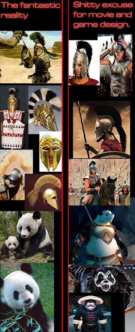
On the left we have Greek armour accurately replicated based on real archaeological examples, old writings, statues, mosaics, painting on pots, carvings etc. It's pretty, it's cool, it's exotic, it's clever!
On the right is the plastic shit they made for the films Troy and The 300. It's crude, it's silly, it's ugly, it's simplistic and boring. One wonders why they even took the time to create their own versions in the first place. The black colour of the Troy armour looks even worse on the fat pink-skinned actors wearing it.
—————-
The Pandas on the left beautifully represent the two key features of pandas, without which they are nothing: Massive, disproportionately large heads with extra wide cheeks, and the spots around their eyes.
On the right you have an excuse for design. Some imbecile has used a polar bear shape and added panda eye markings, so they look like Polar bears in Glam Rock make-up. -without the big head and the wide cheeks, IT IS NOT A PANDA!
Where do these idiots come from?

Start publishing on
DD Comics!
Advertise with us

Comic Talk and General Discussion
Horrible design!!!!!!! Stupid designers who are shiz at their jobs!- in films, games etc.
The designers of this site?
hmmm, I have to admit the armour was the least f the problems with Troy. Most things suffer with weak design rather than bad. What I do hate is when a designer does somethimg great then never seeks to do anything different. Tim burton for example. Or those that try to recreate a look and fail miserably.
The guys that designed the green goblin outfit in the first spiderman film. fuckign terrible. Granted the traditional look wouldn't have fitted but the one they used was hideous.
Genejoke wrote:Before I even finished reading your sentence, I was like, "OH! TIM BURTON!" I don't think he's necesarily a bad designer, but for crying out loud, he doesn't need to make Nightmare Before Christas out of ever project he works on.
The designers of this site?
hmmm, I have to admit the armour was the least f the problems with Troy. Most things suffer with weak design rather than bad. What I do hate is when a designer does somethimg great then never seeks to do anything different. Tim burton for example.
I always hated Rare's design sense in the early-to-mid-nineties. They had been off to a good start with Donkey Kong Country, despite DK looking a bit doofy and weird. They you started to see them try to develop a style as they worked into Banjo-Kazooie and Conker. EVERYTHING had googly eyes and awkward proportions. Banjo was strangely top-heavy. The games' palettes included every hue at maximum saturation. The Killer Instinct games, though more grown-up, were no better. Each fighter was either bland or awkward or a ripoff from some other fighting game. The worst was Jet Force Gemini. It might've been a fun game (I didn't play it) but the characters were so freakin' ugly!
ALSO: Virtually anything in the Hoodwinked movies. Okay, I understand that the first one was made on a tiny budget by a little company with not the best design sense, and it succeeded on a fluke thanks to Shrek triggering the world's thirst for sarcastic fairy tales… But when they gathered their crew and all that money up for a sequel, could they not finally afford a professional character designer? They improved the designs a little, but when even bother if the characters are still going to look awful?
EDIT: Wow, I'm an idiot. I claimed to have been whining about Troy, when I was really whining about Alexander. Whoops!
Tim Burton. I know I'm going to get booed for this, but I don't like him at all. At all. Aside from Charlie and the Chocolate Factory, the man is absolutely incapable of using more than 6 colors. Seriously, look at most of his movies, and all you will see is shades of: black, gray, white, red, purple, and orange. I know the "cooky goth thing" was hip in the early 2000's, but a decade later he's still doing the same crap. Other colors exist on the rainbow, Mr. Burton; you just have to look at them.
Sonic Team. Now, wait. Before I go on, know that I'm not going to whine about modern Sonic games… there's a whole world of people who will do that for me. My beef with Sonic Team is that they can't do their job right when they try to go back to the old formula. Classic Mode of the upcoming Sonic Generations is supposed to play like the Sega Genesis games… but having played through a recent demo of the game, there's nothing "classic" about it. I had no idea it was so impossible to import the gameplay physics of a video game from the mid-90's into a current game. Yet, it seems like Sonic Team, which is the name of the people who developed said mid-90's game, is completely incapable of doing it. I just don't get it. Mario still plays like Mario some 25 years later (in 2D iterations); why can't you people get Sonic right?!
I definitely thought this thread was about "THE DUCK" before I opened it.
Speaking of which, the odd egg logo makes me think of the space-hippies on Star Trek.
You've made me feel like an ignorant bumpkin, ozone! I can't see any difference between the helmets, other than the longer chin-bit on the real ones.
I wasn't real impressed with the Pandaren look either, Ozone. A few years ago when I still played, I would have been probably more miffed as I have a certain love for pandas. I feel like what they're doing is too little too late. Too much of a Kung Fu Panda thing going on and I have to roll my eyes a bit.
You know the first picture for fantastic reality is from Time Bandits. Terry Gilliam is one director who knows to use reality as opposed to trying to improve upon it when it comes to design.
As a student of military uniform there are very few films that don't make me wince. Like Elizabeth Such magnificent opulence of the era and they film it in a drafty old castle so it looks like Monty Python and the Holy Grail? But then there have been a few modern films where the historical military stuff was totally incidental but they got it absolutely perfect. Like the Narnia movies.
The probelm is designers who think they can imporve upon reality by making it cooler, edgier or what have you. One of the most beautifully desinged historical movies was The Duelists. The costumes look ridiculous yet they are all completely accurate and they even bother to show the changes in the uniforms over the Napoleonic Era. Designers think they have to do better when they should just leave well enough alone. Or worse yet designers think they can do better than reality. In many instances far more talented people designed the originals kiddies. And guess what, audiences don't need things dumbed down. We'll get that British artillerymen wore blue uniforms and cavalrymen green uniforms in addition to the infantrymen's red coats.
@Bravo- Yep, that scene in the Time Bandits where Sean Conery as Agamemnon fights the Minotor… Hahaha, funny to talk about accuracy in that context, but yes that's the scene. And I've always loved that! An Ancient Greek warrior who actually looks like an ancient Greek warrior.
Such a thing is exceptionally rare in film.
-Yep, the Duelists is lovely for costumes! So is Royal Flash too actually, in a funny way…
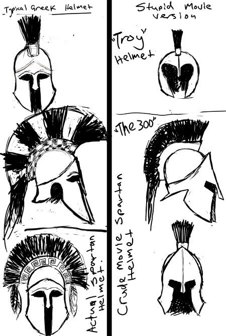
@Hippie- I've drawn some pics so you can better see the differences…
On the left is how they really look and on the right are the movie props. Brad Pit's "Troy" helmet is on the top right: There were actually some real helmets that did sort of look like it, but they weren't typical and they do look pretty crap anyway. His was obviously chosen because it made it easier to see his very un-Greek move-star broad pink face.
(Actual helmets from the time of the mythical battle were made from bone and boar teeth and looked a bit different again… But that's a different thing again)
On the bottom left is an example of a real Spartan helmet, this one has a side facing crest… They didn't all do that but some did… anyway, again it has the same typical shape that most Greek helmets always had for hundreds and hundreds of years.
And On the bottom right you see the crude, angled, wrong looking movie prop with its wimpy little crest, square eyes, oversized forehead, back-sloping cheeks, flat neck-guard and so on.
@Ayes- yeah, I thought the angle of the pic of the bottom bear made it look like a dog too.
————–
I think when you're doing something that's new, then you should do you own take on it! But if part of the whole point of your project is that it is inextricably tied to something that's already in existence, then you HAVE to properly respect your source, especially if it looks better than anything your own poor design skills can conceive of.
NickyP wrote:Tim Burton's "usual" style wore out its welcome years ago for me, but I just want to remind y'all that he did make Big Fish which is a beautiful movie (visually and story-wise). I don't know why he took a whole different approach to that one but it's one of my favorite films. It's actually interesting to consider his older movies like Beetlejuice and Pee-Wee's Big Adventure, where he was playing around with different things. But you can tell he struck it rich with Edward Scissorhands and never strayed too far from that, for the most part. When he did try different things after, like Mars Attacks and Planet of the Apes, they mostly failed.
Tim Burton.
I love the zebra stripes and fancy crests on those helmets! But to be honest if I saw those in a movie I would think the designers were being silly.
I think it is pretty likely that they made the face opening larger so you could see the actors' faces. In drama, faces are important; in real warfare, you wanna cover as much as possible. Personally, I like the movie versions better, but then I go to the movies knowing I'm not watching a documentary. I thought the Spartans in "300" looked bad-ass. Yes, I know in real life the Spartans actually wore armor, but most people wouldn't want to go watch a bunch of short, hairy men weighted down in heavy armor fighting in neat orderly lines for an hour and a half.
I will confess though, probably my favorite part of "300" was the very beginning of the Thermopylae battle, which was about as close as the film ever got to realistically depicting hoplite combat. Still, it would have gotten old fast if the whole movie had been that way.
ozoneocean wrote:A few things. First, most of your issues deal with how accurate things are compared to real life. Hollywood (and since you're dicussing a movie based on a comic, those too) has different concerns than a historical re-enactment. The helmets were probably designed to allow the people watching (or reading) the movie (or comic) to clearly see the characters' faces. Along with that, they are supposed to convey what the writer/director/artist wants the audience to know in a few seconds, or less. In this case, these peopleare Greek and they will ruin your day in a heartbeat. The simple design with the square eyes at a slant does that because even without a guys face there you can easily imagine a pretty impressive scowl.
————–
I think when you're doing something that's new, then you should do you own take on it! But if part of the whole point of your project is that it is inextricably tied to something that's already in existence, then you HAVE to properly respect your source, especially if it looks better than anything your own poor design skills can conceive of.
Second. Also dealing with design, big heads in realation to bodies is considered cute in most cultures (or at least that is what I have been lead to believe). This is not what you want when designing a warrior race. Why pandas? I don't know, maybe because they are easily identifiable as far east. The reason they look like polar bears, it looks more agressive. I'm not saying that they aren't ugly, even hideous, especially that last one, but you have to admit that a big ol' noggin in relation to the body would not have achieved that.
Third, slavishly folowing the past is not a good way to develop new ideas. And to be honest, cheap plastic looking props are more likely the fault of tight deadlines and budgets, not the concept artist. So please, before blasting the poor sap who has to churn out dozens of iterations of each prop. consider that there may have been other concerns besides historical accuracy. If you choose to let that bother you so much that you can't enjoy the movie, then that's your problem.
The Warnock wrote:Problem is a historical movie is not developing new ideas. It is offering a representation of the past for entertainment. Shakespeare could get away with anachronistic outfits with everyone wearing contempory outfits for everything. Many restagings of period works do this all the time restaging Wagner's Ring Cycle into 19th Century Industrial Era Germany or Ian McKellan's turn as Richard III in a fascist 1930s Britain.ozoneocean wrote:
————–
I think when you're doing something that's new, then you should do you own take on it! But if part of the whole point of your project is that it is inextricably tied to something that's already in existence, then you HAVE to properly respect your source, especially if it looks better than anything your own poor design skills can conceive of.
Third, slavishly folowing the past is not a good way to develop new ideas. And to be honest, cheap plastic looking props are more likely the fault of tight deadlines and budgets, not the concept artist. So please, before blasting the poor sap who has to churn out dozens of iterations of each prop. consider that there may have been other concerns besides historical accuracy. If you choose to let that bother you so much that you can't enjoy the movie, then that's your problem.
But, speaking as a real life historian and student of military uniform if there is no need to improve on the real thing… DON'T! If an artist is trying to do something about a specific time and place then do the designs appropriately and keep your uninformed ignorance or pretensions of brilliance out of dressing people. Don't redsign the past, recreate it and people will be astounded. Things worked the way they did for a reason and more often then not better than the later day recreations.
There are a handful of designers who are students of uniform and arms and armor and wheh they're listened to the movie jumps up a whole level of quality. Like those beautiful Home Guard uniforms in Narnia. By the way the Royal Flash movie was re using costumes made for the remake of Charge of the Light Brigade.
Conversely there are movies where the beauty of the thing overwhelms the movie maker so much that the reality of how it was worn vanishes. This covers just about every German WWII soldier ever depicted on screen with a handful of exceptions. This covers most Napoleonic movies and American Revolution Movies. There is the reality of what guys wore versus the expectation of the costume designer and producer for what they should be wearing. The whole British wear red coats thing from The Patriot
There is a little known filming of GBS's Devil's Diciple which to this day astounds me as to how accurately they did the uniforms. Right out of period portraits and Leffert's recreations. And to really confuse things the artillerymen are depicted as Hessians not Royal Artillery which was an excellent detail that livened bits up especially when they're running around yelling in German and the British fusiliers next to them have no idea what they're saying. Someone had read the first hand accounts of Burgoyne's Campaign as opposed to wandering into a museum and glancing at a couple of period uniforms.
Lastly there is no excuse for not doing the research when there is an entire publishing industry devoted to military costume. YO! Costume desginers! Osprey publishing is the leading publisher of books on military subjects and their research into ancient stuff is state of the art. A glance at one of their books on Thermoplyoe and you'll see what it really looked like as opposed to silly movies. And you know a movie based on the illustrations in those books would be beautiful but it'll never happen.
@El Cid- Yep, already acknowledged the wide face opening was prolly to show Pit's fat pink face.
Nope those movie Spartan helmet designs are pure shite, End off.
@The Warnock- I acknowledge your contribution, but you've missed my point. The thing about the helmets is not about "not being true to history", it's about pointlessly going with bad design for no reason.
The thing about the classical Greek helmet style is that it IS a classic. It's not a version, or some silly old anachronistic historical curiosity, it is one of the eternally great and classic designs in all human culture (I studied art history for a few years so I've a perspective on this), it is so classic that it has been repeated in art for almost 3000 years.
Just blowing it off is akin to making a film about Michaelangelo and replacing David with Ronald MacDonald.
Good design is about knowing when to change and when NOT to change things.
(BTW, it would NOT be historically accurate to use it in Troy anyway, so the "slavish" comment is unfounded, that helmet style was a later development, but it IS classic and iconic enough to be shorthand for the whole culture)
-Re: reading faces- this is not an issue. Soldiers are far more menacing as a faceless, anonymous mass anyway, Star Wars is a beautiful example of this. Besides which, main characters always remove their helmets (or hats) in movies when in key scene anyway (with the exception of Darth Vader).
With the bears, big heads are essential. The "cute" thing is something they should tackle directly, like the makers of Kung-Fu Panda did and many others before them. The thing is when you're creating any sort of design based on something you need to have a very good idea of what defines that thing so that you can make a good adaption and communicate what it is to your audience: you HAVE to know your design vocabulary. These designers failed in their work, what they communicate is muddled and incomprehensible.
Ha ha. I'll have to admit, I myself thought somebody else had created another rage thread about the site (failed to read the "in films, games etc." part).
Anyways, it's already been mentioned but the obvious reason why the helmets are designed like that for the movie versions is to give the actors more face time. It's the exact same logic behind why Venom was constantly peeling off his face in Spiderman 3. It's all about the vanity of the actor. Sure they can throw in excuses like that it's harder to emote through a face covering helmet or a mask but people were doing it all the time in both distant and recent past. Planet of the apes? Batman? V for vendetta? Star wars(Darth Vader)? Are you gonna tell me that these performances were worsened, just because I couldn't seen the wrinkles on the actors?
Also, the fact that they broke ranks in 300 made the movie a poorer experience for me. I mean, there you have Leonidas making a big stink about how their unit requires perfect formation for their phalanx maneuver to work, as he turns down Ephialtes due to his inability to properly handle a shield and then 15 seconds into the fight, they completely abandon that setup so that they can do some cool ass slow-mo/fast forward fighting scenes. Might as well have thrown the cripple in as a canon fodder then.
ozoneocean wrote:And here you give me grief, when I complain about horns on Viking helmets.
I am a huge horrible nerd about this stuff, but as an artist who loves getting the look of things "just right" and collects a wealth of research and knows his subjects, this sort of thing is dear to me.
Viking helmet horns are a beautiful case in point because the idea is about communicating with easily understood visual design language:
Horned Viking helmets are NOT historically accurate, and yet they are generally understood to immediately signify "Viking" whenever they appear. This has been true for a few hundred years.
Likewise, the classic Greek helmet I mention is also NOT historically accurate for the events of Troy, not by a long way, but it is visually symbolic of Greek heroes and warriors from whatever time. Using it is simply good design practise.
-And again, the "face-time" issue is a red-herring: key characters always remove helmets, masks in key scenes etc anyway, regardless of how much or how little they cover.
It's not that they want face time during the critical moments. They want more face time. Today it's like big time Hollywood actors have become this self obsessed little drama queens who treat their face as an asset. It needs to get as much exposure on the screen as possible so that it gets engraved in people. Why do they act like that?
The same reason why people say that there's no such thing as bad publicity. The more face time you get, the more people will remember you and being remembered is what gives you jobs in the acting department.
There once was a study made back home about which politician you liked the most and which politician you liked the least. The same politician beat both polls. Out of 50 names, he was chosen both as the most liked politician in the parliament and the most hated, his name either popping up either at the top of the list or the bottom around 80 or 90 percent of the time. Maybe it was because he was so vocal and extreme that people couldn't help either liking or hating him? Doubtful, since he wasn't the most charismatic of the bunch, or that vocal either. He was more of the "behind the scenes" type. Yet, for some reason if people were asked to name 3 politicians, they would always name him.
A physiologist came up with an interesting theory behind his unexplainable popularity/notoriety. For the past 20 years or so, he had been making sure that people that liked him got positions in the government run broadcasting station that runs the most popular news network of the country. During those past 20 years, that news program would always start by flashing dozens of old news reels in the background, while the logo popped up. Many of these news reels had images of that particular politician in the background. Thus every evening when you sat down to watch the news, you were almost guarantied to think about that guy, for just split second, even though nothing newsworthy about him popped up that day. That's why he became the most talked about political figurehead in town.
It's akin to that urban legend where images of a coke can was snuck into the film of movie reels in cinema in order to get people to buy coke during the intermission. The logic is: the more you see the person, the more you think about him. Allot of big star actors aren't interested in portraying the character that they're supposed to play anymore. They're more interested in you staring at them. Therefore they will always demand more screen time.
I will confess though, probably my favorite part of "300" was the very beginning of the Thermopylae battle, which was about as close as the film ever got to realistically depicting hoplite combat. Still, it would have gotten old fast if the whole movie had been that way.
I agree that the "realistic" early part was the best part, and I disagree that if the entire battle was realistic it would have been boring. As soon as the Spartans broke their lines voluntarily and started doing kung fu, I still enjoyed the movie but my brain wasn't absorbing the battle anymore like "OMG this is so cool yet real I want to remember this forever". It became the same kung fu that every other action movie has. And the character deaths no longer meant anything to me, and the epicness of the battles no longer registered on me… because it became an action movie.
For the Troy helmet, yes it's for showing Brad Pitt's face. No, it is not enough for his face to be seen only during critical close-up scenes. It is important that the audience can identify him at a glance during any battlefield action scene, and see what his facial expression is. This applies to any actor playing a major character wearing a war helm.
For the 300 helmet, I thought maybe it was Miller's fault and the movie was just being faithful to the artwork… but no… I Googled it and Miller actually drew the helmet with the historical eye-shaped slits, and the historical jutting jaw guard.
I looked up the different Greek helmet styles because I have been shopping for some nice hoplite figures and have been thinking of doing a diorama of clashing phalanxes. We are confusing two different helmet patterns. Corinthian versus Chalcidian.
Upshot? There are six distinct styles of helmet: Illrian, Boetian, Thracian, Corinthian, Chalcidian and Pylos whereas all of Oz's pictures of of Corinthian and the movie pictures are of Chalcidian variations.
There's more than just one style of Greek helmet and in fact at Thermoplye there was probably more than one type of helmet on display. So the Troy and 300 helmets are actually a mix of historical styles that could have existed and not necessarily an historical distortion. Achilles' helmet could be a mixed style of the Mycenian antecedant of Illian styles with a nasel. Perfectly historical.
So if you really want to get very technical and specific about Greek helmet styles they're all reasonably accurate. *gulp* There were styles of Corinthian helms that had larger eye and ear openings to allow for better vision and hearing. That's how they evolved into the Chalcidian. Remember these things weren't machined and mass produced but made by hand individually. Again leaders could have had custom helmets with larger eye openings because he wants to see (and be seen) on the battlefield. In fact open face helmets of the Illrian pattern as in the movie 300 Spartans. Again perfectly historical as battle accounts are full of leaders yanking off their helmets or wearing open faced helmets so they could be seen.
I have a stack of books next to me as I write posts about The Patriot, The Duelists, Waterloo and the Napoleon Miniseries etc. But truly the best for a TV show remains Sharpe but then that's good old Andrew Mollo who along with brother John Mollo were experts in military uniform before becoming costume and production designers. John Mollo was asked to participate started with Charge of the Light Brigade after writing several books on Crimean uniforms. One was also involved with Revolution which is why that got it right and The Patriot got it wrong. Kudos to the Mollo brothers!
Sgtbravo I have a question for you.
You're obviously knowledgeable about war trivia, and you obviously enjoy delving into it, and enjoy talking and writing about it…
So why are you instead making kitschy photo comics featuring girlie dolls? Why aren't you making historical fiction photo comics featuring army men and stuff? Wouldn't that instantly make your comics more respectable? Not to mention more widely read by a sizeable niche readership (war enthusiasts) who you understand and communicate regularly with?
Product Placement wrote:
It's akin to that urban legend where images of a coke can was snuck into the film of movie reels in cinema in order to get people to buy coke during the intermission. The logic is: the more you see the person, the more you think about him. Allot of big star actors aren't interested in portraying the character that they're supposed to play anymore. They're more interested in you staring at them. Therefore they will always demand more screen time.
Except in the case of subliminal advertising (the coke idea), it doesn't work.
This argument is still very weak, simply because characters with any obscuring headgear always remove it after introducing the fact that they've worn it, so headgear never obscures their faces for any detrimental length of time. -Tom Cruise's mirrored shades in Top Gun, Luke and Hans Solo with their Storm Trooper helmets, etc…
Anyway, Achilles is the sort of all powerful hero yu'd expect to always fight bare headed! ^_^
mlai wrote:
300 helmet, I thought maybe it was Miller's fault and the movie was just
being faithful to the artwork… but no… I Googled it and Miller
actually drew the helmet with the historical eye-shaped slits, and the
historical jutting jaw guard.
Miller styled the designs slightly towards that mutated shape, but it was the movie designers really turned it into the stupid cartoon shaped mutation that it became…
@Bravo- As I've said- this is NOT about strict historical accuracy. I know very well all about the myriad of different helmet styles that abounded through the many centuries in the states that loosely made up ancient Greece. The point is that there is a typical style (the Corinthian) that has always been used to identify "ancient Greek", it is amazingly iconic. But not only that: it looks magnificent, mainly because this was a design conceived and honed by the orignal aesthetic masters who created the very principals of good design, then refined by thousands of humanity's best artists over millennia.
It sounds like I'm exaggerating, but I'm not. Take a look and see how entrenched a part of European art history that thing is.
———-
To widen this a bit… Say in the movie series Lord of the Rings, I think Peter Jackson missed a serious trick when it came to the design theme in the film- It's a series (the books) with a massive cultural impact, far bigger and wider than modern kid's stuff like Harry Potter or Twilight are or will ever be. There's been art, music, animation, sculpture etc inspired by and based on it for many decades, and yet even with that hugely rich resource to draw upon, Jackson limited to aesthetic to one entirely based on the work of a single illustrator…
Sure, that kept things streamlined and unified, but it made everything look too much the same, muddy, not distinct enough, so you almost can't tell all the different groups, armies, cultures, races apart that easily. Visually it was well done, but dull and boring.
It didn't have to be.
Except that the icon had numerous variations and the designers have delved into them! These helmets are not Corinthian but Chalcidian and as such Perfectly acceptable! They are not the great icon but the later actual modifications that real Hoplites wore in battle because the Corinthian totally obscured vision and hearing.
In other words they're right. They didn't screw the pooch they just used a different but equally valid design. In fact it could be argued they are more accurate for using it as soldiers probably wore the Chalcidian more often in battle. So it's one version of aesthetics versus what may have been actually worn.
As for Tom Cruise in Top Gun, he spent most of his time in his mask with his face covered as any actor is obliged to do if they play pilots going back to Gregory Peck in Twelve O'Clock High and Errol Flynn in Dive Bomber. I mention the last because the movie is even about the design of proper oxygen equipment for high altitude aircraft.
As for LOTR the art is based on a long tradition of LOTR portrayal going back to the 1970s. I was surprised how much matched with the classic depictions of the Brothers Hildebrandt. I still have the calendars from the 1970s. Some scenes stepped right out of the paintings so there is more to this than one may think.
As for the subject matter of my comics I ask myself the same question every day. In the end I have too much respect for the material. I'd rather do something kitschy that I know sucks before the first page is uploaded and won't insult the memories of those who have served. (But I did do one story that was on Lite Bites a while back.)
You're on your wife's pain meds right? Or just the curmudgeonly contrarian?
Exact historical accuracy is not the point as I've said every time (and none are accurate in either case, you're wrong if you look at the dates, boar's tusk is an entirely different material to bronze), the iconic style is the iconic style, none of those in the films are iconic. The question remains- why? At least Time Bandits did it nicely with Connery.
I advise you to re-watch Top Gun and count exactly how many seconds Cruise wears his oxygen mask and then calculate what portion of the film that constitutes. I believe it will be a distinct minority… Yes, remember the famous motorbike scenes, or the lecture scene, or the singing in the bar scene… Amazing how he did all that without a pressure suit ^_^
I have a couple of copies of calendars by the artist Jackson used (from decades before his films). Yep, they made the world match that vision… A world so creatively envisioned by thousands, and with all that we have it all narrowed down to one. Very disappointing.
Advertise with us
DDComics is community owned.
The following patrons help keep the lights on. You can support DDComics on Patreon.
- Banes
- JustNoPoint
- RMccool
- Abt_Nihil
- Gunwallace
- cresc
- PaulEberhardt
- Emma_Clare
- FunctionCreep
- SinJinsoku
- Smkinoshita
- jerrie
- Chickfighter
- Andreas_Helixfinger
- Tantz_Aerine
- Genejoke
- Davey Do
- Gullas
- Roma
- NanoCritters
- Teh Andeh
- Peipei
- Digital_Genesis
- Hushicho
- Palouka
- Cheeko
- Paneltastic
- L.C.Stein
- Zombienomicon
- Dpat57
- Bravo1102
- TheJagged
- LoliGen
- OrcGirl
- Fallopiancrusader
- Arborcides
- ChipperChartreuse
- Mogtrost
- InkyMoondrop
- jgib99
- Call me tom
- OrGiveMeDeath_Ind
- Mks_monsters
- GregJ
- HawkandFloAdventures
- Soushiyo