Make sure if you implement smileys that you also implement a way to disable smileys for those of us who dislike them =)

Start publishing on
DD Comics!
Bugs and suggestions roundup thread!
Amelius wrote:I think I remember that discussion - I think I threw in a mockup too? From what I recall of it, I don't think it was so much a matter of 'no' as 'we just don't have the resources to implement that at the moment'.I feel like I've said this before somewhere, but could we make all the categories (Most popular*, Most recent, Random) work like the featured comics UI? ie. Each category shows the first X number of thumbnails and you can just click on the arrow to see the next X?I'm on the same page with you on this, I made a mock-up of some possible ideas on this front but the response to my suggestion makes me hesitant to finish it. Getting told no right out the gate on something I think is a major issue with this site was pretty disheartening…
That said, I think the current homepage is doing an awful lot right and I wouldn't want to see that lost. It makes much better use of its space than the homepages for ComicFury, Smackjeeves, Keenspot or Comic Genesis.
For me areas of improvement are more along the lines of formatting the information dynamically across a wide variety of screen sizes as well as supporting mobile technologies. For example, I think the amount and variety of thumbnails the Duck throws at you right now is great. But the information about the comic in the thumbnail is conveyed by mouseover. That works really well on PC but is incredibly awkward on a mobile phone. We should be using a stylesheet that makes that information available in some other way for people on mobiles (a twistie, maybe?).
HippieVan wrote:I don't know what the Duck is like under the hood so I'm not sure exactly what you mean by 'a complete overhaul'. It seems like a lot of the issues people have raised like mobile support and changing the UI of the homepage should be achievable just by modifying CSS files.
What I meant was that with the small amount of money we have to put towards fixes right now I didn't think it was realistic to do a complete overhaul, although I completely agree that it would be the ideal thing to do. I didn't want to get people's hopes up and have everyone start discussing what a completely new front page would look like, only to have to tell everyone that it can't really happen. But if we could boil down what we would really want out a redesign into a few key points that are more do-able, that would be awesome.
Identifying key points is an awesome idea. I'm not sure if a lot of it is actually going to be fixable independent of a redesign.
BTW, if you do another fundraiser at some point, even if you don't use Kickstarter, one idea well worth stealing from Kickstarter is that of 'stretch goals'. If there's a clear delineation between the 'must haves' and 'nice-to-have' goals (and the Indiegogo page suggests that's the case) then stretch goals are a good way to structure that, and they tend to add motivation for supporters.
Amelius wrote:Gonna dig in my heels on this one, 'cos I think having the randomiser on the home page is really, really useful both for old timers and newbies.
*edit* I forgot to mention though! It could be
"Latest updated, New comics, Quail's recommended (featured)(and have quail's random be in the search area, not the main page…)and popular today" which it could cycle through just like that.
A randomizer is not bad, but people do not associate "random" with positive things. And by that I mean people coming in fresh, not people who have been on this site so long that they got used to the smell.◔‿◔
People who don't associate 'random' with positive things can always look in the 'popular', 'recommended' or 'recent' section. But I like that the home page includes some wildcards. It's put me onto some great comics that may never have been on the homepage otherwise - especially ones that are no longer updating but are still awesome.
One of the concerns about a top ten is that it's a feedback loop: Top ten comics get more eyeballs so they're more inclined to be read by more people which means they're likelier to be in the top ten.
That the Duck gives us thumbnails that were sampled using four different methods gives people a wider and more representative sampling to choose from. If a comic has an interesting looking thumbnail and synopsis then it has a chance to shine, even if it's not currently popular.
BTW, Charby is the #1 comic for me, assuming that furthest to the left = #1.
As a semi-aside, is it still useful to have the 'Tutorials' link at the top? The Tutorials section is looking pretty sad nowadays.
irrevenant
BTW, Charby is the #1 comic for me, assuming that furthest to the left = #1.
The list is currently based on "likes" but filters out all the raunchy adult rated comics. Technically "Death P0rn" is #1 but is not displayed. Looking now there are actually 6 (!!!) adult comics in the REAL top 10. Woah!
Being cheated out of the Top 10 is a little bitter, sure, but I can understand not wanting the frontpage to be a semi-porn page. :)
Anyway, I submitted this suggestion to the survey:
Make the image file "egg-logo.png" easily accessible by admin so it can be periodically changed. For events/holidays or users that make their custom Duck/quail logo. Also, change the logo back to DRUNK duck. It's time.
VERY good suggestions!
Funnily enough with the current top ten- even though it excludes adult comics and is based on likes and managed by Hippie Van, they STILL have the highest number of hits and are actually listed in order of that number, with Charby at the most and every comic with less after that.
So Hippie worked out a pretty accurate system.
awsome owl 98 wrote:
What about the 1 to 5 rating thing? I know people still comment numbers sometimes so even though I was never here when it was here I'm assuming it was something people liked.
I personally liked it. It was a way for anyone who didn't have something to say give the current page a silent 'keep up the good work'. When DD was overhauled and that feature was removed, along with stats being broken that really discouraged me. Being a lurker who rarely does much but upload, not seeing any feedback for months on end is why I struggled to keep updating.
Bringing back the rating thing may not be what the current Duck needs, and I think one of the suggestions is to add a like button to various parts of the site, possibly comic pages, not just comics themselves? It's worded vaguely, but I like to imagine that's what the paraphrasing means since comics already have the like button (=
awsome owl 98 wrote:
What about the 1 to 5 rating thing?
I think a Drunk Duck LIKE button on the comic pages (which has been added to the possible new features) would be better than a 1-5 rating. That way a user can quickly and easily say they like the page.
With a 1-5 Rating, if a comic maker gets anything lower than a 5 they will get angry and bitter. It also opens up for trolls to go and give comics they hate a 1 on every page. Ratings can be nasty business.
Prototype wrote:
A Drunk Duck LIKE button on the pages (which has been added to the suggestion list) would be better than a 1-5 rating. That way a user can quickly and easily say they like the page.
With a 1-5 Rating, if a comic maker gets anything lower than a 5 they will get angry and bitter. It also opens up for trolls to go and give comics they hate a 1 on every page. Ratings can be nasty business.
Yeah, I think a "Like" button would work better. When we had the ratings system, almost every single rating would be a "5," unless someone was trolling and would rate the page a "1," which was really not very constructive. So effectively it functioned as a "like" system anyways.
Stellar wrote:
Also, when you hit the 'quote' button to quote someone, the /quote tag is spelled wrong (qoute). In case Hippy or Ozone don't already know o=
We know! Thanks.
cdmalcolm1 wrote:
Ok is at all possible to increase the mb from 1 to 2 or 3mb?
I believe the 1mb limit has been temporarily removed. I'm not sure what oz is planning to do with that ultimately, but the issue with larger file sizes is keeping the site viable financially. Larger images cost more to store and serve.
irrevenant wrote:
That said, I think the current homepage is doing an awful lot right and I wouldn't want to see that lost. It makes much better use of its space than the homepages for ComicFury, Smackjeeves, Keenspot or Comic Genesis.
For me areas of improvement are more along the lines of formatting the information dynamically across a wide variety of screen sizes as well as supporting mobile technologies. For example, I think the amount and variety of thumbnails the Duck throws at you right now is great. But the information about the comic in the thumbnail is conveyed by mouseover. That works really well on PC but is incredibly awkward on a mobile phone. We should be using a stylesheet that makes that information available in some other way for people on mobiles (a twistie, maybe?).
What is a twistie?
The front page actually works fairly well for me on mobile - tapping on a thumbnail once brings up the mouseover comic info, and again takes me to the comic. Can anyone else chime in on how well this works on other mobile devices? I'm using an iPhone.
irrevenant wrote:
I don't know what the Duck is like under the hood

Also wanted to respond to this one. It's kind of vague, so I'm not sure how to incorporate it into my list:
So long as there's plenty of warning about the nature of it's contents, I'd like to see A rated comics be a little less sidelined.
If anyone wants to offer more input on this issue I'll be happy to add it to the list. The only ways I can think of that adult comics are 'sidelined' is that they're currently not allowed in the Top Ten or in the featured comics. I can't speak to features because I'm not in charge of those, but one of the reasons that I've kept them out of the Top Ten is that users who aren't logged in or who are registered as under 18 can't access them (or even see the thumbnails, iirc).
Also this one:
Search feature in general is lame and useless. Should be updated or just removed.
Please try to be as specific as possible about the issues you've experienced and what you'd like to see fixed. I can definitely understand wanting to vent your frustrations, but I have no idea how a suggestion like this one would be implemented.
If anyone wants to offer more input on this issue I'll be happy to add it to the list. The only ways I can think of that adult comics are 'sidelined' is that they're currently not allowed in the Top Ten or in the featured comics.
I think Drunk Duck can be extremely prude at times. :)
I don't have a problem with adult comics not showing up on the top10 or featured. DD doesn't want to be synonymous with porn. It's reasonable. But being forced to be logged in to access the comics can be a bit problematic at times.
I can't link to my adult comic on sites like "top web comics" for example, or any other webcomic listing, since guest users won't be able to read it and are not likely to bother with signing up just to read. As such I've had to see the Comic Fury version of my comic(which started as a mirror) as the official place that I can actually link and refer to as they don't have that login requirement.
I seem to remember that in the old days of DD a log in for adult comics was not required. Instead a warning popup was displayed informing the reader of the raunchy content. Click to confirm, and you can read away.
I know the login serves a purpose to keep the kiddies away, but let's not fool ourself that it in reality actually keeps the kiddies away. They just register and fake their age. Kids are smart like that.
Not showing adult comic thumbnails to not logged in users is a bit extreme and overprotective I think. I don't think I've seen any adult comic using naked naughty bits for their picture. (that should not be allowed) Again to mention Comic Fury, they display every comic titles thumbnails, adult and non adult, and has no limitations for adult comic whatsoever. And it works just fine.
Prototype wrote:If anyone wants to offer more input on this issue I'll be happy to add it to the list. The only ways I can think of that adult comics are 'sidelined' is that they're currently not allowed in the Top Ten or in the featured comics.
I think Drunk Duck can be extremely prude at times. :)
I don't have a problem with adult comics not showing up on the top10 or featured. DD doesn't want to be synonymous with porn. It's reasonable. But being forced to be logged in to access the comics can be a bit problematic at times.
I can't link to my adult comic on sites like "top web comics" for example, or any other webcomic listing, since guest users won't be able to read it and are not likely to bother with signing up just to read. As such I've had to see the Comic Fury version of my comic(which started as a mirror) as the official place that I can actually link and refer to as they don't have that login requirement.
I seem to remember that in the old days of DD a log in for adult comics was not required. Instead a warning popup was displayed informing the reader of the raunchy content. Click to confirm, and you can read away.
I know the login serves a purpose to keep the kiddies away, but let's not fool ourself that it in reality actually keeps the kiddies away. They just register and fake their age. Kids are smart like that.
Not showing adult comic thumbnails to not logged in users is a bit extreme and overprotective I think. I don't think I've seen any adult comic using naked naughty bits for their picture. (that should not be allowed) Again to mention Comic Fury, they display every comic titles thumbnails, adult and non adult, and has no limitations for adult comic whatsoever. And it works just fine.
Ah okay, I do see what you mean. Yeah, I think censoring thumbnails is probably overboard. Scrolling through the comics tab, most of them just seem to have a lot of cleavage which is whatever.
I've never thought too much about the logging in aspect. I can sort of see both sides - on one hand it's not unusual for all-ages websites to require a login for adult content (e.g. youtube), but I can also see how it would cause problems - preventing users from wanting to accurately rate their comic, for instance, for fear of losing access to readers. And it's probably a minor deterrent but not a major obstacle to teens looking for porn. My main concern is probably preventing people from accidentally stumbling upon adult content, which would be assuaged by a big ol' warning popup.
HippieVan wrote:A twistie (in interface rather than snack food terms :P) is a little widget that you click on to expand and hide information. It's usually a triangle.
What is a twistie?
The front page actually works fairly well for me on mobile - tapping on a thumbnail once brings up the mouseover comic info, and again takes me to the comic. Can anyone else chime in on how well this works on other mobile devices? I'm using an iPhone.
When you're browse folders in the Windows Explorer navigation pane and can fold/unfold the folder structure those are twisties. It's a slightly different UI on mobile but I've seen it use fold/unfold mechanics.
Using Chrome on Android, tapping on a thumbnail takes me to the comic. It also shows the mouseover but only for a moment while the new page is loading.
I see the mouseover text by holding down my finger on the thumbnail then dismissing the context menu. It works, but it's not the most intuitive thing ever.
ozoneocean wrote:
The login for A rated comics stuff isn't for prudishness, it's so we can have advertising.
Ah, of course. Good to know.
Our main issue is keeping costs manageable.
Our Project Wonderful advertising pays for our site costs, but this month ad revenue is WAY down.
So far it's only: $116.16
These are our expenses:
Hosting on Linode.com: $50
Quackcast hosting on Libsyn.com: $20
Projected cost of image hosting/serving on AWS at Amazon.com: $51.65
As you see at the moment there's a shortfall. But there are about 6 days left in the month so we'll make that up, just.
The Linode and Libsyn costs are fixed, but the AWS is variable based on how much data we serve (how many people view our images, per kilobyte of downloaded data). That number can go up or down, -most usually up as we have more viewers.
-The more data downloaded, the higher the cost.
That's the only argument for caps on file sizes.
I have nothing against animated gifs (not at huge file sizes of course).
We're going to explore cheaper image hosting options. Amazon SW3 servers are pricey but they're also a gold standard for keeping your comics safe so I'm loathe to leave it. It's very easy to get cheaper hosting but there are risks involved. I doubt Comic Fury uses Amazon.
The form is now CLOSED. All submitted answers have been added to the list.
If you think I missed your suggestion or misunderstood it, please let me know either in this thread or via PQ! My original plan was to have the next survey come up this Friday, but this is a pretty hectic week so we'll see how that goes. If not it'll be next week.
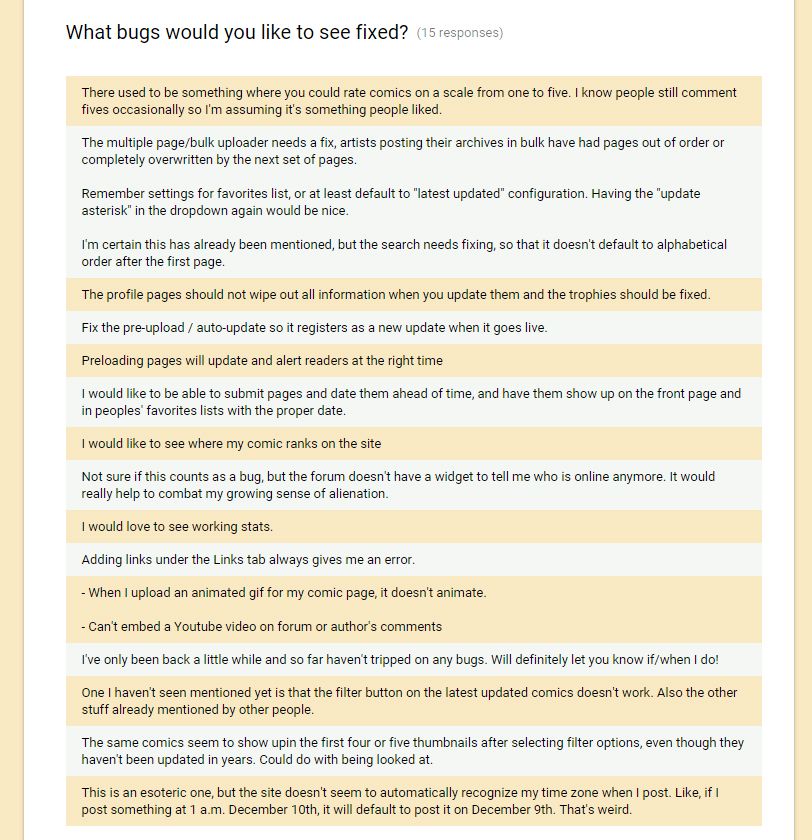
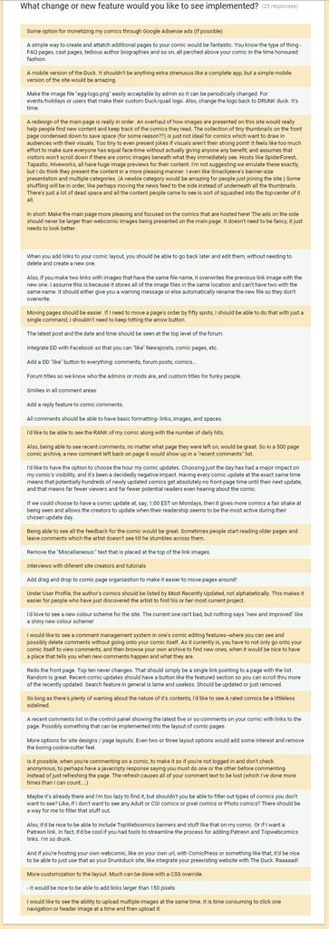
Edit: And just for transparency's sake, here is every single response that we got.

Very good work Hippie!
Here's a list of things that won't be included in this round of fixes and why:
Things that are not feasible at this stage:
2, 21, 22, 23, 34.
2. Allowing comic creators to have PW or Google Adsense ads on their own comic pages
- We only just earn enough at the moment to pay for hosting and a teeny bit left over to put towards emergencies of programming fixes. Something like $10 to $20 at the moment, maybe a lot less.
21. “If you're hosting your own webcomic, like on your own url, with ComicPress or something like that, it'd be nice to be able to just use that as your Drunkduck site, like integrate your pre-existing website with The Duck.”
- I would love to do this, but I think it might take a lot more work than most of the bugs and fixes combined.
22. A mobile version of the site.
- This will take too much work at this stage I think. Not just programming, I think this one will involve specific page designs for the smaller format.
23. A new colour scheme for the site.
- Another one that involves a lot of redesign and could make people really mad- people love the idea of colour changes but hate it when it happens. Plus we have to carefully match and test all the colour combos against all elements of the site on multiple pages. It would be better to ask a bunch of DD members to do this and come up with options for people to vote on.
34.Show adult comic thumbnails even to users who are not logged in.
- We can't do this because of child protection and our advertising.
The only way would be to ask all adult comics to be SFW with their thumbs, but then how do we police compliance? Adult thumbnails could be subjected to an approval process but that would limit their freedom hugely, the trade-off of visible thumbs isn't worth it.
Okay, the second survey is up here: http://goo.gl/forms/pW7Vmfxnjc
OK-
I've troubleshoot this bug. What I THINK happened was that the person doing the reset has more than one account using the same email address.
This is not possible to do using the site as it has been for the last 5 years so it's not a current bug. It's something left over from the previous version of DD where you could have multiple accounts.
So what the person will need to do is contact me directly to reset their password for them using the backend - which is much easier than setting up a fix just solely for the old accounts.
When the next bug-fixes happen I'll make sure an email link to me and a ink to the DD facebook page is included to take care of these weird issues that can crop up!
When I was testing it I did mind a more current bug- manually adding new accounts results in an error because there's no email field when you add them so that bit of data is left out, causing an error.
DDComics is community owned.
The following patrons help keep the lights on. You can support DDComics on Patreon.
- Banes
- JustNoPoint
- RMccool
- Abt_Nihil
- Gunwallace
- cresc
- PaulEberhardt
- Emma_Clare
- FunctionCreep
- SinJinsoku
- Smkinoshita
- jerrie
- Chickfighter
- Andreas_Helixfinger
- Tantz_Aerine
- Genejoke
- Davey Do
- Gullas
- Roma
- NanoCritters
- Teh Andeh
- Peipei
- Digital_Genesis
- Hushicho
- Palouka
- Cheeko
- Paneltastic
- L.C.Stein
- Zombienomicon
- Dpat57
- Bravo1102
- TheJagged
- LoliGen
- OrcGirl
- Fallopiancrusader
- Arborcides
- ChipperChartreuse
- Mogtrost
- InkyMoondrop
- jgib99
- Call me tom
- OrGiveMeDeath_Ind
- Mks_monsters
- GregJ
- HawkandFloAdventures
- Soushiyo
