Am I the only one in the world who never feels sleepy after eating turkey?

Start publishing on
DD Comics!
Advertise with us

Comic Talk and General Discussion
Happy 2022! General Discussion Thread
J_Scarbrough wrote:No one is answering you because they're ALL asleep! XD
Am I the only one in the world who never feels sleepy after eating turkey?
I'm in Australia so I didn't eat any. ^_^

Y'know, maybe I'm just being a snob about this, but I feel as though Anime Ace has become the most overused word balloon font in both professional and amateur comics over the past decade or so. Don't get me wrong, it's not a bad font at all, and I can understand why it's so widely used (mainly because it's one of the few word balloon fonts that's free), but it's become so prominent and so prevalent in comics that it's become ubiquitous.
I am, however, a snob when it comes to the letter U in word balloon fonts: I very much hate those letter Us that look like lopsided letter Vs having sex with uncrossed letter Is.
When I started making webcomics lo those many years ago, I picked Anime Ace 2.0 because it was closest to my own hand lettering. I had no idea everyone would be so impressed by my comics that they would use it, too!
J_Scarbrough wrote:
Y'know, maybe I'm just being a snob about this, but I feel as though Anime Ace has become the most overused word balloon font in both professional and amateur comics over the past decade or so. Don't get me wrong, it's not a bad font at all, and I can understand why it's so widely used (mainly because it's one of the few word balloon fonts that's free), but it's become so prominent and so prevalent in comics that it's become ubiquitous.
Never anime ace. Use zud juice. More expressive and it was El Cid's font of choice and he really knew how to pop dialogue. Actually knew how to pop a lot of things.
My own handwriting is illegible and I've never been able to find anything to match its drunken schizophrenic scrawl.
There might be few free balloon fonts now, but it wasn't always like that. Winkie, balloon, zud juice, komika (huge family there) were all free. Pig Iron cost money but that was a loooooong time ago. Seiber space and bazooka are good effects fonts.
In fact just did a search of free comic fonts and one site had 20+ pages of fonts. But then I'm a font collector. Once slowed a computer to a crawl by installing too many fonts back when RAM was still measured in MB.
But then the weakest of all weakest parts of my comics is the lettering. Just get lazy with the balloons and kerning. Did a pile of on line tutorials and just ignore everything I should have learned.
Anime Ace is a quality font, which might explain it's popularity over most free fonts, but also quite distinctive. I definitely register it as Anime Ace when I see it, but I'm probably more obsessive over lettering and dialogue fonts than most. These days I create the balloons and start lettering before doing any serious drawing and keep tweaking them until it's time to post.
I at least thankful that my Adobe Creative Cloud subscription has licenses to use certain selected fonts from both Comicraft and Blambot, because there have been some fonts that I've liked to use that aren't necessarily just the same freebies we see over and over again. I'm kind of partial to Meanwhile myself - it's got that combination of a handwritten look, while also still appearing somewhat "clean" and legible that I tend to prefer in a word balloon font.
dpat57 wrote:Neat! My handwriting has always been terrible, even as a kid when I would make homemade comics and did everything by hand (even the coloring with pencils), the lettering was also so terrible, you could barely read it. Being able to use actual fonts was a big step-up in the game for me.
When I started making webcomics lo those many years ago, I picked Anime Ace 2.0 because it was closest to my own hand lettering.
bravo1102 wrote:Way back when I started lettering digitally, I used Zud Juice, because it was free, but I honestly never really care for it that much - I was never really sure why, but I just didn't. I remember just to try something different, I tried another freebie I believe was called SundayComix, and while I liked it only marginally better than Zud Juice, there were still some things I didn't like about it both from an artistic and a technical perspective: artistically because it looked too "clean," like it really looked nothing like a handwritten font because the letters and characters were just too neat for any human to write themselves; technically because it was kind of a glitchy font - you couldn't use apostrophes, because it would always substitute quotation marks for some reason, and it lacked the Crossbar I technology, so all Is were uncrossed, even when used for first-person pronouns.
Never anime ace. Use zud juice.
When you've taught and graded papers you'll find the kid whose hand writing matches every particular "handwritten" font in existence. Like I said my handwriting is a schizophrenic drunken scribble that changes and morphs constantly. You should see the handwritten daily reports at my job. 🤣🤣
I switch fonts comic to comic. I've done ten so have done lots of experimentation. I just keep coming back to zud juice for basic dialogue. I'll probably even download anime ace and test it.
The best font in the world won't save an awful comic.
Bad is bad. Whether the lettering is perfect or a scribble or the most popular font ever. No-one ever praised and read an otherwise awful comic just for its great balloons and lettering.
I use my own handwriting for Bottomless Waitress now.
My handwriting is famously pretty horrible, but I KNOW this so I try extra hard to make it neat for the comic. It works well :)
I got tired of Anime Ace. I used it because it was the best "hand written" font at the time, closest to what they use in pro comics. I tried version 2 when that came out as well.
For Pinky TA though I now use Digital Strip because it's better than Anime Ace. Anime Ace is the "basic bitch".
J_Scarbrough wrote:
I'm kind of partial to Meanwhile myself - it's got that combination of a handwritten look, while also still appearing somewhat "clean" and legible that I tend to prefer in a word balloon font.
Meanwhile was the first pro font I invested in. A good all rounder with just enough character while being as you say, very easy on the eye. Comicraft New Years day sale is a real godsend for those of us who haven't ascended to the cloud.
Ozoneocean wrote:
For Pinky TA though I now use Digital Strip because it's better than Anime Ace. Anime Ace is the "basic bitch".
I used it on one of the Belinda Brandon movies in Belle's Best. So many fonts, so little time.
I gaze longingly at Comicraft fonts as if through a Victorian sweetie shop window, always wrestling with that terrible decision: do I buy groceries this month, or a Comicraft font?
Ironscarf wrote:
Comicraft New Years day sale is a real godsend for those of us who haven't ascended to the cloud.
Three letters and one word: VTC Letterer. That is all.
>Nah, not really all.<
When it comes to text in speech bubbles, I always use the font I mentioned above, unless I add different colors or text inside those bubbles. Now for projects' titles on a cover page, I hand-draw the text and use {free} fonts depending if they work well together.
ThrisbyDude wrote:
Three letters and one word: VTC Letterer. That is all.
>Nah, not really all.<
When it comes to text in speech bubbles, I always use the font I mentioned above, unless I add different colors or text inside those bubbles. Now for projects' titles on a cover page, I hand-draw the text and use {free} fonts depending if they work well together.
I looked up VTC Letterer, it is not bad.
I am partial to anything in the “Architect” family of fonts. AutoDesk has a good copyright on an Architect typeface, “Flux Architect Font” is a nice alternative.
VTC Sunday Komix! That was the font that I used for a while! Yeah, like I said, it was only marginally preferable to Zud Juice IMO, but it still wasn't 100% satisfactory since, like I said, it lacked the Crossbar I technology, and for some reason, didn't have an apostrophe, so it instead used quotation marks, which looked weird.
Come to think of it, for some reason, I think the Meanwhile font I have installed through my Adobe Creative Cloud subscription must have rolled back to a previous version, because it suddenly lacks the Crossbar I technology, even though I know they updated that in recent years.
Otherwise, I'm about to really date myself here, but I'm actually old enough to remember when Comic Sans MS used to be considered a really cool font. No, really.
All this subjective chatter is nice, but how about the experienced opinion of someone who's done multiple comics; maybe around a dozen; in different formats and genres. I'd like to hear their opinion.
Thanksgiving was listening to my twenty something nephew spout his all knowing wisdom endlessly. He knows all about narrative form because he watched the entire MCU movie run and played D&D. The uncle who's written a dozen webcomics and created over a thousand pages of content just said nothing. Wiser to keep your mouth shut and be thought a fool than to open it and remove all doubt.
Couldn't get a word in so just nodded and listened. Listening is what I do best. Two ears and one mouth and all that and realize that when I was his age I too could hold them spellbound with my nonsensical rambling and prove myself a fool time and time again.
I should ask for one of his campaign logs and make a comic based on it. Might banish the doldrums.
bravo1102 wrote:My signature is the same way (and yes, I actually know how to sign my name, as opposed to the current generations who apparently know nothing about this, and just print their names in lieu of even knowing what a signature is): I'm honestly surprised I've never been arrested for suspicion of fraud or something, because I were to write my signature on a single piece of paper 10 times, not a single one would look like the other . . . my last name is especially hard at the B-R-O part.
Like I said my handwriting is a schizophrenic drunken scribble that changes and morphs constantly.
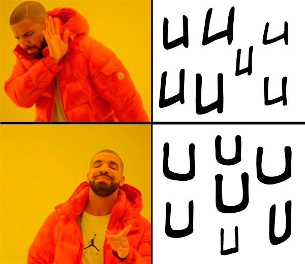
J_Scarbrough wrote:For a visual aid:
I am, however, a snob when it comes to the letter U in word balloon fonts: I very much hate those letter Us that look like lopsided letter Vs having sex with uncrossed letter Is.
kawaiidaigakusei wrote:It's like looking in the mirror, though much better at expressing and defending himself than I ever was.bravo1102 wrote:
Thanksgiving was listening to my twenty something nephew spout his all knowing wisdom endlessly.
I take it, he is your favorite nephew?
J_Scarbrough wrote:J_Scarbrough wrote:For a visual aid:
I am, however, a snob when it comes to the letter U in word balloon fonts: I very much hate those letter Us that look like lopsided letter Vs having sex with uncrossed letter Is.
That's the evil of serifs. Bring one in for a upper case "I" and next you know "U" are corrupted.
Advertise with us
DDComics is community owned.
The following patrons help keep the lights on. You can support DDComics on Patreon.
- Banes
- JustNoPoint
- RMccool
- Abt_Nihil
- Gunwallace
- cresc
- PaulEberhardt
- Emma_Clare
- FunctionCreep
- SinJinsoku
- Smkinoshita
- jerrie
- Chickfighter
- Andreas_Helixfinger
- Tantz_Aerine
- Genejoke
- Davey Do
- Gullas
- Roma
- NanoCritters
- Teh Andeh
- Peipei
- Digital_Genesis
- Hushicho
- Palouka
- Cheeko
- Paneltastic
- L.C.Stein
- Zombienomicon
- Dpat57
- Bravo1102
- TheJagged
- LoliGen
- OrcGirl
- Fallopiancrusader
- Arborcides
- ChipperChartreuse
- Mogtrost
- InkyMoondrop
- jgib99
- Call me tom
- OrGiveMeDeath_Ind
- Mks_monsters
- GregJ
- HawkandFloAdventures
- Soushiyo